
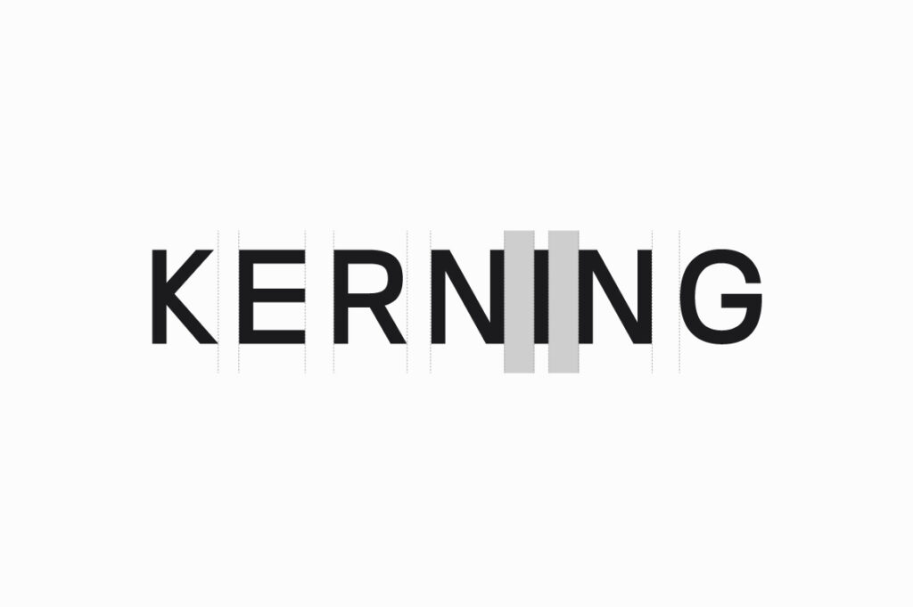
Great typography isn’t just about picking the right font — it’s about how you space it. Kerning and letter spacing are the invisible forces that make your text feel polished and professional. Even a perfectly designed font can look awkward when letters are too close or too far apart. That’s why mastering spacing is one of the most essential yet underrated typography skills every designer should have.
Kerning controls the space between individual letters, while tracking (or letter-spacing) affects the spacing of an entire word or line. Subtle adjustments can dramatically change the tone of your design — tight spacing can feel bold and modern, while generous spacing can feel elegant and airy.
Fonts like Nalte Sans or Prolinea rely on precise spacing for that clean corporate look, while expressive scripts like Brownies Handdrawn or Sigmature Monoline need balanced flow to preserve readability. Always review your typography at multiple sizes and devices, ensuring that your kerning supports both visual rhythm and clarity.
Key Tips
✅ Always zoom out and read text as a whole — don’t over-focus on single pairs.
✅ Avoid auto-kerning for logos or large headlines — fine-tune manually.
✅ Use consistent optical spacing in multi-font layouts.
✅ Looser tracking improves legibility for uppercase titles.
✅ Test your design on print and screen — spacing behaves differently across mediums.
Conclusion
Perfect kerning doesn’t shout — it whispers harmony. It’s what separates “good enough” from “great.” When you start noticing how letters breathe and connect, you begin to design with intention. Remember: beautiful type is not just seen, it’s felt — and spacing is the rhythm that makes it sing.