
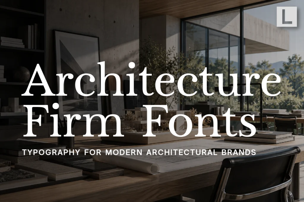
Architecture is about structure.
Every building begins with decisions about proportion, rhythm, materials, space, and function. A strong architecture firm’s branding should communicate those same principles.
Typography plays an important role in that process.
From architectural portfolios and project presentations to websites, proposals, signage, and social media, typography becomes part of how a studio presents its ideas.
The right architecture firm font can make a practice feel precise, contemporary, established, or experimental while allowing its projects to remain the visual focus.
Why Typography Matters in Architecture Branding
Architectural studios often have a very strong visual identity through their work.
Buildings, interiors, drawings, models, and photography already communicate a large part of the studio’s personality.
Typography needs to complement that visual language rather than compete with it.
A carefully selected typeface can communicate:
- Precision
- Structure
- Innovation
- Sophistication
- Permanence
- Creative thinking
This becomes particularly important for studios working on high-value residential, commercial, hospitality, or cultural projects.
What Makes a Good Architecture Firm Font?
Architecture branding benefits from typography that is both distinctive and controlled.
A typeface may look impressive on a large project title, but it also needs to work inside a portfolio containing project descriptions, specifications, dates, locations, and technical information.
A strong architecture font should offer:
- Clear hierarchy
- Excellent readability
- Strong proportions
- Professional character
- Flexible weights
- Good performance in print and digital
The best typography should feel like part of the architectural system itself.
Sans Serif Fonts for Modern Architecture Studios
Contemporary architecture practices often lean toward clean sans serif typography.
The reason is simple: architectural communication already depends heavily on grids, lines, geometry, and precise layouts.
A structured sans serif can reinforce that visual language without introducing unnecessary decoration.
Recommended for Architectural Brand Systems
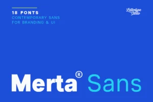
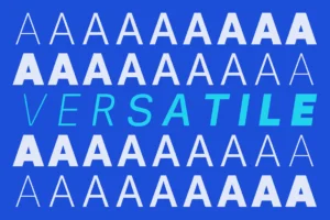

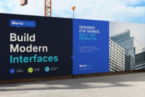
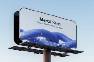
Merta Sans works particularly well as the functional foundation of an architecture firm’s identity.
Its broad 18-style family allows designers to create hierarchy across websites, portfolios, presentation decks, project documentation, and other professional materials.
For architecture studios handling multiple projects simultaneously, that flexibility can be especially valuable.
Editorial Serif Fonts for Architecture Portfolios
Architecture and editorial design have always shared a strong relationship.
Architectural monographs, design magazines, project books, and cultural publications frequently combine photography with carefully structured typography.
A serif can introduce a more sophisticated editorial layer to an architecture firm’s identity.
Recommended for Architectural Portfolios
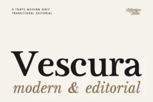
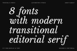
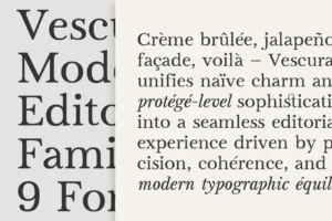
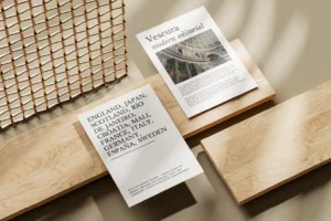
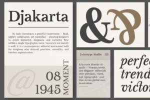
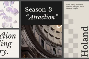
Vescura brings a refined editorial quality to architecture branding.
Its modern transitional serif structure can work particularly well for project names, portfolio covers, studio profiles, architectural essays, and premium printed publications.
This makes it a strong option for practices that want their branding to feel closer to an architecture journal than a conventional corporate identity.
Geometry and Precision in Architecture Typography
Architecture is inherently geometric.
Lines, proportions, grids, repetition, and spatial relationships are fundamental to the discipline. Typography can subtly reinforce those qualities through structured letterforms.
However, geometric typography should still maintain enough personality to avoid making the studio look interchangeable with every other contemporary practice.
Recommended for Contemporary Architectural Identity
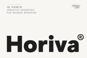

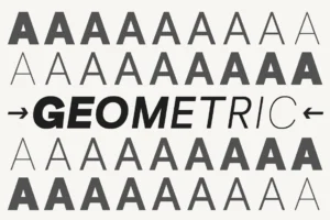
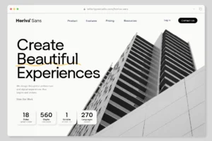


Horiva Sans provides a clean geometric direction that fits naturally with contemporary architecture.
Its structured appearance can be used across studio identities, project presentations, websites, signage, and architectural campaigns where clarity and modernity are important.
It is especially suitable for studios with a minimalist visual language.
Display Fonts for Architectural Campaigns
Architecture firms don’t always need to look restrained.
Large project launches, competitions, exhibitions, design events, and cultural collaborations can benefit from stronger display typography.
A display font can introduce visual impact while the primary corporate typeface continues handling practical information.
Recommended for Architectural Campaigns
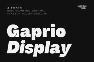
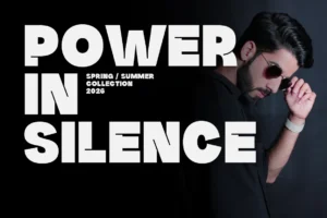

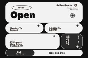
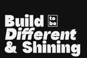
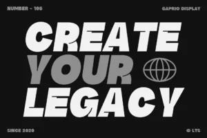
Gaprio Display offers a stronger contemporary display voice for project launches, exhibition graphics, architectural posters, and campaign headlines.
Its bold geometric character can create contrast against large architectural photography and minimalist layouts.
Rather than using it throughout an entire brand system, it works best where the studio needs a more distinctive visual statement.
Experimental Typography for Forward-Thinking Architecture
Some architecture practices operate at the intersection of architecture, technology, research, and digital culture.
These studios often need branding that feels less conventional.
Experimental typography can help communicate that difference, particularly when the firm’s work explores computational design, digital fabrication, speculative architecture, or new materials.
Recommended for Experimental Architecture Studios
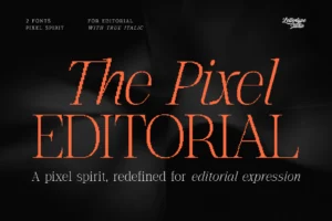
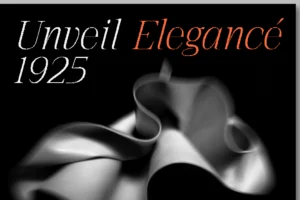
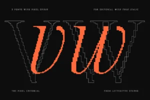
The Pixel Editorial provides an unconventional editorial direction through its combination of structured pixel-inspired forms and controlled irregularity.
For a studio working with digital architecture, computational design, exhibitions, or technology-driven research, this visual tension can become a powerful part of the identity.
The key is using experimental typography selectively so the studio still maintains a coherent professional system.
Typography Across an Architecture Portfolio
A portfolio is one of the most important communication tools for an architecture firm.
It needs to present projects visually while also communicating information clearly.
Typography can establish hierarchy between:
Project Title
The primary visual identifier.
Location & Date
Supporting project information.
Project Description
Longer editorial content.
Specifications
Technical information.
Studio Information
Supporting corporate content.
A consistent hierarchy allows readers to move through the portfolio naturally without distracting them from the architecture itself.
Typography for Architecture Websites
Architecture websites tend to be image-heavy.
Large project photography, drawings, videos, animations, and interactive galleries can dominate the screen.
Typography therefore needs to remain relatively quiet.
A good architecture website might use:
- Large restrained project titles
- Small navigation labels
- Generous whitespace
- Clear project metadata
- Comfortable body text
- Consistent spacing
The goal is to create an environment where typography frames the architecture rather than competing with it.
Creating a Complete Architecture Typography System
A professional architecture brand can benefit from assigning different roles to different typefaces.
Primary typeface
Used across the website, studio information, and everyday communication.
Editorial typeface
Used for project storytelling and publications.
Display typeface
Used selectively for campaigns and major project announcements.
Experimental accent
Reserved for exhibitions, research, or special collaborations.
This approach gives the studio enough flexibility without sacrificing consistency.
Choosing the Right Font for an Architecture Firm
Every architecture practice has a different design philosophy.
A traditional architectural practice may benefit from refined editorial typography. A minimalist studio might prefer a clean geometric sans. A research-driven practice could use more experimental typography.
Before choosing an architecture firm font, consider:
- What kind of architecture does the studio create?
- Is the practice traditional or contemporary?
- Does the typography complement project photography?
- Can it handle long portfolio content?
- Does it work in presentation decks?
- Can it scale to architectural signage?
- Does it feel distinctive without becoming distracting?
The best architecture branding doesn’t simply look modern.
It should reflect the way the studio thinks.
Typography and Architectural Minimalism
Minimalism can be difficult to execute well.
Removing visual elements does not automatically create sophistication. Every remaining element becomes more important.
Typography is one of them.
A simple wordmark, carefully spaced project title, or restrained information system can have enormous visual impact when surrounded by generous negative space.
This is where typography becomes closely connected to architecture itself.
Both disciplines depend on proportion, rhythm, balance, and restraint.
Conclusion
Architecture firms need branding that communicates precision without losing creativity.
Typography provides the structure that connects portfolios, project presentations, websites, publications, signage, and campaigns into one coherent visual identity.
The best architecture firm fonts combine clarity with character. A strong sans serif can provide structure, an editorial serif can add sophistication, while display and experimental typefaces can introduce personality when the project demands it.
Whether you’re branding an established architectural practice, a boutique studio, a computational design firm, or a multidisciplinary architecture office, thoughtful typography can strengthen the way your work is presented.
Explore the Lettertype Studio collection for contemporary sans serifs, refined editorial fonts, and distinctive display typefaces designed for architecture, design, publishing, and sophisticated professional branding.
Featured Fonts from Lettertype Studio
- Merta Sans — Flexible system for architecture websites, portfolios, presentations, and professional communication.
- Vescura — Refined editorial serif for architectural portfolios and project publications.
- Horiva Sans — Geometric sans for contemporary architecture studios and minimalist identities.
- Gaprio Display — Bold display typography for architectural campaigns, posters, and project launches.
- The Pixel Editorial — Experimental editorial direction for computational and technology-driven architecture.