
Luxury real estate is built around perception.
A premium property is not presented simply as a building. It is presented as a lifestyle, an investment, a location, and an experience.
That perception begins long before a potential buyer visits the property.
They may first encounter the development through a website, property brochure, campaign, social media post, signage, or sales presentation. Typography becomes part of that first impression.
The right real estate branding font can make a property brand feel established, sophisticated, contemporary, and valuable.
Why Typography Matters in Luxury Real Estate
Real estate is an unusually visual industry.
Photography, architecture, interiors, location, and typography all work together to communicate value.
A premium property brand needs typography that supports the same qualities as the property itself:
- Exclusivity
- Trust
- Sophistication
- Permanence
- Quality
- Investment value
The typeface should feel intentional rather than generic.
Recommended for Luxury Property Branding
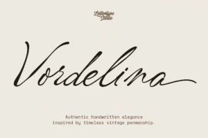
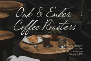
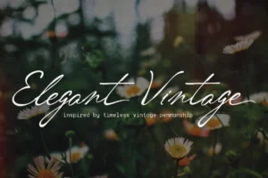

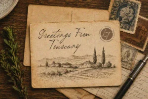

Vordelina offers a distinctive editorial character that can help luxury property brands establish a more refined and memorable identity.
Its personality makes it particularly suitable for boutique developments, luxury residential projects, property campaigns, and sophisticated real estate presentations.
What Makes a Good Real Estate Branding Font?
Real estate brands need typography that works across both emotional and practical communication.
A property campaign might use large display headlines on one page and detailed specifications on another.
The typeface therefore needs to perform across:
- Property brochures
- Websites
- Sales presentations
- Outdoor signage
- Social media
- Floor plans
- Property listings
- Investment documents
A strong family or typography system can help maintain consistency throughout the entire buyer journey.
Serif Fonts Communicate Permanence
Luxury real estate often benefits from serif typography because serif letterforms can create associations with heritage, craftsmanship, and permanence.
Those qualities are particularly relevant when selling premium residential developments or historic properties.
Recommended for High-End Property Campaigns
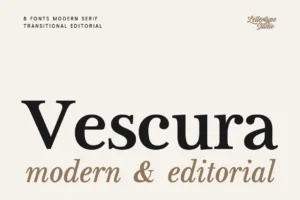
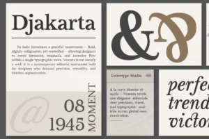
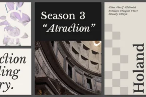
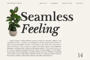
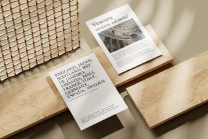
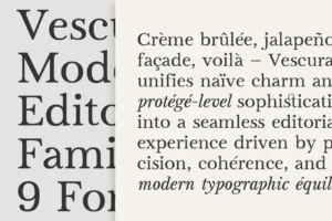
Vescura offers a sophisticated editorial serif direction that can elevate property brochures, development names, campaign headlines, and luxury real estate websites.
Its controlled structure and editorial character make it suitable when the brand needs to feel premium without becoming overly decorative.
Modern Property Brands Need Contemporary Typography
Not every luxury property brand should look traditional.
New developments often target buyers who value architecture, technology, sustainability, and contemporary lifestyles.
For these projects, clean sans serif typography can create a more modern identity.
Recommended for Contemporary Real Estate
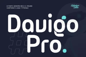
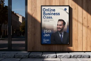


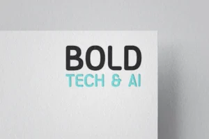

Davigo Pro offers a neo-grotesque direction that can work particularly well for modern property developers, architectural developments, urban residences, and large-scale branding systems.
Its structured neutrality gives designers room to build a sophisticated visual identity around architecture and photography. LTS includes Davigo among its neo-grotesque options for scalable global branding systems.
Typography for Property Brochures
Luxury property brochures are often closer to editorial publications than traditional sales materials.
Large architectural photographs, floor plans, location maps, material details, and lifestyle imagery need to work together.
Typography creates hierarchy between these different forms of information.
A good system can distinguish:
- Development name
- Property type
- Location
- Key features
- Floor information
- Investment details
- Contact information
The result feels more like a carefully designed publication than a sales sheet.
Typography for Digital Property Experiences
Modern property buyers increasingly discover developments online.
A real estate website needs to communicate luxury while remaining easy to navigate.
Typography should therefore work across:
- Desktop websites
- Mobile websites
- Property listings
- Virtual tours
- Investment pages
- Lead-generation forms
- Social media campaigns
Recommended for Digital Property Systems
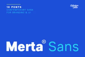
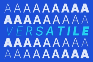
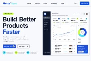
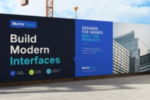
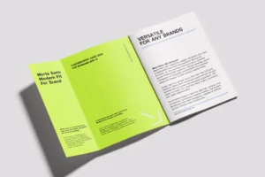
Merta Sans is designed for flexible digital systems and can provide the functional layer of a real estate brand, particularly across websites, presentations, and information-heavy layouts. Its 18 styles give designers considerable flexibility for hierarchy and responsive applications.
For a complete property identity, it can be paired with a more expressive display serif.
Creating a Luxury Real Estate Typography System
The strongest property brands rarely rely on one typeface alone.
A sophisticated system might combine:
Display serif
For the development name and campaign headlines.
Supporting sans serif
For property information and digital navigation.
Editorial typography
For storytelling, location descriptions, and lifestyle content.
This combination allows the brand to feel luxurious without sacrificing usability.
Typography and Property Photography
Luxury real estate photography already contains a lot of visual information.
Architecture, furniture, landscapes, lighting, and materials all compete for attention.
Typography should therefore create structure rather than visual noise.
Generous spacing and restrained hierarchy often make premium property campaigns feel more expensive.
The goal is not to fill every available space.
Luxury branding often works because it knows when to leave space around the message.
Choosing the Right Font for a Real Estate Brand
The best real estate branding font depends on the type of property.
A heritage estate may benefit from classical serif typography. A luxury apartment development might use a contemporary editorial serif. A technology-driven urban development could require a modern sans serif.
Before choosing a typeface, consider:
- What type of property are you selling?
- Who is the target buyer?
- Does the typography communicate value?
- Does it complement the architecture?
- Will it work across signage and digital platforms?
- Can the system handle long property descriptions and technical information?
Typography should ultimately feel like an extension of the property itself.
Conclusion
Luxury real estate branding is about transforming property into perception.
Typography helps communicate that perception across every stage of the buyer journey, from the first campaign image to the property brochure, website, showroom, and final presentation.
The best real estate branding fonts combine sophistication with functionality. They make premium properties feel more distinctive while creating a consistent visual language that buyers can recognize.
Whether you’re branding a luxury residential development, boutique property agency, architectural project, or premium real estate investment company, carefully selected typography can elevate the entire presentation.
Explore the Lettertype Studio collection for refined serif, editorial, and contemporary sans serif typefaces designed for premium branding, property campaigns, digital experiences, and sophisticated visual identities.
Featured Fonts from Lettertype Studio
- Vordelina — Distinctive editorial character for boutique property brands and luxury campaigns.
- Vescura — Refined serif for premium property brochures and development identities.
- Davigo Pro — Structured neo-grotesque for contemporary developers and scalable property systems.
- Merta Sans — Flexible digital system for websites, presentations, and property information.