
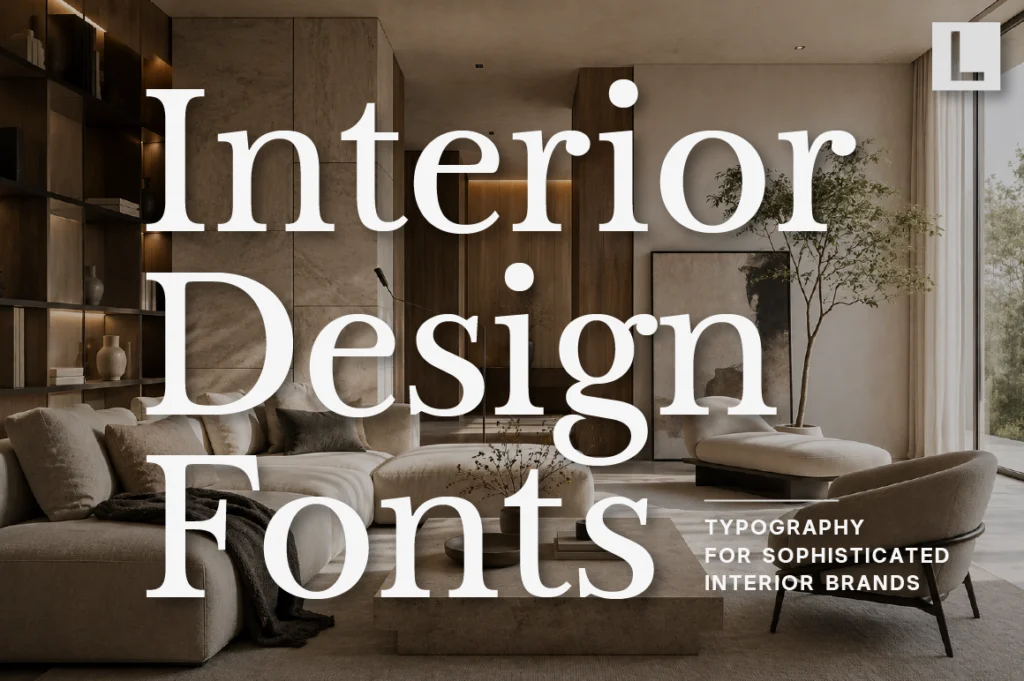
Interior design is built around proportion, material, atmosphere, and detail. A successful interior studio understands that every element of a space contributes to the overall experience.
Branding works in much the same way.
A studio’s website, project portfolio, presentation deck, signage, proposal, and social media all become part of how potential clients perceive its design philosophy.
Typography helps connect these elements.
The right interior design font can communicate sophistication, restraint, creativity, or architectural precision while allowing the studio’s work to remain the visual focus.
Why Typography Matters in Interior Design Branding
Interior designers are selling more than a service. They are selling a point of view.
Clients often choose a studio because they connect with its aesthetic language before they ever discuss a project. That makes the visual identity an extension of the studio’s design philosophy.
Typography can communicate:
- Sophistication
- Precision
- Creativity
- Restraint
- Contemporary taste
- Attention to detail
A strong typeface can make a small studio feel more established while helping an established practice maintain a recognizable visual language.
Recommended for Sophisticated Interior Studios
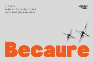



Becaure offers an elegant balance between sophistication and readability, making it suitable for interior design studios, premium portfolios, project presentations, and refined lifestyle branding.
Its polished character can add personality without overwhelming architectural photography or interior imagery.
What Makes a Good Interior Design Font?
Interior design branding benefits from typography that knows when to be quiet.
The studio’s projects should remain the hero. Typography creates the structure around them.
Look for:
- Refined proportions
- Strong readability
- Elegant details
- Balanced spacing
- Flexible hierarchy
- Contemporary character
A typeface should look equally comfortable beside a minimalist living room photograph, an architectural floor plan, or a detailed material board.
Recommended for Editorial Interior Branding
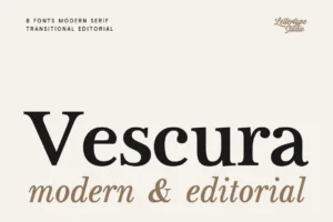
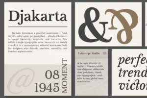
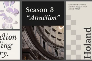
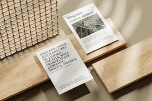
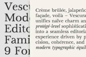
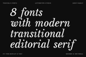
Vescura provides a more editorial direction for interior studios that want their portfolios and project presentations to feel closer to a design publication.
Its modern transitional serif structure balances clarity and expression, making it suitable for sophisticated headlines, project names, editorial layouts, and premium brand communication.
Typography and Architectural Photography
Interior design portfolios depend heavily on photography.
Large images, material details, architectural compositions, and carefully controlled negative space often carry most of the visual communication.
Typography should complement those images rather than compete with them.
This is why restrained typography often works so well for interior design brands.
A simple project title placed with generous spacing can feel more luxurious than a heavily decorated composition.
Serif Fonts Create a Sense of Craftsmanship
Interior design has a natural connection with editorial publishing, architecture, fashion, and luxury lifestyle.
Refined serif typography can strengthen those associations.
Serifs work especially well for:
- Studio names
- Project titles
- Portfolio covers
- Lookbooks
- Editorial features
- Luxury residential projects
Recommended for Premium Interior Projects
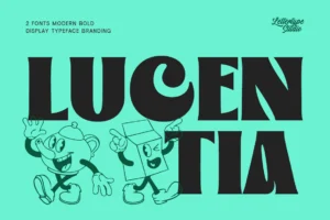


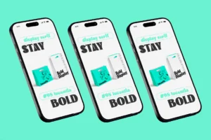
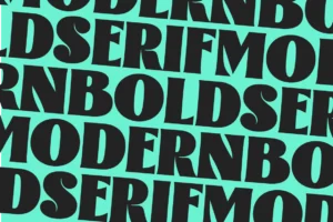
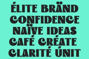
Lucentia brings a more luxurious editorial character to interior branding. Its refined serif details work especially well for premium residential studios, hospitality interiors, architecture-led projects, and sophisticated design publications.
LTS already positions Lucentia across luxury branding, editorial design, premium websites, and high-end visual identities, making its role here particularly natural.
Sans Serif Typography for Contemporary Studios
Not every interior studio wants a classical identity.
Contemporary practices often prefer cleaner typography that reflects minimalist architecture and digital-first presentation.
A modern sans serif can provide the functional layer for:
- Websites
- Project descriptions
- Presentations
- Floor plans
- Client proposals
- Social media
Recommended for Modern Interior Studios
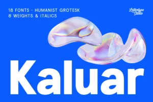
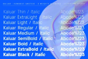



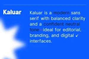
Kaluar offers a warmer humanist sans direction that can soften a highly architectural identity while keeping communication clean and contemporary.
That makes it useful for studios that combine modern interiors with more personal, lifestyle-oriented design.
LTS also places Kaluar within its humanist sans category, where warmth and approachability become important alternatives to rigid corporate typography.
Creating a Complete Interior Design Typography System
A professional interior design studio rarely needs only one font.
A stronger system can assign different roles to different typefaces.
Display typography can introduce the studio’s personality.
Supporting typography can organize project information.
Body typography can handle descriptions, specifications, and case studies.
This approach creates hierarchy without forcing one typeface to perform every job.
Typography Across the Interior Design Brand
Typography can appear across:
- Studio websites
- Project portfolios
- Presentation decks
- Client proposals
- Business cards
- Project signage
- Social media
- Editorial features
- Lookbooks
- Project documentation
Consistency is especially valuable because interior studios often communicate through visually rich projects.
A recognizable typographic system gives every project presentation a connection to the studio behind it.
Choosing the Right Font for an Interior Design Studio
The ideal typeface depends on the studio’s design philosophy.
A classical residential studio may prefer sophisticated serif typography. A minimalist architecture practice may need restrained sans serif lettering. A boutique hospitality studio might combine editorial typography with more expressive display details.
Before choosing a font, ask:
- Does it reflect the studio’s design philosophy?
- Does it complement project photography?
- Is it readable across portfolios and websites?
- Does it work with both large headlines and detailed information?
- Will it remain relevant as the studio evolves?
The best interior design fonts should feel like part of the studio’s design language rather than an unrelated graphic layer.
Conclusion
Interior design branding is an exercise in balance.
The typography needs enough personality to make the studio memorable while remaining restrained enough to let architecture, furniture, materials, and photography take center stage.
The right interior design font can turn a portfolio into a more cohesive visual experience, strengthen a studio’s positioning, and create consistency across every client touchpoint.
Whether you’re building a residential interior studio, hospitality design practice, architectural interiors brand, or premium design consultancy, thoughtfully selected typography can become an important part of the studio’s visual language.
Explore the Lettertype Studio collection for refined serif and sans serif typefaces designed for sophisticated branding, editorial layouts, portfolios, and contemporary visual identities.
Featured Fonts from Lettertype Studio
- Becaure — Elegant and versatile for premium interior studios and project presentations.
- Vescura — Editorial serif for sophisticated portfolios and architectural storytelling.
- Lucentia — Luxurious serif for high-end residential and hospitality interiors.
- Kaluar — Warm humanist sans for contemporary and lifestyle-focused studios.