May 2026

What Makes a Font Feel Luxury?

Luxury branding is rarely loud. The world’s most premium brands often rely on typography that feels restrained, balanced, elegant, and highly intentional. In modern branding, typography plays a major role in shaping how audiences perceive exclusivity, sophistication, and quality. A luxury font is not simply decorative. In fact, many premium brands avoid overly complicated typography …
Continue reading →

Best Fonts for Wellness Brands and Self-Care Packaging

Best Fonts for Wellness Brands and Self-Care Packaging

Modern wellness branding is no longer just about products. It is about emotion, atmosphere, and experience. Today’s wellness, skincare, self-care, and beauty brands focus heavily on creating visual identities that feel calming, premium, elegant, and trustworthy. Typography plays a major role in shaping that emotional perception. The right font can make packaging feel luxurious, minimalist, …

Continue reading →

Typography Mistakes That Make Your Brand Look Unprofessional

Typography Mistakes That Make Your Brand Look Unprofessional

Strong branding is not only about logos, colors, or visuals. Typography plays one of the biggest roles in how people perceive your business. Many brands unknowingly damage their credibility through poor font choices, inconsistent hierarchy, weak readability, or outdated typography systems. Even high-quality products can appear less trustworthy when the typography feels unbalanced or unprofessional. …

Continue reading →

Best Fonts for Minimalist Branding Why Simply Choosing a Clean Font Isn’t Enough

Best Fonts for Minimalist Branding: Why Simply Choosing a Clean Font Isn’t Enough

Minimalist branding continues to dominate modern business design—but many companies misunderstand what minimal typography actually means. They assume minimal branding simply means using the cleanest font possible. That assumption creates one of the biggest branding mistakes in modern design: businesses accidentally make themselves look identical. Open almost any startup website, skincare brand, architecture studio, SaaS …

Continue reading →

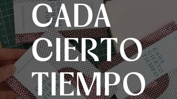
Cover Font in Used - Cada Cierto Tiempo

Cada Cierto Tiempo

FONT IN USED: VOGERA “Cada Cierto Tiempo” is a visual storytelling project by Javier Sánchez that captures intimate everyday moments through a cinematic and emotionally reflective perspective. Blending fine art photography with a quiet editorial atmosphere, the project evokes themes of memory, human connection, and personal reflection. Set in Vogera, the typography enhances the project’s modern …

Continue reading →

Best Fonts for Fashion Brands Typography That Looks Premium and Trend-Forward

Best Fonts for Fashion Brands: Typography That Looks Premium and Trend-Forward

Fashion branding lives in an extremely competitive visual environment where typography often becomes the first signal of identity. Before customers evaluate product quality, pricing, or collections, they often judge whether a brand feels premium, trendy, timeless, minimalist, or mass-market through typography. This is why many successful fashion brands invest heavily in custom typography systems or …

Continue reading →

Best Fonts for Packaging Design How Typography Influences Product Sales

Best Fonts for Packaging Design: How Typography Influences Product Sales

Packaging design often gets reduced to visuals like color palettes, photography, and product mockups. But typography quietly plays one of the biggest roles in how customers perceive a product within seconds. Before someone touches your product, reads reviews, or understands your ingredients, they often judge your packaging typography first. A font can instantly communicate whether …

Continue reading →

Best Fonts for Luxury Branding: Serif vs Sans Serif (2026 Guide)

Best Fonts for Luxury Branding: Serif vs Sans Serif (2026 Guide)

Luxury branding has always been closely connected to typography. The right font can instantly communicate exclusivity, elegance, and professionalism—while the wrong one can make a premium product feel generic. Many business owners assume luxury brands should always use serif fonts because they are commonly seen in fashion magazines, jewelry branding, and premium packaging. While serif …

Continue reading →