Modern wellness branding is no longer just about products. It is about emotion, atmosphere, and experience.
Today’s wellness, skincare, self-care, and beauty brands focus heavily on creating visual identities that feel calming, premium, elegant, and trustworthy. Typography plays a major role in shaping that emotional perception.
The right font can make packaging feel luxurious, minimalist, organic, modern, or deeply personal. Meanwhile, poor typography choices can instantly weaken a brand’s credibility.
In this article, we explore some of the best fonts for wellness brands and self-care packaging, along with the typography styles that continue dominating modern beauty and lifestyle branding.
Why Typography Matters in Wellness Branding
Wellness branding is built around emotional connection.
Customers are not only buying skincare, candles, cosmetics, supplements, or self-care products. They are buying a feeling.
Typography helps communicate:
- Calmness
- Luxury
- Softness
- Simplicity
- Trust
- Organic aesthetics
- Premium quality
- Emotional comfort
This is why modern wellness brands often rely on clean serif typography, elegant editorial fonts, soft sans serifs, and minimalist visual systems.
The goal is to create branding that feels refined without looking overwhelming.
Characteristics of Great Wellness Fonts
The best wellness typography usually shares several common qualities.
1. Elegant Simplicity
Modern beauty and wellness brands often avoid typography that feels too aggressive or overly decorative.
Clean and balanced fonts feel more premium.
2. Soft Emotional Tone
Typography should feel calming and approachable while still maintaining sophistication.
3. Editorial Influence
Many luxury wellness brands use typography inspired by modern editorial design because it creates a refined and timeless atmosphere.
4. Packaging Versatility
Fonts must work well across:
- Product packaging
- Labels
- Websites
- Social media
- E-commerce stores
- Marketing campaigns
5. Premium Readability
Minimalist typography still needs excellent readability, especially for product information and packaging design.
Best Fonts for Wellness Brands and Self-Care Packaging

Serelia
Serelia combines elegant editorial aesthetics with soft modern beauty.
The font feels luxurious, feminine, and sophisticated without becoming overly dramatic. This makes it highly effective for premium skincare, cosmetics, wellness products, and modern beauty branding.
Serelia works especially well for:
- Skincare packaging
- Luxury beauty brands
- Wellness campaigns
- Spa branding
- Editorial product photography
- Feminine e-commerce stores
Its refined structure creates a calm and premium visual atmosphere that aligns perfectly with modern self-care branding trends.
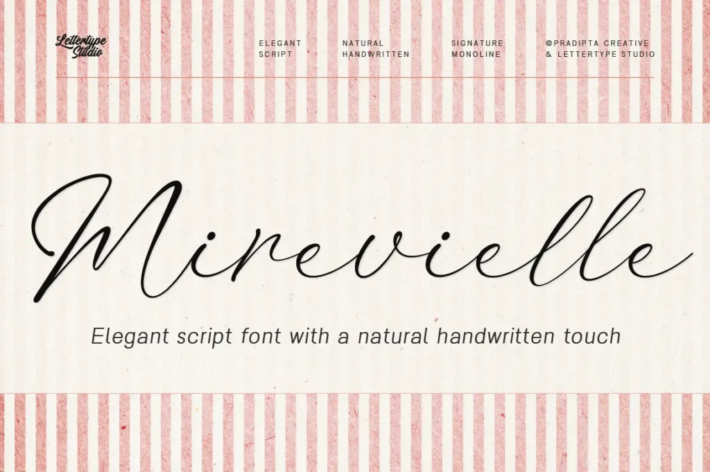
Mirevielle
Mirevielle offers a more delicate and graceful editorial presence.
The font feels soft, romantic, and elevated while maintaining readability and modern balance.
It is ideal for:
- Luxury cosmetics
- Boutique wellness brands
- Organic skincare
- Lifestyle packaging
- Premium feminine branding
Mirevielle helps create branding systems that feel emotionally warm and visually refined.
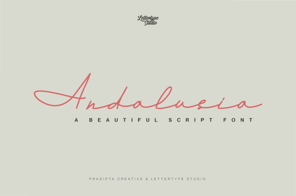
Andalusia
Andalusia brings elegant signature-style personality into wellness branding.
For brands wanting a slightly more handcrafted and emotional identity, this typeface creates a softer and more personal atmosphere.
Best use cases include:
- Boutique beauty brands
- Handmade skincare
- Personal wellness products
- Organic packaging
- Self-care campaigns
Used carefully alongside minimalist layouts, Andalusia creates beautiful premium contrast.
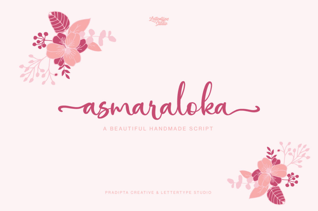
Asmaraloka
Asmaraloka combines femininity with decorative elegance.
The font works especially well for brands wanting branding that feels artistic, dreamy, and emotionally expressive.
It fits perfectly for:
- Feminine packaging
- Perfume branding
- Boutique cosmetic labels
- Lifestyle campaigns
- Beauty editorials
Its personality helps products feel memorable while still maintaining a premium tone.

Vogera
Vogera represents a more modern luxury editorial direction.
Compared to softer feminine styles, Vogera feels cleaner, sharper, and more fashion-oriented.
This makes it highly effective for:
- Modern skincare brands
- Luxury wellness startups
- Fashion beauty campaigns
- Editorial branding systems
- High-end product packaging
The font creates strong premium positioning while remaining contemporary and minimal.
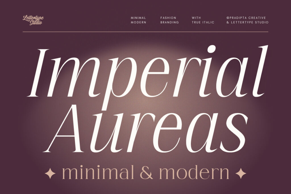
Imperial Aureas
Imperial Aureas delivers elegant luxury with stronger serif sophistication.
For wellness brands targeting high-end positioning, this typeface creates a timeless premium aesthetic inspired by luxury editorial branding.
It works beautifully for:
- Luxury perfumes
- Premium cosmetic packaging
- High-end wellness products
- Fashion-inspired branding
- Elegant campaign visuals
Its refined structure helps brands feel more exclusive and elevated.
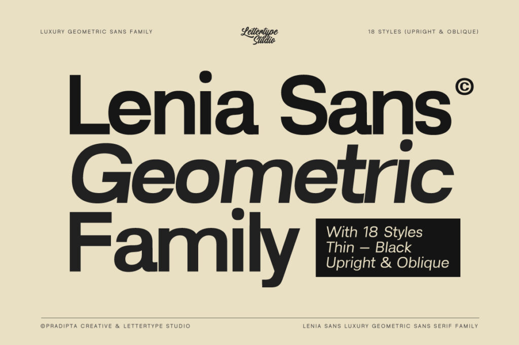
Lenia Sans
Not all wellness branding needs serif typography.
Modern minimalist wellness brands increasingly use clean sans serif systems to create a more contemporary and digital-friendly identity.
Lenia Sans works especially well for:
- Minimal skincare brands
- Organic wellness startups
- Modern supplement brands
- Clean beauty e-commerce
- Lifestyle branding systems
Its clean geometry balances softness with professionalism.
Typography Trends in Modern Wellness Branding
Modern wellness typography trends continue moving toward:
- Minimalism
- Editorial aesthetics
- Soft luxury
- Clean layouts
- Neutral color palettes
- Premium simplicity
- Elegant whitespace
- High readability
Brands are slowly moving away from overly decorative typography and embracing cleaner systems that feel timeless and scalable.
This shift aligns with broader modern branding trends across beauty, lifestyle, and luxury industries.
Common Typography Mistakes in Wellness Branding
Overdecorating Packaging
Too many flourishes and decorative details can make products feel outdated.
Using Fonts That Feel Too Corporate
Wellness branding still needs emotional warmth.
Poor Readability
Packaging typography must remain readable in small sizes.
Following Trends Too Aggressively
Minimal and timeless typography usually performs better long-term.
Weak Typography Pairing
Combining incompatible fonts often weakens the perception of premium.
Final Thoughts
Typography plays a major role in shaping how wellness and self-care brands are perceived.
The right font can help products feel calmer, cleaner, more luxurious, and more emotionally engaging. Meanwhile, poor typography choices can reduce trust and weaken brand identity.
Fonts like Serelia, Mirevielle, Andalusia, Asmaraloka, Vogera, Imperial Aureas, and Lenia Sans reflect the growing demand for elegant modern typography in beauty, skincare, and wellness branding.
As modern wellness branding continues evolving toward refined minimalism and emotional design, typography will remain one of the strongest tools for creating memorable premium experiences.