
Modern branding has become cleaner than ever.
Across startups, technology companies, luxury brands, ecommerce businesses, creative agencies, and digital products, one typography style continues dominating visual identity systems: clean sans serif fonts.
From minimalist startups to premium skincare brands, modern companies increasingly rely on typography that feels:
- Simple
- Professional
- Digital-friendly
- Scalable
- Timeless
- Highly readable
This shift is not accidental.
Modern branding now exists primarily on screens, and typography must perform consistently across websites, mobile apps, dashboards, social media, presentations, and digital campaigns.
In this article, we explore why clean sans serif fonts dominate modern branding and why minimalist typography continues shaping contemporary visual identity systems.
Why Modern Brands Prefer Clean Typography
Modern audiences process visuals quickly.
Brands only have a few seconds to communicate trust, professionalism, and clarity.
Clean typography helps simplify communication and reduce visual friction.
This is why many modern brands prioritize typography that feels:
- Structured
- Minimal
- Organized
- Readable
- Scalable
- Confident
Overly decorative typography often creates distraction, while clean sans-serif systems improve usability and clarity.
Minimalism itself has become associated with professionalism and premium quality.
The Rise of Digital-First Branding
One major reason sans serif fonts dominate modern branding is digital usability.
Most modern business interactions happen through:
- Websites
- Apps
- E-commerce platforms
- SaaS dashboards
- Mobile interfaces
- Digital advertising
- Social media
Typography must remain readable across all screen sizes.
Clean sans serif systems perform extremely well in digital environments because they usually offer:
- Better clarity
- Simpler structure
- Cleaner rendering
- Strong readability
- Flexible scalability
This makes them highly effective for modern digital ecosystems.
Why Sans Serif Fonts Feel More Modern
Typography psychology strongly influences perception.
Sans serif fonts are often associated with:
- Innovation
- Modernity
- Simplicity
- Technology
- Efficiency
- Confidence
- Minimalism
Meanwhile, decorative typography may feel more traditional, nostalgic, or stylistically specific.
This is why startups, AI companies, fintech businesses, and digital platforms often rely heavily on geometric sans serif systems.
The cleaner the typography feels, the easier it becomes for users to focus on the product itself.
Characteristics of Strong Modern Sans Serif Fonts
The best modern branding fonts usually share several important qualities.
1. High Readability
Typography must work well across screens, interfaces, and marketing materials.
2. Balanced Geometry
Clean geometric structures create visual stability and professionalism.
3. Versatility
Modern brands need typography systems that support logos, UI, campaigns, presentations, and product ecosystems.
4. Minimal Personality
The best branding fonts still contain personality while remaining highly usable.
5. Scalability
Modern typography systems must grow with the brand.
Best Clean Sans Serif Fonts for Modern Branding
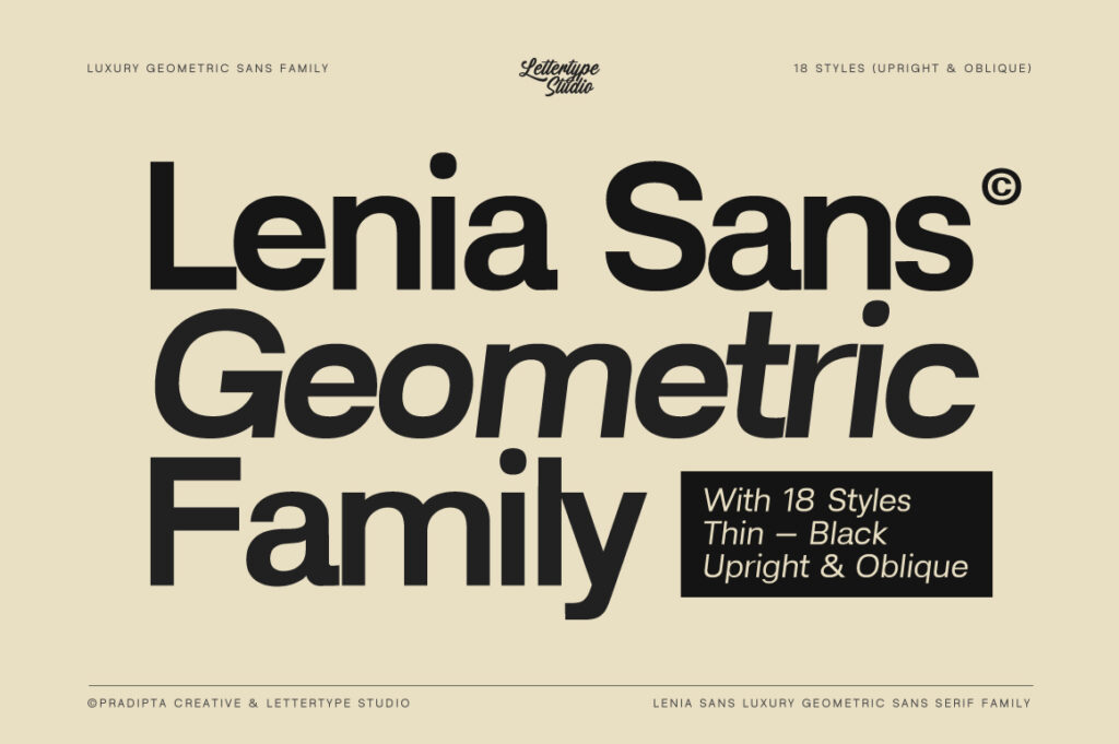
Lenia Sans
Lenia Sans represents modern geometric simplicity at its best.
The font feels clean, professional, and highly adaptable across multiple branding environments.
It works especially well for:
- SaaS branding
- Tech startups
- E-commerce systems
- Modern websites
- Digital product design
- Minimal branding
Its clean structure helps brands appear trustworthy and contemporary without feeling overly corporate.
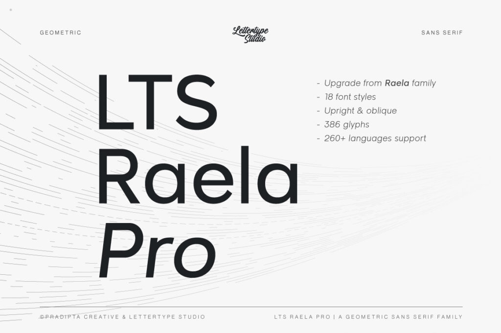
Raela Pro
Raela Pro combines versatility with modern branding usability.
The font works effectively across:
- Logo systems
- UI design
- Social media
- Marketing campaigns
- Corporate presentations
- Product interfaces
Its balanced structure allows brands to maintain consistency across different touchpoints while preserving modern visual clarity.
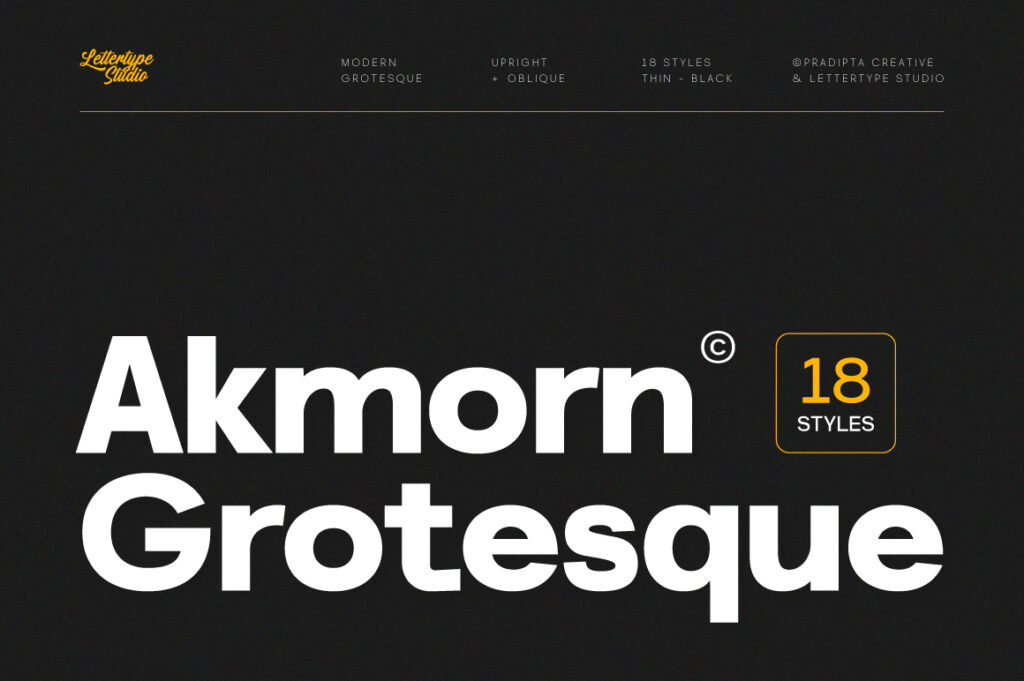
Akmorn Grotesque
Akmorn Grotesque introduces a more editorial-inspired grotesque direction.
Compared to softer geometric systems, it feels more structured and enterprise-oriented.
This makes it highly suitable for:
- Enterprise branding
- B2B startups
- Modern dashboards
- Financial technology
- Professional digital platforms
Its confident structure creates strong premium professionalism.

Kota Sans
Kota Sans balances friendliness with modern professionalism.
Many startups want typography that feels approachable without becoming childish or overly casual.
Kota Sans works beautifully for:
- Productivity apps
- Creative startups
- Team platforms
- Modern service brands
- Digital agencies
Its softer geometry creates warmth while maintaining clean usability.

Reflow Sans
Reflow Sans focuses heavily on digital clarity.
Its clean structure performs especially well in UI-heavy environments where readability becomes critical.
Ideal use cases include:
- App interfaces
- SaaS dashboards
- Product ecosystems
- Minimal websites
- Modern UI systems
The font reflects the growing demand for typography optimized for digital experiences.

Lugio Sans
Lugio Sans introduces a more elevated and design-conscious minimalist direction.
Compared to purely neutral sans-serif systems, Lugio Sans feels more refined and editorial.
It is highly effective for:
- Creative studios
- Luxury startups
- Editorial branding
- Modern portfolios
- Premium digital products
The font creates sophisticated simplicity without losing usability.

Vynce Sans
Vynce Sans pushes modern branding slightly further into futuristic territory.
The font works especially well for:
- AI startups
- Innovation companies
- Technology branding
- Experimental digital products
- Modern launch campaigns
Its structure communicates innovation while remaining clean and highly readable.
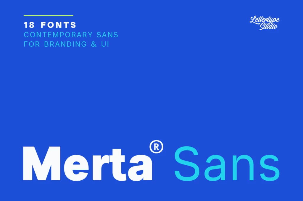
Merta Sans
Merta Sans offers softer, minimalist warmth.
Not every modern brand wants highly technical typography. Some businesses need a cleaner but more emotionally approachable atmosphere.
Merta Sans is effective for:
- Lifestyle startups
- Creative businesses
- Wellness platforms
- Community-focused products
- Modern service brands
Its relaxed geometry creates calm modern friendliness.
Why Minimal Typography Feels More Premium
Many modern luxury brands now rely on minimalist typography systems.
Clean sans-serif branding often feels:
- More expensive
- More confident
- More timeless
- More scalable
- More sophisticated
Minimalism creates visual breathing room.
Instead of overwhelming audiences with decoration, clean typography allows branding systems to feel calm and intentional.
This explains why luxury minimalism continues to dominate modern branding aesthetics.
Common Mistakes Brands Make With Sans Serif Typography
Using Fonts That Are Too Generic
Minimal typography still needs personality.
Weak Hierarchy Systems
Clean typography requires strong spacing and structure.
Poor Spacing
Even great fonts can fail with inconsistent spacing.
Following Trends Too Aggressively
Timeless simplicity usually performs better long-term.
Ignoring Brand Personality
Minimal does not mean emotionless.
The Future of Modern Branding Typography
Typography trends continue evolving toward:
- Cleaner layouts
- Minimal branding systems
- Geometric sans serif fonts
- Digital-first usability
- Sophisticated simplicity
- Flexible typography systems
- Editorial minimalism
As digital environments continue shaping modern communication, clean typography will likely become even more dominant.
Brands increasingly want typography systems that feel modern today while remaining usable years into the future.
Final Thoughts
Clean sans serif fonts dominate modern branding because they balance professionalism, readability, scalability, and digital usability.
Modern audiences associate minimalist typography with trust, innovation, clarity, and premium quality.
Fonts like Lenia Sans, Raela Pro, Akmorn Grotesque, Kota Sans, Reflow Sans, Lugio Sans, Vynce Sans, and Merta Sans reflect the growing demand for modern branding typography that feels clean, confident, and highly versatile.
As branding continues evolving toward digital-first minimalism, sans serif typography will remain one of the strongest foundations of contemporary visual identity systems.