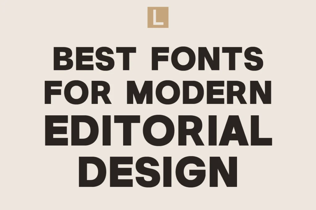
Modern editorial design is built around clarity, sophistication, and visual rhythm.
Whether used for fashion magazines, luxury campaigns, creative portfolios, beauty branding, or modern publishing, typography plays a major role in shaping the emotional atmosphere of editorial layouts.
The best editorial fonts feel refined, intentional, and visually balanced. They help create hierarchy, elegance, and storytelling without overwhelming the design itself.
Today’s editorial typography trends continue moving toward:
- Minimalism
- Sophisticated serif systems
- Modern contrast
- Clean layouts
- Luxury-inspired aesthetics
- Strong whitespace usage
- Refined hierarchy
In this article, we explore some of the best fonts for modern editorial design and why editorial-inspired typography continues dominating premium visual branding.
Why Editorial Typography Feels Premium
Editorial typography creates structure and emotion simultaneously.
Unlike aggressive advertising typography, editorial design focuses more on rhythm, readability, composition, and visual atmosphere.
This is why editorial typography often feels:
- Elegant
- Curated
- Sophisticated
- Artistic
- Minimal
- Timeless
Many luxury brands borrow heavily from editorial systems because they naturally create a premium perception.
Modern editorial typography also works beautifully across:
- Fashion branding
- Magazine layouts
- Luxury packaging
- Beauty campaigns
- Portfolio websites
- Product storytelling
- High-end presentations
Typography becomes part of the storytelling experience itself.
Characteristics of Great Editorial Fonts
1. Strong Visual Rhythm
Editorial typography relies heavily on spacing, hierarchy, and flow.
Fonts must create smooth reading experiences while maintaining visual sophistication.
2. Elegant Contrast
Modern editorial fonts often use subtle contrast to create refinement and depth.
3. Timeless Structure
The best editorial typography rarely feels overly trendy.
Timeless elegance usually performs better long-term.
4. High Readability
Even artistic typography systems still require strong readability for extended layouts.
5. Emotional Atmosphere
Editorial typography should support mood and storytelling, not just functionality.
Best Fonts for Modern Editorial Design

The Letter Editorial
The Letter Editorial was designed specifically around modern editorial aesthetics.
Inspired by contemporary magazine layouts and luxury publishing systems, the font creates a highly curated visual atmosphere that feels sophisticated and clean.
It works especially well for:
- Fashion editorials
- Magazine layouts
- Luxury branding
- Creative portfolios
- High-end publishing
- Premium campaigns
The font balances elegance and readability while maintaining a strong visual personality.

Vogera
Vogera combines editorial sophistication with modern minimalism.
Compared to traditional serif systems, Vogera feels cleaner and more contemporary, making it highly versatile for modern branding environments.
Best use cases include:
- Luxury campaigns
- Fashion branding
- Beauty editorials
- Premium social media visuals
- Contemporary layouts
Its sharp elegance helps compositions feel polished and premium without excessive ornamentation.
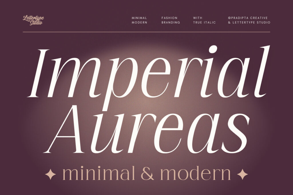
Imperial Aureas
Imperial Aureas delivers a stronger luxury serif character.
The font feels timeless, artistic, and refined, making it highly effective for editorials that want stronger visual sophistication.
It works beautifully for:
- Luxury publishing
- Boutique magazines
- Perfume campaigns
- Fashion lookbooks
- Premium print layouts
Its serif details create elevated visual drama while maintaining elegant readability.

Serelia
Serelia brings softer, feminine editorial energy.
The font creates a calm and luxurious atmosphere perfect for beauty-focused editorials and wellness-inspired layouts.
Ideal applications include:
- Beauty campaigns
- Skincare branding
- Feminine editorials
- Lifestyle publishing
- Boutique e-commerce visuals
Its elegant softness helps layouts feel emotionally warm and visually elevated.
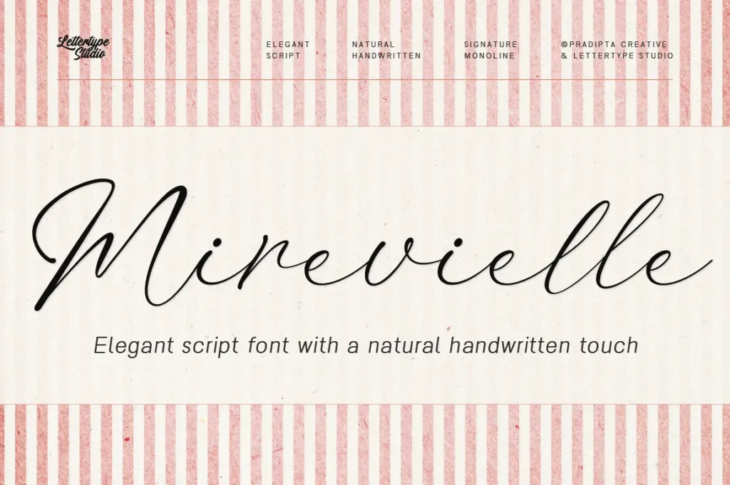
Mirevielle
Mirevielle focuses on delicate sophistication.
The font feels graceful, romantic, and refined without losing modern structure.
It works especially well for:
- Luxury beauty campaigns
- Editorial product photography
- Modern feminine layouts
- Boutique publishing
- Elegant branding systems
Its subtle elegance creates premium emotional storytelling.
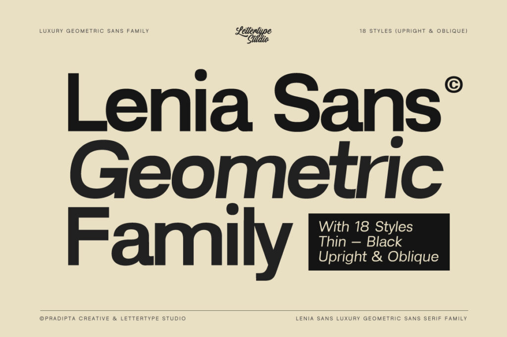
Lenia Sans
Modern editorial systems increasingly combine serif typography with clean sans-serif support.
Lenia Sans works beautifully as a minimalist editorial companion because of its clean geometry and contemporary readability.
Best use cases include:
- Editorial body text
- Minimal layouts
- Luxury websites
- Modern magazines
- Digital publishing systems
Its simplicity balances more expressive editorial typography beautifully.
Lugio Sans
Lugio Sans adds refined contemporary structure to editorial systems.
Compared to purely neutral sans serifs, Lugio Sans feels more elevated and design-conscious.
It is highly effective for:
- Creative publishing
- Modern portfolio systems
- Editorial branding
- Luxury web layouts
- Contemporary design studios
The font creates clean sophistication while maintaining strong usability.
Modern Editorial Typography Trends
Editorial typography trends continue evolving toward:
- Minimalist luxury
- Large whitespace areas
- Serif and sans-serif pairing
- Clean hierarchy systems
- Fashion-inspired layouts
- Sophisticated readability
- Soft neutral palettes
- Refined composition
Many modern editorials now prioritize calm visual confidence over excessive decoration.
This aligns closely with broader luxury branding trends.
Common Editorial Typography Mistakes
Overcrowded Layouts
Editorial systems need breathing space.
Weak Hierarchy
Poor typography hierarchy weakens storytelling.
Overdecorative Typography
Too many visual effects reduce sophistication.
Ignoring Readability
Editorial typography still needs practical usability.
Poor Font Pairing
Combining unrelated typography styles often breaks visual harmony.
Why Editorial Typography Continues Dominating Modern Branding
Modern brands increasingly want to feel curated instead of overly commercial.
Editorial typography naturally creates this atmosphere.
It helps brands feel:
- More premium
- More artistic
- More trustworthy
- More emotionally engaging
- More timeless
This explains why editorial-inspired typography continues influencing:
- Fashion branding
- Wellness branding
- Luxury packaging
- Beauty campaigns
- Creative agencies
- Modern startups
Typography itself becomes part of the brand experience.
Final Thoughts
Editorial typography remains one of the strongest foundations of modern premium branding.
The best editorial fonts combine elegance, readability, hierarchy, and emotional atmosphere into one cohesive visual system.
Fonts like The Letter Editorial, Vogera, Imperial Aureas, Serelia, Mirevielle, Lenia Sans, and Lugio Sans reflect the growing demand for sophisticated modern editorial typography across fashion, beauty, luxury, and creative industries.
As branding continues evolving toward cleaner and more refined visual systems, editorial typography will remain one of the most influential directions shaping modern design aesthetics.