
Luxury branding is built on perception.
Unlike mass-market products that compete primarily on price, luxury brands compete on desirability, exclusivity, craftsmanship, prestige, and emotional connection. Every visual element contributes to this perception, including photography, packaging, color palettes, messaging, and perhaps most importantly, typography.
A luxury brand may spend years refining its visual identity, yet a poorly chosen typeface can instantly diminish its perceived value. Conversely, the right typography can elevate an ordinary design into something that feels premium, sophisticated, and memorable.
In today’s digital-first world, typography has become one of the most powerful tools available for luxury positioning. From fashion houses and jewelry brands to boutique hotels and premium skincare companies, typography often acts as the visual voice of the brand.
This guide explores how luxury typography works, what characteristics define premium fonts, common mistakes brands make, and how to select the right typeface for long-term success.
Why Typography Matters So Much in Luxury Branding
Consumers often associate luxury with details.
The difference between a premium experience and an average one is rarely based on a single factor. Instead, it emerges from hundreds of small decisions that collectively shape perception.
Typography is one of those decisions.
Before a customer evaluates a product, they encounter headlines, packaging, websites, labels, advertisements, social media content, and editorial materials. The typeface used throughout these experiences silently communicates quality and positioning.
Luxury typography typically conveys:
- Refinement
- Confidence
- Exclusivity
- Heritage
- Sophistication
- Craftsmanship
- Timelessness
These attributes influence purchasing decisions long before consumers consciously realize it.
The Psychology Behind Luxury Typography
Luxury brands rarely use typography that feels rushed, overly trendy, or excessively playful.
Instead, premium brands often prioritize visual restraint.
Why?
Because restraint communicates confidence.
When a brand doesn’t need excessive decoration to capture attention, audiences subconsciously perceive it as more established and trustworthy.
Luxury typography often creates psychological associations with:
Heritage
Classic letterforms suggest longevity and tradition.
Authority
Elegant typography feels intentional and controlled.
Exclusivity
Sophisticated type choices create a sense of rarity.
Quality
Carefully designed details signal craftsmanship.
This explains why typography remains one of the strongest visual indicators of premium positioning.
Serif vs Sans Serif for Luxury Brands
One of the most common questions in branding is whether luxury companies should choose serif or sans serif fonts.
The answer depends on positioning.
Serif Fonts
Serif typefaces traditionally dominate luxury branding because they communicate elegance, sophistication, and heritage.
Luxury sectors frequently using serif typography include:
- Fashion
- Jewelry
- Beauty
- Hospitality
- Publishing
- Fine dining
Serifs naturally evoke tradition and craftsmanship.
Sans Serif Fonts
Modern luxury brands increasingly adopt sophisticated sans serif typefaces.
Rather than feeling traditional, these brands emphasize:
- Minimalism
- Precision
- Contemporary design
- Innovation
- Architectural aesthetics
Many premium technology, lifestyle, and wellness brands now favor modern sans serif systems.
The best choice depends on the story a brand wants to tell.
Characteristics of Great Luxury Fonts
Not every elegant-looking font is suitable for luxury branding.
Successful luxury typography typically shares several characteristics.
Balanced Proportions
Premium fonts feel harmonious and intentional.
Strong Readability
Luxury should never sacrifice clarity.
Distinctive Personality
The typeface should feel recognizable without becoming distracting.
Timeless Design
Trendy fonts often age quickly.
Luxury brands generally benefit from typography that remains relevant for years.
Refined Details
Small details such as terminals, contrast, spacing, and curves contribute significantly to perceived quality.
Common Typography Mistakes Luxury Brands Make
Even premium businesses occasionally make typography decisions that weaken their positioning.
Following Trends Too Aggressively
A font that feels fashionable today may appear outdated within a few years.
Luxury branding benefits from longevity rather than trend-chasing.
Using Too Many Fonts
A luxury identity should feel cohesive.
Using multiple unrelated typefaces often creates visual noise.
Prioritizing Decoration Over Function
Ornate fonts may appear elegant at first glance but become ineffective when readability suffers.
Ignoring Digital Applications
A font that performs beautifully in print must also function effectively across websites, mobile devices, and social media platforms.
How Luxury Typography Works Across Digital Platforms
Luxury branding no longer exists solely in magazines and packaging.
Modern customers experience luxury brands through:
- Websites
- Social media
- E-commerce stores
- Mobile experiences
- Digital advertising
- Email marketing
Typography must perform consistently across all these channels.
A successful luxury type system balances visual sophistication with practical usability.
This is particularly important as more premium brands expand their digital presence while maintaining an exclusive image.
Luxury Branding and Editorial Influence
One of the strongest influences on modern luxury typography comes from editorial design.
Luxury magazines have historically shaped visual trends by combining elegant typography with refined layouts and high-quality imagery.
As a result, many luxury brands adopt editorial-inspired typefaces that communicate authority and sophistication.
This approach helps create a visual language that feels both premium and culturally relevant.
Editorial typography works particularly well for:
- Fashion brands
- Boutique hotels
- Interior design studios
- Premium lifestyle companies
- Personal brands
- Luxury e-commerce businesses
Recommended Lettertype Studio Fonts for Luxury Branding
Selecting the right font ultimately depends on positioning, audience, and brand personality. However, several typefaces within the Lettertype Studio collection are particularly well suited for premium and luxury applications.
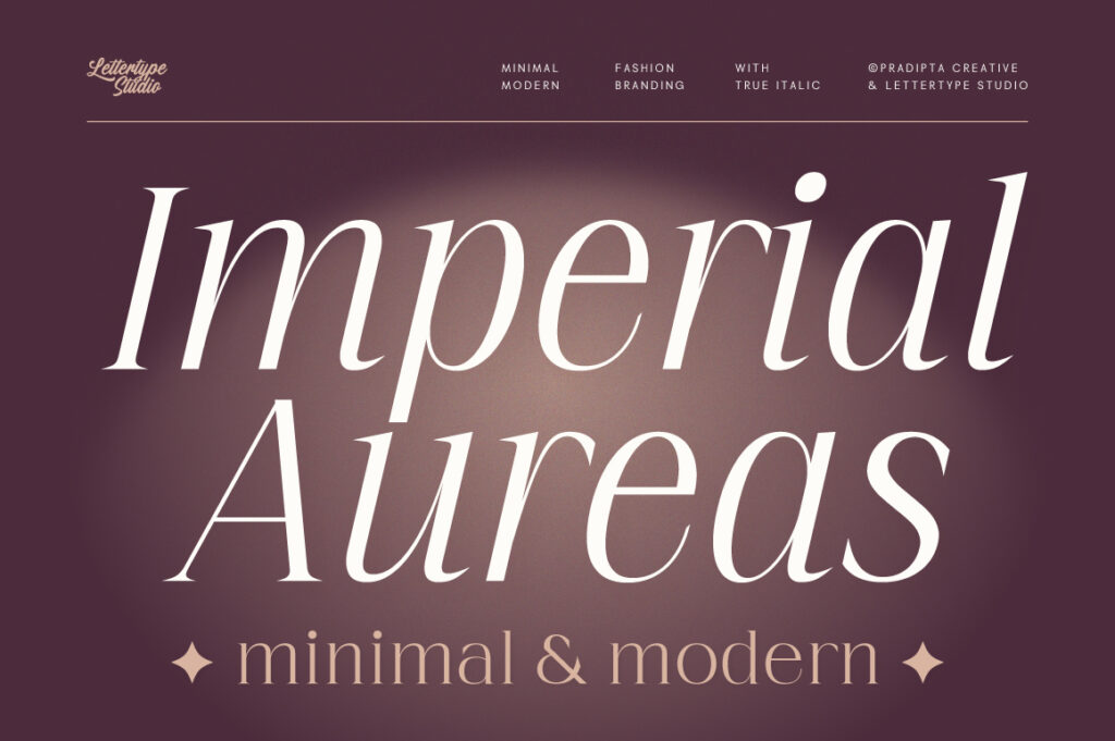
Imperial Aureas
Imperial Aureas combines sophistication with visual impact. Its elegant character makes it especially suitable for luxury branding, premium packaging, high-end marketing campaigns, and upscale visual identities.
Ideal for:
- Fashion labels
- Luxury cosmetics
- Premium packaging
- Jewelry branding

Vogera
Vogera offers a modern editorial aesthetic with strong personality and excellent versatility. It bridges the gap between contemporary branding and premium presentation.
Ideal for:
- Editorial branding
- Lifestyle brands
- Boutique agencies
- Creative studios

The Letter Editorial
Designed with editorial influence in mind, The Letter Editorial brings refinement, readability, and visual authority.
Ideal for:
- Magazines
- Publishing
- Luxury content platforms
- Personal branding
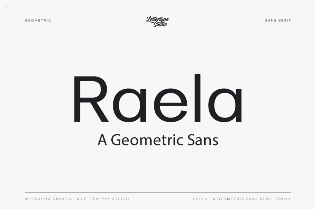
Raela
Raela delivers a clean and sophisticated balance that works exceptionally well for modern premium brands seeking elegance without excessive ornamentation.
Ideal for:
- Beauty brands
- Wellness companies
- Premium startups
- Hospitality projects

Serelia
Serelia provides a refined and graceful presence suitable for luxury-focused visual communication.
Ideal for:
- Boutique businesses
- High-end invitations
- Luxury packaging
- Personal branding
Building a Luxury Typography System
Choosing a font is only the beginning.
Successful luxury brands typically create complete typography systems consisting of:
Display Typeface
Used for major headlines and signature branding moments.
Supporting Typeface
Used for longer content and practical communication.
Hierarchy Guidelines
Establishing consistent sizes, spacing, and weights.
Usage Rules
Ensuring consistency across every platform and campaign.
This structure allows brands to maintain elegance while remaining flexible.
The Future of Luxury Typography
Luxury branding continues to evolve.
While traditional serif typography remains influential, modern luxury increasingly embraces minimalism, editorial aesthetics, and refined sans serif systems.
The future appears less focused on decoration and more focused on clarity, confidence, and distinctive identity.
Brands that successfully combine timeless design principles with modern usability will continue to stand out in increasingly competitive markets.
Typography will remain one of the most effective tools for achieving this balance.
Conclusion
Luxury branding is ultimately about perception.
Typography influences that perception at every stage of the customer journey, from first impressions to long-term brand recognition.
The most successful luxury brands understand that fonts are not simply design assets—they are strategic branding tools capable of communicating quality, exclusivity, sophistication, and trust.
Whether building a fashion label, launching a premium product, creating an editorial platform, or refining an established brand identity, selecting the right typography system can dramatically influence how audiences perceive your business.
In a world where visual impressions matter more than ever, thoughtful typography remains one of the strongest investments a luxury brand can make.