Fonts are more than just shapes on a screen — they’re powerful psychological tools. Every curve, serif, and stroke can influence how people feel about your message. The right font builds trust, emotion, and recognition, while the wrong one can make even the strongest idea feel off-brand. Understanding font psychology helps you communicate tone and personality without saying a word.
Typography psychology is rooted in visual perception. Serif fonts like Cardival or Imperial Aureas often feel classic, reliable, and intellectual — ideal for luxury or editorial brands. Meanwhile, sans-serif types such as Alvara Sans or Raela Grotesque evoke modernity, clarity, and confidence, making them perfect for startups or tech companies.
Playful display fonts like Chocho Aura or Shake Bubble add charm and approachability, which work great for lifestyle or children’s brands. The secret lies in aligning the font’s emotion with your brand’s mission — whether it’s trust, innovation, elegance, or joy.
Key Tips
✅ Identify your brand’s core values (e.g., modern, elegant, bold).
✅ Match font style with emotion — not just aesthetics.
✅ Limit to 2–3 fonts per brand identity.
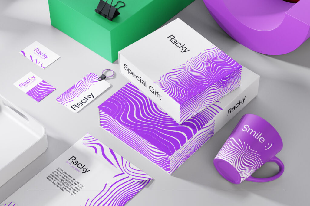
✅ Consider how type looks in real use: packaging, web, print.
✅ Test readability and consistency before finalizing.
Conclusion
Fonts speak before your words do. Choosing the right typeface is like selecting your brand’s voice — it sets the tone for how audiences feel and remember you. When your type choice matches your message, your design doesn’t just look professional — it feels authentic.