

Most brands don’t look bad.
They just don’t look premium.
And in many cases, the difference isn’t your logo, colors, or layout—it’s your font.
The right typeface can instantly elevate how people perceive your brand. It can make you look more refined, more confident, and more intentional—without changing anything else.
Here are 10 fonts that can instantly upgrade your brand presence in 2026.
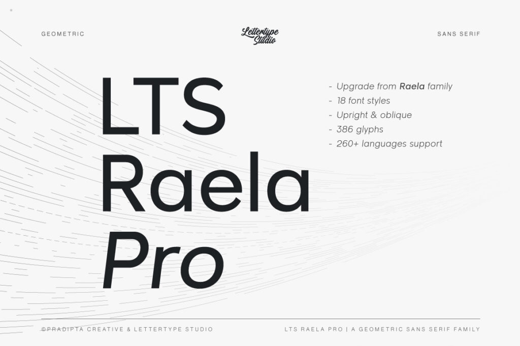
1. Raela Pro — Clean Precision for Modern Brands
If your brand needs to feel sharp and professional, Raela Pro delivers with clean geometry and confident spacing. It’s built for clarity, making it perfect for tech, corporate, and modern identity systems.
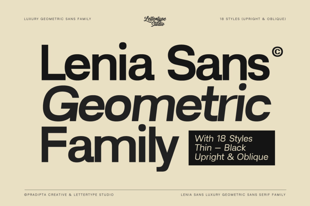
2. Lenia Sans — Minimalism That Feels Intentional
Lenia Sans is not just minimal—it’s refined. Its balanced proportions and smooth rhythm make it ideal for brands that want to feel calm, modern, and quietly premium.
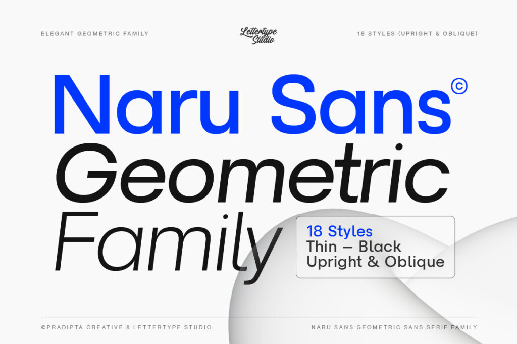
3. Naru Sans — Friendly but Structured
Naru Sans sits in that perfect middle ground: approachable yet professional. Great for startups, digital products, and brands that want to feel human without losing structure.

4. Vescura — Elegant and Editorial Presence
Not every premium brand needs to be minimal.
Serif typefaces like Vescura bring a sense of elegance and timelessness. With its editorial character and refined details, Vescura is perfect for luxury branding, beauty products, and high-end packaging.
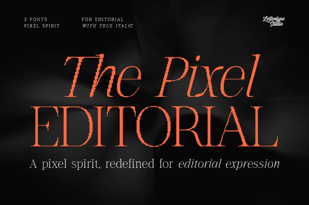
5. The Pixel Editorial — Distinctive and Expressive
If you want your brand to stand out, The Pixel Editorial offers a unique editorial voice. It adds personality without losing sophistication—ideal for creative brands and bold visual identities.
6. Helvetica Now — The Industry Standard
A classic choice. While widely used, Helvetica remains a benchmark for neutrality and clarity. However, its popularity can also make your brand feel less distinctive if not used carefully.
7. Inter — Optimized for Digital
Inter is designed for screens, making it a strong choice for UI-heavy products. It’s functional and clean, though often lacks the unique character needed for standout branding.
8. Neue Haas Grotesk — Classic with Authority
This typeface carries historical weight and professionalism. It’s often used in editorial and corporate environments where credibility matters.
9. Circular — Modern and Friendly
Circular blends geometry with warmth, making it suitable for modern brands that want to feel accessible yet polished.
10. Söhne — Structured and Contemporary
A modern reinterpretation of classic grotesques, Söhne offers a balance between neutrality and character—ideal for high-end branding systems.
Why the Right Font Changes Everything
Typography is often underestimated. But in reality, it’s one of the fastest signals people use to judge your brand.
A refined font communicates:
- Confidence
- Clarity
- Professionalism
While a generic one does the opposite—no matter how good the rest of your design is.
Final Thought
If your brand feels “almost there” but not quite premium, don’t start by redesigning everything.
Start with your font.
Because sometimes, the smallest change creates the biggest impact.