
Typography continues to evolve alongside changes in branding, digital experiences, editorial design, and visual culture. As designers explore new ways to communicate personality and meaning, typefaces are becoming more than functional tools for presenting information. They are increasingly central to how brands establish recognition and express their identities.
Looking toward 2027, the most interesting typography directions are not necessarily about replacing everything that came before. Instead, they reflect a growing interest in distinctive visual character, thoughtful contrast, flexible design systems, and more intentional use of type.
For brands, this creates an opportunity to move beyond generic typography and develop identities that feel recognizable without sacrificing usability. For designers, it means understanding which visual approaches can support a project and which are better treated as temporary inspiration.
The typography trends of 2027 should be approached as creative directions rather than guaranteed predictions. Design trends rarely emerge in isolation, and their relevance depends on the industry, audience, and purpose of each project.
In this guide, we explore seven typography directions worth watching in 2027, how they can be applied to branding and editorial design, and how designers can use emerging styles without making their work feel interchangeable.
Why Typography Trends Matter in 2027
Typography influences how people interpret a brand before they engage with its products or services.
A typeface can make an identity feel refined, approachable, technical, playful, or authoritative. Its proportions, weight, spacing, and letterforms all contribute to the overall impression.
As visual communication becomes increasingly crowded, distinctive typography can help brands establish recognition across websites, packaging, advertising, social media, and other customer touchpoints.
However, following a trend does not automatically produce an effective design.
A typeface that works beautifully for a fashion campaign may not suit a financial application. An expressive display font might create a memorable headline but become difficult to read in a dense editorial layout.
The challenge for designers is to understand the characteristics behind a trend and determine whether they serve the project.
Rather than asking which font style will be popular in 2027, it is more useful to ask which typographic approaches can help a brand communicate more clearly, express its personality, and remain recognizable over time.
1. Expressive Display Typography
One direction worth watching is the continued use of expressive display typography in branding, campaigns, and editorial layouts.
Display typefaces are designed to create visual impact. They can feature distinctive proportions, unusual letterforms, strong contrasts, or other characteristics that make them immediately recognizable.
For brands competing in visually crowded categories, this type of typography offers an opportunity to develop a stronger visual signature.
Rather than relying on a neutral typeface that could belong to almost any company, designers can choose a font with a more specific personality.
Where It Works Best
Expressive display typography can be particularly effective for:
- Brand headlines and campaign titles.
- Independent fashion and lifestyle brands.
- Editorial covers and feature stories.
- Product launches and promotional graphics.
- Packaging that needs a distinctive visual presence.
The key is to use display typography where its personality contributes to the message.
A highly expressive typeface does not need to handle every text element in the design. Pairing it with a more restrained supporting font can create a clearer hierarchy.
How to Apply It
Start by defining the personality the brand wants to communicate.
Then select a display typeface whose visual character reinforces that direction. Test it with the actual brand name, headlines, and layouts rather than evaluating it only through specimen text.
A distinctive font becomes most effective when it supports a consistent visual system.
2. Modern Serif Typography
Serif typography remains an important option for brands seeking a refined or editorial identity.
The appeal of serif fonts extends beyond traditional or formal design. Contemporary serif typefaces can communicate sophistication, individuality, and visual contrast while working alongside modern layouts and digital experiences.
For brands that want to distinguish themselves from competitors using similar sans serif styles, an editorial serif can provide an alternative direction.
Where It Works Best
Modern serif typography can be considered for:
- Premium lifestyle brands.
- Independent fashion labels.
- Beauty and personal-care identities.
- Editorial publications.
- Boutique retail and product branding.
- Creative studios and portfolio websites.
Serifs are not automatically more luxurious than sans serifs. Their effectiveness depends on the specific design, the surrounding visual elements, and the brand’s positioning.
How to Apply It
Use a serif for prominent headlines, brand statements, or other applications where its distinctive character can be appreciated.
For information-heavy layouts, consider pairing it with a readable sans serif. This can provide contrast while preserving clarity across different text sizes.
The goal is not to make every brand look editorial. It is to use serif typography when its character genuinely supports the identity.
3. More Distinctive Sans Serif Identities
Sans serif typography remains highly versatile, but designers do not need to rely exclusively on neutral or visually interchangeable styles.
A sans serif can be clean and practical while still possessing distinctive proportions, shapes, spacing, or details.
For brands that need to communicate across websites, packaging, presentations, and digital products, a contemporary sans serif can provide a useful foundation.
The opportunity lies in selecting a typeface that balances functionality with recognizable character.
Where It Works Best
Distinctive sans serif typography can support:
- Technology and software companies.
- Contemporary corporate identities.
- Modern lifestyle businesses.
- Digital-first brands.
- Creative agencies.
- Retail and consumer product brands.
How to Apply It
Evaluate the typeface beyond its appearance in a large headline.
Test its performance across different sizes, weights, and applications. Examine the letterforms closely, especially when the brand name or content requires particular character combinations.
A successful sans serif identity should be practical enough for everyday communication while distinctive enough to contribute to brand recognition.
4. Variable Fonts and Flexible Typography Systems
Variable fonts allow designers to adjust supported font characteristics along defined axes, such as weight or width, within a single font file.
This technology can provide greater flexibility when building digital design systems. Instead of choosing only from a fixed collection of styles, designers may be able to fine-tune typography according to the needs of a particular layout.
For websites and digital products, this can support more adaptable typography across different screen sizes and interface conditions.
However, variable fonts are not automatically the right choice for every project. Their usefulness depends on the available font design, the implementation requirements, and the degree of flexibility the project actually needs.
Where It Works Best
Variable typography can be useful for:
- Responsive websites.
- Digital publications.
- Interactive design projects.
- Brand systems with multiple digital touchpoints.
- Interfaces that need flexible typographic hierarchy.
- Designers exploring controlled animation or typographic interaction.
How to Apply It
Start by identifying the specific problem that flexible typography needs to solve.
A variable font may help a website adapt typography across different layouts, but a conventional family may be sufficient for a static brand identity.
Test performance, browser support, file delivery, and readability before implementation.
The strongest use of variable typography is not simply demonstrating technical capability. It is using that flexibility to improve the design.
5. Typography as a Stronger Part of Brand Identity
Another direction worth watching is the continued emphasis on typography as a defining element of brand identity.
A logo is only one part of a brand’s visual system. Typography also appears in headlines, product descriptions, advertising, website navigation, packaging, presentations, and everyday communication.
When these applications use a coherent typographic language, they reinforce recognition.
A distinctive typeface can therefore contribute more to the overall identity than a logo used in isolation.
Where It Works Best
Typography-led identity systems can be effective for:
- Independent brands.
- Creative studios.
- Editorial businesses.
- Consumer product companies.
- Digital services.
- Retail and lifestyle brands.
How to Apply It
Choose a primary typeface that reflects the brand’s positioning and establish clear rules for its use.
Define how it will work in headlines, supporting text, captions, and other common applications. If a second typeface is necessary, give it a specific role.
Consistency is more important than the number of fonts in the system.
A strong identity can use one versatile family or several complementary typefaces, provided the relationship between them is intentional.
6. Intentional Contrast Between Typography Styles
Typography contrast can help designers establish hierarchy and create a more distinctive visual identity.
A serif headline paired with a sans serif body font is one familiar example, but contrast can also come from differences in weight, width, scale, spacing, or typographic personality.
The important point is that the contrast should have a purpose.
When every text element competes for attention, the design becomes difficult to navigate. When contrast is controlled, it can guide the viewer through the content.
Where It Works Best
Intentional typographic contrast can support:
- Editorial layouts.
- Premium product branding.
- Campaign design.
- Creative agency identities.
- Packaging systems.
- Digital landing pages.
How to Apply It
Begin with a clear hierarchy.
Decide which element should attract attention first, which information should support it, and which details need to remain secondary.
Then use typography to reinforce those relationships.
For example, a display font may establish the headline, while a more restrained typeface handles explanatory text. Differences in size, weight, and spacing can create additional structure without introducing unnecessary visual complexity.
7. Typography With a More Human and Contextual Character
Designers increasingly have opportunities to explore typography that feels connected to the personality, story, or context of a brand.
This does not necessarily mean using handwritten fonts or deliberately imperfect letterforms. A typeface can feel human through its proportions, rhythm, distinctive shapes, or relationship with the rest of the design.
The broader principle is to select typography that communicates something specific rather than defaulting to a generic visual style.
Where It Works Best
A more contextual approach to typography can support:
- Independent lifestyle brands.
- Hospitality and retail identities.
- Creative businesses.
- Cultural and editorial projects.
- Local product brands.
- Businesses built around a distinctive founder story or creative perspective.
How to Apply It
Start with the brand’s story and intended audience.
Consider the qualities that make the business different, then look for typography that reinforces those characteristics.
A local brand does not automatically need traditional lettering, just as a contemporary company does not automatically need a minimalist sans serif.
The right direction depends on the identity being developed.
Typography becomes more meaningful when it reflects the brand rather than following a predetermined aesthetic.
Seven Lettertype Studio Fonts to Explore for 2027
Typography trends are most useful when they inspire designers to explore different creative possibilities.
The following Lettertype Studio fonts offer a range of typographic directions that can be considered for contemporary branding, editorial work, and display applications.
Their suitability will depend on each font’s actual characteristics, the project’s requirements, and the way the typeface is applied.
1. Swaraga
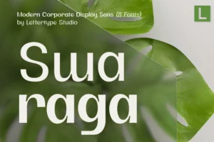
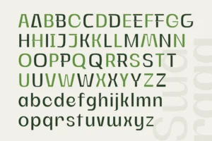


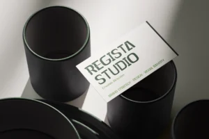
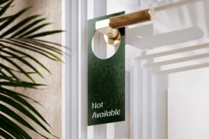
Swaraga offers a distinctive direction for projects that need a recognizable visual presence.
For brands that want to avoid an overly generic identity, a typeface with a specific character can help establish a more memorable visual language.
Swaraga can be explored for prominent headlines, campaign graphics, and branding applications where typography contributes strongly to the overall composition.
The important consideration is whether its visual character supports the intended positioning rather than simply adding decoration.
Best for: contemporary branding, expressive display applications, creative businesses, and distinctive campaign design.
2. Gaprio Display
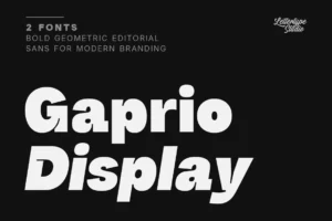
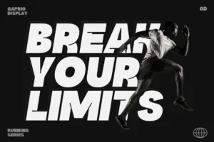
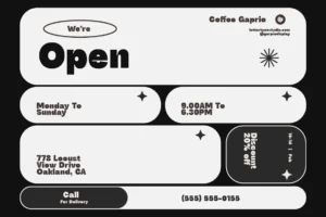
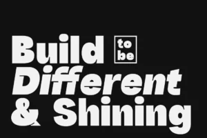
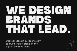
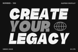
Gaprio Display is an option to explore when a project needs stronger typographic impact.
Display typography can be especially useful for campaigns, promotional graphics, editorial headlines, and brand applications where the typeface becomes a central visual element.
Rather than using an expressive font everywhere, designers can reserve it for moments where its personality creates the greatest value.
Best for: display headlines, branding campaigns, promotional graphics, product launches, and creative editorial layouts.
3. The Letter Editorial
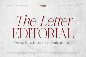
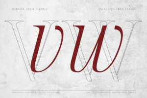
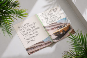
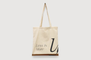
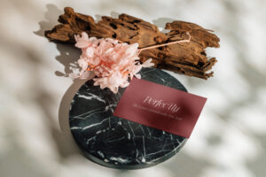

The Letter Editorial offers an editorial direction for projects that benefit from a more considered typographic identity.
An editorial typeface can contribute to the presentation of premium products, lifestyle brands, publications, and creative businesses.
Its role can extend beyond the main logo to headlines, campaign materials, and other prominent applications.
For smaller text, evaluate whether the typeface remains appropriate at the required sizes and consider a supporting font where necessary.
Best for: editorial branding, premium lifestyle identities, fashion-related projects, and sophisticated campaign design.
4. Vescura
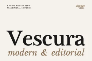
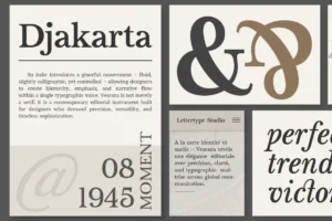
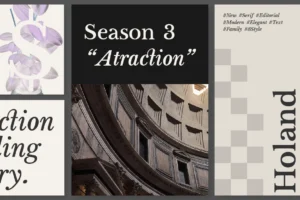
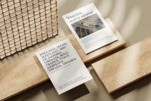
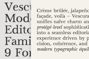

Vescura offers another direction for designers exploring refined typography in contemporary branding.
A carefully chosen typeface can help create a distinctive identity without requiring an overly complicated visual system.
Vescura can be explored for brand statements, prominent headlines, and selected applications where a more refined typographic character supports the intended design.
The most effective result will depend on how the font works with the brand name, layout, imagery, and supporting typography.
Best for: refined branding, premium product identities, lifestyle businesses, and editorial-inspired design.
5. Horiva Sans
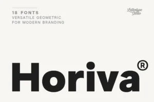

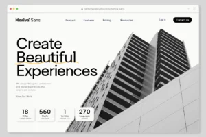


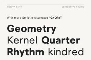
Horiva Sans provides a contemporary sans serif direction for projects that need a flexible typographic foundation.
A versatile sans serif can support multiple applications across a brand’s digital and physical communication, helping maintain consistency without relying on several unrelated fonts.
Designers can explore Horiva Sans for headlines, supporting content, and broader brand communication according to the family’s available styles and the needs of the project.
Best for: contemporary branding, digital-first identities, modern business communication, and versatile brand systems.
6. Merta Sans
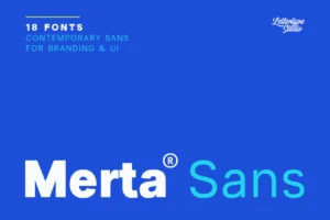
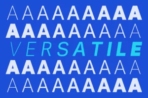

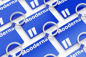
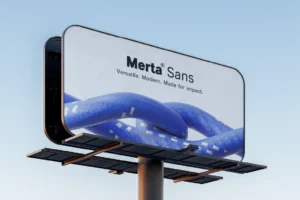
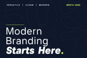
Merta Sans offers another contemporary sans serif option for designers who want to build a consistent visual identity.
A cohesive type system can make it easier to maintain a recognizable brand presence across websites, presentations, promotional materials, and other customer-facing applications.
Merta Sans can be explored as part of that system, with attention to its performance at the sizes and in the contexts where it will be used.
Best for: modern brand identities, digital communication, contemporary lifestyle businesses, and corporate applications.
7. Montegar
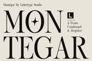
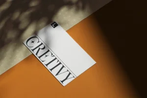
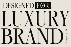
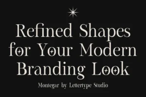
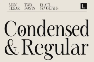

Montegar offers a distinctive option for projects that need a stronger typographic signature.
In branding and editorial design, typography can become a recognizable part of the visual language when it is applied consistently and intentionally.
Montegar can be explored for prominent brand applications, campaign headlines, and creative compositions where the typeface’s character complements the overall direction.
Best for: expressive branding, creative campaigns, contemporary retail identities, and prominent display applications.
How to Use Typography Trends Without Losing Your Brand Identity
Following typography trends can provide inspiration, but the strongest design decisions are grounded in the needs of the project.
A trend should be treated as a creative possibility rather than a rule.
Start With the Brand, Not the Trend
Before selecting a typeface, define the brand’s personality, audience, and positioning.
A font style that works well for an independent fashion label may not suit a financial technology company or a healthcare service.
Choose typography according to the message the brand needs to communicate.
Separate Visual Impact From Everyday Usability
Some typefaces are designed primarily for display, while others are better suited to extended reading or functional interfaces.
Identify where the typography will appear and select the appropriate style for each role.
A display font can create a strong campaign headline, while a readable supporting typeface handles the information customers need to understand.
Test Typography in Real Applications
A font specimen is only a starting point.
Test the typeface with the actual brand name, headlines, and supporting content.
Evaluate it across the relevant touchpoints, including websites, packaging, social media graphics, presentations, and printed materials.
This process helps reveal whether the typeface is practical as well as visually appealing.
Use Trends Selectively
Not every trend needs to appear in every project.
A brand may benefit from a distinctive display font while maintaining a relatively restrained supporting system. Another may achieve its goals through a contemporary sans serif with a carefully considered typographic hierarchy.
The objective is to choose the elements that strengthen the design.
Consider Longevity
Some design decisions can be updated easily, while others become deeply connected to a brand’s identity.
A campaign headline can adopt an experimental typographic treatment without requiring the entire brand system to change.
A primary brand typeface, however, should be evaluated for its long-term usefulness.
Consider whether the typeface will continue to support the brand as its products, audience, and communication evolve.
Common Typography Mistakes to Avoid in 2027
Even promising typography directions can become ineffective when they are applied without a clear concept.
Following Every Trend
Combining multiple fashionable styles can make a design feel inconsistent.
Choose trends that complement the project rather than treating every new visual direction as something that must be included.
Prioritizing Uniqueness Over Readability
Distinctive typography should still communicate effectively.
Test fonts at realistic sizes and make sure important information remains accessible.
Using Display Fonts for Every Application
A display font may be excellent for headlines but unsuitable for body copy or dense information.
Give each typeface a clear role within the system.
Ignoring the Brand’s Existing Identity
An established brand may already have recognizable typography.
Before making changes, evaluate which parts of the identity should remain consistent and where experimentation would be useful.
Confusing Technical Innovation With Better Design
Variable fonts and advanced typographic features can create new possibilities, but they do not automatically improve a project.
Use technical features when they solve a real design problem or create a meaningful benefit.
Final Thoughts
Typography trends worth exploring in 2027 include expressive display typography, modern serif styles, distinctive sans serif identities, flexible font technology, typography-led branding, intentional contrast, and more contextual typographic choices.
These directions offer opportunities for designers to develop identities that feel distinctive while remaining useful and coherent.
For Lettertype Studio, fonts such as Swaraga, Gaprio Display, The Letter Editorial, Vescura, Horiva Sans, Merta Sans, and Montegar provide different starting points for exploring contemporary branding and editorial design.
The important thing is not to predict which style will dominate every project. It is to understand how typography can support the brand’s message, audience, and practical needs.
Trends can inspire a design, but a clear concept is what gives it purpose.
Conclusion
Typography in 2027 should be approached as both a creative opportunity and a practical design decision.
Expressive display fonts can help brands establish recognition, modern serifs can introduce editorial character, and distinctive sans serifs can provide a flexible foundation for contemporary identities. Variable fonts and intentional typographic contrast offer additional possibilities when they serve the project.
However, no trend can replace a clear understanding of the brand and its audience.
Choose typefaces that support the message, test them in realistic applications, and use emerging styles selectively.
The strongest typography is not simply fashionable. It is appropriate, recognizable, and effective at communicating what makes a brand different.