
Independent boutiques offer something that large retailers often struggle to replicate: a distinctive point of view.
Whether selling curated clothing, handmade accessories, home décor, beauty products, stationery, or lifestyle goods, a boutique can build its identity around carefully selected products, thoughtful presentation, and a recognizable sense of style.
Typography plays an important role in bringing that identity together.
A well-chosen typeface can make a boutique feel refined, playful, contemporary, nostalgic, or understated. It can influence how customers perceive the business before they enter the store, browse the website, or interact with a product.
For independent retailers, this matters because the brand experience often extends beyond the products themselves. Packaging, shopping bags, product labels, social media graphics, promotional materials, and storefront signage all contribute to the impression a boutique creates.
The best fonts for boutique branding help establish a consistent visual identity while reflecting the character of the products and the customers the business wants to reach.
However, choosing a boutique font is not simply about selecting something elegant or fashionable. The typeface should communicate the right personality, work across different applications, and remain recognizable as the business grows.
In this guide, we explore the typography styles that work well for independent boutiques, how to choose a typeface for different retail concepts, and seven Lettertype Studio fonts worth exploring for boutique branding.
Why Typography Matters for Boutique Branding
Boutique branding is often built around differentiation.
Independent retailers compete not only through products and prices but also through curation, atmosphere, presentation, and customer experience. Their visual identities need to communicate what makes them different.
Typography can establish that distinction.
A refined serif might suggest a carefully curated selection of premium products. A contemporary sans serif can make a boutique feel modern and accessible. A handwritten script may communicate warmth, individuality, or a personal touch.
These associations influence how the overall brand is perceived.
Typography also creates consistency across customer touchpoints. The same visual language can connect a storefront sign, shopping bag, website, product tag, thank-you card, and social media profile.
For a small business with limited branding resources, this consistency is particularly valuable. A thoughtfully selected typeface can help create a recognizable identity without requiring an elaborate graphic system.
The objective is not to make every boutique look luxurious. It is to find typography that expresses the specific character of the business.
What Makes a Good Font for Boutique Branding?
The right typeface depends on the boutique’s products, positioning, audience, and visual direction. Several characteristics can help guide the selection process.
1. A Distinctive Personality
Boutiques often build their appeal around a recognizable aesthetic.
Some specialize in minimalist essentials, while others focus on expressive accessories, vintage finds, contemporary homeware, or carefully curated lifestyle products.
Typography should reflect that point of view.
A restrained serif may suit a boutique with a sophisticated editorial identity, while a playful display face may be more appropriate for a colorful lifestyle store.
The important thing is that the typeface feels connected to the products and experience rather than selected simply because it is popular.
2. Versatility Across Retail Applications
A boutique identity rarely appears in only one place.
The typeface may be used in a logo, storefront signage, product packaging, shopping bags, website headings, promotional campaigns, and printed materials.
A versatile family can make these applications feel connected while allowing designers to create different levels of hierarchy.
Before committing to a font, consider where it will be used most frequently and whether it can accommodate the practical requirements of the business.
3. Readability at Different Sizes
A typeface that looks beautiful in a large logo may not perform as well on a small product label or mobile screen.
Boutique branding frequently involves both expressive typography and functional information.
Product names, prices, care instructions, website navigation, and business details should remain legible.
When using a highly decorative typeface, pair it with a more readable supporting font for smaller text.
4. A Cohesive Visual Direction
Typography should work alongside the brand’s photography, colors, layout, packaging materials, and other visual elements.
An elegant serif paired with restrained photography creates a different impression from a bold display face combined with colorful graphics.
Neither approach is inherently better. The goal is to establish a coherent visual direction that reflects the boutique’s positioning.
5. Long-Term Usability
A boutique may begin with a simple logo and a small collection of products before expanding into e-commerce, seasonal campaigns, and additional product categories.
A typeface should be able to support that growth.
Consider whether the family offers enough flexibility for different applications and whether its visual character will remain relevant beyond a single trend.
Best Typography Styles for Boutique Brands
Different typography styles communicate different personalities. Understanding their characteristics can help you choose the right direction for an independent retail identity.
Elegant Serif Fonts
Serif fonts are a natural choice for boutiques that want to communicate refinement, sophistication, or an editorial sensibility.
They can work particularly well for curated fashion, premium accessories, stationery, beauty products, and lifestyle stores with a carefully considered aesthetic.
Serif typography can also create a strong foundation for packaging and printed materials.
However, not every serif looks traditional or formal. Some have contemporary proportions and distinctive details that give them a more modern personality.
The best choice depends on the balance between elegance and individuality that the boutique wants to communicate.
Modern Sans Serif Fonts
Sans serif typography offers a cleaner and more contemporary direction.
It can suit boutiques that emphasize simplicity, functionality, modern design, or an accessible shopping experience.
A versatile sans serif can also be useful when the business needs one consistent typeface across its website, social media graphics, product information, and promotional materials.
For minimalist boutiques, this approach can create a visual identity that feels intentional without becoming overly decorative.
Expressive Script Fonts
Script fonts can introduce movement, warmth, and personality.
They may work well for boutiques built around personal curation, handcrafted products, romantic aesthetics, or expressive lifestyle concepts.
A script can make a logo feel more individual, especially when its letterforms complement the brand’s name.
However, scripts should be used selectively. Highly connected or decorative letterforms may become difficult to read at small sizes.
A practical combination is to use the script for the main brand signature and a clean supporting typeface for product details and everyday communication.
Display Fonts
Display typefaces can help a boutique develop a distinctive identity that stands apart from competitors.
They are particularly useful for prominent headlines, campaign graphics, storefront messaging, and packaging.
A display font can become a recognizable part of the brand’s visual language when used consistently.
Nevertheless, a highly expressive typeface does not need to appear everywhere. Using it selectively can make its visual character more effective.
Seven Lettertype Studio Fonts for Boutique Branding
The following Lettertype Studio typefaces offer different creative directions for independent retail and lifestyle brands.
From editorial-inspired typography to expressive scripts and contemporary display styles, each can be considered according to the boutique’s intended personality and application requirements.
1. The Letter Editorial
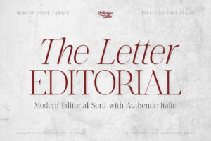
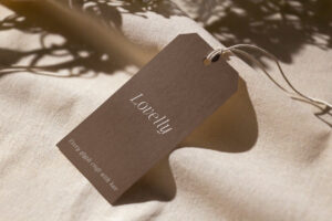
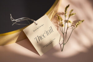
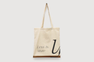
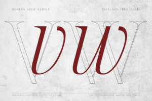
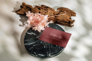
The Letter Editorial is worth exploring for boutiques that want an editorial and carefully curated visual identity.
Independent retailers often rely on presentation to communicate the value of their products. Typography that creates a strong headline or brand statement can support that presentation across printed materials and digital platforms.
An editorial typeface can be especially effective when the boutique uses considered layouts, product photography, and a restrained visual palette.
The Letter Editorial can form part of that direction, particularly for prominent branding applications where typography contributes directly to the overall atmosphere.
Best for: curated fashion boutiques, premium lifestyle stores, independent concept stores, editorial-inspired retail, and sophisticated product collections.
2. Montegar
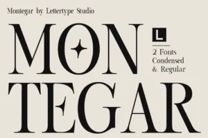

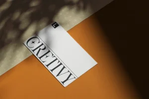
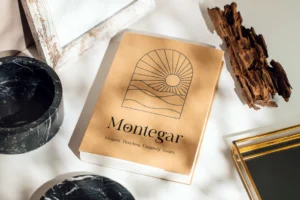
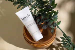
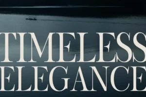
Montegar offers a distinctive direction for boutiques that want their typography to become a recognizable part of the brand.
A boutique does not always need an elaborate logo or complicated visual system. A well-chosen typeface, combined with thoughtful composition, can create a strong identity across shopping bags, packaging, storefront graphics, and digital campaigns.
Montegar can be explored for applications where the boutique wants its name and messaging to have a more prominent visual presence.
Its suitability will depend on the specific brand direction and how the typeface works alongside the rest of the identity.
Best for: contemporary retail concepts, curated product stores, lifestyle boutiques, distinctive brand identities, and retail campaign graphics.
3. Vordelina
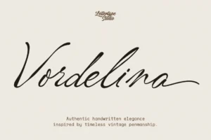
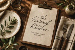

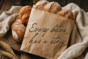
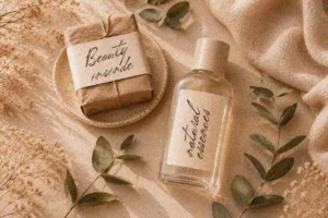
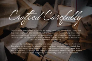
Vordelina offers an expressive script direction for boutiques that want to communicate individuality and a more personal character.
For some independent retailers, the appeal comes from feeling carefully selected rather than mass-produced. Typography can support this positioning by introducing a more personal visual signature.
An expressive script may work well for the boutique’s primary logo, packaging accents, thank-you cards, and selected promotional graphics.
To maintain readability, pair the script with a simpler typeface for product names, prices, website navigation, and other functional information.
Best for: feminine lifestyle boutiques, accessories stores, personalized retail brands, gift shops, and boutiques with an expressive visual identity.
4. Elvanyra
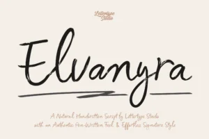
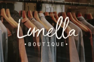
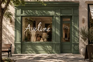
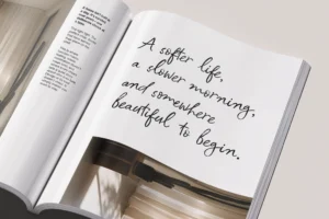
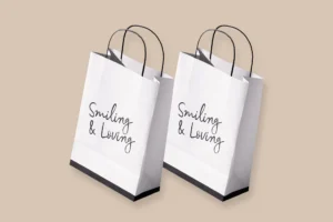
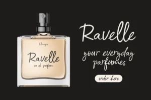
Elvanyra can be considered for boutiques that want an elegant and distinctive typographic direction.
A refined typeface can help connect the different elements of a retail identity, from the primary logo to product presentation and printed materials.
For boutiques selling carefully curated collections, typography can contribute to a more considered experience without requiring excessive visual decoration.
Elvanyra is worth exploring for prominent brand applications where its individual character can support the business’s positioning.
Best for: premium lifestyle boutiques, curated accessories, elegant retail identities, boutique gifting, and sophisticated product presentation.
5. Notevera Duo
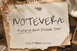
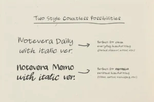

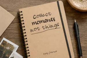


Notevera Duo provides an option for boutiques that want to explore a more expressive typographic identity.
Independent retail brands often need to communicate both personality and product variety. A distinctive type direction can help make campaigns, packaging, and social media content feel connected while allowing the business to adapt its visual presentation for different collections.
Notevera Duo can be explored as part of a boutique’s branding toolkit, particularly when the intended identity benefits from a more expressive approach.
Before using any font combination in a final identity, test the relationship between the typefaces carefully. Contrast should create a clear hierarchy rather than make the design feel inconsistent.
Best for: creative lifestyle boutiques, gift stores, curated retail concepts, expressive packaging, and boutique campaign design.
6. Lenia Soft
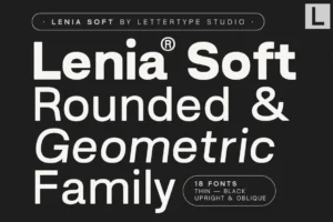
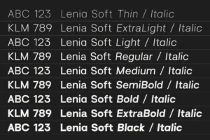
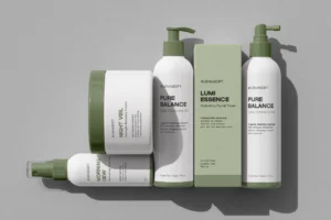
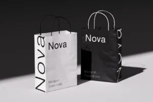
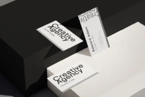
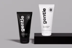
Lenia Soft offers a softer typographic direction for boutiques that want their branding to feel approachable and contemporary.
Not every independent retailer wants to communicate formality or luxury. Some build their identity around comfort, friendliness, everyday products, or a relaxed lifestyle.
For these brands, softer typography can help create a welcoming impression.
Lenia Soft can be explored across brand headlines, website graphics, packaging, and promotional materials where a less rigid visual character supports the overall identity.
Best for: approachable lifestyle boutiques, home and living stores, gift shops, contemporary retail brands, and friendly product identities.
7. Bring Vacation
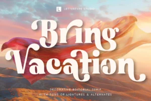
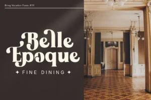
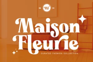
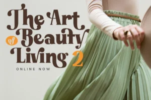
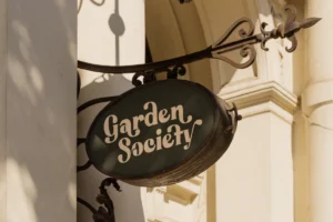

Bring Vacation offers an expressive direction for boutiques that want to communicate a relaxed and lifestyle-oriented personality.
Some retail brands are built around a particular mood as much as their products. Travel-inspired accessories, casual lifestyle goods, seasonal collections, and playful gift concepts may benefit from typography that reinforces that atmosphere.
A distinctive typeface can help create consistency across campaign graphics, packaging, promotional materials, and selected brand applications.
Bring Vacation can be considered when the boutique wants its identity to feel expressive rather than strictly formal.
Best for: resort-inspired boutiques, casual lifestyle stores, gift shops, seasonal retail collections, and playful independent brands.
How to Choose the Right Font for Your Boutique
Before selecting a typeface, define the role typography needs to play in the brand.
The following considerations can help narrow down the options.
Start With Your Product Category
The products you sell provide an important starting point.
A boutique specializing in premium stationery may need a different visual language from a store selling colorful home accessories or handcrafted gifts.
Consider the materials, presentation, price positioning, and overall experience associated with the products.
Typography should reinforce those qualities rather than introduce a personality that feels disconnected from them.
Define Your Brand Personality
Choose three to five words that describe how the boutique should be perceived.
For example:
- Refined and curated: Consider elegant serif typography and restrained layouts.
- Modern and minimal: Explore contemporary sans serif fonts.
- Warm and personal: Consider expressive scripts or softer typefaces.
- Playful and creative: Explore distinctive display typography.
- Relaxed and lifestyle-oriented: Look for a typeface whose character complements the brand’s atmosphere.
These descriptions are not strict rules. They are starting points for evaluating which fonts feel appropriate.
Consider Where the Font Will Appear
List the main applications in which the typeface will be used.
For many boutiques, these include:
- Primary logo and secondary logo.
- Storefront signage.
- Shopping bags and packaging.
- Product labels and tags.
- Website and online store.
- Social media graphics.
- Promotional campaigns.
- Printed cards and customer communications.
A font that works well in a large logo may not be the best choice for every other application.
Testing the typeface in these contexts will reveal whether it can support the full identity.
Decide Whether You Need One Font or a Pair
Some boutiques can build a cohesive identity around a single versatile family.
Others benefit from combining two complementary typefaces.
For example, a distinctive serif may be used for headlines while a clean sans serif handles supporting information. Alternatively, a script can provide a recognizable brand signature while a simpler typeface maintains readability.
The goal is not to use as many fonts as possible. It is to establish a system that feels intentional and remains easy to apply.
Test the Typeface With Your Actual Brand Name
A typeface can look excellent in a specimen but behave differently when used with a particular brand name.
The length of the name, the shapes of its letters, and the spacing between characters all affect the final result.
Create several logo drafts using the actual name of the boutique.
Then test those drafts on packaging, signage, website headers, and social media layouts.
This process makes it easier to evaluate the typeface as part of a real identity rather than as an isolated design element.
Common Typography Mistakes in Boutique Branding
Even a beautiful font can become ineffective when it is used without considering the needs of the business.
Choosing a Font Only Because It Looks Luxurious
Serif typography and elegant scripts can create a sophisticated impression, but they are not suitable for every boutique.
A business built around playful products or contemporary essentials may benefit from a different direction.
Choose a font that reflects the brand rather than following a generic idea of premium design.
Using Too Many Different Fonts
Combining too many unrelated typefaces can make a boutique identity feel inconsistent.
Establish clear roles for the primary and supporting fonts. Use additional display styles only when they contribute something meaningful to the design.
Ignoring Small Applications
A logo may look impressive on a large presentation board but become difficult to read on a small product label.
Test typography at the sizes customers will actually encounter.
Following Trends Without Considering Longevity
Trends can provide inspiration, but a boutique’s identity should not depend entirely on a temporary visual style.
Choose typography that reflects the brand’s personality and can continue to support the business as its products and communication evolve.
Treating the Logo as the Entire Brand
A boutique’s identity extends beyond its logo.
Typography should help connect packaging, signage, website content, campaign graphics, and customer communications.
A consistent system creates a more recognizable experience across these touchpoints.
Final Thoughts
The best fonts for boutique branding reflect the character of the business while supporting a cohesive retail identity.
The Letter Editorial and Montegar offer directions to explore for distinctive brand presentation. Vordelina introduces an expressive script option, while Elvanyra provides another elegant typographic direction. Notevera Duo, Lenia Soft, and Bring Vacation offer additional possibilities for boutiques with different creative personalities.
The right choice depends on the products, audience, brand positioning, and applications in which the typeface will appear.
Start by defining the personality of the boutique, then test your shortlisted fonts with the actual brand name and across realistic applications.
A successful boutique identity does not need to be complicated. It needs to feel intentional, recognizable, and appropriate for the experience the business wants to create.
Conclusion
Typography helps independent boutiques turn their visual identity into a recognizable part of the customer experience.
Whether you are building a refined concept store, an expressive lifestyle brand, or a contemporary independent retailer, the right typeface can connect your logo, packaging, signage, and digital communication.
Focus on personality, versatility, and readability rather than choosing a font simply because it looks fashionable.
When typography reflects the character of the products and remains consistent across customer touchpoints, it becomes more than a decorative element. It becomes part of what makes the boutique memorable.