
Indonesia has a diverse and dynamic business landscape, from independent fashion labels and contemporary coffee brands to technology startups, lifestyle businesses, and established consumer companies.
As more local businesses develop their visual identities, typography has become an important part of how they communicate with customers.
A typeface can make a brand feel modern, approachable, sophisticated, energetic, or rooted in a particular creative perspective. It can help a business distinguish itself in a competitive market while creating consistency across logos, packaging, websites, advertising, and social media.
For Indonesian businesses, the challenge is not simply choosing a font that looks attractive. It is finding typography that reflects the brand’s identity, speaks to its intended audience, and works across the channels where customers encounter it.
The best fonts for Indonesian brands do not have to look traditionally Indonesian. A contemporary sans serif, an editorial serif, or a distinctive display typeface can work just as effectively when it supports the brand’s positioning.
Local character can also emerge through naming, language, visual storytelling, color, photography, and the wider design system—not typography alone.
In this guide, we explore how Indonesian businesses can choose typography for modern brand identities, which font styles suit different industries, and seven Lettertype Studio typefaces worth exploring for contemporary branding projects.
Why Typography Matters for Indonesian Brands
A brand identity is often the first point of contact between a business and its potential customers.
Before people understand a company’s products, values, or services, they may encounter its logo on a storefront, product label, social media post, website, or advertisement.
Typography helps shape that first impression.
A bold display typeface can create a strong visual presence. A refined serif may communicate an editorial or premium character. A clean sans serif can make a brand feel contemporary and accessible.
These impressions are not universal rules, but they influence how a visual identity is interpreted.
For Indonesian businesses operating in crowded markets, typography can also help establish differentiation. Two companies may offer similar products but communicate very different personalities through their visual identities.
A well-chosen typeface helps connect that personality to the wider brand experience.
Modern Branding Does Not Mean Losing Local Character
One common misconception is that a brand must use traditional visual elements to communicate its Indonesian identity.
Traditional scripts, regional patterns, and cultural references can be meaningful when they are relevant to the brand. However, they are not mandatory for every Indonesian business.
A contemporary brand can express its local identity through its name, story, language, product philosophy, photography, and relationship with its audience.
Typography should support those choices rather than force the brand into a predetermined visual style.
For example, a technology startup based in Jakarta may need a straightforward and contemporary identity, while a heritage-inspired lifestyle brand may benefit from a more expressive visual direction.
Both can be distinctly Indonesian without using the same typography.
What Makes a Good Font for Indonesian Branding?
The right typeface depends on the business, its audience, and its intended positioning. Several practical considerations can help narrow down the options.
1. A Clear Brand Personality
Before choosing a font, define how the business should be perceived.
Does the brand want to feel premium, friendly, energetic, contemporary, traditional, or experimental?
These characteristics provide a starting point for evaluating typography.
A modern sans serif may support a contemporary technology brand. An editorial serif might suit a premium lifestyle business. A bold display typeface can work for a brand that wants to communicate energy and individuality.
The goal is to select a typeface that reinforces the brand’s character.
2. Readability in Indonesian and English
Many Indonesian brands communicate primarily in Bahasa Indonesia but also use English in product names, campaigns, websites, or international-facing materials.
A typeface should support the characters and punctuation required by the brand’s actual content.
Test it with realistic text rather than relying exclusively on specimen words.
For Indonesian copy, check how the font performs with commonly used words and combinations of letters. If the brand communicates in multiple languages, verify that the necessary glyphs are available.
This is particularly important when selecting fonts for websites, packaging, and other customer-facing applications.
3. Versatility Across Digital and Physical Media
An Indonesian brand may appear on a marketplace listing, a social media account, a printed label, a storefront sign, and a company website.
Typography should create a recognizable visual language across these different environments.
Consider whether the font works at large headline sizes and whether it remains legible in smaller applications.
A versatile family can simplify the design system by supporting several typographic roles without requiring too many unrelated fonts.
4. Distinctiveness Without Unnecessary Complexity
A brand needs to be recognizable, but visual complexity is not the same as originality.
A distinctive typeface can create character through its proportions, spacing, weight, and letterforms.
For many businesses, a carefully chosen font combined with consistent composition and art direction is more effective than an overly complicated logo.
Choose typography that makes the brand recognizable while remaining practical to use.
5. Commercial Licensing
Before using a typeface in a commercial project, check the relevant license.
Logo creation, advertising, packaging, website embedding, and application development may involve different licensing requirements.
Designers should confirm that the selected license covers the intended uses rather than assuming every font purchase includes every type of permission.
This is particularly important for agencies and freelancers delivering brand identities to clients.
Best Typography Styles for Indonesian Brands
Different typography styles can support different business categories and visual directions.
Understanding their characteristics helps designers make more informed choices.
Modern Sans Serif Fonts
Modern sans serifs are a versatile starting point for many Indonesian businesses.
Depending on their design, they can communicate simplicity, professionalism, friendliness, or technological sophistication.
They are useful for brands that need consistent typography across websites, presentations, packaging, and marketing materials.
A well-selected sans serif can also support clear hierarchy through different weights and sizes.
For companies that prioritize contemporary communication, this style can provide a flexible foundation.
Editorial Serif Fonts
Editorial serifs can introduce sophistication and a more considered visual character.
They may suit premium lifestyle brands, independent fashion labels, creative studios, specialty retail businesses, and companies that want to establish an editorial identity.
A serif can also help a brand stand apart from competitors that rely exclusively on neutral sans serifs.
The most effective results usually come from choosing a typeface that matches the brand’s actual personality rather than using serif typography as an automatic signal of luxury.
Display Fonts
Display typefaces are designed to create a stronger visual impression in prominent applications.
They can work well for brand headlines, campaign graphics, product launches, packaging, and promotional materials.
For Indonesian brands competing in visually crowded categories, a distinctive display font can contribute to recognition.
However, display typography should be used carefully when content needs to remain readable at smaller sizes.
Expressive Script Fonts
Script typography can introduce movement, personality, and a more personal character.
It may suit selected lifestyle brands, gift businesses, creative products, or campaigns that benefit from a handwritten visual direction.
Scripts are not appropriate for every industry, and readability varies significantly between designs.
When using a script for a logo or brand signature, consider pairing it with a simpler supporting font for everyday communication.
Seven Lettertype Studio Fonts for Indonesian Brands
The following Lettertype Studio typefaces offer different creative directions for contemporary branding projects.
Rather than treating them as fonts exclusively for Indonesian businesses, consider how each could support a local brand’s positioning, visual identity, and communication requirements.
1. Swaraga
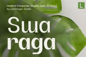
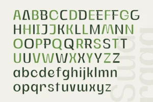

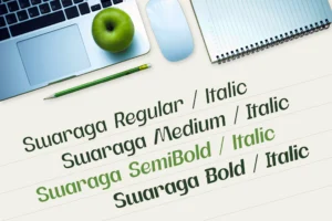

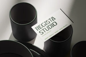
Swaraga offers a distinctive direction for brands that want a contemporary identity with a stronger visual character.
For Indonesian businesses, this can be an opportunity to create an identity that feels modern without looking interchangeable with every other brand in the market.
A distinctive display-oriented approach can be useful for prominent headlines, campaign graphics, and brand applications where recognition matters.
The important consideration is how the typography fits the business. A bold visual identity should reinforce the brand’s positioning rather than exist only for decoration.
Best for: contemporary Indonesian brands, creative businesses, distinctive corporate identities, campaign graphics, and brands seeking a recognizable display direction.
2. Ngawi Sans
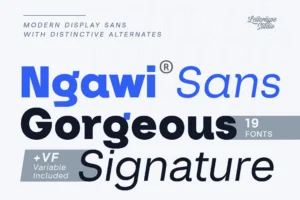
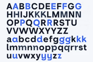
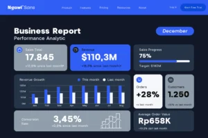
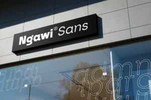


Ngawi Sans provides a contemporary sans serif direction for Indonesian businesses that need a flexible typographic system.
Many brands communicate through several channels, from websites and social media to presentations, product descriptions, and promotional materials.
A consistent sans serif can help connect those applications while allowing the designer to create hierarchy through weight, size, and spacing.
Ngawi Sans can be explored for brands that want a contemporary visual identity without relying on highly decorative typography.
Best for: modern local businesses, technology companies, digital-first brands, corporate identities, and contemporary product brands.
3. Merta Sans
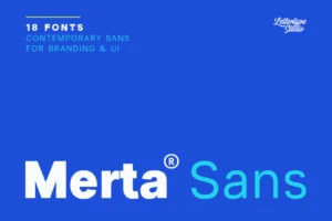




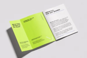
Merta Sans offers another contemporary sans serif option for brands that prioritize a cohesive visual identity.
For businesses that need to communicate clearly across digital and physical touchpoints, a consistent typeface can simplify the design process.
It can provide a shared typographic foundation for headlines, supporting content, presentations, and promotional materials, depending on the family’s available styles and the needs of the project.
The final choice should be tested against the brand’s actual content and applications.
Best for: contemporary Indonesian businesses, service companies, lifestyle brands, professional services, and modern commercial identities.
4. Vescura
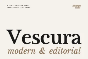
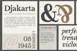


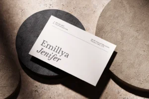
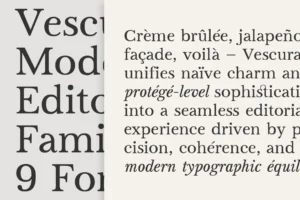
Vescura offers a refined typographic direction for Indonesian brands seeking a more sophisticated and distinctive visual identity.
For businesses in fashion, lifestyle, retail, and premium consumer markets, typography can help communicate a carefully considered brand personality. Vescura can be explored for prominent headlines, brand statements, and campaign materials where a more refined typographic presence supports the overall identity.
When paired with a complementary typeface for supporting content, Vescura can help create a cohesive brand system that balances visual character with readability.
Best for: premium Indonesian brands, independent fashion labels, lifestyle businesses, curated retail, and sophisticated brand identities.
5. Horiva Sans
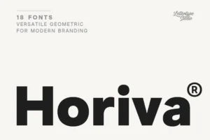

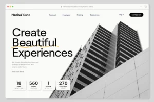



Horiva Sans provides a contemporary sans serif direction for brands seeking a modern and adaptable identity.
For a growing business, typography needs to work across multiple applications without creating an inconsistent visual experience.
A contemporary sans serif can help establish a shared visual language for brand communication, website headings, campaign materials, and other prominent content.
Horiva Sans can be explored as part of this approach, provided it is tested against the specific requirements of the project.
Best for: modern service businesses, digital brands, contemporary lifestyle companies, professional services, and modern corporate identities.
6. Montegar
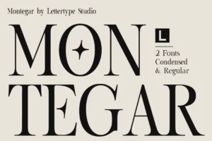
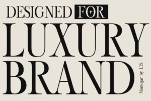
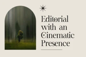
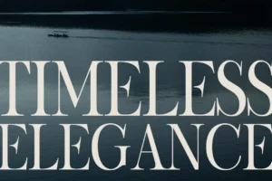


Montegar offers a distinctive typographic direction for brands that want a stronger visual signature.
Some Indonesian businesses benefit from a more expressive identity, particularly when their products, services, or creative positioning call for a recognizable visual presence.
A distinctive typeface can help create memorable headlines and campaign materials while connecting different parts of the brand system.
Montegar can be explored for prominent brand applications where its specific character complements the business’s positioning.
Best for: creative businesses, independent retail brands, lifestyle products, campaign-led identities, and distinctive brand communication.
7. Bring Vacation

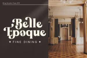
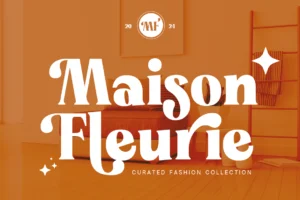

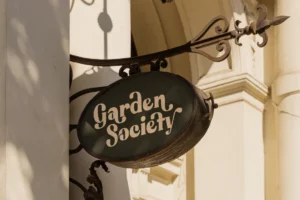
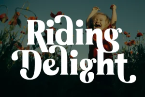
Bring Vacation offers an expressive direction for brands that want to communicate a relaxed and lifestyle-oriented personality.
Indonesia’s broad lifestyle and tourism-related markets include businesses built around travel, leisure, personal experiences, and distinctive product concepts.
For brands in these categories, typography can help establish an atmosphere that feels consistent with the experience being offered.
Bring Vacation can be considered for prominent branding and campaign applications where an expressive typographic style supports the intended direction.
Best for: travel-inspired lifestyle brands, leisure businesses, creative retail, gift brands, and expressive promotional campaigns.
How to Choose the Right Font for an Indonesian Brand
Choosing typography becomes easier when the brand’s positioning and practical requirements are clearly defined.
The following steps can help structure the process.
Define the Brand’s Positioning
Start by identifying what makes the business different.
Consider its products, audience, price positioning, values, and competitive landscape.
A business offering premium lifestyle products may need a different typographic direction from a technology company or an accessible everyday consumer brand.
Write down a few characteristics that describe the intended identity. Use them to evaluate whether a typeface feels appropriate.
Understand the Target Audience
A brand’s visual identity should make sense to the people it wants to reach.
Consider where the audience discovers the business, how it interacts with products, and what type of communication feels appropriate for the category.
This does not mean following assumptions about what Indonesian customers prefer. Instead, use audience research and actual brand requirements to guide the design.
Typography should support the intended relationship between the business and its customers.
Consider the Competitive Landscape
Review the visual identities of businesses operating in the same category.
Look for common patterns in typography, composition, color, and overall presentation.
This helps identify where a brand can establish a distinctive direction without losing relevance to its market.
Differentiation does not require making the identity radically different from every competitor. Sometimes a more considered typographic choice is enough to establish a recognizable personality.
Test the Typeface With the Actual Brand Name
The same font can look different depending on the name being set.
Letter combinations, word length, spacing, and proportions all affect the final result.
Create logo drafts using the actual business name and test them across several layouts.
A typeface that looks attractive in a specimen may need adjustments in spacing or composition before it works effectively for a specific brand.
Build a Consistent Typographic System
A complete identity needs more than a logo font.
Define how typography will be used for headlines, body text, product names, captions, supporting information, and other common applications.
A simple system makes it easier to maintain consistency as the business expands into new channels.
If the identity requires multiple typefaces, give each one a clear role.
Test the Identity Across Real Applications
Before finalizing the design, evaluate it on the touchpoints most relevant to the business.
These may include:
- Website and e-commerce pages.
- Product packaging and labels.
- Social media graphics.
- Storefront signage.
- Business presentations.
- Advertising campaigns.
- Printed promotional materials.
Testing helps reveal problems with readability, hierarchy, and consistency before the identity is implemented.
Should Indonesian Brands Use Traditional Typography?
Traditional visual references can contribute to a distinctive brand identity, but they should be used with a clear purpose.
A brand may draw inspiration from regional lettering, local scripts, cultural patterns, historical references, or the visual traditions associated with a particular place.
When those elements are relevant to the brand’s story, they can help establish a meaningful connection with its audience.
However, traditional references should not be treated as a requirement for every Indonesian identity.
A contemporary business can express its local perspective through its name, language, photography, products, and storytelling.
The most effective approach depends on what the brand wants to communicate.
Designers should also be careful when working with regional scripts or culturally significant visual elements. Verify the accuracy of the references and consider whether their use is appropriate for the brand and audience.
Local identity is strongest when it is thoughtfully developed rather than added as a superficial decorative layer.
Common Typography Mistakes in Indonesian Branding
Even an attractive font can become ineffective when the wider identity lacks direction.
Choosing a Font Only Because It Is Trending
A popular typeface may be useful, but popularity does not guarantee that it suits a particular business.
Evaluate typography according to the brand’s positioning and practical requirements.
Making Every Local Brand Look the Same
Using the same visual conventions as competitors can make differentiation difficult.
A thoughtful typographic choice can help create a distinct identity without requiring excessive decoration.
Ignoring Language and Character Support
Brands should test fonts with the actual languages and characters used in their communication.
This is particularly important when the business publishes multilingual content or uses specialized characters.
Overcomplicating the Logo
A logo does not need numerous decorative elements to be memorable.
A well-selected typeface, appropriate spacing, and thoughtful composition can create a strong foundation.
Forgetting the Wider Brand System
Typography should work across the entire identity, not only in the logo.
Consistency between the website, packaging, marketing, and other applications helps make the brand recognizable over time.
Final Thoughts
The best fonts for Indonesian brands are those that support a business’s identity, audience, and communication needs.
Swaraga offers a distinctive display direction, while Ngawi Sans, Merta Sans, and Horiva Sans provide contemporary sans serif options. The Letter Editorial introduces an editorial possibility, Montegar offers a more distinctive typographic direction, and Bring Vacation provides an expressive option for lifestyle-oriented brands.
Each typeface should be evaluated according to the brand’s actual requirements rather than treated as a universal solution.
Start by defining the brand’s personality, research its audience and competitive landscape, and test shortlisted typefaces across realistic applications.
A modern Indonesian brand does not need to choose between contemporary design and local identity. With a clear concept and a consistent typographic system, the two can work together naturally.
Conclusion
Typography helps Indonesian businesses communicate their identity in a competitive and constantly evolving market.
Whether you are developing a technology startup, an independent lifestyle brand, a creative studio, or a contemporary retail business, the right typeface can help establish recognition and consistency across customer touchpoints.
Focus on the brand’s personality, the needs of its audience, and the practical requirements of its applications.
Local identity does not have to depend on a single visual style. It can emerge through thoughtful design decisions that connect the brand’s story with the way it communicates.
When typography supports that story, it becomes an effective part of building a distinctive modern brand.