
Typography is one of the most powerful elements in brand identity. The right typefaces can communicate personality, establish visual hierarchy, and make a brand feel instantly recognizable. But choosing a single font is only part of the process. Many successful brand identities rely on carefully selected font pairings to create a more flexible and expressive visual language.
The best font pairings for branding are not simply combinations of attractive typefaces. They are combinations that work together with purpose. A refined serif paired with a contemporary sans serif can create an elegant yet approachable identity, while two contrasting display fonts may bring a more expressive and creative character to a brand.
Whether you are designing a logo, developing a visual identity, or refreshing an existing brand, understanding how to combine fonts will help you make more confident typographic decisions.
In this guide, we explore the principles of effective font pairing, popular combinations for different brand personalities, and practical ways to build a cohesive typographic system.
Why Font Pairing Matters in Branding
A brand rarely communicates through a single typographic application. Its identity may appear across logos, websites, packaging, social media, advertising, presentations, and printed materials.
Using one typeface across every application can create consistency, but it may also limit the brand’s expressive range. A well-designed font pairing introduces variation while maintaining a recognizable visual identity.
Creating Visual Hierarchy
Font pairing helps audiences understand which information matters most.
A distinctive display typeface can establish the primary message, while a more restrained supporting font handles secondary information. This contrast creates a clear hierarchy without requiring excessive changes in size, color, or layout.
For example, a fashion brand may use an elegant serif for headlines and a clean sans serif for product descriptions. The headline establishes a refined mood, while the supporting text remains readable and functional.
Communicating Brand Personality
Different typefaces carry different visual associations.
Serif fonts often communicate heritage, sophistication, or editorial character. Sans serif fonts can feel modern, minimal, or approachable. Script fonts introduce movement and personality, while expressive display fonts can make a brand feel distinctive and creative.
Combining these characteristics allows designers to communicate a more nuanced brand personality.
Building a Flexible Visual Identity
A strong brand system needs to work across different contexts.
A display typeface may be ideal for a logo or campaign headline but less suitable for long-form text. A supporting typeface can provide the readability needed for websites, product information, and everyday communication.
The goal is to create a typographic system that feels consistent without becoming visually repetitive.
The Principles of Effective Font Pairing
Before exploring specific combinations, it is useful to understand what makes two typefaces work together.
1. Combine Contrast with Compatibility
The most effective font pairings often balance contrast and compatibility.
Contrast creates visual interest. Compatibility ensures that the fonts still feel like they belong to the same brand.
A high-contrast serif and a geometric sans serif may create a sophisticated editorial identity. However, pairing two highly expressive display fonts can make the design feel visually competitive.
Look for differences in structure, weight, or personality while maintaining a shared visual direction.
2. Establish a Clear Typographic Hierarchy
Each typeface should have a defined role.
A simple brand typography system might include:
- Primary Typeface: Used for logos, headlines, and key brand statements.
- Secondary Typeface: Used for body text, descriptions, and supporting information.
- Accent Typeface: Used selectively for expressive details, campaign graphics, or special applications.
Not every brand needs three typefaces. In many cases, two well-selected fonts are enough to create a complete identity.
3. Consider Proportions and Letterforms
Font pairing is not only about classification. The proportions of individual letterforms also influence how typefaces interact.
Consider the following characteristics:
- X-height and overall proportions
- Width and spacing
- Stroke contrast
- Geometric or organic construction
- Shape of lowercase letters
- Character of uppercase forms
A condensed display font may pair beautifully with a more open sans serif. A high-contrast serif may benefit from a supporting typeface with simpler letterforms.
These details become particularly important when fonts appear together in the same layout.
4. Avoid Unnecessary Competition
Two fonts can be visually interesting individually but difficult to combine.
When both typefaces have strong personalities, they may compete for attention. This can weaken the hierarchy and make the brand feel inconsistent.
A useful approach is to let one font lead while the other supports.
For example, an expressive display serif can establish the visual identity, while a neutral sans serif provides clarity and balance.
5. Test Pairings in Real Applications
A font pairing should never be evaluated only through a specimen sheet.
Test it in realistic brand applications such as:
- Logo and wordmark concepts
- Website headlines and body text
- Packaging labels
- Social media graphics
- Business cards
- Campaign advertisements
A combination that looks beautiful in a large headline may become difficult to read in smaller text.
Testing helps reveal whether the pairing works as a complete brand system.
Best Font Pairings for Different Brand Personalities
Different industries and brand personalities require different typographic approaches. The following combinations offer useful starting points for building a cohesive brand identity.
1. Elegant Serif + Minimal Sans Serif
Best for: Luxury brands, fashion labels, beauty businesses, and premium lifestyle brands.
An elegant serif paired with a minimal sans serif creates a balance between sophistication and contemporary clarity.
The serif introduces refinement through its proportions, contrast, and distinctive details. The sans serif provides a clean supporting structure that keeps the identity from feeling overly traditional.
This combination works particularly well for brands that want to communicate quality without appearing excessively formal.
Use the serif for logos, headlines, and editorial statements. Reserve the sans serif for navigation, product descriptions, and supporting information.
2. Modern Display Sans + Neutral Sans Serif
Best for: Technology brands, creative studios, contemporary businesses, and digital-first identities.
A modern display sans serif can introduce distinctive character through its geometry, proportions, or unusual letterforms.
Pairing it with a more neutral sans serif allows the brand to maintain a contemporary appearance while ensuring readability.
This combination is especially effective for digital applications, where typography needs to work across different screen sizes and content formats.
The display typeface establishes the brand’s visual voice, while the supporting sans serif handles functional communication.
3. Editorial Serif + Contemporary Grotesk
Best for: Publishing, architecture, fashion, design studios, and cultural brands.
Editorial serif fonts often carry a strong sense of sophistication and visual storytelling.
A contemporary grotesk introduces a more direct and modern character, creating a balanced identity that feels both established and current.
This pairing is ideal for brands that want to communicate creative intelligence, refined taste, and a strong editorial perspective.
Use the serif for large headlines and expressive typography. The grotesk can support captions, navigation, and informational content.
4. Soft Sans Serif + Geometric Sans Serif
Best for: Wellness brands, skincare, lifestyle businesses, and contemporary consumer products.
A soft sans serif can communicate warmth and approachability through rounded shapes and gentle proportions.
Pairing it with a geometric sans serif introduces structure and consistency without sacrificing the brand’s friendly character.
The result can feel calm, modern, and accessible.
This combination is particularly effective for brands that want to avoid the coldness of overly technical typography while maintaining a clean visual identity.
5. Expressive Display Typeface + Clean Supporting Font
Best for: Creative brands, independent businesses, fashion campaigns, and expressive packaging.
Some brands need typography that immediately attracts attention.
An expressive display typeface can establish a distinctive visual identity through unusual shapes, strong proportions, or unexpected stylistic details.
A clean supporting font keeps the overall system functional.
This pairing works best when the display typeface is used selectively. Headlines, logos, and campaign graphics can carry the expressive character, while supporting text remains simple.
The contrast creates a recognizable identity without overwhelming the audience.
Font Pairing Ideas for Specific Industries
While brand personality should always guide typography, industry context can provide useful direction.
Luxury and Fashion Branding
Luxury and fashion brands often benefit from high-contrast serif fonts paired with understated sans serifs.
The serif creates an editorial and sophisticated impression, while the sans serif introduces a contemporary touch.
This combination works particularly well for fashion wordmarks, campaign headlines, packaging, and digital storefronts.
However, luxury branding does not always require a serif. A distinctive modern sans serif can also create a premium identity when its proportions and spacing are carefully considered.
Wellness and Lifestyle Branding
Wellness brands often rely on typography that communicates calmness, clarity, and trust.
Soft sans serifs, understated serif fonts, and humanist typefaces can all contribute to this visual language.
The key is to avoid excessive visual complexity. A restrained pairing allows the brand to feel considered and approachable.
Creative and Design Studio Branding
Creative businesses have more freedom to experiment with typographic contrast.
A distinctive display typeface paired with a functional sans serif can create an identity that feels expressive and professional.
Some studios may even use contrasting typefaces across different applications, provided that the overall system maintains a consistent visual direction.
Food and Hospitality Branding
Restaurants, cafés, and food businesses often need typography that feels memorable while remaining practical.
A characterful serif or display sans serif can establish the brand’s personality. A supporting typeface can handle menus, product descriptions, and other information.
For packaging and signage, consider how the fonts perform at different sizes and viewing distances.
How to Build a Typographic Brand System
Choosing two complementary fonts is only the beginning. A complete brand identity needs clear rules for how typography should be used.
Define the Role of Each Typeface
Start by identifying the purpose of each font.
For example:
| Typography Role | Recommended Application |
|---|---|
| Primary Typeface | Logo, headlines, key brand statements |
| Secondary Typeface | Body text, descriptions, digital content |
| Accent Typeface | Campaigns, packaging details, special graphics |
These roles should remain consistent across the brand’s major touchpoints.
Establish a Scale
Create a basic typographic scale for headlines, subheadings, body text, captions, and supporting information.
The scale does not need to be complicated. Its purpose is to ensure that the typography remains consistent and recognizable.
For digital applications, consider readability across desktop and mobile layouts.
Define Weight and Style Usage
Different font weights and styles can introduce additional variation.
However, using too many weights can weaken the visual hierarchy.
Choose a limited range of styles for each role. A display font may use a bold or expressive style for headlines, while the supporting font uses regular and medium weights for functional content.
Create Consistent Spacing Rules
Typography is not only about the shape of the letters. Spacing also influences the overall character of a brand.
Consider:
- Letter spacing for logos and headlines
- Line height for body text
- Paragraph spacing
- Alignment
- Spacing between typographic elements
Consistent spacing helps the identity feel intentional across different applications.
Test the System Across Brand Touchpoints
A typography system should work beyond a single design.
Test it across a website, packaging, social media, print materials, and other relevant applications.
If the pairing feels inconsistent or difficult to use, reconsider the roles of the typefaces or simplify the system.
Common Font Pairing Mistakes to Avoid
Even experienced designers can struggle with font pairing. Several common mistakes can make a brand identity feel less cohesive.
Choosing Fonts Based Only on Popularity
Popular typefaces are not automatically suitable for every brand.
A font may be widely used because it is versatile, but it may not communicate the personality or positioning of a particular business.
Choose typefaces based on the brand’s objectives rather than current trends alone.
Using Too Many Typefaces
Adding more fonts does not necessarily make a brand more expressive.
Too many typefaces can create visual inconsistency and make the identity difficult to maintain.
Start with two fonts and introduce a third only when it serves a clear purpose.
Ignoring Readability
A typeface may look beautiful in a large headline but perform poorly in smaller applications.
Always consider the intended use, including screen size, viewing distance, and the amount of text.
Pairing Fonts with Similar Personalities
Two typefaces with nearly identical characteristics may create a combination that feels repetitive.
This does not mean every pairing needs dramatic contrast. Even subtle differences in structure, proportions, or weight can create a more useful hierarchy.
Forgetting Brand Consistency
A font pairing should support the brand’s visual identity over time.
Changing typefaces too frequently across applications can weaken recognition.
Establish clear typography guidelines and use them consistently.
Finding the Right Font Pairings for Your Brand
The best font pairing is not necessarily the most unusual or visually complex combination.
It is the one that communicates the brand’s personality, creates a clear hierarchy, and works consistently across different applications.
Start by identifying the brand’s core characteristics. Is it elegant, modern, expressive, approachable, or authoritative? Use these qualities to guide your typographic decisions.
Then explore different combinations, test them in realistic applications, and refine the system until the fonts work together naturally.
For designers looking to build distinctive brand identities, exploring typefaces from independent foundries can provide a wider range of creative possibilities. Lettertype Studio offers a curated collection of display, serif, sans serif, and expressive typefaces designed for branding, editorial work, packaging, and contemporary visual identities.
Explore the Lettertype Studio collection to discover typefaces that can help bring your next brand project to life.
Conclusion
Font pairing is an essential part of building a successful brand identity. The right combination can establish visual hierarchy, communicate personality, and create a more flexible typographic system.
By balancing contrast and compatibility, defining clear typographic roles, and testing combinations across real applications, designers can create brand identities that feel cohesive and memorable.
Whether you are developing a premium fashion identity, a contemporary wellness brand, or an expressive creative business, thoughtful typography can make a meaningful difference.
The key is to choose fonts with purpose. When each typeface has a clear role and complements the overall brand direction, the result is a typography system that feels confident, consistent, and distinctive.
Featured Fonts
For this article, the featured selection focuses on different typographic personalities that can be combined to create distinctive brand identities.
Kaluk Sans
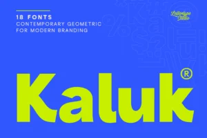
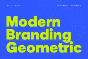
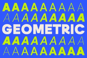

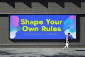
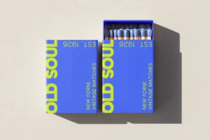
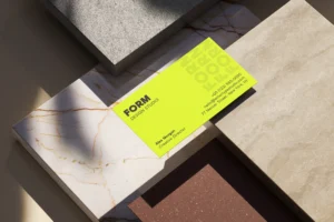
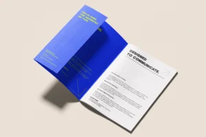

A contemporary geometric sans serif with a confident, modern character. Its clean structure makes it a compelling direction for branding that needs a strong typographic presence.
Venadria Signature
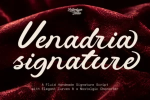

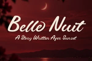
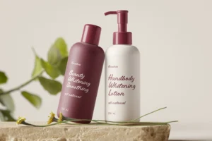
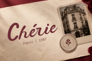

A fluid, handmade script that introduces personality and expressive movement. It can work as an accent typeface for brands seeking a more personal and distinctive visual voice.
Nostavelle
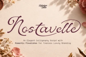
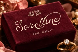
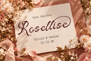
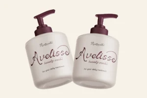
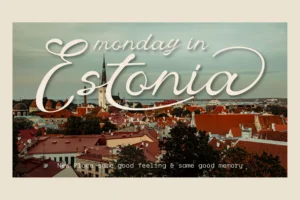
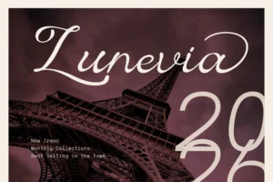
An elegant display direction for branding that needs a refined, editorial atmosphere. Its character makes it suitable for sophisticated visual identities and expressive headlines.
Merta Sans
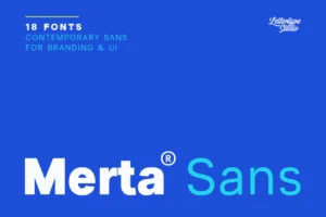
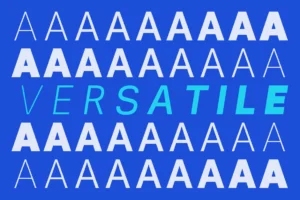


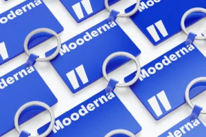
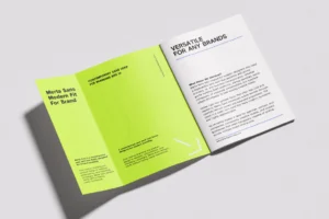
A contemporary sans serif option for modern branding systems that require a clean and versatile typographic foundation.
Vescura
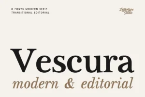
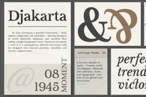
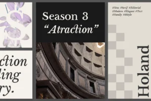
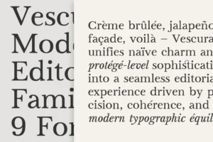
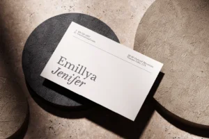
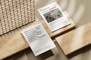
A refined editorial choice for brands that want to communicate sophistication through typography.
Gaprio Display
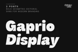
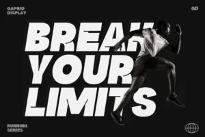
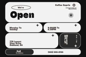
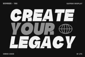
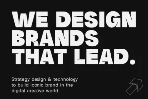

A distinctive display option for expressive headlines, creative identities, and visual systems that need a stronger typographic statement.
These typefaces demonstrate how different typographic personalities can work together. The most effective pairing depends on the brand’s positioning, intended audience, and visual direction.