Most people can tell when a brand looks premium.
But very few can explain why.
It’s not just the logo. Not the colors. Not even the layout.
More often than not, the difference comes down to something subtle—but powerful:
the font.
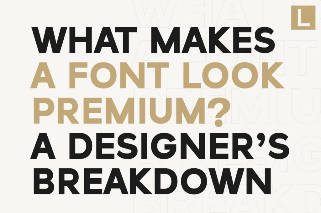
So what actually makes a font look premium?
Let’s break it down from a designer’s perspective.
1. Proportions That Feel Balanced (Not Mechanical)
A premium font doesn’t feel “constructed.”
It feels designed.
Look closely, and you’ll notice:
- Letter widths are carefully balanced
- Curves are smooth and intentional
- No character feels out of place
Low-quality fonts often rely on rigid, mechanical proportions.
Premium typefaces, on the other hand, are optically adjusted to feel natural.
This is what gives them a refined, effortless look.
2. Spacing That Breathes
Spacing is one of the most overlooked aspects of typography.
Yet it’s one of the biggest factors in perceived quality.
Premium fonts are designed with:
- Consistent kerning
- Comfortable letter spacing
- Even visual rhythm
When spacing is too tight or inconsistent, everything feels cramped and amateur.
Fonts like Raela Pro and Lenia Sans are carefully spaced to maintain clarity and balance—even in demanding branding scenarios.
3. Optical Correction (The Invisible Craft)
Here’s where most people don’t even realize what they’re seeing.
Premium fonts are not mathematically perfect—they are visually corrected.
For example:
- Circular shapes slightly overshoot the baseline
- Vertical strokes may appear thicker than horizontals
- Certain letters are subtly adjusted for balance
These micro-adjustments create harmony that your eye perceives instantly—even if you can’t explain it.
4. Consistency Across Characters
A font is not just a few nice letters—it’s a system.
Premium typefaces maintain:
- Consistent stroke weight
- Cohesive style across all glyphs
- Harmony between uppercase, lowercase, and numerals
This is especially important in branding, where the font needs to perform across different contexts.
Fonts like Naru Sans are designed with this system-level thinking, making them reliable across multiple use cases.
5. Character Without Overdesign
Here’s a subtle but important balance:
- Too neutral → feels generic
- Too expressive → feels gimmicky
Premium fonts sit in the middle.
They have:
- Enough personality to stand out
- Enough restraint to stay versatile
This balance is what allows a font to feel both distinctive and timeless.
6. Built for Real Use (Not Just Preview)
Many fonts look good in previews—but fall apart in real-world usage.
A premium font is tested across:
- Logos
- Websites
- Packaging
- Editorial layouts
It performs consistently, no matter the context.
This is why well-crafted typefaces from professional foundries are built with real application in mind—not just aesthetics.
Why This Matters More Than You Think
Typography is one of the fastest signals of quality.
Before people read your message, they feel your design.
A premium font communicates:
- Trust
- Professionalism
- Intentionality
While a poorly crafted one can instantly reduce perceived value, no matter how good the rest of your design is.
Final Thought
Premium typography isn’t about decoration.
It’s about precision.
It’s the result of hundreds of small decisions—spacing, proportions, corrections—that come together to create something that feels effortless.
And that’s exactly why it works.