A brand isn’t just a logo — it’s the entire visual language that tells your story. Typography plays one of the most critical roles in shaping that voice. Whether it’s your website, packaging, or social media, consistent type choices make your brand instantly recognizable. A mismatched font system, on the other hand, can weaken your credibility no matter how good your design looks.
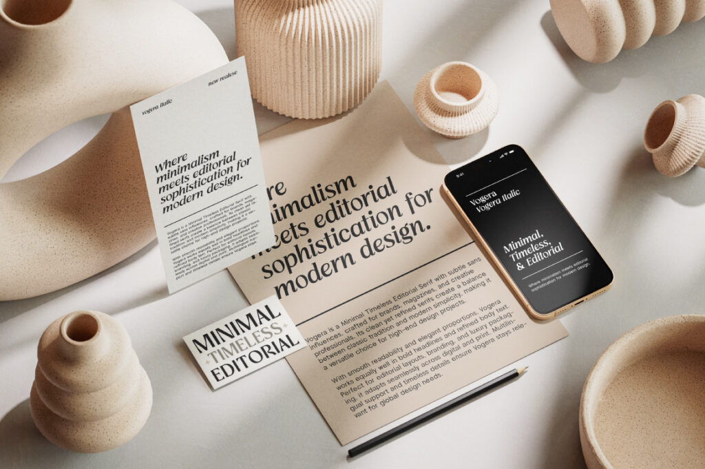
Building a cohesive typographic system starts with defining your brand personality. For instance, a modern tech company might rely on clean sans-serifs like Alvara Sans or Vogera, while an editorial or luxury brand could use elegant serifs like Cardival or Imperial Aureas. The key is consistency — not just in font choice, but in scale, spacing, and hierarchy.
Use the same headline and body font pairing across your materials, apply a defined color and weight system, and set clear type rules (like line heights, tracking, and emphasis styles). When your typography remains consistent, your audience begins to recognize your brand through type alone — even without seeing your logo.
Key Tips
✅ Define 2–3 core typefaces that reflect your brand tone.
✅ Create a type style guide (font sizes, colors, and use cases).
✅ Maintain consistent kerning and tracking across mediums.
✅ Use typography to emphasize emotion — not just readability.
✅ Regularly audit your design materials for type consistency.
Conclusion
Typography is your silent ambassador. It’s the visual glue that holds your brand together — across platforms, campaigns, and audiences. When you master typographic consistency, your brand’s message becomes not only seen but felt. In a world full of visual noise, harmony is the real differentiator.