
Choosing a font is not just about style—it’s about purpose. A typeface that works beautifully for branding and editorial identity may not perform well in fast-paced digital production, and vice versa. Understanding the difference between editorial fonts and digital fonts helps designers make smarter typographic decisions.
Below is a clear breakdown—followed by real examples—to help you choose the right typeface for your project.
What Are Editorial Fonts?
Editorial fonts are designed to communicate authority, elegance, and narrative depth. They are meant to live longer, build trust, and support storytelling across branding and publishing work.
They are commonly used in:
Brand identities
Editorial layouts
Long-form content
Premium visual systems
What Are Digital Fonts?
Digital fonts focus on speed, flexibility, and volume. They are built to perform across many formats, screen sizes, and repetitive layouts where efficiency matters more than expression.
They are commonly used in:
Web and UI design
Social media content
Presentations and templates
High-volume digital production
Real Examples: Editorial Fonts vs Digital Fonts
To make the difference clearer, here are real font examples based on how designers typically use them in practice.
📰 Editorial Fonts — Built for Identity & Storytelling

1. Vogera
Elegant, calm, and authoritative.
Best used for premium branding, magazines, and editorial headlines where trust and sophistication matter.

2. The Letter Editorial
Professional and highly readable.
Ideal for long-form articles, publishing layouts, and brand storytelling that prioritizes comfort and clarity.
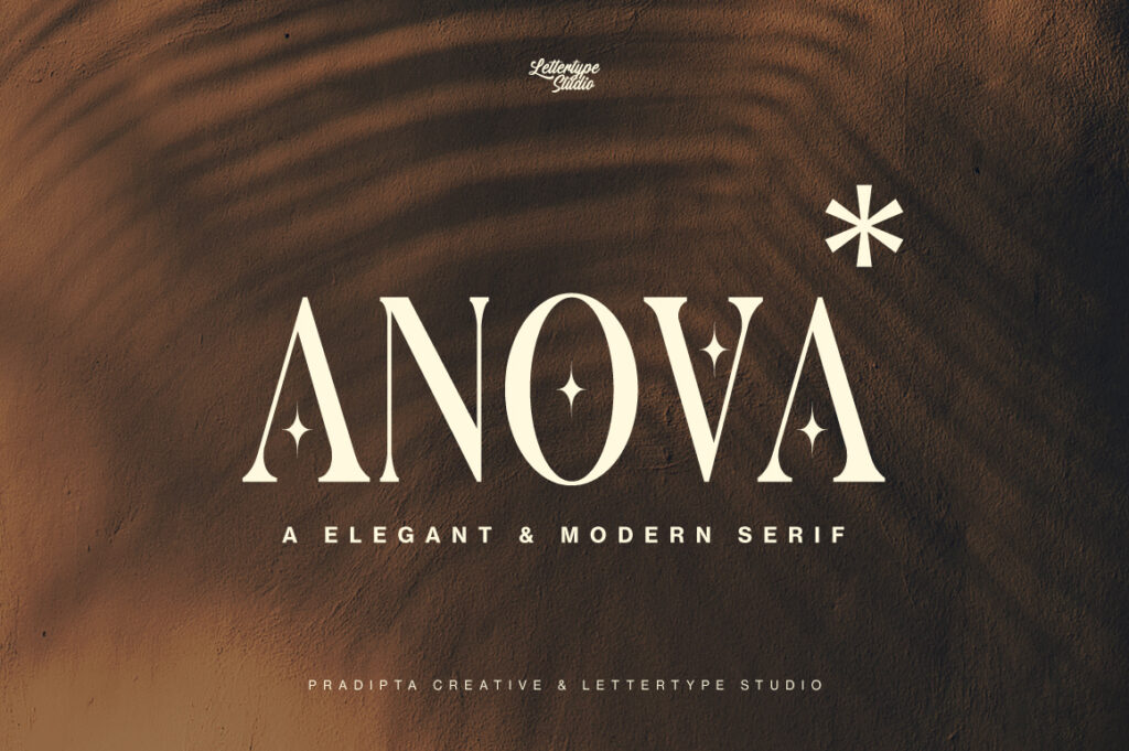
3. Anova
Modern serif with a clean presence.
Works well for contemporary branding that needs a balance between classic structure and modern tone.

4. Cirvia
Structured and system-oriented.
Often used in corporate branding and editorial systems that require consistency across many materials.
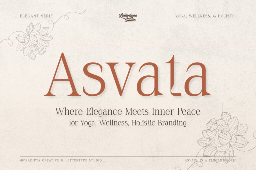
5. Asvata
Soft, calm, and mindful.
Perfect for boutique brands, wellness projects, and editorial visuals that rely on subtle elegance.
💻 Digital Fonts — Built for Speed & Versatility

6. Whoomp Extended Wide
Bold and attention-driven.
Used for posters, thumbnails, and digital headlines that need instant impact.

7. Somerun Extended Sans
Clean and adaptable.
A reliable choice for web layouts, presentations, and multi-format digital projects.

8. Reflow Sans
Neutral and highly readable.
Designed for UI, dashboards, websites, and corporate digital materials.

9. Written Capture
Expressive yet readable script.
Works well for social media content, quotes, and creative digital visuals.

10. Zolfiq Monoline Script
Simple, clean, and flexible.
Often used for logos, social graphics, and digital branding assets that need a modern handwritten touch.
How to Choose the Right Font for Your Project
Choose an editorial font when your project focuses on identity, storytelling, and long-term brand value.
Choose a digital font when speed, scalability, and multi-format output are the priority.
Professional designers often use both—editorial fonts for depth, and digital fonts for efficiency.
Final Thoughts
Great typography is not about finding one perfect font—it’s about choosing the right font for the right job. By understanding the difference between editorial and digital fonts, designers can build stronger systems, work faster, and create more consistent results.
A balanced font library allows creative work to move smoothly between expression and production, without compromise.