

Clean, modern design has become the visual backbone of contemporary branding, digital products, and editorial systems. At the center of this aesthetic lies one essential typographic choice: sans-serif fonts.
Sans-serifs are favored for their clarity, neutrality, and scalability. However, choosing the right sans-serif font goes beyond aesthetics—it requires understanding structure, proportion, usability, and long-term flexibility.
In this curated guide, we present 10 carefully selected sans-serif fonts from Lettertype Studio, ordered intentionally from foundational modern styles to system-ready and technical expansions. These fonts are built for designers who value clean design, professional performance, and timeless usability.
What Defines a Clean & Modern Sans-Serif Font?
A truly modern sans-serif font shares several key characteristics:
Balanced proportions and consistent rhythm
Open counters for strong legibility
Neutral tone with subtle personality
Reliable performance on screen and print
Scalability across branding systems
Modern typography is not about trends—it is about clarity, restraint, and function.
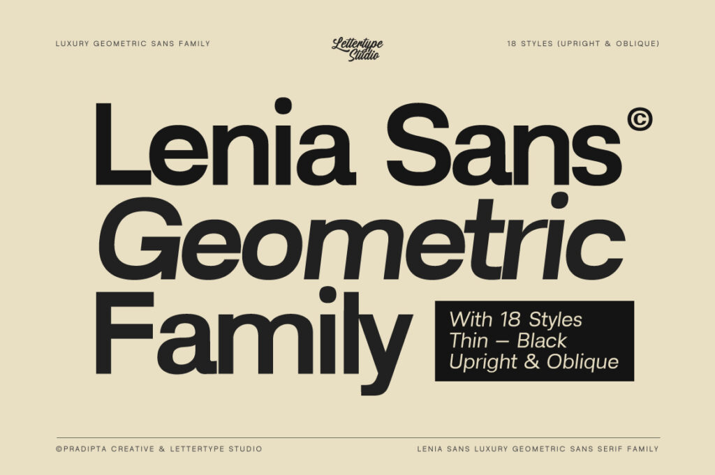
1. Lenia Sans — Contemporary Clean with Editorial Balance
Lenia Sans stands as a modern foundation font. Its clean construction and subtle softness create a calm, contemporary tone that works seamlessly across editorial and branding projects.
Why it works
Balanced geometry
Smooth reading flow
Clean but not sterile
Perfect for
Modern branding, editorial layouts, websites, and minimalist visual systems.

2. Reflow Sans — Digital-First and System-Ready
Reflow Sans is designed with scalability and performance in mind. Its neutral appearance and strong legibility make it ideal for digital products and content-heavy layouts.
Why it works
Optimized for screen readability
Consistent spacing system
Reliable at small sizes
Perfect for
Web platforms, UI design, dashboards, and digital publications.
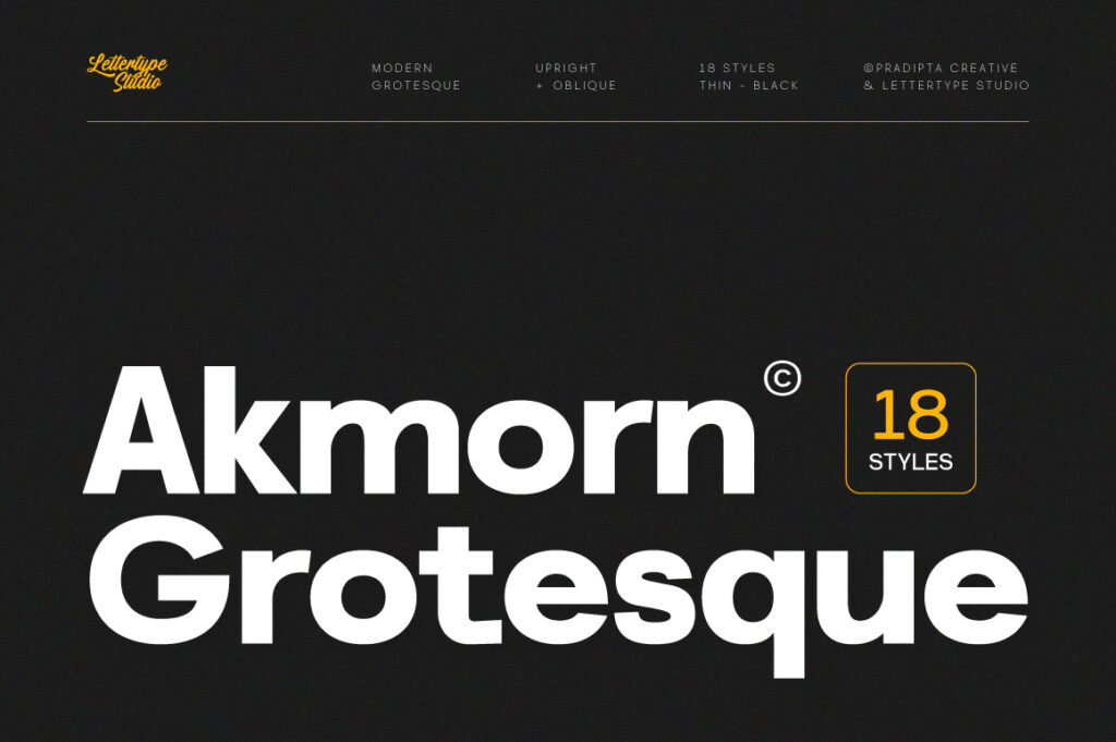
3. Akmorn Grotesque — Structured Modern Authority
Akmorn Grotesque brings a stronger grotesque influence with confident structure and professional presence. It adds authority while remaining clean and controlled.
Why it works
Strong vertical rhythm
Editorial-friendly proportions
Confident tone without heaviness
Perfect for
Corporate branding, modern editorial design, and headline systems.
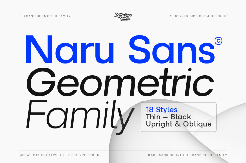
4. Naru Sans — Minimal, Efficient, and Functional
Naru Sans focuses on efficiency and clarity. Its disciplined construction makes it an excellent choice for interfaces and information-driven layouts.
Why it works
Highly legible at small sizes
Minimal visual noise
Clean information flow
Perfect for
UI/UX design, data-driven layouts, digital products, and documentation.

5. Kaluar — Clean Modern Sans with Distinctive Edge
Kaluar introduces a slightly more expressive tone while maintaining clean modern foundations. It adds character without compromising usability.
Why it works
Subtle personality
Modern humanist influence
Strong balance between form and function
Perfect for
Creative brands, modern identities, and contemporary editorial design.
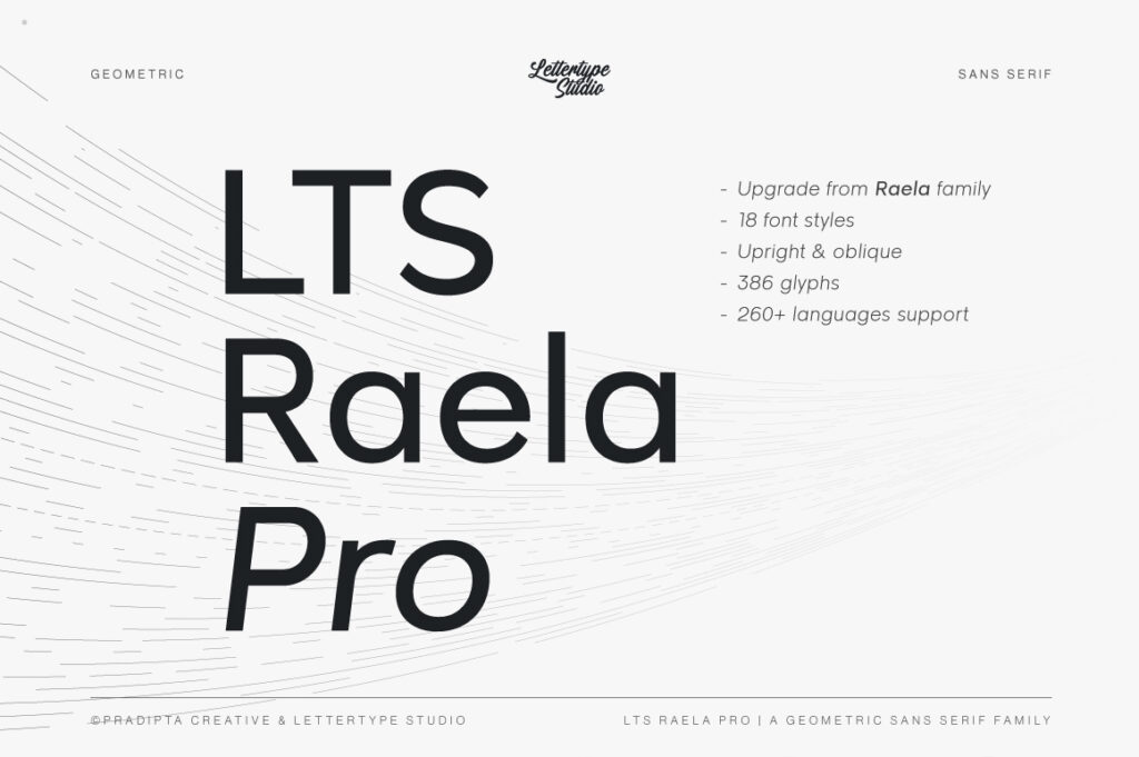
6. Raela Pro — Professional Neutral Sans
Raela Pro is designed for versatility. Its neutral appearance allows it to adapt across branding, editorial, and digital environments with ease.
Why it works
Clean professional tone
Excellent hierarchy across weights
Timeless usability
Perfect for
Brand systems, presentations, editorial layouts, and corporate communication.

7. Raela Grotesque — Editorial Expression with Control
Raela Grotesque expands the Raela family into a more expressive editorial direction while retaining modern restraint.
Why it works
Strong headline presence
Editorial-ready proportions
Modern but confident character
Perfect for
Magazines, campaigns, publishing layouts, and bold branding.

8. Kota Sans — Adaptable and Long-Term Clean Design
Kota Sans is built for adaptability. Its neutral construction makes it a dependable choice for long-term branding systems.
Why it works
Flexible across media
Clean typographic texture
Scales well across layouts
Perfect for
Corporate branding, websites, print systems, and long-term design projects.
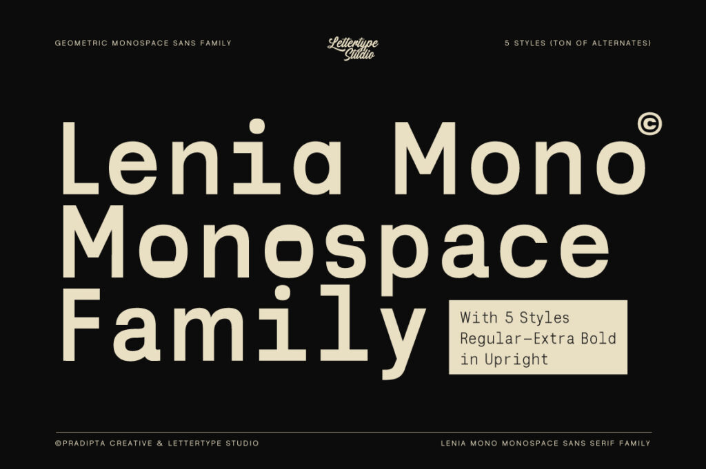
9. Lenia Mono — Clean Monospaced Modern Typography
Lenia Mono brings monospaced precision into modern design contexts while maintaining visual cleanliness.
Why it works
Clear mono structure
Modern proportions
Readable and aesthetic
Perfect for
Tech branding, code-related visuals, data layouts, and UI components.

10. Reflow Mono — Functional Mono for Digital Systems
Reflow Mono completes the system-ready spectrum with a functional, efficient monospaced design built for digital environments.
Why it works
Optimized for screens
Consistent spacing
System-friendly design
Perfect for
Dashboards, developer tools, technical interfaces, and digital platforms.
How to Choose the Right Sans-Serif Font
When selecting a sans-serif font for modern design, consider:
Primary usage (branding, UI, editorial)
Reading distance and scale
Tone (neutral, friendly, authoritative)
Long-term scalability
A good sans-serif font should support the design without drawing unnecessary attention.
Final Thoughts
Clean, modern typography is built on intention, not trends. The ten sans-serif fonts above represent a curated spectrum—from editorial foundations to system-ready and technical applications.
By choosing thoughtfully designed typefaces, designers can create visual systems that remain clear, professional, and relevant for years to come.