
A law firm needs to communicate confidence before a client ever walks through its doors. From the firm’s website and business cards to legal documents, proposals, and office signage, every visual detail contributes to the first impression.
Typography plays an especially important role because legal branding depends heavily on credibility. A carefully selected typeface can make a firm feel established, professional, trustworthy, and authoritative without making the identity feel outdated or overly formal.
For modern law firms, the challenge is finding typography that balances tradition with contemporary professionalism.
Why Typography Matters in Legal Branding
Choosing a lawyer or legal consultancy is rarely an impulsive decision. Clients want to feel confident that the people representing them are experienced, reliable, and capable of handling important matters.
Branding helps establish that confidence before the first consultation.
Typography contributes to that perception through qualities such as:
- Trust
- Authority
- Professionalism
- Stability
- Experience
- Attention to detail
The strongest legal identities don’t necessarily need to look intimidating. A refined typeface combined with a clean visual system can create authority while remaining approachable.
Recommended for Established Legal Brands
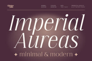
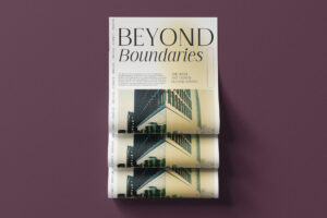
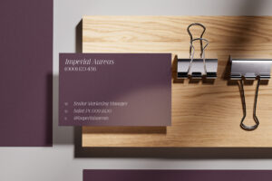
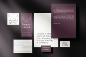
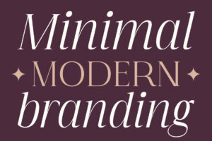

Imperial Aureas brings a sense of prestige and authority to a legal identity, making it a strong direction for established law firms, private practices, and professional services brands looking for a more distinguished visual presence.
What Makes a Good Law Firm Font?
Legal branding needs typography that can survive years of use.
Unlike fashion or lifestyle brands that may refresh their identity frequently, a law firm’s visual identity often needs to remain credible for a much longer period.
A strong legal typeface should offer:
- Clear readability
- Refined proportions
- Professional character
- Strong visual hierarchy
- Timeless appeal
- Flexibility across print and digital
Typography should also work comfortably with long firm names, practice-area descriptions, and professional documentation.
Recommended for Classic Legal Branding
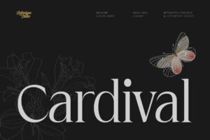


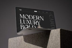

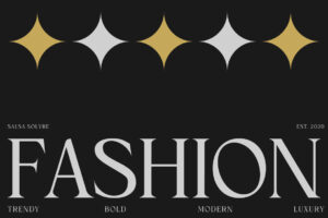
Cardival offers a sophisticated editorial character that can bring a polished, established feeling to law firm identities, stationery, professional presentations, and premium corporate communications.
Serif Typography and Legal Authority
Serif typography has long been associated with institutions, publishing, academia, and established professional organizations.
That connection makes serif fonts particularly effective for legal branding. Their structured letterforms can communicate heritage and authority while still feeling contemporary when combined with modern layouts.
The key is balance.
A legal identity shouldn’t look like it belongs to another century. Instead, typography should preserve the credibility associated with traditional serif design while presenting it through a cleaner and more contemporary visual system.
Recommended for Contemporary Legal Identities



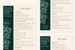

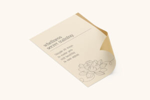
Asvata offers a more contemporary direction for firms that want professional typography without relying on an overly traditional aesthetic. It can work particularly well for modern practices, specialist firms, and legal consultancies targeting contemporary businesses.
Typography Across Every Legal Touchpoint
A law firm’s typography needs to work far beyond its logo.
It may appear across:
- Website headings
- Business cards
- Legal stationery
- Proposals
- Presentations
- Office signage
- Reports
- Client communications
- Social media
- Printed publications
When the same typography is consistently applied across these touchpoints, the brand feels more established and intentional.
A strong typography system also helps transform individual documents into recognizable brand assets.
Recommended for Legal Publications
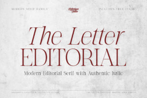
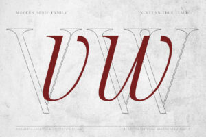
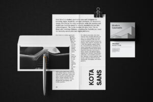
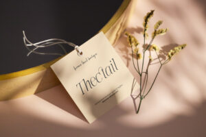

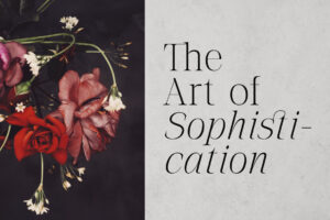
The Letter Editorial is particularly suited to firms that invest heavily in thought leadership, publications, legal journals, reports, and long-form content. Its editorial character can give professional publications a more distinctive and considered visual identity.
Modern Law Firms Need Modern Typography
Legal branding is changing.
Today’s firms work across technology, intellectual property, corporate transactions, real estate, international business, creative industries, and emerging sectors. Their clients are often startups, global companies, entrepreneurs, and modern professionals.
That means a law firm doesn’t necessarily need to look traditional to appear credible.
A contemporary typeface can preserve professionalism while making the firm feel more relevant to its audience.
Recommended for Distinctive Legal Branding
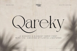





For firms looking for a more individual visual personality, Qareky offers a distinctive direction that can help a specialist practice stand apart from conventional corporate legal identities.
Used thoughtfully, a more characterful typeface can make a firm’s branding memorable without sacrificing professionalism.
Typography for Boutique Law Firms
Not every legal practice needs the visual language of a large corporate firm.
Boutique practices often benefit from branding that feels more personal, sophisticated, and approachable. Their typography can communicate expertise while introducing enough personality to differentiate the firm.
This is particularly relevant for firms working in:
- Intellectual property
- Creative industries
- Technology
- Fashion
- Entertainment
- Private clients
- Specialist consultancy
Recommended for Modern Boutique Firms
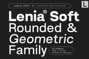
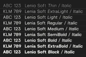
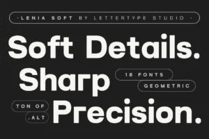


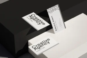
One interesting option is Lenia Soft, LTS’s newer release. Its softer contemporary character can help a boutique legal brand feel cleaner and more approachable than conventional legal typography.
It can work especially well for modern legal consultancies, intellectual property practices, creative-industry lawyers, and firms that want to appeal to contemporary businesses without losing professionalism.
Choosing the Right Font for a Law Firm
The best law firm font depends on the firm’s positioning, clientele, and personality.
Before selecting a typeface, consider:
- Does it communicate trust?
- Does it feel established without looking outdated?
- Is it readable across digital and print applications?
- Can it accommodate a long firm name?
- Does it work with formal documents as well as marketing?
- Will it still feel appropriate ten years from now?
Longevity matters particularly in legal branding. A visual identity should be able to grow with the firm rather than require frequent redesigns.
Building Trust Through Consistent Typography
Typography cannot replace legal expertise, but it can reinforce the perception of professionalism.
A cohesive visual system makes every client interaction feel intentional. From the first website visit to a printed proposal, consultation document, or office sign, consistent typography creates familiarity and confidence.
This becomes especially important when several firms offer similar services.
A distinctive but professional typography system gives clients another reason to remember the brand.
Conclusion
A successful law firm identity needs to communicate trust, authority, and professionalism while remaining relevant to the people it serves. Typography is one of the most effective tools for achieving that balance.
The right law firm branding font can make a practice feel established without appearing outdated, sophisticated without being intimidating, and distinctive without sacrificing credibility.
Whether you’re building a traditional practice, a boutique legal consultancy, or a modern specialist firm, professionally crafted typography can become a long-term asset for your visual identity.
Explore the premium typeface collection from Lettertype Studio for serif and editorial fonts designed for sophisticated branding, professional identities, and premium visual communication.
Featured Fonts from Lettertype Studio
- Imperial Aureas — Prestige-focused serif for established legal identities and premium professional branding.
- Cardival — Sophisticated editorial serif for polished corporate and legal communication.
- Asvata — Contemporary serif direction for modern law firms and specialist practices.
- The Letter Editorial — Editorial typography for legal publications, reports, and thought leadership.
- Qareky — Distinctive serif character for boutique and specialist legal identities.
- Lenia Soft — Contemporary and approachable typography for modern legal consultancies and creative-industry practices.