
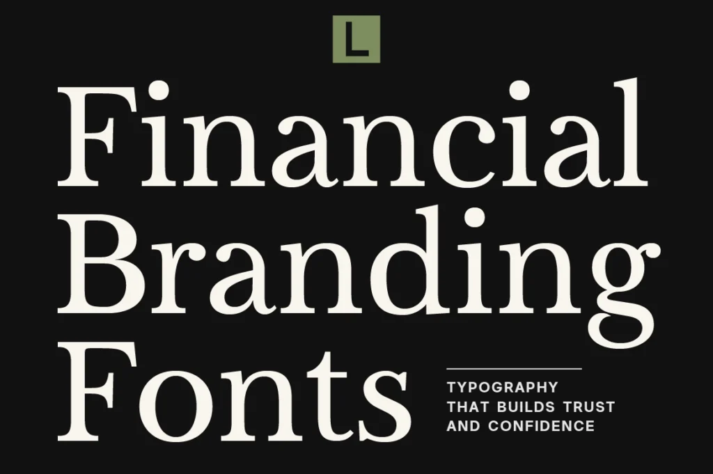
Financial brands operate in a world where trust matters. Whether it’s a bank, investment firm, wealth management company, fintech platform, or financial consultancy, customers need to feel confident that their money and decisions are in reliable hands.
Branding plays an important role in creating that confidence. A company’s website, reports, presentations, advertisements, and digital products all contribute to how professional and dependable the business feels.
Typography sits quietly at the center of that visual system.
The right financial branding font can communicate stability, intelligence, precision, and confidence while helping a financial company establish a recognizable identity in an increasingly competitive market.
Why Typography Matters in Financial Branding
People rarely choose a financial service based on aesthetics alone. However, visual presentation can strongly influence how credible and trustworthy a company feels.
A professional financial identity should communicate:
- Trust
- Stability
- Expertise
- Precision
- Confidence
- Long-term value
Typography helps establish these qualities before a customer ever speaks with an advisor or opens a financial application.
A strong typeface can make a company feel established without appearing outdated, while contemporary typography can make a traditional industry feel more accessible.
Recommended for Modern Financial Brands






Anova offers a refined contemporary character that works well for financial companies looking to balance professionalism with a modern visual identity. Its clean presence makes it suitable for fintech brands, financial consultancies, investment platforms, and contemporary corporate identities.
What Makes a Good Financial Branding Font?
Financial brands need typography that can function across many different applications.
A strong financial typeface should offer:
- Excellent readability
- Clear hierarchy
- Professional proportions
- Consistent visual character
- Strong digital performance
- Flexibility across print and screen
Unlike a campaign typeface used for a single advertisement, financial branding typography may appear everywhere from annual reports to mobile interfaces.
Consistency therefore becomes one of the most important considerations.
Recommended for Institutional Branding
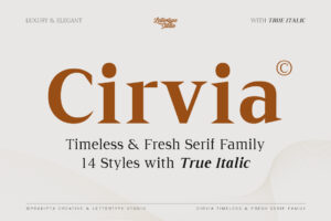





Cirvia brings a more premium and established personality to financial branding. Its sophisticated character makes it particularly suited to wealth management firms, investment companies, private financial services, and brands where authority and exclusivity are important.
Serif Typography and Financial Heritage
Traditional financial institutions often use typography associated with publishing, academia, and established organizations.
This connection makes refined serif typography particularly effective for private banking, investment management, and professional financial services.
Serifs can create a sense of heritage and authority without requiring a traditional-looking identity. When combined with modern layouts, generous spacing, and restrained color palettes, they can feel surprisingly contemporary.
Recommended for Premium Financial Communication

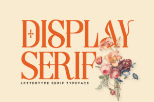
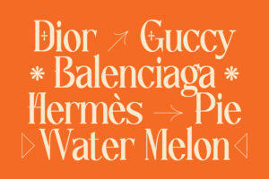



Lettertype offers a refined typographic personality that works beautifully for corporate identities, financial reports, advisory firms, and premium business communication where sophistication needs to remain understated.
Modern Finance Needs Modern Typography
The financial industry has changed dramatically.
Fintech platforms, digital banking, investment applications, and financial technology companies have introduced a more contemporary visual language.
These brands often need to appear:
- Accessible
- Intelligent
- Innovative
- Reliable
- Digital-first
That creates a different typography challenge.
A fintech brand needs to feel modern enough to appeal to digital audiences while still communicating the seriousness expected from financial services.
Recommended for Fintech & Digital Finance

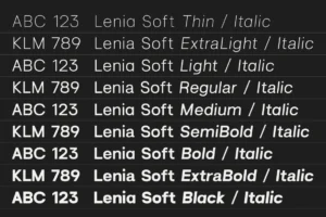




Lenia Soft brings a softer contemporary character that can make financial branding feel more approachable and human. It works particularly well for fintech platforms, digital financial products, modern consultancies, and brands that want to move away from overly rigid corporate typography.
As a recent Lettertype Studio release, it also offers a fresh alternative for financial brands looking to establish a more distinctive visual identity.
Editorial Typography for Financial Content
Financial companies produce enormous amounts of information.
Annual reports, investment insights, market commentary, newsletters, research papers, and thought-leadership content all need clear visual hierarchy.
Typography can transform dense information into something easier and more engaging to read.
Recommended for Financial Editorials
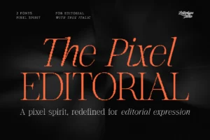




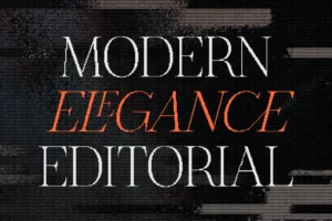
The Pixel Editorial brings an editorial character with a more contemporary visual direction, making it an interesting option for fintech publications, investment newsletters, financial media, digital reports, and brands combining finance with technology.
Precision, Data, and Financial Communication
Financial branding isn’t only about looking trustworthy. It also needs to communicate precision.
Numbers, charts, financial statements, projections, and analytical content require typography that can support structured information without becoming visually overwhelming.
This is where a more distinctive serif can create an interesting balance between personality and precision.
Recommended for Analytical Finance Brands






Coefficient has a naturally analytical feel that makes it particularly interesting for investment platforms, financial research brands, data-driven consultancies, and companies where numbers and analysis sit at the center of the brand experience.
Choosing the Right Font for a Finance Brand
Every financial company has a different audience.
A private wealth management firm may need to communicate exclusivity and heritage, while a fintech startup might prioritize accessibility and innovation.
Before choosing typography, consider:
- Who is the primary audience?
- Does the font communicate trust?
- Does it work equally well on screen and in print?
- Can it handle information-heavy layouts?
- Does it feel modern enough for the company’s future?
- Will it remain relevant as the company grows?
The best financial branding font should support both the emotional and practical sides of communication.
Building Trust Through Typography
Financial services depend heavily on credibility.
A cohesive visual identity helps reinforce that credibility by making every interaction feel intentional. When customers see consistent typography across a website, report, presentation, and physical environment, the company feels more established.
Typography alone cannot create trust, but it can support the visual signals that make a financial brand feel professional and dependable.
This becomes especially valuable for newer companies competing against established institutions.
A distinctive typography system can help a young financial company appear confident without pretending to be something it isn’t.
Conclusion
Financial branding requires a careful balance between trust and innovation. Typography that feels too traditional can make a modern financial company appear outdated, while typography that is too experimental may weaken the sense of reliability customers expect.
The right financial branding font creates a visual identity that feels confident, professional, and appropriate for its audience.
Whether you’re building a private wealth management firm, fintech platform, investment company, financial consultancy, or research-driven financial brand, thoughtfully selected typography can strengthen every part of the customer experience.
Explore the premium typeface collection from Lettertype Studio for professionally crafted serif and editorial fonts designed for sophisticated branding, corporate communication, digital experiences, and premium visual identities.
Featured Fonts from Lettertype Studio
- Anova — Contemporary typography for modern finance, fintech, and professional services.
- Cirvia — Premium character for wealth management and institutional financial brands.
- Lettertype — Refined typography for advisory firms, reports, and corporate communication.
- Lenia Soft — Approachable contemporary typography for digital-first financial brands.
- The Pixel Editorial — Editorial direction for fintech publications and financial media.
- Coefficient — Analytical character for investment, research, and data-driven financial brands.