
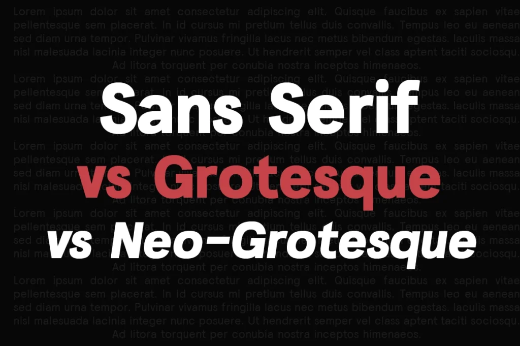
Understanding Sans Serif Categories
Sans serif is a broad classification of typefaces without serifs, designed for clarity, modernity, and versatility. Within this category, grotesque and neo-grotesque represent two historically and structurally distinct families that influence how a typeface feels in branding, editorial, and digital environments.
For designers and brands, understanding these distinctions helps in choosing typefaces that align with visual identity, brand personality, and usability requirements.
What Is a Grotesque Typeface?
Grotesque typefaces emerged in the late 19th and early 20th centuries as early sans serif designs. They often feature:
- Slightly irregular proportions
- Industrial, pragmatic shapes
- Human and mechanical tension in letterforms
Grotesques feel utilitarian, trustworthy, and corporate—making them a popular choice for institutional branding and professional systems.
What Is a Neo-Grotesque Typeface?
Neo-grotesque typefaces appeared in the mid-20th century, refining grotesque principles with more uniformity and neutrality. Key characteristics include:
- Consistent stroke widths
- Balanced proportions
- Minimal personality for universal usability
Neo-grotesques are widely used in global corporate identities, technology companies, and digital interfaces due to their neutrality and scalability.
Modern Sans Serif: Beyond Historical Categories
Contemporary sans serif families often blend geometric, grotesque, and humanist influences. Modern type foundries design hybrid systems that balance neutrality with character, optimized for both branding and UI environments.
Lettertype Studio’s modern sans serif families are designed with this hybrid philosophy—combining professional neutrality with distinctive design details.
When to Use Each Category
Sans Serif (General):
- Versatile for branding, editorial, and digital use
- Suitable when broad flexibility is required
Grotesque:
- Corporate branding
- Professional editorial systems
- Institutional and financial identities
Neo-Grotesque:
- Tech companies and SaaS platforms
- UI and digital products
- Global corporate identity systems
Lettertype Studio Perspective: Choosing Like a Foundry
Professional type foundries evaluate more than aesthetics. Key factors include:
- Optical consistency across sizes
- Family depth (weights, styles, widths)
- Performance in digital rendering
- Brand narrative and visual positioning
Selecting between grotesque, neo-grotesque, or modern sans serif should align with long-term brand strategy, not just visual trends.