
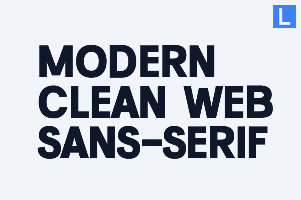
Introduction — Why Web Design Depends on Sans Serif Typography
Modern web design is built on clarity, usability, and speed. Every interface element — from navigation menus to hero headlines — relies on typography to guide user behavior and communicate brand tone.
Sans serif fonts have become the dominant typographic choice in digital environments because of their clean construction and screen-friendly legibility. Unlike serif fonts, which can lose clarity at smaller sizes, sans serifs maintain readability across responsive layouts and high-density displays.
For designers and brands, choosing the right sans serif font isn’t just an aesthetic decision — it directly impacts user experience, accessibility, and conversion performance.
Below are key sans-serif categories widely used in modern web design systems, along with examples suitable for digital branding.
UI-Optimized Sans Serif — Built for Interfaces
UI typography requires precision. Fonts used in dashboards, mobile apps, and SaaS platforms must remain legible at small sizes while supporting complex hierarchies.
Characteristics of UI-optimized sans serifs include:
• High x-height for readability
• Open apertures
• Neutral letterforms
• Consistent stroke weight
These fonts ensure clarity in buttons, labels, and dense information layouts.
Examples: Vynce Sans, Cirvia, Alvara Sans, Reflow Sans, Prolinea
Startup & Tech Sans — Innovation-Driven Tone
Technology brands often lean toward geometric sans serifs because of their structured, futuristic appearance. These fonts visually communicate innovation, efficiency, and forward thinking.
Geometric web fonts work especially well for:
• SaaS landing pages
• AI platforms
• Web3 products
• Fintech startups
Their mathematical construction creates a sense of precision and digital sophistication.
Examples: Glass Edge, Vynce Sans, Raela, Davigo, Alvara Sans
Corporate Web Sans — Professional Platforms
Not all web typography needs to feel futuristic. Corporate and enterprise websites require neutrality, trust, and authority.
Corporate web sans serifs are typically more restrained, focusing on balance rather than stylistic expression. They’re commonly used in:
• Consulting firms
• Financial institutions
• B2B platforms
• Government websites
These fonts ensure professionalism while maintaining strong readability across long-form web content.
Examples: Naru Sans, Lenia Sans, Raela Grotesque, Kota Sans, Akmorn Grotesque
Editorial Web Sans — Brand-Led Experiences
For portfolio sites, fashion brands, and creative studios, typography becomes part of the visual storytelling.
Editorial sans serifs emphasize elegance, spacing, and refined proportion — making them ideal for high-impact headlines and hero sections.
They’re often used in:
• Agency websites
• Luxury brands
• Fashion labels
• Creative portfolios
These fonts bring personality without sacrificing modern clarity.
Examples: Serelia, The Letter Editorial, Imperial Aureas, Asvata, Cardival
Performance Considerations in Web Typography
Choosing a font for web design isn’t only about style — performance matters.
Here are key technical factors designers should evaluate:
1. Webfont Load Speed
Heavy font files can slow down page performance. Optimized font families improve loading times and SEO rankings.
2. Weight Versatility
Multiple weights allow designers to build hierarchy without switching typefaces.
3. Responsive Rendering
Fonts must remain legible across screen sizes — from widescreen monitors to mobile devices.
4. Accessibility Compliance
Clear letterforms improve readability for users with visual impairments.
A well-engineered sans serif font supports both aesthetics and technical efficiency.
How Brands Use Sans Serif Typography Online
Many modern brands are simplifying their web typography systems. The shift toward minimal sans serif branding reflects the need for:
• Faster loading interfaces
• App-friendly design systems
• Global readability
• Cross-platform consistency
From tech giants to boutique studios, clean sans serif typography has become the universal language of digital branding.
Final Thoughts
Modern web design demands typography that performs as beautifully as it looks. Sans-serif fonts provide the clarity, scalability, and neutrality required for digital environments.
Whether used in UI systems, startup branding, or editorial websites, a well-chosen sans serif font ensures that content remains accessible, professional, and visually cohesive across every digital touchpoint.