1️⃣ Introduction — The Secret Language of Type Pairing
Mixing fonts can make or break a design.
A well-balanced pairing helps communicate tone and hierarchy effortlessly, while a poor one can confuse or overwhelm the viewer.
Whether you’re creating a logo, packaging, or editorial layout, mastering font pairing is one of the most powerful visual skills a designer can learn.
2️⃣ Understanding Contrast and Harmony
The best font pairs work because they complement, not compete.
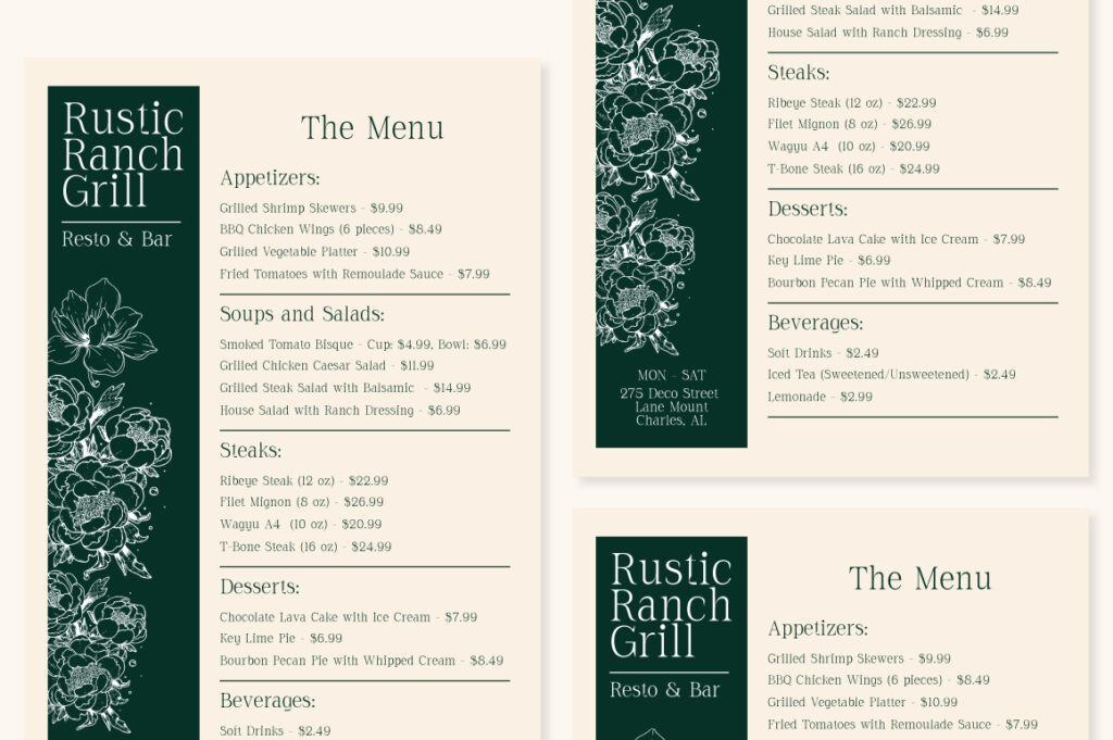
Combine serif + sans serif for a timeless balance (e.g., Cardival with Raela Grotesque).
Pair display + sans to let headlines shine and body text stay readable.
Contrast keeps things interesting — but too much contrast can feel chaotic. The trick is to aim for controlled variety.
3️⃣ Establishing Visual Hierarchy
Fonts guide the reader’s eye.
Use size, weight, and spacing to signal importance.
Let your heading font be expressive, but keep supporting text functional.
Example: A bold display like Chocho Aura grabs attention, while a geometric sans like Alvara Sans keeps content clean and legible.
Remember: Hierarchy = readability + rhythm.
4️⃣ Avoiding Common Pairing Mistakes
Some pairings fail because they’re too similar (e.g., two geometric sans-serifs).
Others fail because they fight for attention (e.g., both decorative).
Avoid overusing fonts with too many stylistic quirks or mixed moods.
Always test your combo across different sizes and mediums — what looks good in a logo might not work in a website paragraph.
5️⃣ Expert Pairing Examples from Lettertype Studio
You can highlight your LTS fonts here:
- Nalte Sans + Lenia Mono → minimal modern
- Cardival + Raela Grotesque → editorial elegance
- Lenia Sans + Bitroad → tech meets creative
- Alvara Sans + Imperial Aureas → corporate meets luxury
Each pairing showcases how contrast and cohesion create emotional clarity in design.
6️⃣ Conclusion — When Fonts Work Together, Stories Flow Better
Typography pairing is visual chemistry.
When fonts support each other, your message feels unified and memorable.
Treat every font combo like a conversation — one speaks, the other listens.
The result? A design that looks professional, intentional, and emotionally on point.
Explore premium font pairings and find your perfect match at Lettertype Studio.

