1. More Than Just Letters
Typography is more than an aesthetic decision — it’s a psychological tool that shapes how people perceive your brand. The curves, spacing, and structure of each letter carry meaning long before a single word is read. A sleek sans serif can feel modern and precise, while a classic serif exudes heritage and trust. Every brand message, from a minimalist tech logo to a warm bakery sign, begins with a subconscious emotional cue driven by typography.
Fonts don’t just tell your story — they become your story. When a typeface aligns with your visual tone and values, it communicates authenticity and creates a lasting emotional impression.
2. Emotional Impact of Typeface Categories
Each font category has a unique psychological footprint that influences how your audience feels:
Sans Serif: clean, modern, and confident. Perfect for brands that value clarity, simplicity, and innovation.
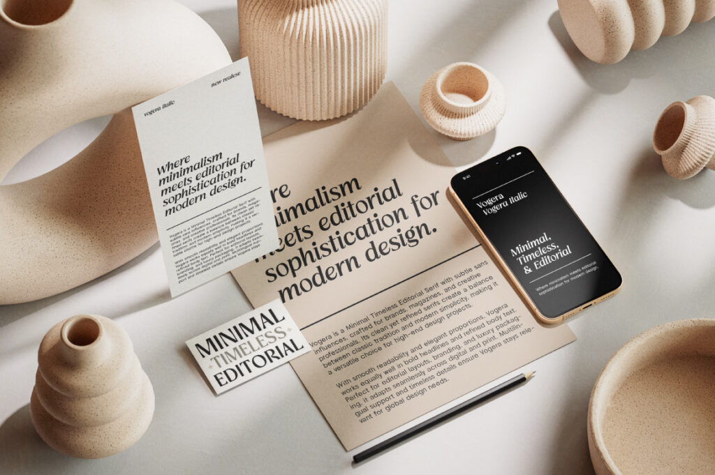
Serif: sophisticated, credible, and timeless. Great for luxury, editorial, and corporate identities.
Display: bold, expressive, and creative — ideal for making strong first impressions.
Script: personal, human, and emotional. Perfect for lifestyle, boutique, or artistic brands.
Monospace: technical, structured, and precise. Common in tech, coding, and utilitarian design.
At Lettertype Studio, fonts like Raela Grotesque (sans), Cardival (serif), Chocho Aura (display), and Naru Mono (monospace) are designed to evoke these distinct emotional tones while staying versatile for real-world branding.
3. How Brands Leverage Font Psychology
Typography plays a silent but powerful role in shaping brand trust and recognition.
Tech companies often rely on geometric sans serifs such as Alvara Sans to signal efficiency and stability.
Editorial or beauty brands lean toward high-contrast serifs like Imperial Aureas for their graceful sophistication.
Food and creative industries might embrace expressive displays like Chocho Aura to capture warmth and playfulness.
When chosen intentionally, typography reinforces a brand’s personality without saying a word — it becomes a visual handshake that sets the tone for every interaction.
4. Choosing the Right Font for Your Brand
Selecting a font isn’t just about what looks good — it’s about what feels right.
Start by defining your brand values and personality: is it minimalist or expressive, modern or classic?
From there, narrow your font choice by testing how it performs across different touchpoints — web, packaging, or signage.
Avoid chasing trends; instead, find fonts that align with your brand’s long-term identity.
When typography and meaning work hand-in-hand, your brand communicates effortlessly. The right typeface can turn a name into an emotion — and an audience into believers.
5. Conclusion
Typography is silent storytelling. It speaks through weight, rhythm, and proportion — defining how your brand makes people feel. The next time you choose a font, think beyond aesthetics: think psychology, tone, and message. Because in branding, every curve counts.
Discover 90+ carefully crafted typefaces at Lettertype Studio — each designed to give your brand a unique emotional voice.