

Choosing a font for a brand identity can seem simple at first. Browse a font library, find something that looks good, and use it for the logo, website, packaging, and social media.
In practice, choosing the right typeface is much more complicated.
Typography influences how people perceive a brand before they consciously process the words themselves. A geometric sans serif can feel modern and structured. A serif can feel established and sophisticated. A handwritten typeface can feel personal and expressive. A bold display font can communicate confidence and energy.
This means the best font for a brand is not necessarily the most beautiful font.
It is the font that communicates the right personality, works across the brand’s applications, and remains useful as the business grows.
If you are wondering how to choose a font for your brand, this guide will walk through the most important considerations, from brand personality and audience to readability, versatility, and typography systems.
Start With Brand Personality
Before opening a font library, define the personality of the brand.
Ask what the brand should feel like when someone encounters it for the first time.
Should it feel:
- Modern or traditional?
- Premium or accessible?
- Serious or playful?
- Minimal or expressive?
- Technical or human?
- Bold or understated?
- Elegant or energetic?
These characteristics create a starting point for choosing typography.
For example, a luxury fashion brand may need refined serif typography with sophisticated proportions. A technology startup might prefer a contemporary sans serif that feels precise and efficient.
A children’s lifestyle brand could benefit from softer, more expressive lettering.
There is no universally correct category.
The correct choice depends on what the brand needs to communicate.
Understand the Difference Between Font and Typeface
The terms “font” and “typeface” are often used interchangeably, especially in everyday design conversations.
Technically, a typeface refers to the overall design system, while a font traditionally refers to a specific style or instance within that system.
For branding, however, the distinction is less important than understanding the structure of the family you are choosing.
A type family may include:
- Regular
- Medium
- Semibold
- Bold
- Black
- Italic
- Condensed
- Extended
- Variable styles
A broader family gives designers more flexibility when developing a complete brand identity.
Consider the Industry
Industry should influence your typography decision, but it should not dictate it completely.
Some visual conventions are useful because they help audiences understand what kind of business they are interacting with.
Financial companies often use typography that communicates stability and professionalism.
Fashion brands frequently use high-contrast serifs or refined display typography.
Technology brands often favor clean sans serifs.
Hospitality brands may use typography with warmth and personality.
However, following industry conventions too closely can make a brand look interchangeable.
The strongest identities usually understand the visual language of their category while introducing something distinctive.
Think About Your Target Audience
A brand does not choose typography for itself.
It chooses typography for the people it wants to reach.
Consider the audience’s expectations, preferences, age, cultural context, and familiarity with the category.
A typeface that feels sophisticated to one audience may feel distant or old-fashioned to another.
Likewise, an experimental display typeface may feel exciting to a creative audience but confusing in a highly technical environment.
The question should therefore not simply be:
“Do I like this font?”
Ask:
“Will this typography communicate effectively with the people this brand is trying to reach?”
That change in perspective can dramatically improve the selection process.
Choose the Right Typography Category
Once the personality and audience are clear, start narrowing down the type category.
Sans Serif
Sans serif typefaces are often associated with modernity, simplicity, clarity, and efficiency.
They are especially useful for:
- Technology
- Digital products
- Contemporary retail
- Creative studios
- Corporate branding
- Lifestyle brands
A good sans serif can also serve as the foundation for an entire identity system because it tends to perform well across digital and print applications.
Serif
Serif typefaces can introduce sophistication, tradition, authority, and editorial character.
They are frequently effective for:
- Fashion
- Luxury
- Publishing
- Beauty
- Hospitality
- Premium products
Modern serif typography does not necessarily feel traditional. Contemporary serif designs can be highly expressive while still maintaining a sophisticated appearance.
Display Fonts
Display typefaces are designed to attract attention.
They can be excellent for logos, campaign headlines, packaging, posters, and other large-scale applications.
However, display fonts are usually more specialized than general-purpose text families.
This means they often work best as part of a larger system rather than being used everywhere.
Script and Handwritten Fonts
Script fonts can introduce personality, craftsmanship, intimacy, or a sense of human touch.
They can work particularly well for:
- Personal brands
- Fashion
- Beauty
- Lifestyle
- Wedding businesses
- Boutique products
Because their personalities are often strong, restraint is important.
A script typeface may be perfect for a logo while being inappropriate for paragraphs of body text.
Test the Font With the Actual Brand Name
One of the most important steps in choosing brand typography is also one of the easiest to overlook.
Do not judge a font using random sample text alone.
Type the actual brand name.
This allows you to see how the specific letter combinations interact.
Pay attention to:
- Capital letters
- Repeated characters
- Letter spacing
- Word width
- Ascenders and descenders
- Character rhythm
- Overall silhouette
A typeface can look beautiful in a specimen but behave completely differently when used with your actual brand name.
This is particularly important when designing a wordmark.
Look at the Logo as a Shape
A logo is not only a collection of letters.
It is also a visual shape.
When choosing logo typography, temporarily stop reading the word and look at it as a graphic composition.
Does it feel balanced?
Is the wordmark too wide?
Are some letters visually heavier?
Does the spacing create awkward gaps?
Does the overall silhouette feel distinctive?
This is where typography moves from simple font selection into identity design.
Check the Font’s Personality at Different Sizes
A font can look excellent at 100 pixels and fail completely at 12 pixels.
Brand typography needs to work across multiple scales.
Test the typeface in:
- Logo
- Website headline
- Navigation
- Body copy
- Social media graphics
- Packaging
- Business cards
- Presentations
- Signage
This is particularly important for modern brands that exist across both physical and digital environments.
A typeface with strong display character may become the hero of the identity while a more readable family handles smaller communication.
Evaluate the Complete Family
When selecting brand identity fonts, do not only look at the regular style.
Look at the complete family.
Ask:
Does it have enough weights?
Does it include italics?
Are the heavier weights still attractive?
Does the family maintain its character across different styles?
Can the typography create hierarchy without requiring several unrelated typefaces?
A family with multiple useful styles can make a brand system much easier to maintain.
Check Multilingual Support
This is especially important for brands operating internationally.
If a brand may eventually communicate in multiple languages, check the typeface’s character coverage before committing to it.
Depending on the market, you may need support for accented Latin characters or additional writing systems.
Changing the brand font later because of missing characters can create unnecessary redesign work.
A good branding decision considers future expansion rather than only today’s requirements.
Don’t Choose a Font Based Only on Trends
Typography trends can be useful sources of inspiration, but they should not be the foundation of a brand identity.
A trendy typeface may look excellent today and feel dated several years later.
Brand identities are usually expected to have a longer lifespan than social media trends.
Instead of asking:
“Is this font currently popular?”
Ask:
“Will this font still communicate the brand’s personality when the current trend disappears?”
Timeless does not mean boring.
A typeface can feel contemporary while still having enough structural quality to remain useful for years.
Consider Pairing Two Fonts
A brand does not always need a single typeface.
A carefully selected combination can create a stronger system.
For example:
Primary Sans Serif + Display Serif
The sans serif handles navigation and supporting content, while the serif creates personality in major headlines.
Or:
Neutral Sans Serif + Expressive Display
The neutral typeface provides consistency while the display font creates moments of visual impact.
The important thing is to give each typeface a clear role.
Using two fonts that perform exactly the same job usually adds unnecessary complexity.
Think Beyond the Logo
One of the biggest mistakes in brand typography is choosing a font solely because it looks good in a logo.
A brand identity extends far beyond the wordmark.
Typography appears in:
- Websites
- Packaging
- Social media
- Advertisements
- Presentations
- Editorial content
- Product information
- Signage
- Email communication
- Printed materials
The ideal typeface should therefore be evaluated as a system rather than as an isolated logo element.
A beautiful logo font that becomes difficult to use everywhere else may create more problems than it solves.
Create a Simple Typography Hierarchy
Once you have selected your fonts, define how they will be used.
A simple brand typography system might include:
Display: major headlines and campaign statements
Heading: section titles and supporting headlines
Body: paragraphs and long-form information
Caption: small supporting information
You do not necessarily need four different fonts.
A single family with multiple weights can create the entire hierarchy.
The important thing is consistency.
When typography follows predictable rules, the brand immediately feels more professional.
Featured Lettertype Studio Fonts to Explore
Here are several Lettertype Studio typefaces that demonstrate different approaches to brand typography.
Elvanyra
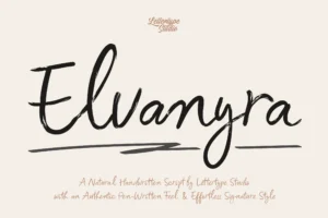

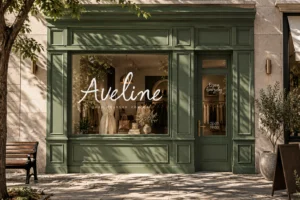



Elvanyra offers a more expressive direction for brands that want typography to contribute strongly to their visual personality.
It can work particularly well when the identity needs an elegant or distinctive display presence.
Best for: fashion, beauty, lifestyle, editorial, and boutique branding.
Bring Vacation

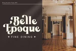
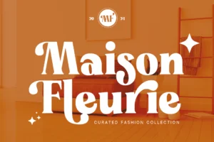



Bring Vacation introduces a more relaxed and expressive personality.
It can be useful for brands that want to communicate creativity, lifestyle, energy, or a sense of approachability.
Best for: lifestyle, hospitality, travel, fashion, events, and consumer brands.
Notevera Duo

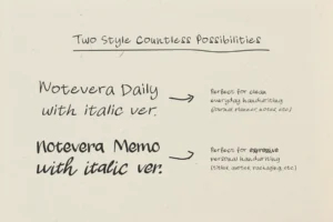




Notevera Duo offers a more decorative approach that can be useful when branding needs a distinctive visual accent.
Rather than treating it as the only typeface in a system, designers can use its personality selectively for logos, campaigns, or special brand applications.
Best for: boutique branding, fashion, creative businesses, packaging, and campaigns.
The Pixel Editorial
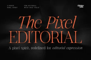
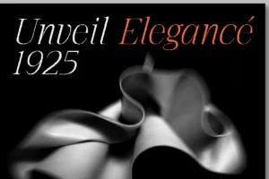
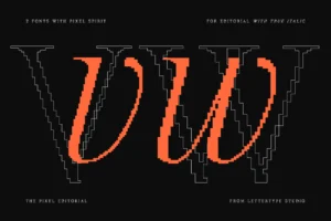
The Pixel Editorial can provide a more editorial and distinctive direction for brands that want typography to become part of their visual concept.
Its editorial character makes it especially interesting for identities where typography, art direction, and content need to work closely together.
Best for: publishing, fashion, cultural brands, creative studios, and editorial projects.
Merta Sans
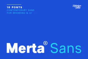
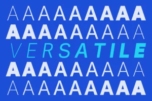

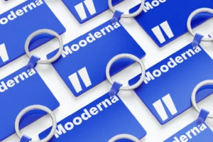

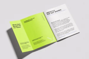
Merta Sans offers a cleaner and more functional direction.
Its contemporary sans serif structure makes it useful when a brand needs typography that can move comfortably between identity, digital communication, and everyday content.
Best for: technology, lifestyle, corporate, retail, digital products, and modern businesses.
Vordelina
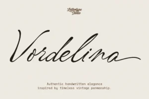
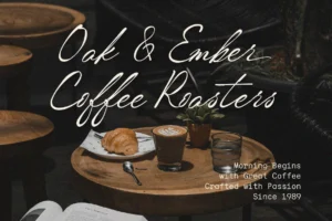




Vordelina can provide a more expressive and decorative direction for brands that need a distinctive typographic signature.
Used selectively, a font with stronger personality can create memorable moments within an otherwise restrained identity system.
Best for: fashion, beauty, lifestyle, personal brands, creative businesses, and campaigns.
Horiva Sans
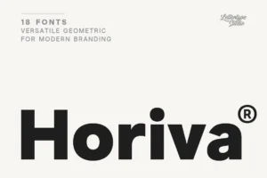

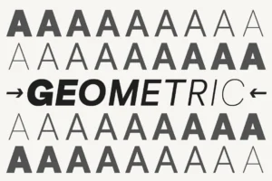
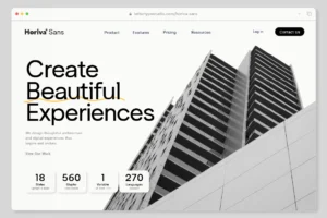


Horiva Sans provides another contemporary sans serif option for brands that want modernity with more character than a completely neutral typeface.
It can work as part of a broader identity system where usability and visual personality need to coexist.
Best for: creative businesses, digital brands, lifestyle, retail, and modern corporate identities.
A Practical Font Selection Checklist
Before finalizing a brand typeface, ask:
1. Does it match the brand personality?
If the brand is sophisticated, does the typography feel sophisticated?
2. Does it work with the actual brand name?
Always test the real wordmark.
3. Does it work at multiple sizes?
Check both large headlines and small text.
4. Does the family provide enough flexibility?
Look at weights, styles, and available variations.
5. Does it work across digital and print?
Your brand should not depend on a single medium.
6. Does it support your target languages?
Check character coverage before committing.
7. Can it remain relevant over time?
Avoid choosing solely based on current trends.
8. Does it differentiate the brand?
A good font should fit the category without making the brand invisible.
9. Can it work with another typeface?
If the identity needs more flexibility, consider a complementary pairing.
10. Does it feel like the brand?
Ultimately, this is the most important question.
Final Thoughts
Learning how to choose a font for your brand is really about understanding the relationship between typography and identity.
The best choice is not necessarily the most fashionable, unusual, or beautiful typeface. It is the one that communicates the right personality while remaining functional across the entire brand ecosystem.
Start with the brand’s personality. Understand the audience. Consider the industry without becoming trapped by its conventions. Test the actual brand name. Evaluate the typeface at different sizes and across different applications.
Then build a simple system around it.
Typography becomes much more powerful when it is treated as a strategic part of branding rather than simply a visual decoration.
A good typeface does not just make a brand look better.
It helps the brand become recognizable.
Conclusion
Choosing the right font for a brand identity requires both creative judgment and practical thinking.
The typeface needs to reflect personality, connect with the target audience, work across multiple applications, and remain flexible as the brand grows.
Whether you choose a contemporary sans serif, an elegant serif, an expressive display face, or a combination of several styles, the goal remains the same: create a typographic system that feels unmistakably connected to the brand.
Take time to test the typography, compare different directions, and think beyond the logo.
When the right typeface is combined with thoughtful spacing, hierarchy, and consistent application, even a simple word can become a powerful brand asset.