
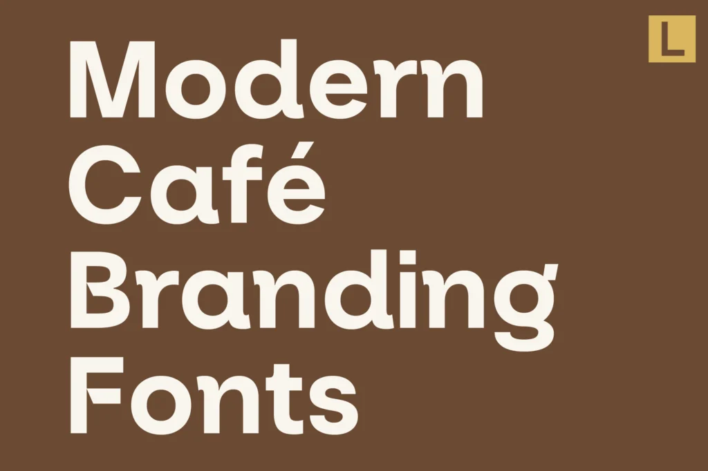
A memorable coffee shop is about more than the coffee itself. From the moment customers discover a café online to the moment they read its menu, typography helps shape their perception of the experience.
A carefully chosen typeface can make a coffee shop feel warm and welcoming, contemporary and minimal, sophisticated and premium, or playful and unconventional. It can communicate the character of a neighborhood café just as effectively as it can express the identity of a specialty coffee brand.
This is why choosing the right fonts for coffee shop branding matters. Typography appears across almost every customer touchpoint, including logos, menus, takeaway cups, packaging, storefront signage, loyalty cards, social media graphics, and websites.
The challenge is finding a typeface that reflects the café’s personality while remaining practical for everyday use. A distinctive display font might look excellent on a storefront, but the menu still needs to be readable. An elegant serif might create a premium impression, but the supporting typography must work across smaller formats.
In this guide, we explore how to choose coffee shop branding fonts, the typography styles that work for different café concepts, and seven Lettertype Studio typefaces worth considering for modern coffee brands.
Why Typography Matters in Coffee Shop Branding
Coffee shops compete through a combination of product quality, atmosphere, service, location, and identity.
Typography contributes to that identity by creating a recognizable visual language.
Consider the difference between a minimalist specialty coffee bar and a relaxed neighborhood café. The first might use a clean sans serif, restrained colors, and spacious layouts. The second might choose softer lettering, expressive typography, and a more approachable visual style.
Neither direction is inherently better. Each serves a different brand personality.
Typography can help a café communicate several qualities:
- Personality: Does the brand feel sophisticated, friendly, energetic, or understated?
- Positioning: Is it a premium specialty coffee destination or an accessible everyday café?
- Recognition: Can customers recognize the brand across packaging, signage, and social media?
- Consistency: Does the identity feel connected across different applications?
- Readability: Can customers quickly understand menus, prices, and product information?
A successful coffee shop identity balances visual character with practical communication.
What Makes a Good Coffee Shop Font?
The best café typography is not necessarily the most decorative or unusual. It is the typography that supports the experience the business wants to create.
1. A Clear Brand Personality
Start by defining what makes the coffee shop different.
A minimalist espresso bar may benefit from precise, contemporary lettering. A specialty roastery might prefer typography with an editorial or technical character. A neighborhood café could use softer forms to create a friendly and relaxed impression.
The typeface should reinforce the concept rather than compete with it.
2. Readability Across Different Sizes
Coffee shop typography appears in both large and small formats.
A storefront sign needs to be legible from a distance, while menu descriptions and packaging details need to remain readable at close range.
Before committing to a font, test it at realistic sizes and in the actual environments where customers will encounter it.
3. Versatility
A café identity rarely consists of a logo alone.
The chosen typography may need to work on menus, takeaway cups, merchandise, coffee bags, promotional posters, digital ordering platforms, and social media.
A versatile typeface or carefully designed type system makes these applications easier to manage.
4. Strong Visual Recognition
Coffee branding often uses familiar visual references, including coffee beans, cups, brewing equipment, and earthy colors.
Typography offers another way to establish distinction.
A recognizable typeface can help a coffee shop develop its own identity without relying on predictable coffee-related illustrations.
5. A Consistent Typography System
A display font may be ideal for the logo, but a supporting typeface can handle menu descriptions, prices, and longer text.
This combination allows the brand to express personality while maintaining a practical hierarchy.
Best Typography Styles for Modern Cafés
Different coffee shop concepts benefit from different typographic approaches. Understanding these categories can help narrow down the available choices.
Modern Sans Serif Fonts
Sans serif typography is a popular choice for contemporary cafés because it can communicate clarity, simplicity, and modernity.
Depending on its proportions and construction, a sans serif can feel geometric, technical, friendly, or sophisticated.
It works particularly well for specialty coffee bars, minimalist cafés, contemporary roasteries, and businesses with a strong digital presence.
Serif Fonts
Serif typography can introduce warmth, refinement, and editorial character.
It is particularly effective for cafés that emphasize craftsmanship, premium ingredients, slow coffee rituals, or a sophisticated atmosphere.
A serif can also help differentiate a coffee brand from competitors that rely heavily on conventional sans serif typography.
Display Fonts
Display typefaces are designed to create visual impact.
They can be especially effective for café logos, storefront signs, packaging headlines, merchandise, and promotional campaigns.
However, highly expressive display fonts should generally be used selectively. Supporting information still needs a typeface that prioritizes readability.
Script Fonts
Script typography can create a personal, artistic, or handcrafted impression.
It may suit independent cafés, lifestyle-oriented coffee shops, and businesses with a relaxed visual identity.
Because script fonts can become difficult to read at small sizes, they are usually most effective in logos or selected decorative applications rather than entire menus.
Seven Lettertype Studio Fonts for Coffee Shop Branding
The following Lettertype Studio typefaces offer different creative directions for café identities. Each can serve a different role depending on the concept, audience, and overall visual system.
1. Merta Sans
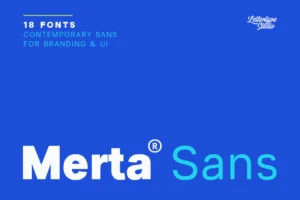
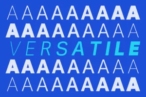

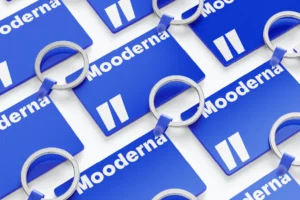

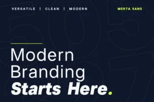
Merta Sans offers a contemporary direction for coffee shops that want a clean and adaptable identity.
A modern sans serif can provide a strong foundation for menus, product labels, website navigation, and everyday communication. It can also create a straightforward wordmark that remains recognizable without relying on excessive decoration.
For specialty cafés, this approach works particularly well when the coffee, materials, and atmosphere are already strong visual elements.
Merta Sans can help keep the typography consistent while allowing photography, packaging materials, and interior details to contribute to the overall brand experience.
Best for: specialty coffee shops, minimalist cafés, modern roasteries, contemporary retail, and neighborhood espresso bars.
2. The Letter Editorial
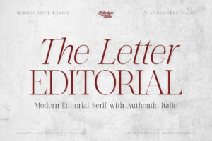

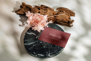

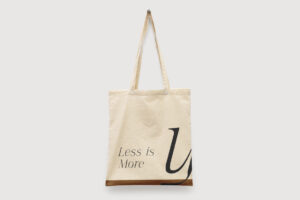
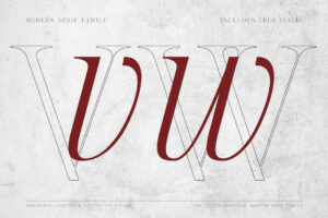
The Letter Editorial is worth considering for coffee brands that want a more sophisticated, editorial identity.
Rather than following the conventional visual language of coffee packaging, a café can use refined typography to communicate its point of view.
This approach can be particularly effective for premium coffee shops that emphasize carefully sourced beans, thoughtful brewing methods, distinctive interiors, and a curated customer experience.
The typeface can be used for prominent brand statements, packaging titles, editorial-style menus, and campaign graphics.
Paired with generous whitespace and restrained colors, editorial typography can make a coffee brand feel considered without making the design unnecessarily complicated.
Best for: premium cafés, specialty coffee brands, lifestyle coffee shops, boutique roasteries, and editorial-inspired hospitality brands.
3. Bring Vacation

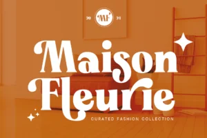
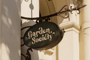
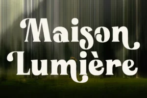

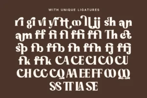
Bring Vacation offers a more expressive direction for coffee brands that want to communicate an easygoing lifestyle.
Not every café needs to feel minimalist or premium. Some businesses are built around relaxed social experiences, weekend visits, outdoor seating, travel-inspired concepts, or a playful neighborhood atmosphere.
For these brands, expressive typography can help communicate a welcoming personality.
Bring Vacation can be used for selected headlines, promotional graphics, merchandise, and packaging elements where the identity needs more visual energy.
The key is to balance its expressive character with clear supporting typography.
Best for: lifestyle cafés, casual coffee shops, travel-inspired concepts, relaxed hospitality brands, and café merchandise.
4. Vescura
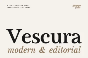
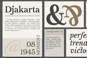



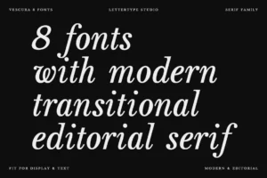
Vescura provides an alternative for coffee brands seeking a more refined visual direction.
Typography can influence whether a café feels everyday and accessible or carefully curated and premium. A sophisticated typeface can help establish the latter, especially when combined with thoughtful packaging, restrained color, and strong photography.
Vescura can serve as a prominent element in a café’s wordmark, packaging, campaign headlines, or brand collateral.
It is particularly relevant when the coffee shop wants its identity to extend beyond the physical café into packaged products, merchandise, and a broader lifestyle brand.
Best for: boutique cafés, premium coffee brands, sophisticated hospitality, curated retail, and contemporary lifestyle businesses.
5. Notevera Duo
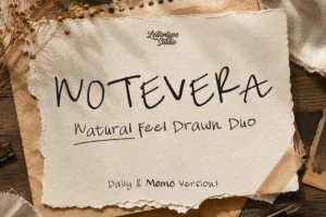
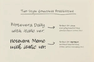

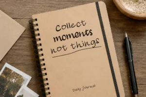


Notevera Duo offers a more decorative option for coffee brands looking to introduce additional personality into their typography.
Expressive typography can be useful when a café wants to build a recognizable visual identity for seasonal promotions, specialty drinks, merchandise, or packaging.
Rather than using a decorative font for every application, designers can reserve it for specific moments where personality matters most.
This creates contrast between the expressive elements and the more functional parts of the identity.
For example, a café could use a decorative typeface for campaign headlines while keeping menu descriptions and product information simple.
Best for: independent cafés, boutique coffee shops, creative hospitality brands, packaging, and seasonal campaigns.
6. Horiva Sans
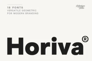

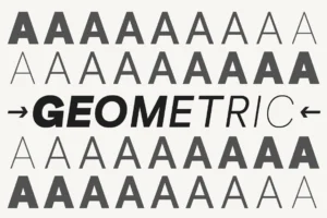

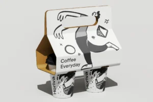
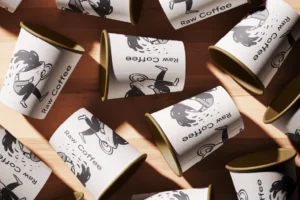
Horiva Sans offers a contemporary sans serif direction for cafés that need a clean identity with character.
A typeface in this category can work across menus, storefront signage, digital ordering interfaces, product labels, and social media.
This versatility is especially useful for coffee shops with multiple locations or businesses planning to expand their packaged coffee offerings.
A consistent sans serif system helps keep communication connected even when the design appears across different formats.
Horiva Sans can also provide a strong supporting role when paired with a more expressive display typeface.
Best for: modern cafés, coffee chains, specialty roasteries, digital-first coffee brands, and contemporary hospitality businesses.
7. Vordelina
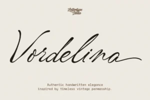
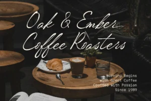
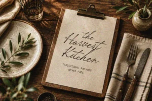

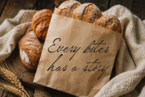
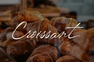
Vordelina provides a more expressive typographic direction for coffee brands that want a distinctive signature.
A decorative or script-oriented typeface can create a recognizable element in a wordmark, packaging design, merchandise, or promotional artwork.
This approach is especially useful for independent businesses that want their identity to feel personal rather than standardized.
However, expressive typography works best when its role is clearly defined. Using it for every menu item and supporting paragraph may make the overall identity harder to navigate.
For a more balanced system, combine the expressive typeface with a readable supporting font.
Best for: independent cafés, lifestyle coffee brands, boutique hospitality, creative packaging, and distinctive café merchandise.
How to Choose Fonts for Different Coffee Shop Concepts
The same typeface can communicate different things depending on how it is used. Nevertheless, certain typographic approaches naturally support particular brand directions.
Minimalist Specialty Coffee Bars
Minimalist coffee shops often benefit from clean sans serif typography, restrained color palettes, and generous whitespace.
The identity should feel intentional rather than empty.
Use a practical typeface for menus and supporting information, then establish hierarchy through size, spacing, and weight.
A simple wordmark can become memorable when the proportions and spacing are carefully considered.
Premium Coffee Brands
Premium coffee shops and roasteries can benefit from sophisticated serif typography, refined display faces, or carefully selected combinations.
Packaging can play an especially important role because customers may encounter the coffee brand outside the physical café.
Typography should remain consistent across coffee bags, product labels, tasting notes, and promotional materials.
Casual Neighborhood Cafés
A neighborhood café often needs to feel approachable and familiar.
Softer typography, friendly sans serifs, or expressive display fonts can support this personality.
The goal is to create a welcoming identity without sacrificing readability or consistency.
Creative and Lifestyle Cafés
Some coffee shops position themselves as creative destinations rather than simply places to buy coffee.
These businesses may benefit from expressive typography, unexpected font combinations, and more experimental layouts.
The key is to ensure that the creative direction still supports clear communication.
A memorable identity should make the experience easier to recognize, not harder to understand.
Typography for Coffee Shop Menus
Menus are among the most practical applications of café typography.
Customers need to identify drink categories, compare options, understand prices, and read descriptions quickly.
A beautiful display font may work for the menu title, but smaller descriptions require careful attention to readability.
A simple menu hierarchy might use:
- Display typography: café name or major menu headings
- Heading typography: categories such as Espresso, Filter Coffee, and Tea
- Body typography: drink names and descriptions
- Supporting typography: prices, sizes, and additional details
Consistent spacing can be just as important as font selection.
Avoid using too many typefaces or competing weights. A restrained system makes the menu easier to scan and helps maintain the brand’s visual identity.
Typography for Coffee Packaging
Coffee packaging gives typography another important role.
A bag of coffee may need to communicate the brand name, roast level, origin, processing method, tasting notes, and product weight.
The challenge is balancing visual impact with the amount of information customers need.
A display typeface can establish recognition on the front of the package, while a more functional typeface handles technical details on the back.
Packaging should also be tested at its actual dimensions. Typography that looks attractive on a large design canvas may become crowded when applied to a smaller label.
Typography for Café Signage
Storefront signs need to be readable from a distance.
This makes letter proportions, spacing, contrast, and scale especially important.
Before finalizing a typeface, test the café name in uppercase and lowercase, depending on the intended design.
Consider how the letters will appear against the building materials and whether the sign will be viewed in daylight, at night, or from across the street.
The best signage typography balances personality with immediate recognition.
Common Mistakes to Avoid
Even a well-designed typeface can become ineffective when used without a clear system.
Choosing a Font Only Because It Looks Trendy
A popular type style may attract attention, but it should still fit the café’s personality and audience.
Choose typography that supports the business rather than copying the visual identity of another coffee shop.
Using Too Many Fonts
Multiple typefaces can create unnecessary complexity.
Start with one versatile family or a carefully selected pairing. Add more only when each typeface has a distinct purpose.
Prioritizing Style Over Readability
Menus, product labels, and ordering interfaces must remain easy to understand.
Decorative typography should not interfere with the information customers need.
Ignoring the Physical Environment
Coffee shop branding exists in real spaces, not just on screens.
Test typography on packaging, signs, menus, cups, and other relevant applications before making a final decision.
Treating the Logo as the Entire Identity
A logo is only one component of a larger system.
Consistent typography across menus, packaging, digital platforms, and promotional materials is what helps the identity feel complete.
Final Thoughts
The best fonts for coffee shop branding balance character, clarity, and versatility.
Merta Sans and Horiva Sans offer contemporary sans serif directions, while The Letter Editorial and Vescura provide more refined approaches. Bring Vacation, Notevera Duo, and Vordelina introduce more expressive possibilities for cafés that want a distinctive visual personality.
The right choice depends on the experience the coffee shop wants to create.
Start with the brand concept, understand the audience, and consider how the typography will work across menus, signage, packaging, and digital communication.
A strong café identity does not need to follow every coffee branding trend. It needs a clear visual personality that customers can recognize wherever they encounter the brand.
Conclusion
Typography is one of the most versatile tools in coffee shop branding.
The right typeface can communicate the personality of a café, create recognition across different applications, and make everyday materials feel like part of a cohesive identity.
Whether you are developing a minimalist espresso bar, a premium coffee roastery, a relaxed neighborhood café, or a creative lifestyle destination, choose typography that supports both the brand’s visual direction and its practical needs.
Test the fonts on real applications, establish a clear hierarchy, and keep the system consistent.
When the typography reflects the experience behind the coffee, the identity becomes much more than a logo on a cup.
It becomes part of the café itself.