
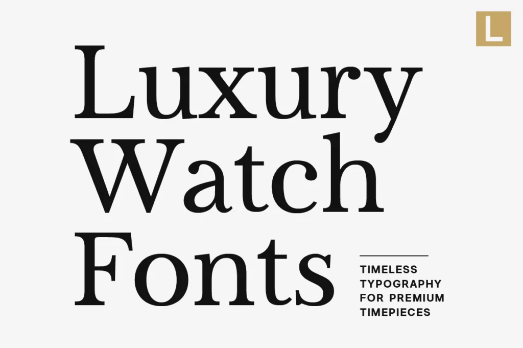
Luxury watches are more than instruments for telling time. They represent craftsmanship, precision, heritage, and status. Every detail—from the movement inside the case to the typography on the packaging—helps define how a brand is perceived.
Before customers hold a watch in their hands, they encounter the brand through its logo, website, catalogs, advertisements, and packaging. Typography quietly communicates quality, attention to detail, and confidence long before the product is experienced.
For luxury watch brands, selecting the right typeface is an investment in creating a timeless visual identity that reflects the same precision found in every timepiece.
Why Typography Matters for Luxury Watch Brands
Luxury watches are built on trust and heritage.
Customers invest not only in exceptional engineering but also in the story behind the brand. Typography reinforces that story by creating a visual identity that feels sophisticated, established, and enduring.
Premium watch branding should communicate:
- Precision
- Heritage
- Exclusivity
- Craftsmanship
- Timeless elegance
When typography is used consistently, every interaction strengthens the brand’s identity.
Recommended for Heritage Watch Brands
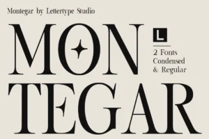
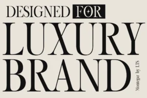
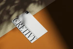

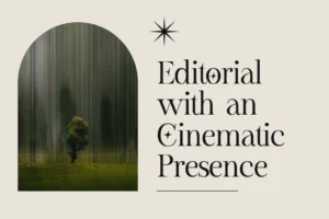
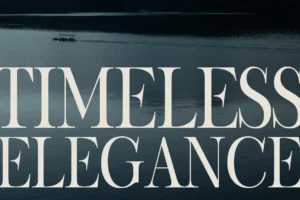
Montegar blends editorial sophistication with timeless serif details, making it an exceptional choice for luxury watch logos, premium packaging, catalogs, and brand campaigns.
Characteristics of Luxury Watch Fonts
The most successful watch brands rarely rely on decorative typography.
Instead, they prefer fonts that offer:
- Elegant proportions
- Refined serif details
- Excellent readability
- Balanced spacing
- Timeless personality
- Premium editorial appearance
These characteristics help create an identity that remains relevant for decades.
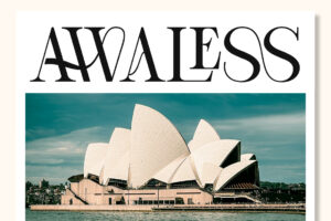
Recommended for Swiss-Inspired Branding
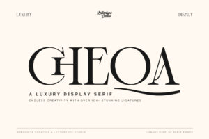
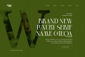

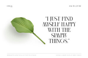

Cheqa delivers graceful serif styling with balanced proportions, making it ideal for premium watch brands seeking a classic yet contemporary visual identity.
Typography Across Every Brand Experience
Luxury watch typography extends far beyond the logo.
It appears on:
- Product packaging
- Watch catalogs
- Warranty cards
- Brand websites
- Boutiques
- Exhibition displays
- Advertising campaigns
- Social media
- Collector publications
Maintaining a consistent typography system strengthens recognition while reinforcing premium craftsmanship.
Recommended for Editorial Catalogs
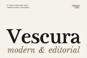
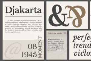

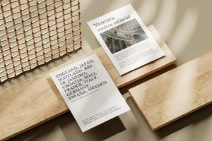
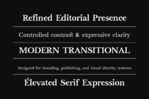
Vescura brings dramatic editorial elegance that elevates luxury catalogs, campaign headlines, collector magazines, and premium brand presentations.
Editorial Design Reflects Precision
Many luxury watch brands adopt an editorial-inspired design language.
Minimal layouts, generous white space, refined typography, and carefully directed photography allow every timepiece to become the center of attention.
This approach works beautifully for:
- Mechanical watch brands
- Independent watchmakers
- Luxury accessories
- Collector editions
- Premium lifestyle brands
Editorial typography creates an atmosphere of exclusivity without overwhelming the product.
Recommended for Contemporary Collections
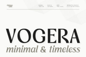

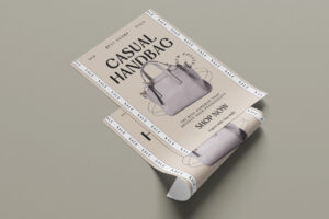
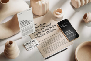

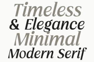
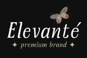
Vogera combines timeless serif elegance with modern refinement, making it a perfect choice for premium watch branding and sophisticated product launches.
Choosing the Right Font for a Luxury Watch Brand
Before selecting typography, consider your brand philosophy.
Ask yourself:
- Does the font reflect the craftsmanship of the watches?
- Will it remain timeless for future collections?
- Does it perform well across packaging, catalogs, and digital platforms?
- Does it reinforce trust and premium positioning?
- Can it support an international audience?
A carefully selected typeface becomes part of the brand’s heritage and strengthens recognition over time.
Recommended for Limited Editions
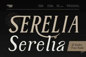

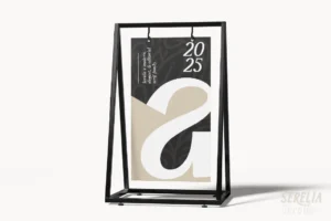

Serelia offers refined editorial elegance that complements collector editions, anniversary collections, premium packaging, and luxury storytelling.
Precision Is Found in Every Detail
Luxury watch enthusiasts appreciate details.
The typography on a warranty card, presentation box, printed catalog, or boutique display may seem subtle, but together these elements create a complete brand experience.
Consistency across every touchpoint builds trust while reflecting the precision customers expect from a premium watchmaker.
Recommended for Lifestyle Collections

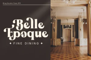
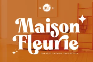
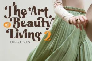
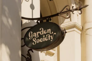
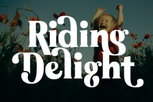
For brands introducing modern lifestyle collections or travel-inspired editions, Bring Vacation provides an elegant yet relaxed personality that complements premium branding without sacrificing sophistication.
Conclusion
Luxury watch branding is built on precision, heritage, and timeless design. Typography quietly reinforces these values by creating a visual identity that communicates confidence before a customer ever wears the watch.
Whether you’re launching an independent watch brand or refining an established collection, investing in elegant typography strengthens every customer interaction—from packaging and catalogs to boutiques and digital experiences.
Explore the premium serif collection from Lettertype Studio to discover professionally crafted typefaces designed for timeless branding, editorial layouts, and sophisticated visual identities.