
Luxury real estate is built on perception. Long before buyers step inside a penthouse, waterfront villa, or exclusive residential development, they begin forming opinions through branding. Every visual element—from the logo and brochure to the website and sales presentation—contributes to the feeling of quality and exclusivity.
Typography is one of the most influential elements in that experience. A carefully selected typeface communicates confidence, sophistication, and trust while helping premium properties stand apart in an increasingly competitive market.
Whether you’re developing luxury residences, marketing high-end apartments, or building a premium real estate agency, the right typography becomes a powerful asset for creating a memorable brand identity.
Why Typography Matters in Luxury Real Estate
Buying a luxury property is an emotional decision as much as a financial one.
Clients are investing in a lifestyle, prestige, and long-term value. Typography helps reinforce these expectations by creating a visual language that feels refined, professional, and timeless.
Luxury real estate branding should communicate:
- Trust
- Exclusivity
- Stability
- Elegance
- Long-term value
When every touchpoint uses consistent typography, the entire brand feels more established and credible.
Recommended for Luxury Developments
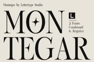
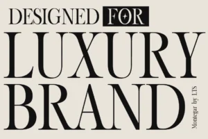
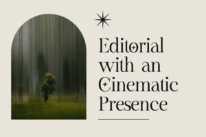
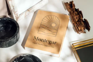
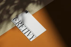
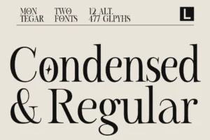
Montegar blends editorial elegance with architectural precision, making it an exceptional choice for luxury real estate logos, premium brochures, property signage, and high-end residential branding.
Characteristics of Luxury Real Estate Fonts
The most successful property brands rarely use decorative or trendy typefaces.
Instead, they rely on typography that offers:
- Elegant proportions
- Strong readability
- Balanced spacing
- Timeless serif details
- Professional presentation
This understated sophistication allows the architecture and lifestyle imagery to remain the focus while typography quietly reinforces quality.
Recommended for Premium Agencies
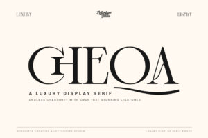
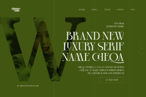
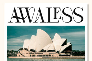
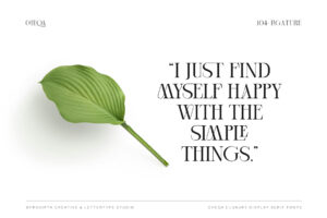
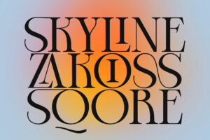

For developers and boutique real estate agencies seeking a refined yet approachable identity, Cheqa provides graceful serif details that work beautifully across branding, printed materials, and premium marketing campaigns.
Typography Across Every Client Touchpoint
Luxury buyers encounter typography throughout the purchasing journey.
It appears on:
- Property logos
- Sales brochures
- Development websites
- Floor plan presentations
- Billboards
- Sales galleries
- Email campaigns
- Business cards
- Property signage
Using one cohesive typography system strengthens recognition and creates a premium customer experience from the very first interaction.
Recommended for Editorial Presentations
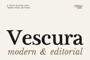
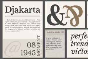
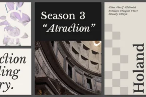
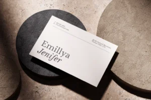
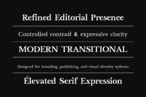
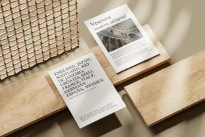
Vescura delivers sophisticated high-contrast serif styling that elevates brochures, presentation decks, architectural portfolios, and premium marketing materials.
Editorial Design Inspires Premium Property Marketing
Many luxury real estate brands borrow inspiration from editorial magazines.
Clean layouts, generous white space, elegant typography, and high-quality photography create a sense of exclusivity without overwhelming potential buyers.
Editorial-inspired branding works especially well for:
- Luxury condominiums
- Waterfront developments
- Private villas
- Residential estates
- Property investment firms
- Boutique agencies
This minimalist approach allows the property itself to become the hero while typography supports the overall experience.
Recommended for Prestige Branding
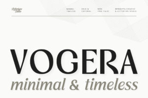
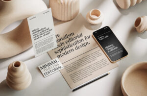
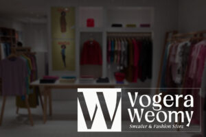
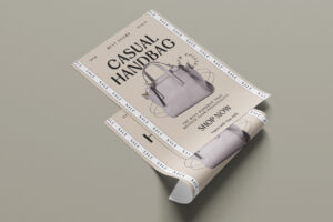
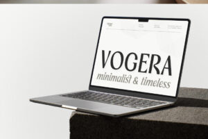
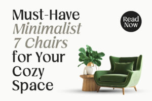
Vogera combines timeless serif elegance with contemporary refinement, making it ideal for premium property identities, luxury residential developments, and architectural marketing.
Choosing the Right Font for a Premium Property Brand
Before selecting typography, consider the personality of the development.
Ask yourself:
- Does the typeface reflect the architectural style?
- Does it feel premium without appearing intimidating?
- Will it remain timeless over the next decade?
- Does it perform equally well in print and digital?
- Can it represent both the developer and the property itself?
Choosing a timeless typeface ensures that the brand remains elegant long after construction is complete.
Recommended for Landmark Developments
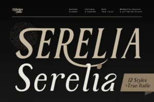
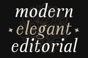
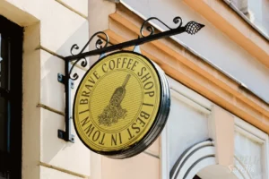
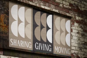
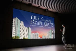
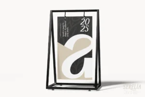
For luxury developments that emphasize prestige and lasting value, Serelia offers refined editorial elegance with graceful serif details. It works beautifully for premium brochures, exclusive property launches, and sophisticated residential branding.
Building Trust Through Consistent Typography
Luxury real estate brands succeed by maintaining consistency.
From sales offices and printed catalogs to websites and digital advertising, typography should remain recognizable across every customer touchpoint.
A cohesive visual identity reinforces professionalism, increases brand recall, and helps buyers associate your properties with quality and confidence.
Recommended for Signature Branding
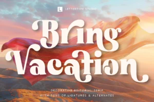
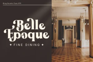
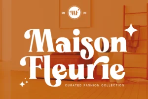
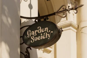
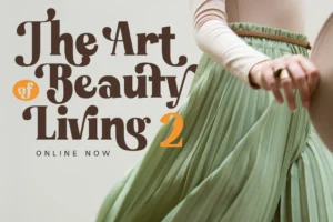
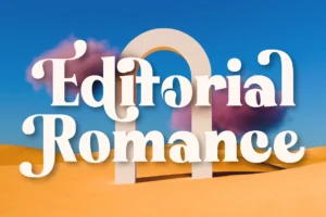
For premium property signage, investment brochures, and high-end marketing materials, Bring Vacation introduces a refined lifestyle aesthetic that’s particularly effective for luxury villas, resort residences, coastal developments, and destination properties.
Conclusion
Luxury real estate is about more than exceptional architecture—it is about creating confidence before a buyer ever schedules a viewing.
Thoughtfully chosen typography helps communicate trust, elegance, and long-term value across every interaction, from digital presentations to printed sales materials.
If you’re building a premium property brand, explore the carefully crafted serif collection from Lettertype Studio. Designed for sophisticated branding, editorial design, and luxury visual identities, these typefaces help developers, architects, and real estate professionals present their projects with confidence.