
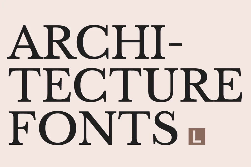
Architecture is the balance between creativity and precision. Every project tells a story through proportion, materials, and thoughtful design. That same philosophy should extend to the visual identity of an architecture firm.
Typography plays a significant role in shaping how clients perceive an architectural practice. Before reviewing a portfolio or visiting a completed project, potential clients encounter the firm’s logo, website, project proposals, and presentation materials. A carefully chosen typeface immediately communicates professionalism, confidence, and attention to detail.
For architecture firms, typography is more than aesthetics—it becomes part of the firm’s design philosophy.
Why Typography Matters for Architecture Firms
Architecture clients expect expertise.
Whether designing luxury residences, commercial developments, or cultural spaces, every visual element should reinforce credibility and precision.
The right typography communicates:
- Professionalism
- Timeless design
- Precision
- Confidence
- Premium quality
When typography aligns with the firm’s architectural style, it strengthens the overall brand identity and helps create lasting trust.
Recommended for Architecture Studios
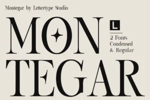




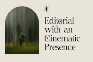
Montegar combines editorial sophistication with clean architectural proportions, making it an excellent choice for architecture firm logos, design portfolios, presentation boards, and premium branding.
Characteristics of Great Architecture Fonts
Unlike decorative branding, architecture typography should feel structured and refined.
The best architecture fonts typically feature:
- Clean proportions
- Excellent readability
- Balanced spacing
- Timeless serif details
- Strong visual hierarchy
These qualities allow typography to complement architectural imagery without distracting from the work itself.
Recommended for Premium Portfolios
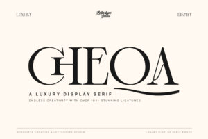

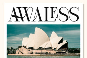
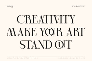
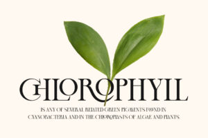

For firms seeking understated elegance, Cheqa offers refined serif styling that performs beautifully across portfolios, project books, proposal documents, and professional stationery.
Typography Across Every Client Presentation
Architecture firms communicate through presentations.
Typography appears across:
- Company logos
- Project proposals
- Portfolio books
- Presentation boards
- Website headings
- Signage
- Business cards
- Competition submissions
- Project documentation
Maintaining a consistent typography system creates a cohesive visual identity that reflects the same attention to detail clients expect from the firm’s architecture.
Recommended for Editorial Layouts
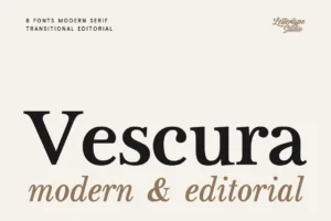


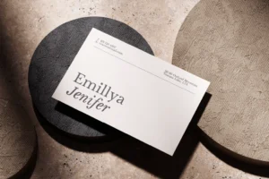
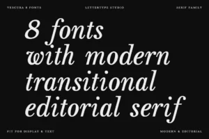
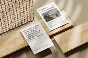
Vescura brings dramatic editorial elegance to architectural presentations, creating sophisticated headlines that enhance portfolios and project showcases without overpowering the imagery.
Editorial Design Meets Architecture
Many award-winning architecture firms adopt an editorial-inspired visual language.
Minimal layouts, generous white space, refined typography, and carefully curated photography allow projects to become the centre of attention.
This approach works particularly well for:
- Residential architecture
- Interior architecture
- Hospitality projects
- Urban developments
- Landscape architecture
- Design studios
Editorial typography enhances the narrative while maintaining a timeless appearance.
Recommended for Contemporary Branding
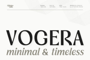
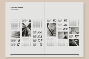


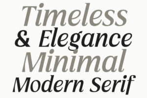
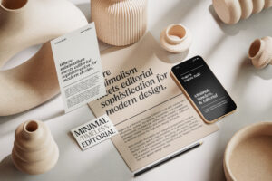
Vogera offers elegant serif details with a modern personality, making it ideal for architecture firms seeking a balance between classic professionalism and contemporary design.
Choosing the Right Font for an Architecture Firm
Before selecting a font, consider your firm’s identity.
Ask yourself:
- Does the typography reflect the firm’s design philosophy?
- Will it remain timeless over the next decade?
- Does it perform equally well in print and digital?
- Can it support technical presentations as well as marketing materials?
- Does it complement the firm’s portfolio rather than compete with it?
Choosing a timeless typeface ensures that the firm’s branding evolves alongside its architectural work.
Recommended for Signature Identity
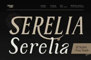
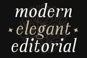

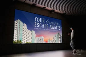
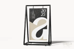

For studios that value elegance and craftsmanship, Serelia introduces refined serif styling with an editorial influence that’s ideal for architecture books, luxury residential branding, and premium client presentations.
Building Trust Through Consistent Branding
Clients rarely judge an architecture firm solely by its portfolio. They evaluate the entire brand experience.
Consistent typography across websites, proposals, project signage, and printed materials reinforces professionalism while demonstrating attention to detail.
The strongest architecture brands create visual systems where every element—from typography to photography—works together to communicate confidence and expertise.
Recommended for Lifestyle Architecture

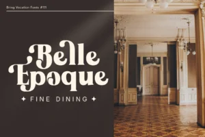
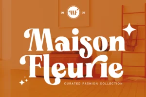



For firms specialising in luxury villas, resorts, and destination properties, Bring Vacation offers a relaxed editorial elegance that complements architecture inspired by travel, nature, and premium hospitality.
Conclusion
Architecture is built on thoughtful design, and typography should follow the same principle. A carefully selected typeface reinforces professionalism, enhances presentations, and creates a memorable visual identity that reflects the quality of your work.
Whether your studio focuses on residential, commercial, hospitality, or luxury developments, investing in timeless typography helps communicate confidence before the first meeting ever takes place.
Explore the premium serif collection from Lettertype Studio to discover professionally crafted typefaces designed for architecture firms, creative studios, and sophisticated visual branding.