
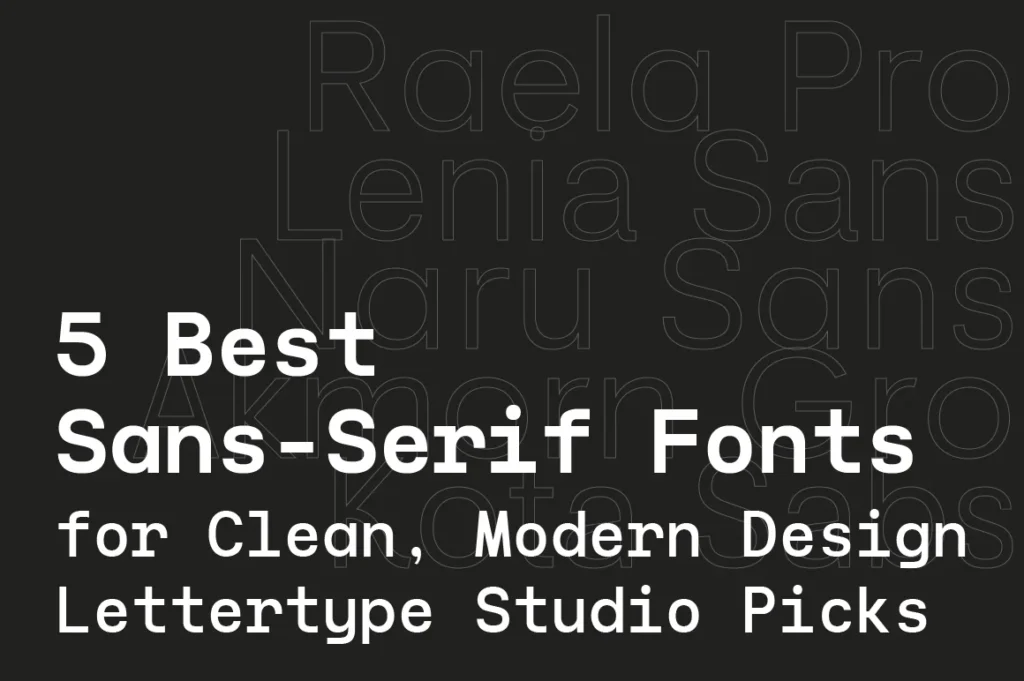
In the age of digital branding, minimal interfaces, and fast-moving content, sans-serif fonts have become the backbone of modern visual communication.
They are clean.
They are readable.
They scale beautifully across screens.
But not all sans-serifs are created equal.
Here are five standout sans-serif fonts from Lettertype Studio that designers love for branding, UI, posters, and digital products.
1. Raela Pro — The Modern Workhorse
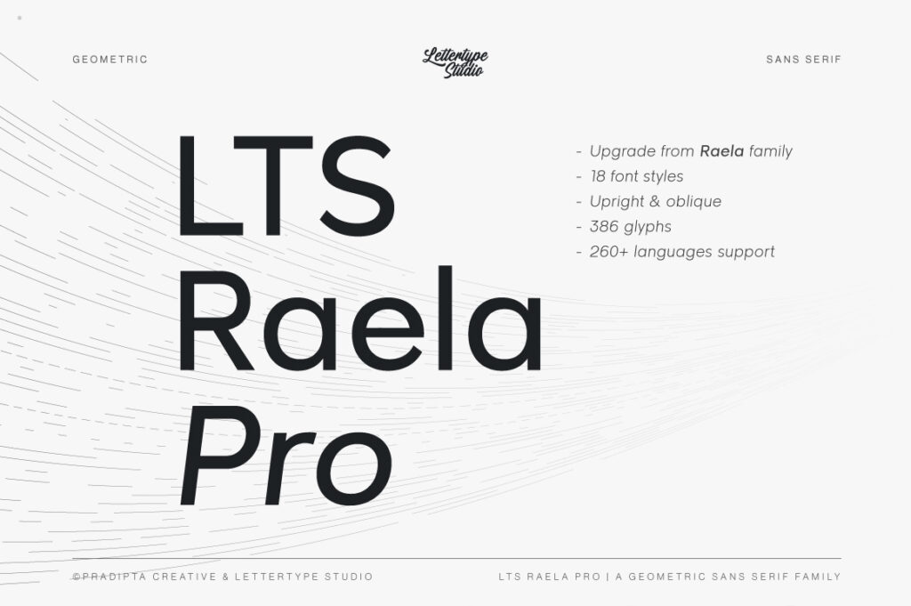
Raela Pro is built for one thing:
clarity with character.
It is a professional grotesque sans-serif designed for:
Brand identities
Websites
Editorial layouts
App interfaces
Raela Pro feels neutral, but never boring.
It keeps your design sharp without stealing attention from the content.
Perfect for:
logos, startups, portfolios, SaaS, and corporate branding.
2. Lenia Sans — Soft, Friendly, and Digital-Ready
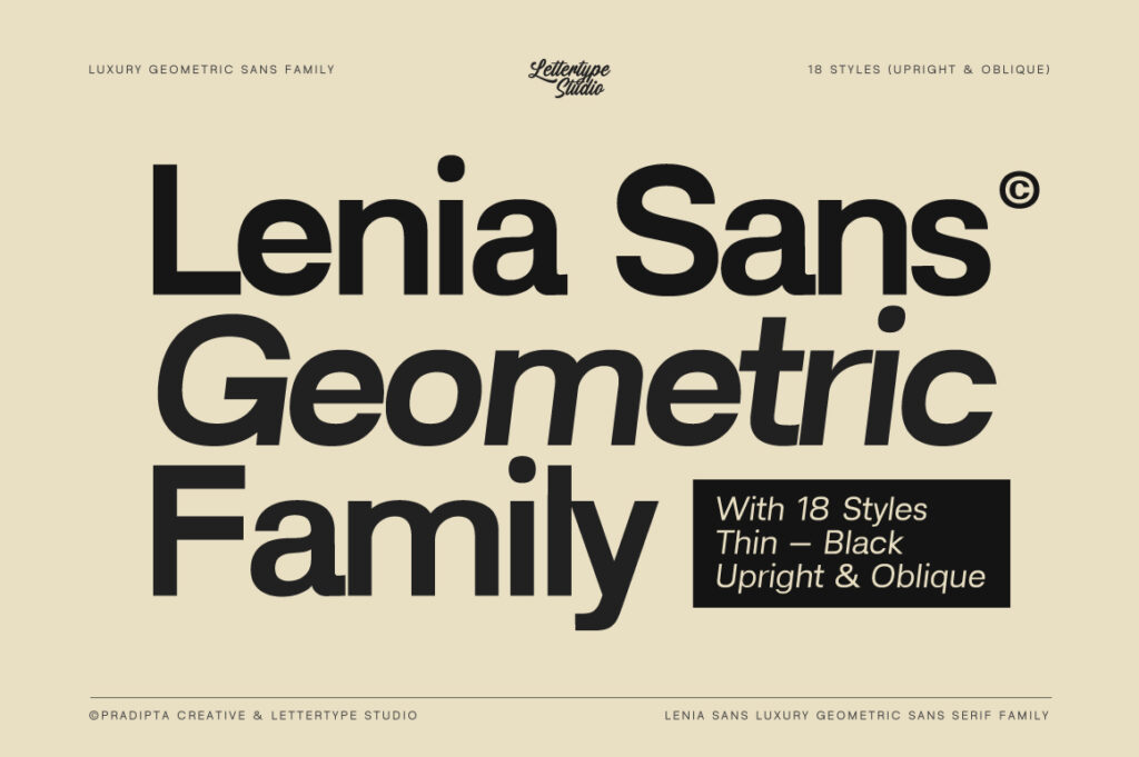
Lenia Sans brings warmth into the modern sans-serif world.
With its slightly rounded structure and balanced proportions, it feels:
approachable
contemporary
highly readable
This makes Lenia Sans ideal for:
social media, lifestyle brands, landing pages, and creative studios.
It’s modern typography that doesn’t feel cold.
3. Naru Sans — Minimalist with Personality
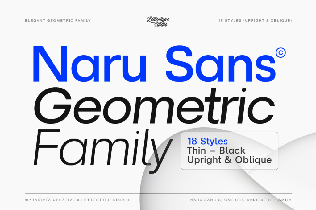
Naru Sans is for designers who want clean design with subtle attitude.
It’s geometric, but not robotic.
It’s minimal, but not empty.
Use Naru Sans when you need:
editorial layouts
modern branding
fashion or creative direction
It gives your work a quiet confidence.
4. Akmorn Grotesque — Strong, Bold, and Professional
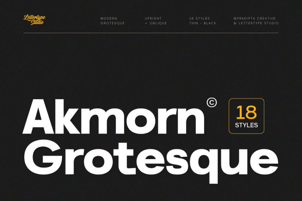
Akmorn Grotesque is built to make statements.
It is heavier, more confident, and more impactful than a typical neutral sans-serif.
Perfect for:
headlines
posters
brand identities that need strength
If your design needs to look solid and serious, Akmorn delivers.
5. Kota Sans — Clean Typography for the Real World

Kota Sans is designed for usability.
It works beautifully in:
long-form text
UI design
web layouts
presentations
It doesn’t try to be loud — it tries to be useful.
And in modern design, that is powerful.
Why Sans-Serif Fonts Dominate Modern Design
Sans-serif fonts perform better on screens, scale more smoothly, and fit perfectly into minimal design systems.
That’s why today’s biggest brands, startups, and platforms rely on clean sans-serifs to communicate trust, clarity, and modernity.
Lettertype Studio’s sans-serif collection is crafted for:
digital brands, creatives, and designers who want typography that works everywhere.
Explore More at Lettertype Studio
These five fonts are just a glimpse of our growing sans-serif family.
From geometric to grotesque, from soft to bold — every typeface is designed with modern workflows in mind.
Discover the full collection at:
lettertypestudio.com