
Introduction
Serif fonts have long been associated with credibility, readability, and timeless design. From books and newspapers to luxury branding and modern editorial layouts, serif typefaces remain one of the most widely used font categories in the design industry.
In this article, we’ll explore five of the most commonly used serif font styles today, followed by a curated list of editorial serif fonts from Lettertype Studio—representing the studio’s more mature and professional design phase.
Why Serif Fonts Remain Widely Used
Despite the rise of sans-serif and experimental type, serif fonts continue to dominate many design fields due to:
Strong readability for long-form content
Professional and trustworthy appearance
Timeless visual structure
High adaptability across print and digital media
1. Old Style Serif Fonts
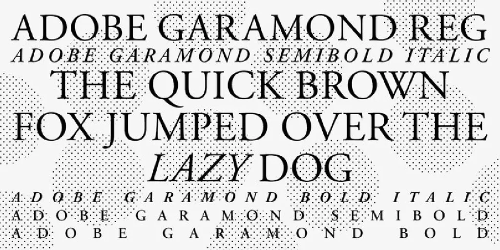
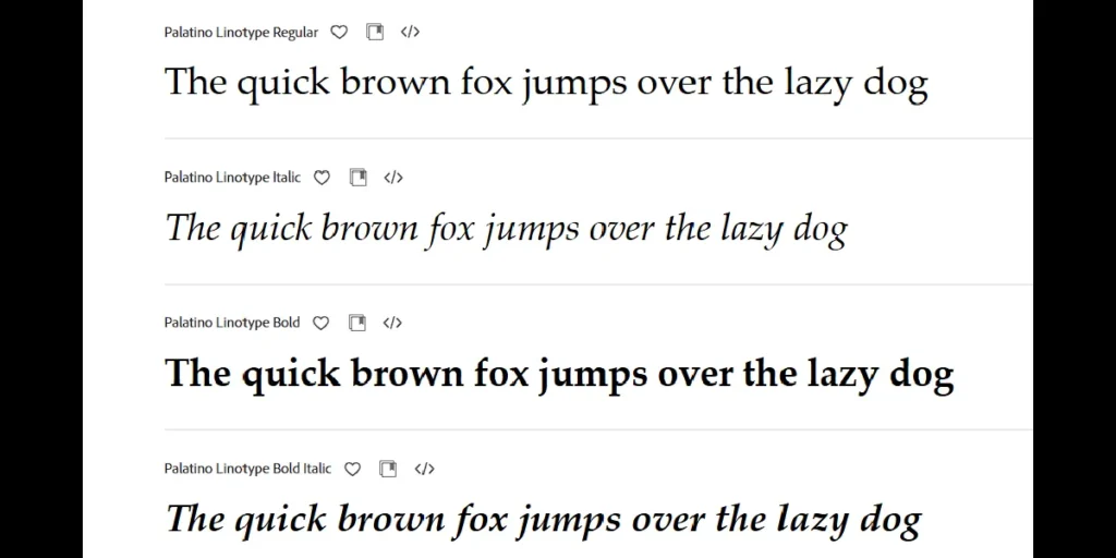
Old Style serif fonts originate from Renaissance typography and feature low contrast, diagonal stress, and softly bracketed serifs.
Popular examples:
- Garamond

5 Most Used Serif Font Styles Today (Plus Lettertype Studio Picks)_Garamond - Caslon
5 Most Used Serif Font Styles Today (Plus Lettertype Studio Picks)_Caslon - Palatino
5 Most Used Serif Font Styles Today (Plus Lettertype Studio Picks)_Palatino

Where they are commonly used:
Books, novels, academic publications, and long-form editorial content.
Why designers use them:
Old Style serifs feel warm, human, and extremely comfortable for long reading sessions, making them a timeless choice for body text.
2. Transitional Serif Fonts
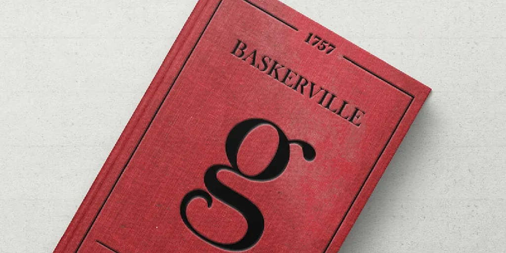
Transitional serif fonts bridge the gap between Old Style and Modern serif designs. They feature higher contrast and more refined proportions.
Popular examples:
Baskerville
5 Most Used Serif Font Styles Today (Plus Lettertype Studio Picks)_Baskerville Times New Roman
5 Most Used Serif Font Styles Today (Plus Lettertype Studio Picks)_Times New Roman
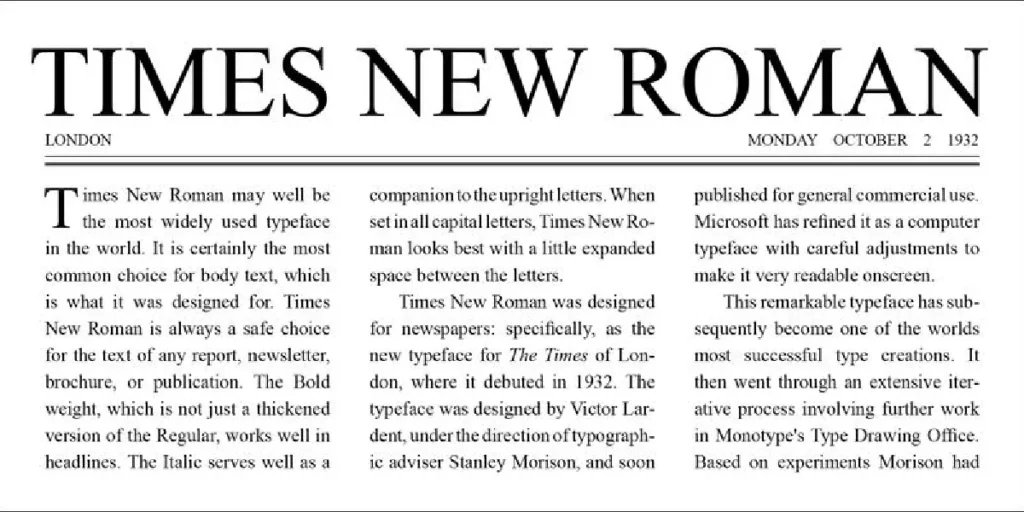
Where they are commonly used:
Newspapers, magazines, journals, and professional documents.
Why designers use them:
They offer excellent readability while appearing more structured and formal than Old Style serifs.
3. Modern (Didone) Serif Fonts
Modern serif fonts—often called Didone—are defined by extreme contrast, vertical stress, and sharp, thin serifs.
Popular examples:
Bodoni
5 Most Used Serif Font Styles Today (Plus Lettertype Studio Picks)_Bodoni Didot
5 Most Used Serif Font Styles Today (Plus Lettertype Studio Picks)_Didot
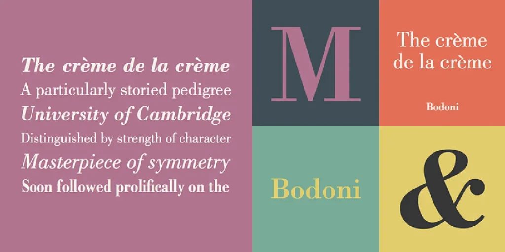
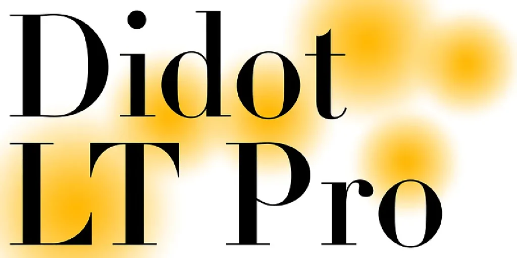
Where they are commonly used:
Luxury branding, fashion editorials, high-end magazines, and premium packaging.
Why designers use them:
They instantly convey elegance, sophistication, and exclusivity.
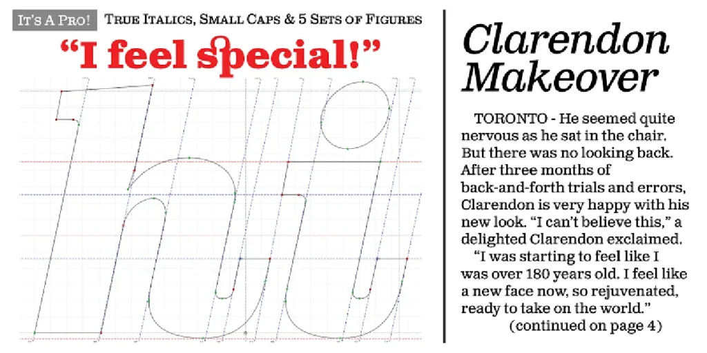
4. Slab Serif Fonts
Slab serif fonts feature thick, block-like serifs with minimal stroke contrast, giving them a bold and stable appearance.
Popular examples:
Rockwell
5 Most Used Serif Font Styles Today (Plus Lettertype Studio Picks)_Rockwell Clarendon
5 Most Used Serif Font Styles Today (Plus Lettertype Studio Picks)_Clarendon
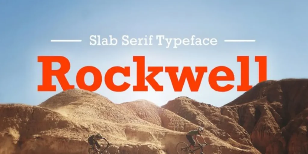
Where they are commonly used:
Posters, headlines, logos, advertising, and web interfaces.
Why designers use them:
Their strong structure makes them highly legible and visually impactful, even at large sizes.
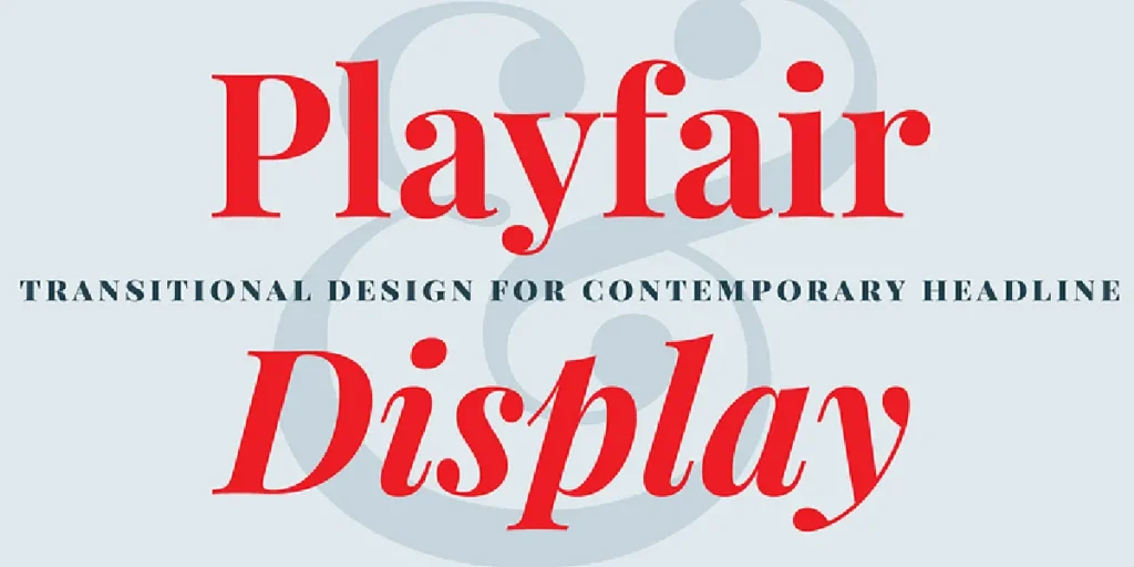
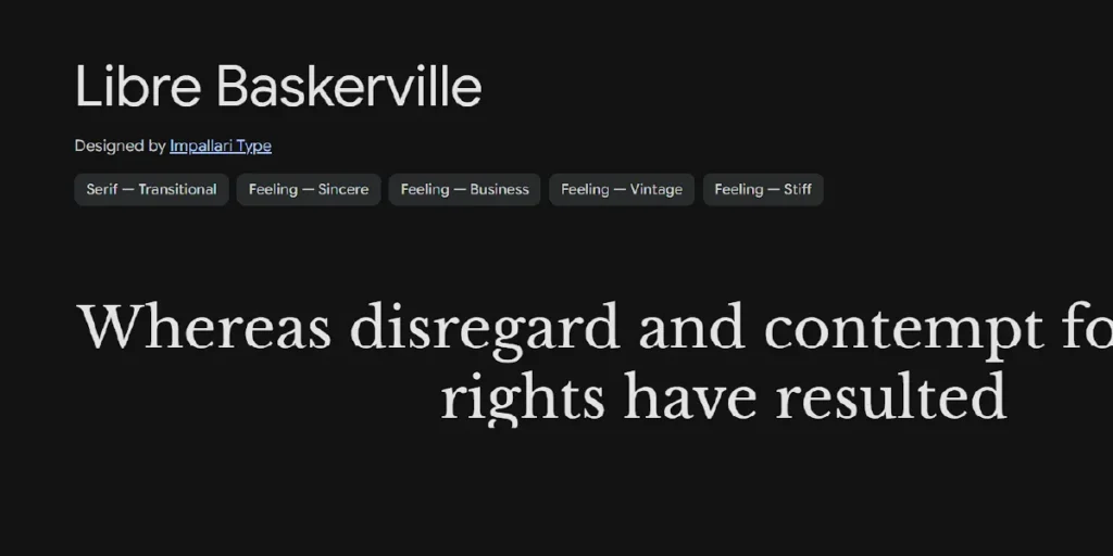
5. Contemporary Editorial Serif Fonts
Contemporary serif fonts reinterpret classical serif principles with modern proportions, cleaner details, and expanded weight ranges.
Popular examples:
Playfair Display
5 Most Used Serif Font Styles Today (Plus Lettertype Studio Picks)_Playfair Display Libre Baskerville
5 Most Used Serif Font Styles Today (Plus Lettertype Studio Picks)_Libre Baskerville
Where they are commonly used:
Modern editorial layouts, websites, brand identities, and digital publishing.
Why designers use them:
They combine traditional credibility with a fresh, modern aesthetic—ideal for today’s editorial and branding needs.
Recommended Editorial Serif Fonts from Lettertype Studio

1. Vogera
A minimal editorial serif with clean proportions and calm rhythm. Vogera is designed for modern publishing systems and refined brand identities.
Highlight:
Currently ranking on page one at Creative Market in the minimal editorial serif category.
Best for: Editorial layouts, modern publishing, branding
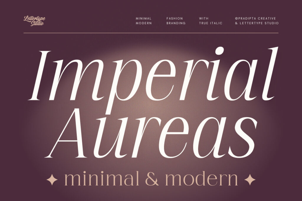
2. Imperial Aureas
A high-contrast serif with strong classical influence. Its sharp details and dramatic strokes create a luxurious and authoritative tone.
Best for: Luxury branding, fashion editorials, premium packaging

3. The Letter Editorial
A serif typeface built specifically for editorial performance. Balanced contrast and disciplined structure ensure readability in long-form content.
Best for: Magazines, newspapers, editorial systems

4. Rotifera
A character-rich serif that combines expressive details with strong readability. Rotifera works well for creative editorial and conceptual projects.
Best for: Books, creative editorials, publishing design

5. Serelia
A contemporary serif with modern structure and editorial sensibility. Serelia performs well for both headlines and body text.
Best for: Editorial branding, print and digital layouts
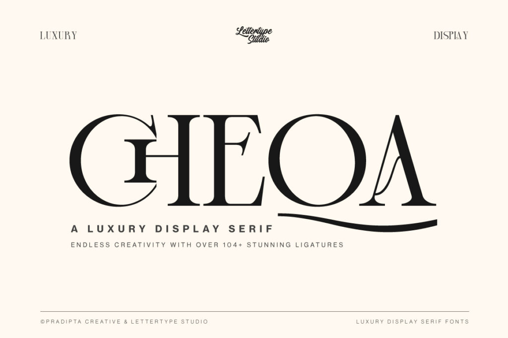
6. Cheqa
A stylish modern serif with distinctive personality. Cheqa is visually strong and currently gaining traction among designers.
Why it matters:
Cheqa is trending and fits current editorial and fashion-forward design directions.
Best for: Fashion branding, modern editorials, creative projects
Conclusion
Serif fonts continue to be widely used because they adapt effortlessly to changing design trends while maintaining clarity and authority. Understanding the most common serif styles helps designers choose typography more intentionally.
By focusing on Lettertype Studio serif fonts, designers gain access to a curated selection of typefaces built with stronger concepts, refined structure, and real-world editorial performance in mind.