
Financial technology has changed how people interact with money. Digital banking, mobile payment platforms, investment applications, and financial management tools have made financial services more accessible and convenient.
But as the fintech industry grows, companies face an increasingly important branding challenge: how do they communicate trust, security, and professionalism while still looking modern and innovative?
Typography plays a significant role in answering that question.
A typeface can influence whether a financial brand feels established or experimental, approachable or institutional, sophisticated or accessible. These impressions matter because customers need to feel comfortable interacting with products that handle their money and financial information.
The best fonts for fintech branding balance clarity, credibility, and contemporary character. They help financial technology companies communicate complex information while establishing a recognizable visual identity.
However, choosing a typeface for fintech is not simply about finding a clean sans serif. A successful typography system must work across mobile applications, websites, financial dashboards, marketing campaigns, presentations, and customer communications.
In this guide, we explore how to choose fintech branding fonts, the typography styles that work for different financial technology businesses, and seven Lettertype Studio typefaces worth considering for modern financial brands.
Why Typography Matters in Fintech Branding
Financial services depend heavily on communication.
Customers need to understand account balances, transaction histories, payment instructions, investment information, and financial products. Even when the underlying technology is sophisticated, the user experience should feel clear and manageable.
Typography helps make that possible.
A well-designed type system creates visual hierarchy, making it easier for users to distinguish headings, important information, supporting details, and actions.
At the same time, typography contributes to the brand’s personality.
A digital banking company might use a contemporary sans serif to communicate clarity and efficiency. An investment platform targeting premium customers could introduce more refined typography to express sophistication. A payment startup might choose a friendly, approachable typeface to make financial interactions feel less intimidating.
The important thing is that the typography supports both the brand’s positioning and the practical needs of its customers.
For fintech companies, these two responsibilities should work together.
What Makes a Good Font for Fintech Branding?
The right typeface depends on the financial product, its audience, and the role typography needs to perform.
Nevertheless, several characteristics are particularly valuable for fintech brands.
1. Clarity and Readability
Financial products frequently display numbers, dates, account details, transaction descriptions, and other information that customers must understand quickly.
Typography should make this information easy to scan.
Pay attention to the distinction between similar characters, particularly when a typeface will be used for account identifiers, transaction references, or numerical displays.
For digital products, test the actual typeface at realistic interface sizes rather than evaluating it exclusively through large promotional headlines.
2. Professional Character
Customers need to understand what a financial brand represents and feel comfortable interacting with it.
Typography can contribute to that impression through balanced proportions, consistent spacing, and a coherent visual hierarchy.
However, professional does not have to mean conservative.
A fintech company can use contemporary typography and distinctive letterforms while maintaining a clear, credible identity.
3. Digital Versatility
Fintech brands typically operate across several digital touchpoints.
A typeface may appear on a website, mobile application, landing page, dashboard, email campaign, and social media account.
The typography system should remain consistent across these environments while adapting to different screen sizes and content requirements.
4. A Recognizable Personality
The fintech market includes digital banks, payment providers, investment platforms, accounting software, and financial management applications.
These businesses should not all look identical.
A distinctive typeface can help a company establish a recognizable identity without compromising readability.
5. Flexible Weight Options
Multiple font weights help establish hierarchy across interfaces and marketing materials.
Regular and medium weights can support everyday information, while semibold and bold styles can emphasize headings, important messages, and promotional statements.
The goal is to create a clear system rather than use different typefaces for every element.
Best Typography Styles for Financial Technology Brands
Different fintech businesses have different requirements. Understanding the available typography styles can help narrow down the selection.
Modern Sans Serif Fonts
Sans serif typography is a natural starting point for many fintech brands.
Depending on its proportions, a sans serif can feel precise, friendly, technical, or sophisticated.
It can also provide a practical foundation for digital products because the same family may be used for headings, interface labels, supporting text, and marketing communication.
For companies that prioritize clarity and consistency, a versatile sans serif can be an effective primary brand typeface.
Geometric Typography
Geometric sans serifs can communicate modernity, structure, and technological sophistication.
Their constructed appearance may suit fintech companies that want to position themselves as contemporary and digitally focused.
However, designers should evaluate individual letterforms carefully. Some geometric designs may be less comfortable for extended reading or dense financial interfaces.
Visual consistency should not come at the expense of usability.
Editorial Serif Fonts
Serif typography can provide a more sophisticated direction for fintech brands that emphasize investment, wealth management, financial education, or premium services.
A refined serif can introduce a sense of editorial authority while differentiating the brand from competitors that use exclusively neutral sans serifs.
For interface-heavy products, a serif is often best used selectively for headlines and brand statements, with a practical supporting typeface handling smaller information.
Display Fonts
Display typefaces can create a distinctive visual identity for marketing campaigns, product launches, and promotional graphics.
They can help a fintech company look recognizable without requiring an elaborate graphic system.
However, display typography should be used selectively. The typeface that makes an excellent campaign headline may not be suitable for financial dashboards or transaction histories.
Seven Lettertype Studio Fonts for Fintech Branding
The following Lettertype Studio typefaces offer different visual directions for financial technology brands.
Each has a potential role in a branding system, depending on the company’s positioning and application requirements. Before selecting a typeface for an actual financial product, test its readability, character coverage, and performance at the sizes required by the interface.
1. Naru Sans
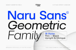
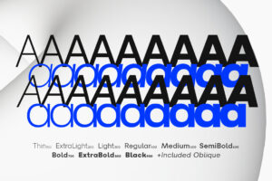

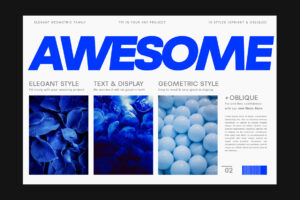


Naru Sans is a contemporary sans serif option for fintech brands that want a clean and adaptable typographic foundation.
Financial technology companies need a visual identity that can move comfortably between brand communication and practical digital applications. A contemporary sans serif can help maintain consistency across websites, presentations, marketing materials, and other customer-facing content.
Naru Sans can provide a structured foundation for this type of identity, allowing designers to establish hierarchy through weight, size, spacing, and composition.
For a fintech brand that wants to look modern without relying on overly decorative typography, this approach offers a useful starting point.
Best for: digital financial services, fintech startups, financial management brands, payment platforms, and contemporary corporate identities.
2. Merta Sans
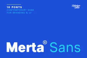





Merta Sans offers another contemporary sans serif direction for financial brands that value clarity and versatility.
A consistent typeface can simplify the design of a fintech company’s marketing ecosystem, especially when the brand communicates through websites, presentations, product announcements, and educational content.
Merta Sans can serve as the primary typography for these applications, with a clear hierarchy separating headlines, supporting information, and longer descriptions.
Its role in a fintech identity would depend on the specific product and the results of testing it in the intended interface.
Best for: financial technology companies, digital payment services, financial education platforms, corporate fintech, and modern business services.
3. Horiva Sans



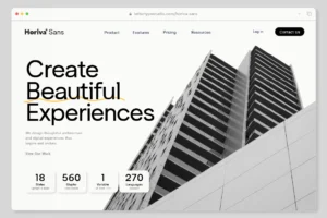


Horiva Sans provides a contemporary sans serif direction for brands that want to combine modernity with a more distinctive visual personality.
In a competitive industry, a fintech company needs more than an identity that simply looks technological. It needs a recognizable design language that communicates its particular approach to financial services.
Horiva Sans can contribute to that identity through its use in headlines, promotional materials, website content, and selected brand applications.
For information-dense interfaces, designers should separately evaluate its performance at smaller sizes before using it as a primary interface typeface.
Best for: digital financial brands, payment services, contemporary business platforms, fintech marketing, and modern corporate identities.
4. The Letter Editorial
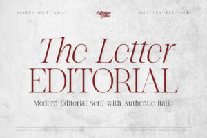




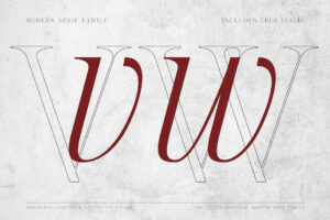
The Letter Editorial offers a more editorial direction for financial brands that want to communicate sophistication and authority.
Not every fintech company needs to look like a technology startup. Businesses focused on investment education, premium financial services, or financial publications may benefit from a more editorial visual identity.
A distinctive editorial typeface can create strong headlines and brand statements, particularly when combined with restrained layouts and clear supporting typography.
The Letter Editorial could therefore serve as a display component within a broader fintech identity, rather than necessarily handling every interface element.
Best for: investment brands, financial publications, premium financial services, wealth management marketing, and editorial-driven fintech businesses.
5. Vescura
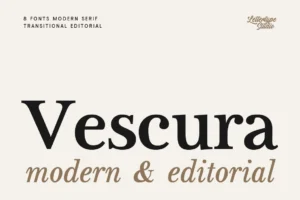


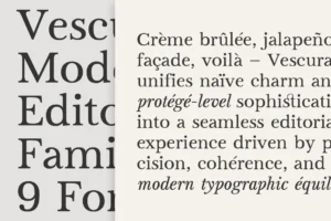
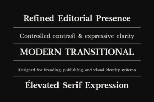

Vescura provides another direction for financial brands seeking a refined and sophisticated appearance.
Typography can help establish the tone of a financial service, especially when the company wants to communicate a premium positioning rather than a purely functional technology proposition.
Vescura can be considered for prominent headlines, brand statements, campaign materials, and other applications where a more distinctive typographic presence is desirable.
The supporting typography should remain clear and consistent, particularly when the identity is applied to websites and digital financial services.
Best for: premium financial services, investment branding, wealth management marketing, sophisticated fintech campaigns, and financial lifestyle brands.
6. Gaprio Display





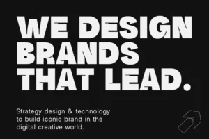
Gaprio Display offers a stronger display direction for fintech brands that want to create memorable marketing and campaign visuals.
A distinctive display face can help a financial technology company establish recognition through product launches, advertising, social media, and major website headlines.
This approach is particularly relevant for brands that compete in crowded markets and need their promotional communication to stand apart.
Gaprio Display is best treated as a display component within the larger identity. Financial figures, product information, and other essential details should remain easy to read.
Best for: fintech campaigns, digital payment marketing, financial product launches, creative financial brands, and technology advertising.
7. Serifant






Serifant provides a serif-based direction for financial brands seeking a more refined and editorial identity.
Serif typography can introduce contrast and sophistication, especially when a company wants to move beyond the familiar all-sans-serif aesthetic of many digital businesses.
For example, a financial education platform could use a serif for major headlines and a clean sans serif for explanatory content.
This pairing can make the brand feel more distinctive while preserving clarity across different types of information.
The most effective application depends on the brand’s audience and positioning, as well as the specific design characteristics of the typeface.
Best for: financial education, investment editorial, premium financial brands, wealth management content, and sophisticated fintech marketing.
8. Kaluk Sans
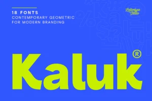





Kaluk Sans is a contemporary sans serif typeface for fintech brands seeking a modern identity with a distinctive typographic character.
For financial technology companies, typography needs to balance personality with clarity. A contemporary sans serif can help create a cohesive visual identity across brand headlines, websites, presentations, and marketing campaigns without relying on overly decorative elements.
Kaluk Sans can be explored as part of a fintech branding system, particularly for prominent headlines and brand communication. When considering it for financial dashboards or information-heavy interfaces, designers should test its readability at smaller sizes and ensure that numerical information remains clear.
Best for: fintech startups, digital banking brands, payment platforms, financial technology marketing, and contemporary corporate identities.
How to Choose Fonts for Different Fintech Businesses
The right typography depends on the type of financial service being offered.
A payment platform has different communication requirements from an investment company or a digital banking application.
Digital Banking
Digital banking brands need to communicate clarity, reliability, and accessibility.
A contemporary sans serif can provide a consistent foundation across websites, account interfaces, marketing materials, and customer communications.
Numerical clarity is particularly important. Designers should test the appearance of numbers and similar-looking characters in realistic interface conditions.
The goal is to make financial information easy to understand without making the brand feel generic.
Payment Platforms
Payment platforms often prioritize speed, convenience, and straightforward user experiences.
Their typography should support a visual identity that feels efficient and approachable.
A flexible sans serif can provide consistency across product announcements, websites, promotional materials, and supporting information.
Display typography can add personality to campaigns, but the practical parts of the experience should remain clear and predictable.
Investment and Wealth Management
Investment brands may need to communicate a different balance of qualities.
Some emphasize accessibility and financial education, while others position themselves around premium services and sophisticated financial products.
A clean sans serif can support clarity, while a refined serif can introduce an editorial or premium character.
A carefully selected combination can help a brand express both professionalism and individuality.
Financial Management Applications
Budgeting and financial management tools often present substantial amounts of information.
Typography needs to support clear hierarchy, comfortable reading, and consistent presentation across different screens.
Designers should pay particular attention to numerical alignment, label readability, and the distinction between primary and secondary information.
A distinctive brand font can contribute to the product’s personality, but the interface should prioritize usability.
Branding Typography vs. Interface Typography
One of the most important distinctions in fintech design is the difference between branding typography and interface typography.
They are related, but they do not always have identical requirements.
Branding typography helps establish personality and recognition. It appears in logos, headlines, campaigns, and other prominent brand applications.
Interface typography helps users navigate and understand the product. It appears in menus, forms, account details, transaction histories, and other functional elements.
A typeface can perform well in one role but be less suitable for the other.
For example, a distinctive display font may create an excellent marketing headline but become difficult to read in a compact financial dashboard.
A practical approach is to define separate typographic roles.
The brand typeface can express personality, while a highly readable supporting typeface handles information-heavy applications.
If a single family performs well in both roles, the system can be simpler. However, this should be determined through testing rather than assumed from its appearance in a specimen.
Why Numerical Readability Matters
Numbers are central to financial technology.
Users regularly encounter balances, transaction amounts, dates, percentages, account identifiers, and other numerical information.
Small typographic differences can influence how easily this information is interpreted.
When evaluating a typeface for fintech applications, examine its numerals closely.
Consider whether similar characters are distinguishable, whether the numerals remain clear at smaller sizes, and whether the overall design supports the information hierarchy.
For dashboards and financial reports, tabular numerals may also be useful because they occupy consistent widths and can help numbers align vertically.
Not every branding typeface needs to handle all these requirements. The important thing is to choose an appropriate typeface for each role within the system.
Common Typography Mistakes in Fintech Branding
Even a visually attractive typeface can become ineffective when the typography system is poorly planned.
Choosing a Font Only Because It Looks Technological
A futuristic appearance does not automatically communicate reliability or clarity.
Choose typography that reflects the product’s positioning and the needs of its audience.
Using Display Fonts Everywhere
Display typography can create a memorable identity, but it should not interfere with essential information.
Reserve highly expressive typefaces for applications where their character adds value.
Ignoring Numerical Legibility
Financial products display numbers constantly.
Test numerical characters in realistic contexts before committing to a typeface for data-heavy applications.
Making the Brand Too Generic
A neutral sans serif may be practical, but a brand still needs a recognizable personality.
Distinctive letterforms, a thoughtful type pairing, and consistent art direction can help establish differentiation.
Treating the Logo as the Entire Identity
A fintech brand extends across product interfaces, marketing, educational content, presentations, and customer communications.
Typography should be evaluated as part of that wider system.
Final Thoughts
The best fonts for fintech branding combine clarity, versatility, and a distinctive visual personality.
Naru Sans, Merta Sans, and Horiva Sans offer contemporary sans serif directions, while The Letter Editorial, Vescura, and Serifant provide more refined editorial possibilities. Gaprio Display introduces a stronger display option for campaigns and other prominent brand applications.
The right choice depends on the financial service, its audience, and the role typography needs to perform.
Start by defining the brand’s positioning. Then consider the requirements of its digital products, marketing materials, and everyday communication.
Test the typefaces in realistic contexts, paying particular attention to numerical readability and smaller interface sizes.
A successful fintech identity should communicate the brand’s personality without making financial information harder to understand.
Conclusion
Typography is an important part of how financial technology companies build a recognizable and coherent brand.
The right typeface can communicate professionalism, modernity, sophistication, or accessibility while helping a company maintain consistency across its digital ecosystem.
Whether you are developing a payment platform, digital banking service, investment brand, or financial management application, choose typography that supports both the brand’s identity and its users’ needs.
Use expressive fonts where they create value, prioritize clarity where information matters most, and establish a system that works across every relevant touchpoint.
In fintech, good typography should do more than make a brand look modern.
It should help make financial experiences feel clear, coherent, and approachable.