Introduction: The Silent Dialogue Between Fonts
Every great brand tells a story — not only through its words, but through the subtle dialogue between its typefaces. A headline might shout confidence, while the subtext whispers warmth and familiarity. The perfect pairing doesn’t happen by accident; it’s a quiet dance between form, tone, and rhythm.
As a designer, you’ve probably stared at endless font lists, scrolling through serifs, sans serifs, and scripts, hoping for that “aha” moment — the one where two fonts suddenly click. That spark of harmony isn’t luck; it’s visual psychology in motion.
At Lettertype Studio, we’ve paired hundreds of typefaces across projects — from editorial layouts to startup brands — and one truth always stands out: great typography is about balance, not similarity. Let’s explore how to create that balance and why the right pairing can make your design unforgettable.
1. The Principle of Contrast and Complement
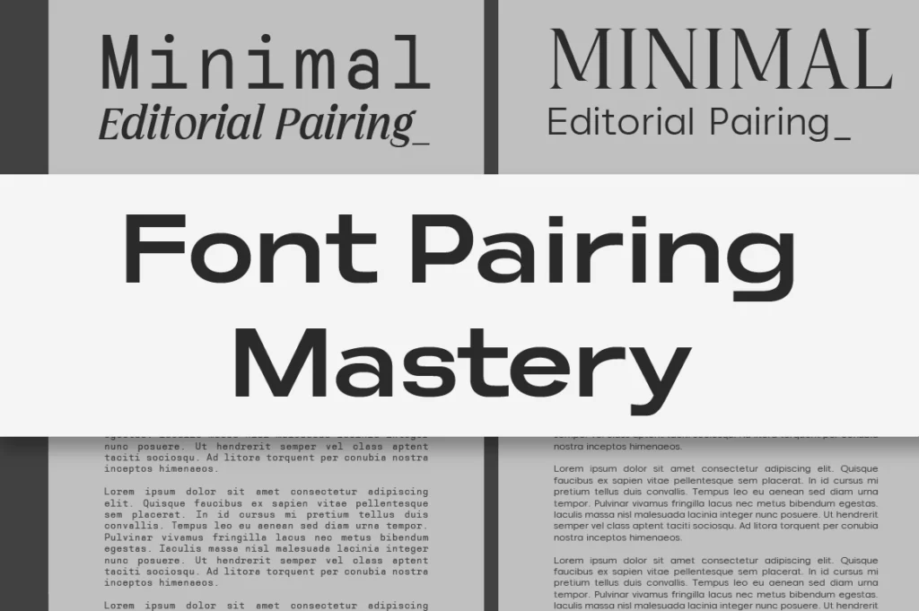
Good font pairing begins with contrast — not conflict. It’s about finding fonts that bring out each other’s strengths without stealing the spotlight. For instance, a geometric sans serif like Reflow Mono exudes structure and precision, while a humanist serif like Vogera adds a touch of warmth and readability.
Together, they create a visual dialogue that feels both modern and human — perfect for editorial layouts, tech brands, or portfolio websites that need clarity and personality.
💡 Pro Tip: When pairing fonts, look for differences in structure (like monoline vs contrast stroke), but similarities in mood or proportion. Harmony comes from shared rhythm, not identical style.
2. Emotional Consistency: Speaking in One Voice
Each font has emotional undertones — bold sans serifs often convey strength, while elegant serifs speak refinement. When pairing, you’re essentially blending two voices into one conversation.
For instance, Nalte Sans — sleek, confident, and corporate — pairs beautifully with Imperial Aureas — a luxurious serif with gentle curves. Together, they express authority with empathy — perfect for modern brands in finance, architecture, or fashion where both trust and taste matter.
🎯 Designer’s Insight: Emotion consistency matters more than typographic category. You can mix serif and sans as long as both fonts “feel” like they belong to the same personality spectrum.
3. Hierarchy and Function: The Backbone of Readability
In every visual layout, hierarchy guides the eye. The headline must grab attention; the body text must invite reading. A mismatch here can make even the most beautiful fonts fail.
Take Akmorn Grotesque — bold, structured, designed for commanding attention — and pair it with Cardival — refined and sophisticated. The result? A timeless editorial combination that feels both premium and grounded.
📘 Rule of Thumb: Use a distinctive display font for the headline and a versatile text font for the body. Contrast in size, weight, and texture builds natural rhythm.
4. The Invisible Rhythm: Spacing, Scale, and Harmony
Even the best font pairing can fall flat without balance in size and spacing. Adjust leading and kerning so both fonts “breathe” equally. A generous margin between a strong sans and a delicate serif creates elegance; tight spacing with consistent rhythm creates energy.
Designers often overlook this, but rhythm is what turns typography from mechanical to musical. When every line feels intentional, your layout reads effortlessly — and that’s where emotion silently lives.
🧩 Quick Exercise: Try pairing Reflow Mono 700 Bold for headlines with Vogera Regular at 16px for body. Observe how the mechanical precision of one frames the organic curves of the other — a dialogue between logic and art.
5. Beyond Rules — Designing With Personality
While principles help you start, the best pairings often come from intuition. Typography is like conversation; sometimes the right chemistry just feels right. Allow space for experimentation. Try unexpected duos. See how Naru Sans behaves beside Cardival, or how Alvara Sans interacts with Imperial Aureas.
In the end, what matters isn’t just aesthetic balance, but emotional resonance. The fonts you choose become the personality of your message — one that people remember, trust, and come back to.
Conclusion: Harmony as a Signature
The art of pairing fonts is the art of storytelling. It’s how you choreograph emotion through type — balancing the loud and the quiet, the bold and the refined. When done right, typography stops being decoration and becomes identity.
At Lettertype Studio, we believe every designer deserves typefaces that naturally harmonize — built not just for form, but for feeling. Whether you’re building a brand, crafting a portfolio, or designing your next digital product, explore our curated library and find your next perfect match.
🖋️ Fonts that fit every voice — discover yours at Lettertype Studio.