
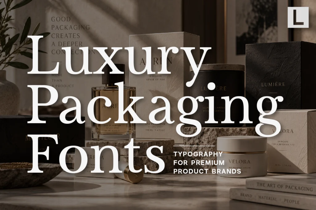
Packaging is often the first physical experience someone has with a product.
Before a customer opens a perfume bottle, skincare jar, candle, cosmetic box, or premium product, they encounter the packaging itself.
Materials, colors, photography, finishes, and typography all contribute to that first impression.
Typography is particularly important because it communicates the personality of the product before the customer interacts with it.
A refined serif can make a package feel luxurious and established. A clean sans serif can create a contemporary identity. A softer typeface can make a lifestyle product feel more approachable.
The right luxury packaging font should therefore do more than look beautiful.
It should communicate what kind of product is inside.
Why Typography Matters in Luxury Packaging
Premium packaging has very little space to communicate a lot.
A box, bottle, tube, or label may only have a few words available:
- Brand name
- Product name
- Collection
- Description
- Ingredients
- Volume
- Supporting information
Every typographic decision becomes more visible.
A carefully selected typeface can communicate:
- Luxury
- Craftsmanship
- Exclusivity
- Modernity
- Sophistication
- Authenticity
This is why typography is often one of the most important elements in premium packaging design.
What Makes a Good Luxury Packaging Font?
Packaging typography needs to work at multiple scales.
The brand name may be displayed prominently across the front of a box, while supporting information needs to remain readable at a much smaller size.
A strong packaging typeface should offer:
- Distinctive character
- Clear letterforms
- Strong hierarchy
- Good spacing
- Multiple weights or styles
- Excellent print performance
The best choice also needs to complement the physical characteristics of the packaging.
A delicate serif may work beautifully with embossed paper, while a bold sans serif might be better suited to contemporary glass or metallic packaging.
Serif Fonts Create a Premium Impression
Serif typography remains one of the most effective directions for luxury packaging.
Its connection with editorial design, fashion, beauty, publishing, and heritage brands makes it naturally suited to premium products.
Recommended for Refined Product Packaging
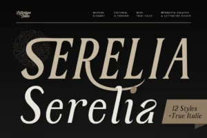
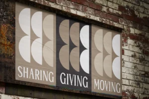
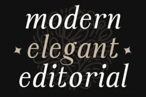
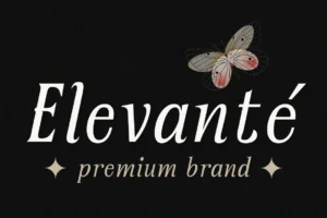
Serelia brings an elegant serif character that works particularly well for fragrance, beauty, skincare, candle, and lifestyle packaging.
Its refined proportions can create a sophisticated product identity without requiring excessive decorative elements.
For brands using minimal packaging, a strong serif can become the primary visual feature.
Editorial Typography for Luxury Packaging
Luxury packaging often borrows visual language from fashion editorials and premium magazines.
Large product names, generous whitespace, restrained layouts, and carefully controlled typography can create a sense of exclusivity.
Recommended for Editorial Luxury Brands
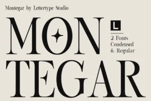
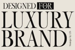
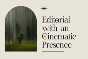
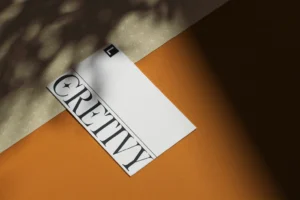
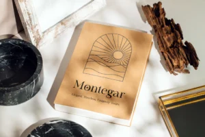
Montegar offers a more expressive editorial direction for premium packaging.
Its character makes it suitable for perfume collections, fashion accessories, boutique beauty products, luxury candles, and limited-edition packaging where the typography needs to become part of the product’s visual personality.
Used with generous spacing and minimal supporting graphics, it can create a sophisticated editorial feel.
Sans Serif Fonts for Contemporary Packaging
Luxury does not always mean traditional.
Many contemporary product brands use clean sans serif typography to create a more modern interpretation of premium design.
This approach is especially effective for:
- Skincare
- Wellness products
- Modern cosmetics
- Interior products
- Premium food packaging
- Technology-led products
Recommended for Modern Packaging Systems
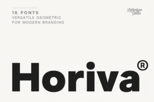
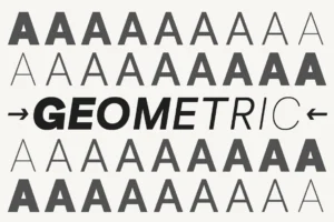
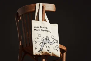

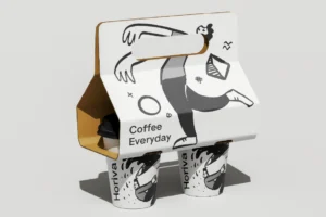
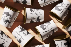
Horiva Sans provides a clean geometric direction for brands that want their packaging to feel contemporary and structured.
Its modern character can work across product labels, cartons, websites, social media, and broader brand systems.
This makes it useful when packaging needs to remain consistent with a digital-first identity.
Bold Typography for Statement Packaging
Some premium brands deliberately move away from understated luxury.
A bold typeface can create a stronger shelf presence, especially when competing against many products in a retail environment.
Recommended for Statement Packaging
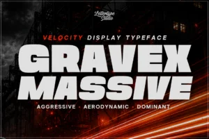
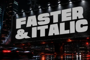
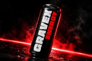

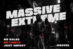
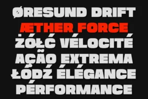
Gravex Massive offers a powerful display direction for packaging where the product name needs to become a major visual element.
Its heavy presence can work especially well for:
- Limited editions
- Fashion products
- Lifestyle products
- Creative beauty brands
- Campaign packaging
- Special collections
Rather than using it for every piece of information, designers can reserve it for the most important message on the package.
Soft Typography for Lifestyle Products
Luxury packaging can also be warm and approachable.
Products positioned around self-care, home, wellness, lifestyle, or everyday luxury may benefit from softer typography rather than an extremely formal serif.
Recommended for Soft Luxury Packaging
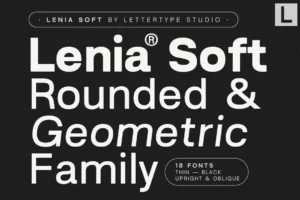
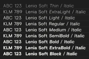
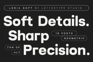
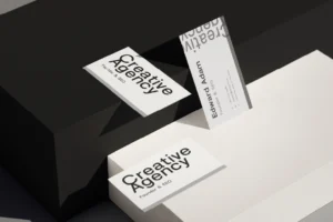
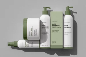
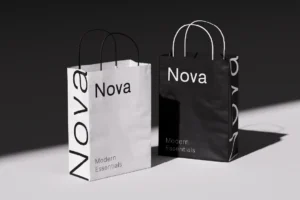
Lenia Soft offers a gentler personality that can work particularly well for lifestyle-led products.
Its softer character makes it suitable for skincare, wellness, home fragrance, personal care, and contemporary lifestyle brands that want to communicate premium quality without feeling overly formal.
Typography and Material Finishes
Font selection should also consider how typography will physically appear on the package.
The same typeface can feel completely different depending on the production technique.
Typography may be:
- Foil stamped
- Embossed
- Debossed
- Screen printed
- Letterpress printed
- UV printed
- Printed with metallic ink
A delicate typeface may look beautiful in one application but lose clarity in another.
Packaging designers should therefore test the actual production size and material before finalizing the typography.
Typography for Perfume Packaging
Fragrance is one of the strongest categories for luxury typography.
Perfume packaging often relies on minimal visual communication.
A bottle may contain only a brand name, fragrance name, and a small amount of supporting information.
That creates an opportunity for typography to carry much of the identity.
Refined serif typography can communicate heritage and sophistication, while contemporary sans serifs can make a fragrance feel more modern and architectural.
The important thing is creating a visual relationship between the typeface, bottle shape, materials, and fragrance positioning.
Typography for Beauty and Skincare Packaging
Beauty and skincare brands often require a slightly different approach.
The packaging needs to feel premium while remaining clear and trustworthy.
A typography system might combine an elegant display serif for the brand and product name with a clean sans serif for ingredients, directions, and product information.
This creates a balance between emotional branding and practical communication.
Building a Luxury Packaging Typography System
A successful packaging identity rarely depends on one font alone.
A complete system can assign specific roles to different typefaces.
Primary display font
For the brand and product name.
Supporting typeface
For descriptions and secondary information.
Small text system
For ingredients, specifications, and regulatory information.
Campaign typeface
For seasonal launches and special collections.
This allows packaging to remain consistent while giving individual products enough flexibility.
Typography Across the Product Ecosystem
Packaging is only one part of a premium product brand.
The same typography may also appear on:
- Websites
- Product photography
- Social media
- Advertising
- Lookbooks
- Retail displays
- Shopping bags
- Product cards
- Email campaigns
A consistent typography system makes the entire brand feel more established.
The packaging should feel like a physical extension of the digital identity rather than a completely separate design.
Choosing the Right Font for Luxury Packaging
The ideal font depends heavily on the product category.
A heritage perfume brand may need an elegant serif. A contemporary skincare company may prefer a geometric sans serif. A fashion-oriented product might benefit from bold display typography.
Before choosing a luxury packaging font, consider:
- What does the product represent?
- Who is the target customer?
- Is the brand traditional or contemporary?
- How much text appears on the package?
- What materials and finishes will be used?
- Does the typography work at both large and small sizes?
- Can the same type system extend into digital branding?
The best packaging typography should feel inseparable from the product itself.
Conclusion
Luxury packaging depends on details.
Typography is one of the details customers notice immediately, even when they don’t consciously recognize why a package feels premium.
The right luxury packaging font can communicate sophistication, craftsmanship, modernity, or individuality while creating a consistent identity across physical and digital brand experiences.
Whether you’re designing fragrance, skincare, cosmetics, fashion accessories, candles, wellness products, or another premium product category, typography can transform a simple package into a memorable brand experience.
Explore the Lettertype Studio collection for refined serif, contemporary sans serif, and expressive display typefaces designed for premium packaging, branding, editorial design, and sophisticated product identities.
Featured Fonts from Lettertype Studio
- Serelia — Refined serif for elegant beauty, fragrance, and lifestyle packaging.
- Montegar — Editorial luxury character for premium product collections and campaigns.
- Horiva Sans — Contemporary geometric sans for modern packaging systems.
- Gravex Massive — Bold display typography for statement packaging and limited editions.
- Lenia Soft — Softer premium direction for skincare, wellness, and lifestyle products.