
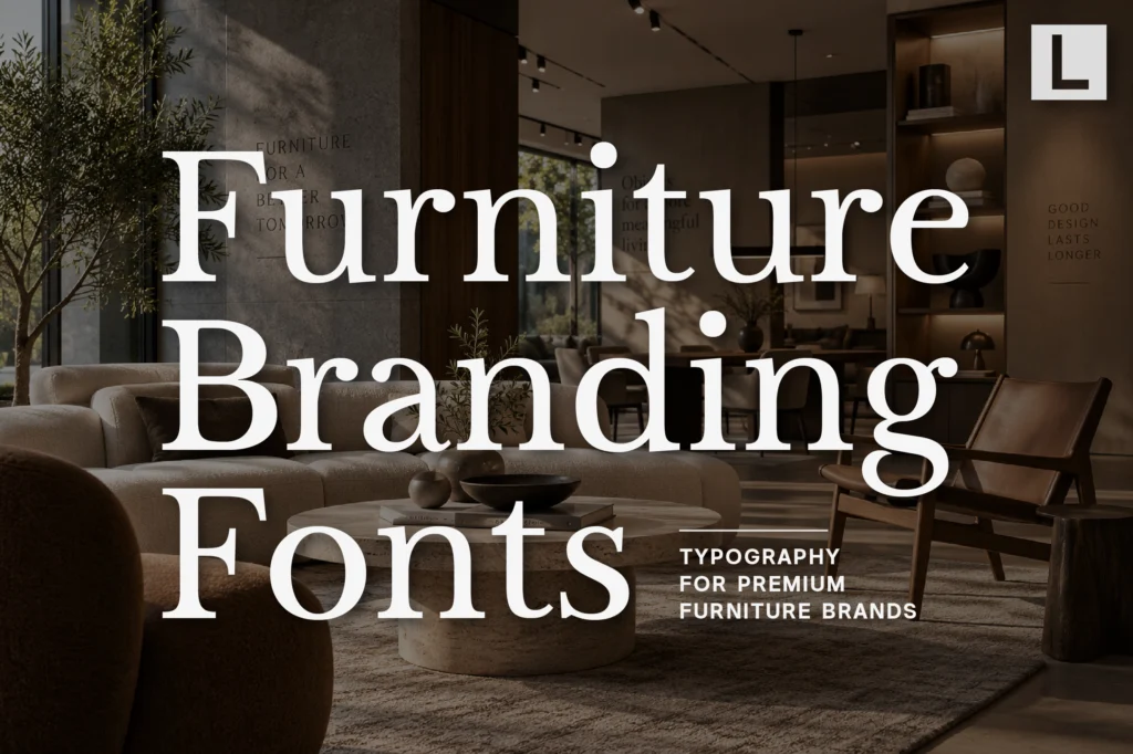
Luxury furniture is defined by details.
Materials, proportions, craftsmanship, finishes, and construction all contribute to the perception of quality. But before customers experience the product physically, they often encounter its visual identity.
A furniture brand may first appear through a website, catalogue, showroom, packaging, social media campaign, or product photography.
Typography connects these touchpoints.
The right furniture branding font can make a collection feel sophisticated, contemporary, artisanal, architectural, or bold while allowing the furniture itself to remain the focus.
Why Typography Matters in Furniture Branding
Premium furniture brands often operate somewhere between product design, architecture, fashion, and lifestyle.
That gives typography an unusually important role.
A typeface can reinforce:
- Craftsmanship
- Sophistication
- Modernity
- Precision
- Heritage
- Design innovation
The goal isn’t simply to make the brand look expensive.
The typography should communicate the design philosophy behind the furniture.
What Makes a Good Furniture Branding Font?
Furniture branding needs typography that can work around highly visual product photography.
A good typeface should have enough personality for campaigns while remaining controlled enough for catalogues and product information.
Look for:
- Elegant proportions
- Strong readability
- Distinctive details
- Flexible hierarchy
- Professional presentation
- Good performance in print and digital
This is especially important for brands with large product collections.
Serif Fonts for Luxury Furniture Brands
Refined serif typography can create an immediate connection with editorial design and luxury interiors.
It works particularly well when furniture photography emphasizes materials such as marble, wood, leather, metal, or handcrafted finishes.
Recommended for Refined Furniture Branding
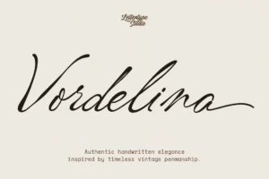
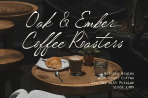
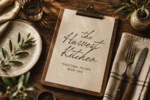


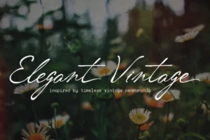
Vordelina brings an expressive editorial character that can work beautifully for premium furniture collections, catalogue covers, campaign headlines, and sophisticated showroom identities.
Its personality gives the brand a more distinctive voice while maintaining the polished feeling expected from high-end design.
Typography for Furniture Catalogues
A furniture catalogue is more than a product list.
Premium catalogues often combine large-scale photography with product descriptions, dimensions, materials, designer information, and collection stories.
Typography needs to establish a clear hierarchy between all of these elements.
A strong system might use:
Collection Name
Large editorial display.
Product Name
Secondary headline.
Description
Comfortable reading typography.
Specifications
Compact supporting information.
Dimensions & Materials
Functional information system.
The result should feel closer to a design publication than a conventional catalogue.
Lifestyle Typography for Furniture Brands
Furniture brands increasingly sell an entire lifestyle.
A sofa isn’t presented only as a piece of furniture. It becomes part of a living room, a hotel, a workspace, or an aspirational interior.
Typography can reinforce that emotional positioning.
Recommended for Lifestyle-Led Furniture Brands
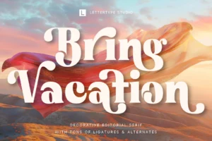
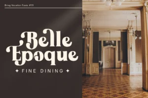
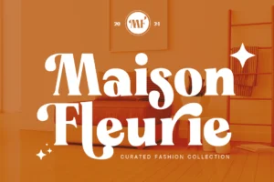
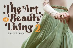
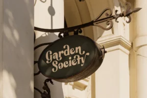
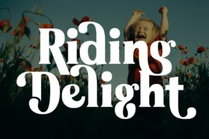
Bring Vacation offers a warmer and more relaxed character that can work particularly well for lifestyle campaigns, resort-inspired collections, outdoor furniture, hospitality furniture, and editorial storytelling.
Used selectively, it can soften an otherwise highly polished identity and make the brand feel more experiential.
Sans Serif Fonts for Modern Furniture
Contemporary furniture brands often need a clean functional layer.
Websites, product pages, price lists, showroom signage, specification sheets, and digital catalogues all require excellent readability.
Recommended for Modern Furniture Systems
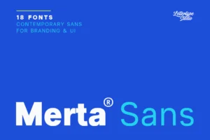
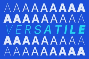
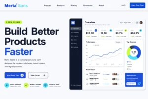
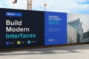
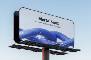
Merta Sans provides the practical foundation for this type of communication.
Its 18-style family allows designers to build hierarchy across product names, descriptions, navigation, specifications, and marketing materials.
For furniture brands with large collections, this flexibility can make the identity significantly easier to manage.
Bold Typography for Furniture Campaigns
Furniture campaigns sometimes need typography with considerably more impact.
A single chair, sofa, or lighting object can become the hero of a campaign, surrounded by large areas of negative space.
A bold display typeface can create contrast against that minimal composition.
Recommended for Statement Campaigns
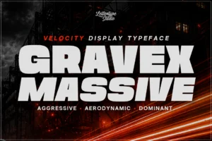



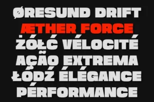

Gravex Massive provides a much stronger visual voice for campaign headlines, showroom events, collection launches, posters, and social media graphics.
Its heavy display presence can create a strong focal point without requiring additional graphic decoration.
The key is using it selectively rather than allowing the display typeface to dominate every part of the brand.
Experimental Typography for Contemporary Design Brands
Furniture design is closely connected with innovation.
Brands working with new materials, modular systems, digital fabrication, sustainable production, or experimental forms may want typography that feels less traditional.
Recommended for Contemporary Design Concepts
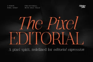
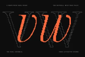
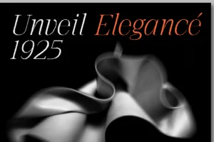
The Pixel Editorial introduces a more unconventional visual language through its structured yet irregular character.
For experimental furniture collections, design exhibitions, digital campaigns, or collaborations between furniture and technology brands, it can provide a distinctive contemporary accent.
Typography and Product Photography
Furniture branding often depends on photography.
The product needs enough space to communicate its silhouette, materials, texture, and proportions.
Typography should therefore work with the image rather than fight against it.
Large headlines with generous spacing can create a premium editorial feeling.
Smaller typography can provide product information without interrupting the visual experience.
This balance is especially effective for brands positioned at the intersection of furniture, architecture, and luxury interiors.
Building a Furniture Brand Typography System
A complete furniture identity can assign different jobs to different typefaces.
Display font
For collection launches and major campaigns.
Editorial font
For brand storytelling and catalogue covers.
Sans serif
For product information and digital communication.
Accent font
For special collections, collaborations, or seasonal campaigns.
This creates flexibility while maintaining a recognizable visual identity.
Typography for Showrooms
Physical showrooms create another important typography environment.
Furniture brands may use type across:
- Exterior signage
- Product labels
- Collection names
- Wall graphics
- Price cards
- Catalogues
- Wayfinding
- Digital displays
Typography needs to remain legible at different scales while maintaining the same premium character established online and in print.
Consistency between the showroom and digital experience makes the brand feel more complete.
Choosing the Right Font for a Furniture Brand
Different furniture brands require different typographic personalities.
A heritage furniture maker may benefit from refined serif typography. A contemporary Scandinavian-inspired brand might prefer a restrained sans serif. An experimental design studio could use something more unconventional.
Before choosing a furniture branding font, consider:
- What materials define the collection?
- Is the brand traditional or contemporary?
- Who is the target customer?
- Does the typography complement product photography?
- Can it work across catalogues and websites?
- Does it remain distinctive at showroom scale?
Typography should ultimately feel like another designed component of the product experience.
Conclusion
Luxury furniture branding is built around details.
Typography is one of those details.
The right typeface can reinforce craftsmanship, sophistication, innovation, or contemporary design while creating consistency across catalogues, websites, campaigns, showrooms, and social media.
The strongest furniture branding fonts don’t simply make a company look premium. They help communicate the design philosophy behind the products.
Whether you’re branding a luxury furniture manufacturer, boutique design studio, contemporary collection, or premium interiors company, thoughtful typography can turn product presentation into a complete visual experience.
Explore the Lettertype Studio collection for refined serif, contemporary sans serif, and distinctive display typefaces designed for furniture, interiors, architecture, editorial design, and premium branding.
Featured Fonts from Lettertype Studio
- Vordelina — Editorial character for sophisticated furniture collections and premium campaigns.
- Bring Vacation — Lifestyle-oriented typography for relaxed and experiential furniture brands.
- Merta Sans — Flexible system for catalogues, websites, product information, and showroom communication.
- Gravex Massive — Bold display typography for collection launches and statement campaigns.
- The Pixel Editorial — Experimental direction for contemporary furniture and design concepts.