
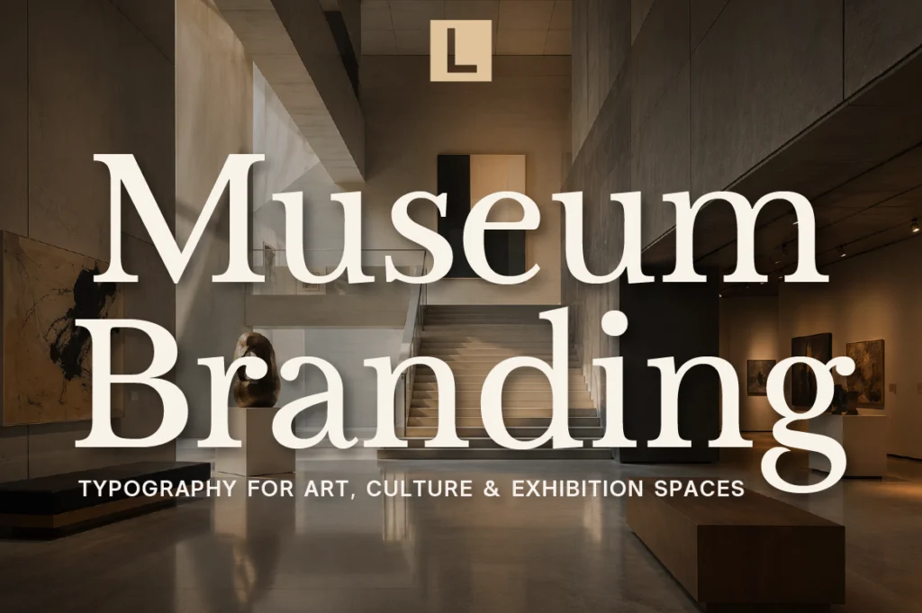
Museums and art galleries communicate through visual culture.
From exhibition posters and catalogues to gallery signage, websites, tickets, and social media, typography becomes part of the visitor’s experience long before they encounter an artwork in person.
Unlike conventional commercial branding, cultural institutions often need typography that can accommodate different artists, exhibitions, historical periods, and creative directions while maintaining a recognizable institutional identity.
The right museum branding font should therefore be both expressive and functional.
Why Typography Matters for Museums and Art Galleries
A museum identity has to perform several jobs at once.
It needs to establish credibility as an institution while remaining open to new ideas, artists, and audiences.
Typography can communicate:
- Cultural authority
- Creativity
- Contemporary relevance
- Intellectual character
- Accessibility
- Curatorial personality
A well-designed typographic system also helps visitors navigate exhibitions more comfortably.
The result is branding that doesn’t compete with the artwork, but creates a framework in which the artwork can exist.
Recommended for Contemporary Art
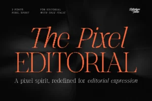
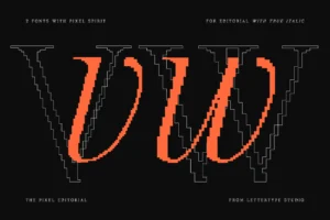
The Pixel Editorial offers a particularly interesting direction for contemporary art institutions. Its pixel-inspired structure combines technical precision with controlled irregularity, creating a visual language that feels experimental without becoming chaotic.
For digital exhibitions, new-media art, experimental galleries, and technology-focused cultural programs, that tension between structure and expression can become part of the institution’s identity.
What Makes a Good Museum Branding Font?
Museum typography has a difficult balance to maintain.
It needs enough personality to feel culturally relevant, but enough discipline to work across large amounts of information.
A strong museum typeface should offer:
- Clear hierarchy
- Excellent readability
- Distinctive character
- Flexibility across formats
- Strong display performance
- Long-term usability
This is especially important because museums often communicate through multiple layers of information, from exhibition titles and artist names to dates, descriptions, directions, and educational materials.
Recommended for Exhibition Campaigns
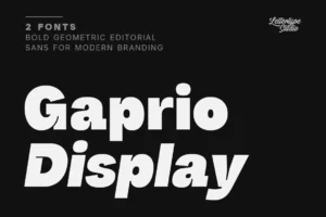
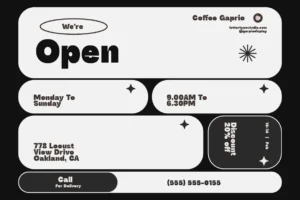
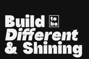
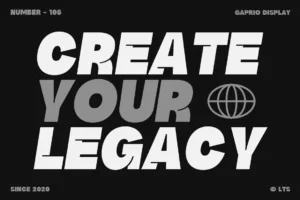

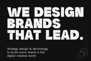
Gaprio Display provides a stronger contemporary display voice for exhibition posters, campaign headlines, promotional graphics, and cultural events. Its bold geometric character makes it useful when an exhibition needs a more immediate visual presence.
Serif Typography for Museum Publications
Museums also have a long relationship with editorial design.
Exhibition catalogues, academic publications, artist monographs, annual reports, and printed programmes all require typography that can support serious reading while retaining a sophisticated visual character.
This is where an editorial serif becomes particularly useful.
Recommended for Art Books & Catalogues
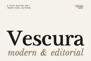
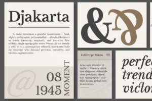
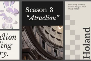
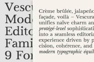
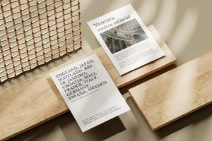
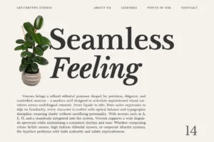
Vescura is a natural fit for museum publications. Its modern transitional serif structure was designed to balance clarity, structure, and editorial expression, while its intended applications include editorial and magazine design, creative direction, and art publishing.
It can provide a more literary and institutional tone for exhibition catalogues, collection books, curatorial essays, and premium printed materials.
Typography Should Support the Artwork
One of the biggest challenges in cultural branding is avoiding typography that becomes more visually dominant than the artwork itself.
A museum may host radically different exhibitions throughout the year.
One exhibition might be minimalist and monochromatic. Another could be colorful, historical, experimental, or deeply typographic.
The institutional typography therefore needs enough restraint to coexist with different artistic languages.
A flexible system allows exhibition-specific graphics to change while keeping the museum recognizable.
Building a Museum Typography System
A complete museum identity often needs several typographic roles.
Display typography
For exhibition titles, posters, and campaigns.
Editorial typography
For catalogues, essays, publications, and curatorial content.
Information typography
For signage, labels, directions, tickets, and visitor information.
Digital typography
For websites, event listings, newsletters, and online collections.
Using one typeface for every role isn’t always necessary.
A carefully selected combination can create stronger hierarchy while making the identity easier to use across different environments.
Recommended for Information Systems
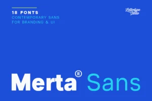
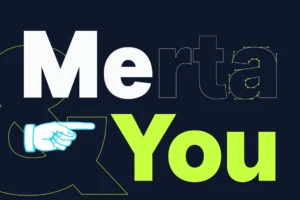
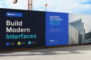
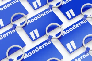
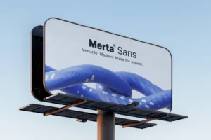
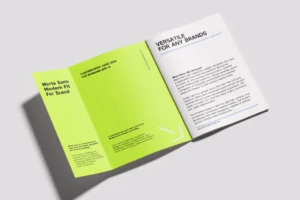
Merta Sans is particularly useful as the functional layer of a museum identity. Its broad family, 18 styles, and strong language support make it suitable for websites, signage, presentation systems, and information-heavy layouts.
This gives designers a practical counterpart to more expressive display and editorial fonts.
Adding Human Personality to Cultural Branding
Not every museum experience needs to feel institutional.
Independent galleries, artist-run spaces, craft museums, design exhibitions, and community cultural programs can benefit from more personal typography.
A handwritten typeface can be especially useful when the identity needs to communicate the human side of art and culture.
Recommended for Artist-Led Experiences
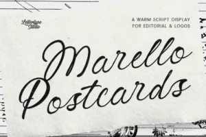
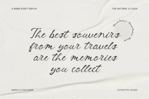
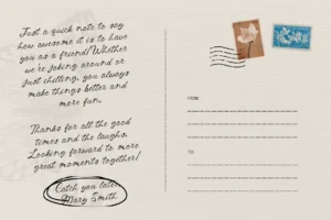
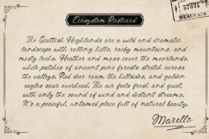

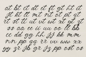
Marello Postcards introduces a warmer handwritten voice that can be used selectively for artist notes, special exhibitions, event invitations, social content, or educational materials.
Rather than using it as the primary institutional typeface, it works better as an expressive accent that makes specific cultural experiences feel more personal.
Creating Distinctive Exhibition Identities
Museums don’t necessarily need a completely different brand for every exhibition.
Instead, typography can create a flexible framework where each exhibition receives its own personality while remaining connected to the institution.
A strong system might use:
- One consistent institutional typeface
- A flexible display typeface
- Exhibition-specific graphic treatments
- Consistent information hierarchy
- A recognizable spacing system
This approach allows the museum to evolve visually without losing recognition.
Choosing the Right Font for a Museum
Before selecting typography, consider the institution’s role and audience.
Ask:
- Is the museum historical, contemporary, or multidisciplinary?
- Does the identity need to feel institutional or experimental?
- Will typography be used for large exhibitions?
- Does it need to support multilingual information?
- Will the same system work in print, signage, and digital environments?
- Can the typography coexist with very different artworks?
The best museum typography isn’t necessarily the most decorative.
It is the typography that creates enough structure for art to communicate while giving the institution its own recognizable voice.
Conclusion
Museum and art gallery branding requires a delicate balance between cultural authority and creative expression.
Typography helps create that balance by providing structure for exhibitions, publications, signage, digital experiences, and educational materials while allowing individual artworks and artists to remain the focus.
The best museum branding fonts are flexible enough to evolve with changing exhibitions while remaining recognizable as part of a larger institutional identity.
Whether you’re branding a contemporary gallery, a cultural institution, an independent art space, or a museum publication, thoughtfully selected typography can turn every visitor interaction into part of the overall experience.
Explore the contemporary typeface collection from Lettertype Studio for editorial, display, serif, and sans serif fonts designed for cultural branding, publications, exhibitions, and modern visual identities.
Featured Fonts from Lettertype Studio
- The Pixel Editorial — Experimental editorial typography for contemporary art and digital exhibitions.
- Gaprio Display — Bold geometric display typography for exhibition campaigns and cultural posters.
- Vescura — Refined editorial serif for catalogues, art books, and curatorial publications.
- Merta Sans — Flexible sans serif system for signage, information, websites, and wayfinding.
- Marello Postcards — Handwritten accent for artist-led storytelling and cultural events.
- Becaure — Distinctive display typography for exhibition identities and creative campaigns.