
A luxury spa is designed around a feeling. From the moment a guest enters the space, everything is carefully considered to create calm, comfort, and a sense of escape.
The same principle should apply to the brand identity.
Typography appears on the spa logo, treatment menus, product packaging, website, booking system, signage, and social media. When those elements share a thoughtful typographic language, the entire brand begins to feel more cohesive and premium.
For wellness businesses, the right font should not simply look beautiful. It should help communicate the feeling customers expect to experience.
Why Typography Matters in Spa Branding
Wellness branding is highly emotional.
Customers are often looking for more than a treatment. They are looking for relaxation, self-care, confidence, and a moment away from their everyday routine.
Typography can reinforce those emotions through qualities such as:
- Calm
- Elegance
- Warmth
- Trust
- Natural sophistication
- Premium simplicity
A carefully selected typeface can make a spa feel more inviting before a customer even books an appointment.
Recommended for Calm Wellness Brands
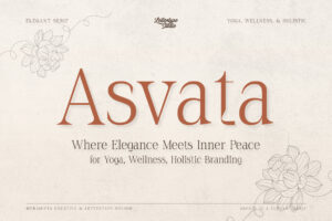
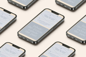
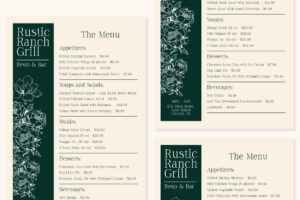
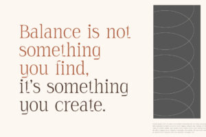
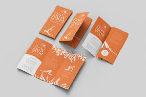

Asvata brings a calm, elegant, and purposeful character that works naturally for wellness brands seeking a refined visual identity. Its understated personality makes it suitable for spa identities, premium self-care brands, wellness campaigns, and sophisticated packaging.
What Makes a Good Spa Branding Font?
Spa typography should feel effortless.
Overly decorative fonts can make a wellness brand feel busy, while extremely rigid typography may create a cold or clinical impression.
A strong spa font usually benefits from:
- Soft visual rhythm
- Excellent readability
- Refined proportions
- Comfortable spacing
- Contemporary elegance
- Versatility across print and digital
The goal is to create an atmosphere of calm without sacrificing professionalism.
Recommended for Modern Wellness Branding
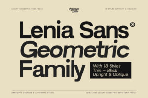
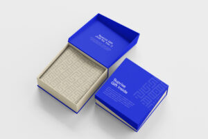
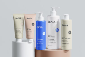
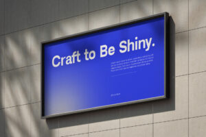
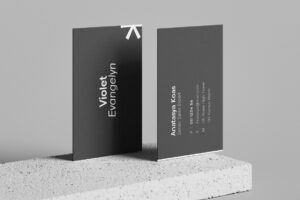
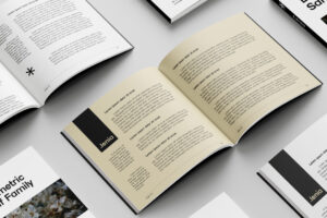
Lenia Sans offers a soft yet confident direction for modern wellness identities. Its clean structure makes it particularly useful for spa websites, treatment menus, social media, booking interfaces, and minimalist wellness campaigns. LTS also positions Lenia Sans as effective for lifestyle and wellness brands.
Serif Fonts Can Make Wellness Feel More Premium
Wellness branding doesn’t have to rely entirely on minimal sans serif typography.
A sophisticated serif can introduce warmth, elegance, and editorial character while maintaining a calm visual atmosphere.
This approach works especially well for:
- Luxury spas
- Boutique retreats
- Premium skincare
- Holistic wellness
- Private wellness clubs
- High-end self-care brands
The key is choosing a serif with enough restraint to complement the peaceful nature of the brand.
Recommended for Luxury Spa Identities
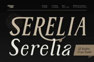
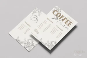


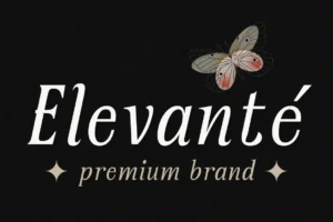
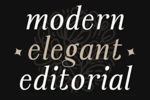
Serelia brings soft contemporary elegance to wellness branding. Its graceful curves and refined editorial character make it particularly effective for spa branding, skincare campaigns, premium packaging, and feminine wellness identities. LTS explicitly highlights Serelia for spa branding and wellness campaigns.
Typography Across the Spa Experience
A spa brand communicates through far more than its logo.
Typography may appear on:
- Treatment menus
- Booking websites
- Appointment cards
- Product packaging
- Gift vouchers
- Interior signage
- Social media
- Loyalty cards
- Staff uniforms
- Wellness guides
Consistency across these touchpoints makes the brand experience feel intentional.
A guest should be able to move from the website to the treatment room without feeling like they’ve entered a completely different brand environment.
Recommended for Premium Wellness Content
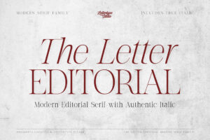
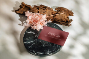
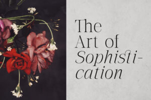
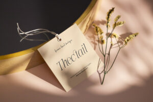
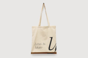
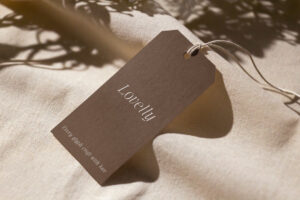
The Letter Editorial provides a polished editorial voice for longer wellness content, treatment guides, brochures, brand stories, and premium publications. Its structured rhythm can bring sophistication to information-heavy materials without making them feel clinical.
Typography for Spa and Skincare Packaging
Many modern wellness businesses extend beyond physical treatments.
Spas increasingly sell skincare products, body oils, candles, supplements, bath products, and other self-care products under their own brands.
This makes packaging typography an important part of the identity.
The typeface needs to remain elegant on a small product label while still creating enough personality to distinguish the product from competitors.
Recommended for Premium Packaging
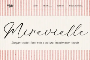
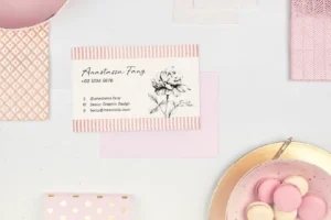
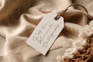
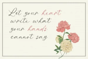
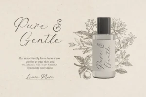
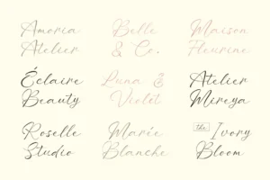
Mirevielle introduces a softer and more delicate editorial character that can work beautifully for premium self-care products, feminine wellness collections, spa gift sets, and boutique skincare packaging. Its graceful personality gives packaging a more personal and elevated feeling.
Creating a Sense of Calm Through Typography
Typography can influence how a brand feels before the audience consciously notices it.
Generous spacing, restrained hierarchy, soft contrasts, and carefully selected letterforms can create visual breathing room. Combined with natural photography and neutral colors, typography becomes part of the calming experience.
This is particularly important for wellness brands because visual noise can contradict the promise of relaxation.
The best wellness identities often say less while communicating more.
Choosing the Right Font for Your Spa Brand
Every wellness business has its own personality.
A luxury urban spa may require polished contemporary typography, while a countryside retreat could benefit from warmer and more organic letterforms.
Before choosing a typeface, consider:
- What should customers feel when they see the brand?
- Does the typography feel calm rather than busy?
- Does it complement the interior environment?
- Is it readable across booking platforms and printed materials?
- Can it work on both packaging and digital applications?
- Will it remain elegant as the business grows?
The right typeface should support the entire experience rather than simply decorate the logo.
Building a Consistent Wellness Identity
Premium wellness brands understand that customers experience the brand through small details.
A beautifully designed treatment menu, appointment card, product label, and website all contribute to the same perception of quality.
Typography connects those details.
When the same typographic language appears across every touchpoint, the brand feels more established, more considered, and more trustworthy.
That consistency is particularly valuable for boutique spas competing with larger wellness chains.
Conclusion
Luxury wellness is about creating an environment where customers can slow down, reconnect, and feel cared for. Typography plays a quiet but important role in establishing that atmosphere.
The best spa branding fonts balance elegance with calm, personality with readability, and premium aesthetics with practical usability.
Whether you’re building a luxury day spa, wellness retreat, skincare studio, holistic practice, or premium self-care brand, thoughtfully selected typography can transform individual touchpoints into one cohesive experience.
Explore the premium typeface collection from Lettertype Studio for sophisticated serif, sans serif, and editorial fonts designed for wellness, lifestyle, packaging, and modern premium branding.
Featured Fonts from Lettertype Studio
- Asvata — Calm and refined serif for sophisticated wellness identities.
- Lenia Sans — Soft contemporary sans serif for modern spa and digital wellness brands.
- Serelia — Elegant editorial serif for luxury spa, skincare, and wellness branding.
- The Letter Editorial — Refined typography for wellness publications and long-form content.
- Mirevielle — Delicate editorial character for premium self-care packaging and feminine wellness brands.