
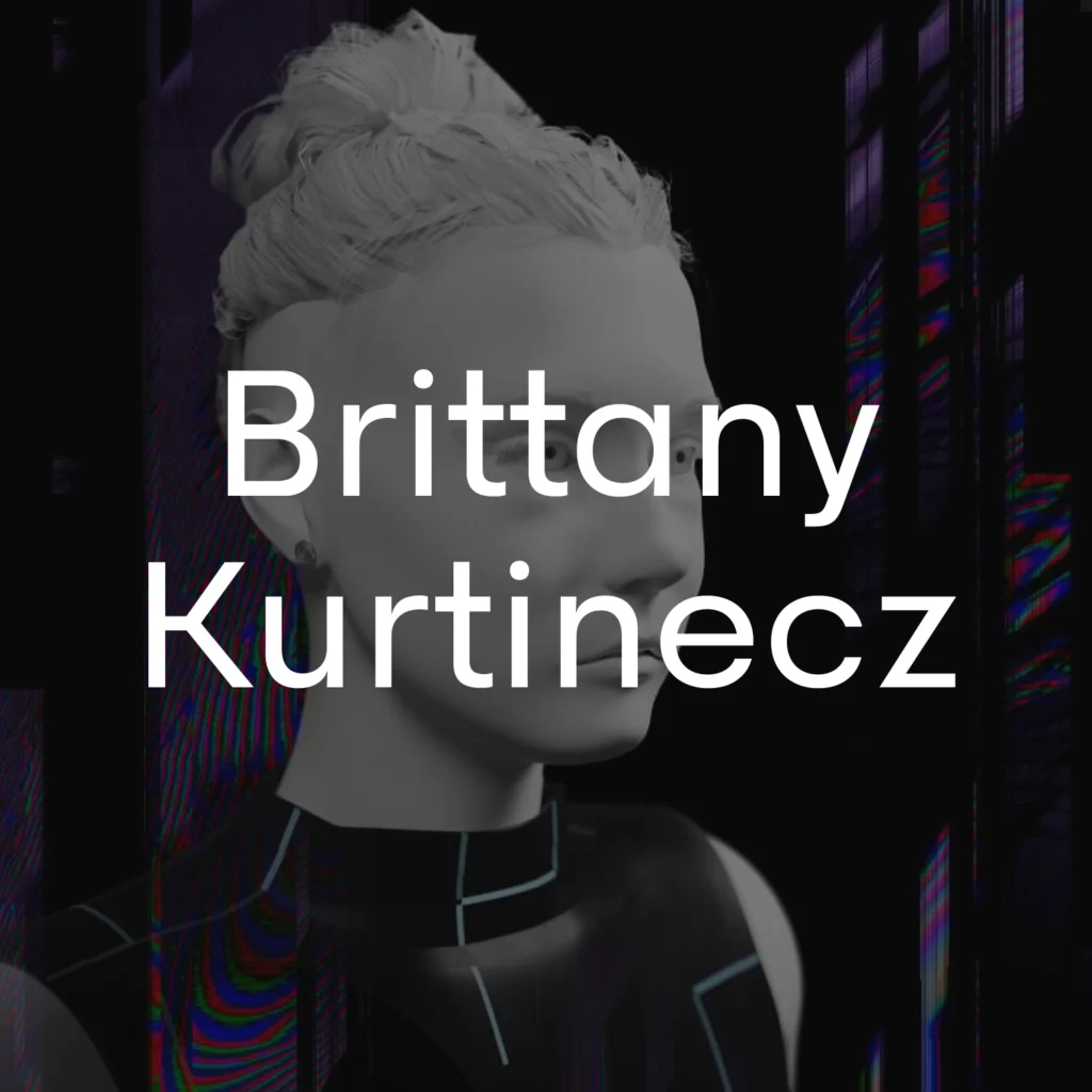
FONT IN USED: NARU SANS
Brittany Kurtinecz presents a clean and thoughtful digital portfolio—focusing on clarity, structure, and a straightforward presentation of work. The layout reflects a modern approach where content takes priority, supported by a calm and minimal visual system.
Set in Naru Sans, the typography reinforces this direction with a neutral and highly readable character—supporting a clear hierarchy while maintaining a contemporary and professional tone across the website.
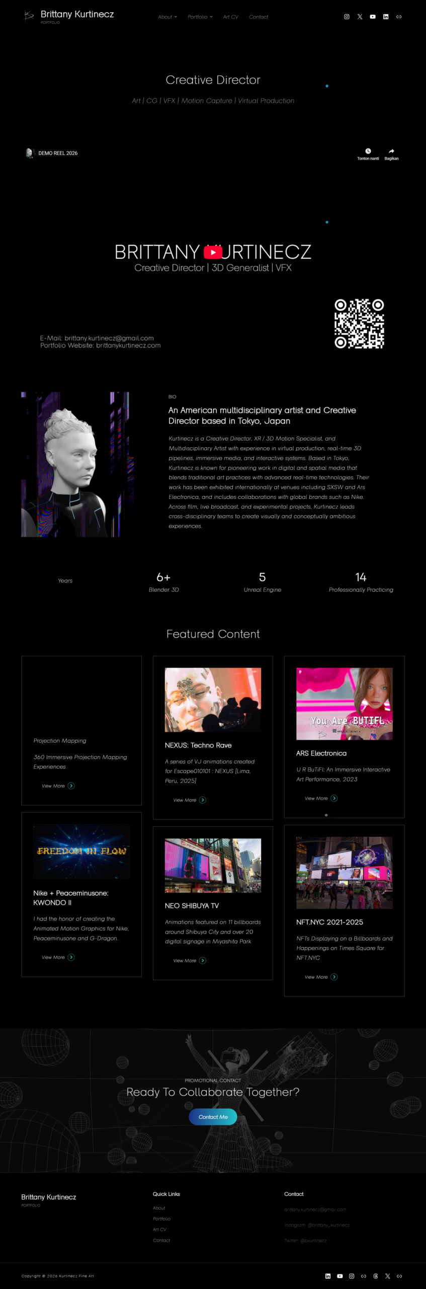
Brittany Kurtinecz: Website