
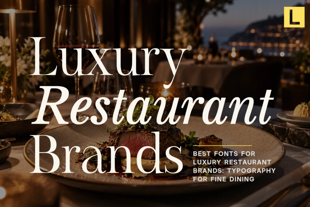
Fine dining is an experience built around detail. From the interior design and tableware to the menu, service, and presentation of each dish, every element contributes to the perception of quality.
Typography plays an equally important role.
A restaurant’s font can influence how guests perceive the establishment before they even see the food. Elegant typography can communicate sophistication, heritage, exclusivity, or contemporary culinary culture through something as simple as a restaurant name.
The right typeface can be used across menus, signage, packaging, websites, reservations, social media, and promotional materials to create a consistent visual identity.
In this guide, we explore the best fonts for luxury restaurant brands and how different typographic styles can help create a refined fine dining identity.
Why Typography Matters in Fine Dining Branding
Luxury restaurants rely heavily on atmosphere and perception.
Typography becomes part of that atmosphere because guests encounter it throughout the dining experience.
It can appear on:
- Restaurant logos and wordmarks
- Menus
- Exterior signage
- Table cards
- Business cards
- Reservation websites
- Social media
- Food packaging
- Wine lists
- Event invitations
- Promotional campaigns
A sophisticated typeface can make the brand feel more intentional and premium, while a poorly matched font can make the identity feel ordinary.
For fine dining, typography should support the restaurant’s personality rather than compete with the food or environment.
What Makes a Font Feel Luxurious?
There is no single formula for luxury typography, but several characteristics frequently appear in premium restaurant identities.
Refined Letterforms
Elegant proportions and carefully designed letterforms can immediately create a more sophisticated visual impression.
Serifs, high contrast, and distinctive details can be particularly effective for upscale restaurants.
Strong Personality
Luxury restaurants often need to stand apart from competitors.
A distinctive typeface can give a restaurant its own visual voice rather than relying on generic typography.
Good Readability
A beautiful menu still needs to be easy to read.
Typography should remain clear across different sizes, especially for menus, dish descriptions, prices, and reservation information.
Versatility
Restaurant branding extends beyond the logo.
The selected font should work across print, signage, digital interfaces, packaging, and social media.
1. Elegant Serif Fonts
Elegant serif fonts are one of the strongest choices for traditional luxury restaurant branding.
Their sophisticated appearance can communicate heritage, craftsmanship, and exclusivity.
Serifs work particularly well for:
- Restaurant names
- Menu covers
- Wine lists
- Fine dining invitations
- Editorial campaigns
- Premium packaging
A refined serif can be especially effective for restaurants inspired by European culinary traditions or classic hospitality.
2. Modern Serif Fonts
Modern serif fonts bring a more contemporary interpretation of fine dining.
They can retain the elegance associated with traditional serif typography while introducing sharper proportions and a more editorial personality.
This makes them ideal for contemporary fine dining, boutique restaurants, chef-led concepts, luxury hotel restaurants, and modern culinary brands.
A modern serif can make a restaurant feel sophisticated without appearing overly formal.
3. Minimalist Sans Serif Fonts
Not every luxury restaurant needs a serif.
A minimalist sans serif can create a clean, architectural identity that works particularly well for contemporary restaurants.
This approach is useful for restaurants where the design language is centered around modern architecture, minimal interiors, Japanese-inspired aesthetics, contemporary cuisine, or experimental dining.
The simplicity of a sans serif can also create an interesting contrast with photography and food presentation.
4. Geometric Sans Serif Fonts
Geometric sans serifs provide a more structured and contemporary direction.
Their clean forms can make a restaurant identity feel precise and confident.
They are particularly useful for modern urban restaurants, design-driven concepts, and hospitality groups.
A geometric sans serif can also work well as the supporting typeface when paired with an elegant display serif.
5. Expressive Display Fonts
Some restaurants need a stronger personality.
Expressive display fonts can be useful for brands that want to feel artistic, fashionable, theatrical, or unconventional.
They can work particularly well for boutique restaurants, cocktail bars, chef collaborations, culinary events, and contemporary food concepts.
The important thing is moderation. A highly expressive display font is often most effective when reserved for the restaurant name, campaign headlines, or special occasions.
Best Lettertype Studio Fonts for Luxury Restaurant Branding
Several Lettertype Studio fonts can provide different directions for a premium restaurant identity.
Vescura
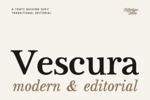
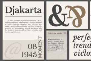
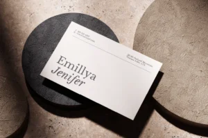
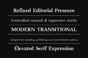
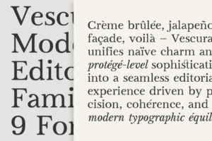
Vescura is a strong choice for luxury restaurant branding where the identity needs to feel refined and distinctive.
It can work particularly well for restaurant names, menus, editorial headlines, and premium culinary campaigns where typography needs to make a sophisticated first impression.
Montegar
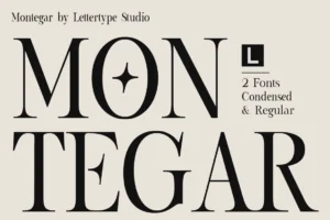
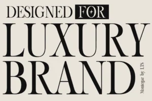
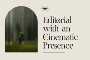
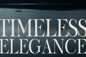
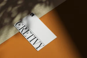

Montegar offers a more distinctive display personality.
It can work well for boutique restaurants and culinary brands looking for a premium identity with stronger visual character.
Horiva Sans
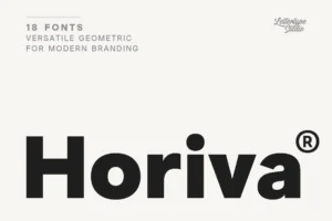
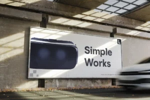
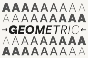
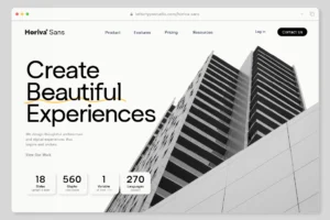

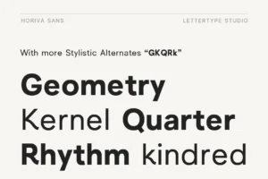
Horiva Sans provides a cleaner contemporary direction.
Its modern sans serif character can be used for restaurant identities, menus, websites, navigation, and supporting information.
Vordelina
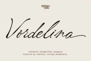
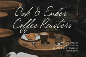
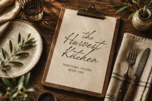

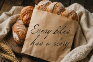
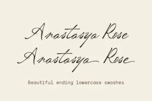
Vordelina brings a strong display presence to the lineup.
It can be useful for restaurant logos, promotional campaigns, packaging, and large-scale typography where the brand needs a more expressive visual statement.
Lenia Soft
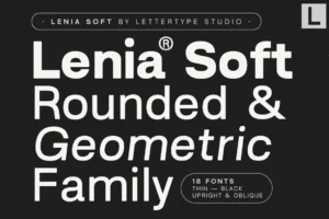
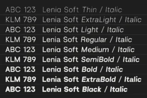
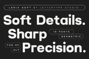
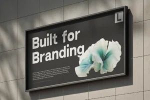
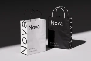

Lenia Soft offers a softer personality that can work nicely for sophisticated cafés, lifestyle restaurants, dessert brands, and boutique hospitality concepts.
Inkora Sans
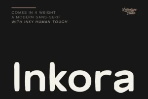
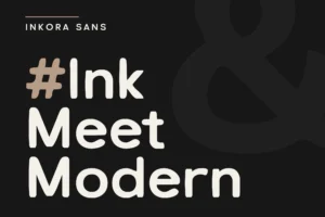
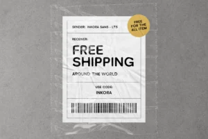

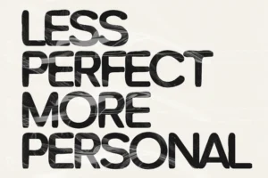
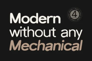
Inkora Sans provides a more distinctive contemporary direction.
Its character can be useful for restaurants that want a modern identity with a less conventional personality, particularly across promotional graphics, menus, social media, and supporting brand applications.
Ngawi Sans
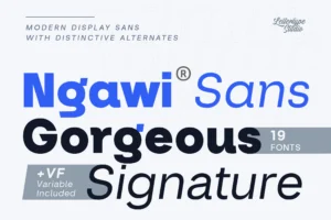
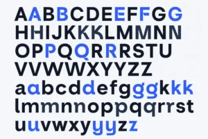
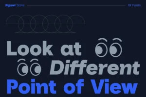
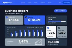
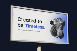
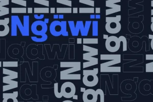
Ngawi Sans works well when a restaurant needs a modern display sans with a strong visual identity.
It can be especially effective for contemporary culinary concepts, restaurant campaigns, signage, and branding systems that need clean typography with distinctive character.
Choosing Fonts for Restaurant Menus
The menu is one of the most important typographic applications in a restaurant.
Unlike a logo, a menu contains a large amount of information, so hierarchy and readability become critical.
A useful approach is to create different levels of typography:
Restaurant Name
Display Typeface
Menu Category
Secondary Typeface
Dish Name
Primary Text Typeface
Description and ingredients
Readable Supporting Typeface
Price
Consistent Supporting Typeface
This structure allows the brand to maintain its personality while keeping the menu easy to navigate.
Typography for Restaurant Logos
Restaurant logos need to be memorable while reflecting the concept.
A classic fine dining restaurant may benefit from a sophisticated serif wordmark, while a modern restaurant could use a minimalist sans serif.
Letter spacing is also particularly important.
Luxury restaurant identities often benefit from generous spacing, allowing the wordmark to breathe and creating a more premium visual rhythm.
However, spacing should always be considered together with the specific letterforms. Simply increasing tracking does not automatically make a logo luxurious.
Typography for Fine Dining Websites
Restaurant websites need to combine visual atmosphere with practical information.
Large typography can establish the mood of the restaurant on the homepage, while supporting typography handles:
- Reservations
- Opening hours
- Menus
- Location
- Contact information
- Private dining
- Events
An elegant display font paired with a clean sans serif can create an effective balance.
The display type establishes the restaurant’s personality, while the supporting font keeps the website functional.
Typography for Restaurant Packaging
Luxury restaurants increasingly extend their identities into takeaway packaging, gift boxes, coffee products, sauces, and other branded products.
This creates another opportunity for typography to reinforce the brand.
A distinctive serif or display font can make packaging feel premium even when the design itself remains minimal.
For packaging, large typography can also work particularly well when combined with generous negative space and restrained visual elements.
Serif and Sans Serif Pairings
Combining serif and sans serif typefaces is one of the easiest ways to create typographic hierarchy.
For example:
Restaurant Name
Elegant Serif
Menu categories
Modern Serif
Dish information
Clean Sans Serif
This combination creates contrast without making the identity feel visually complicated.
For contemporary restaurants, the hierarchy can also be reversed:
Restaurant Name
Modern Sans Serif
Editorial headlines
Elegant Serif
Supporting information
Minimal Sans Serif
The result can feel modern while retaining a sense of luxury.
Matching Typography to the Restaurant Concept
The best font is ultimately the one that matches the restaurant’s personality.
Classic Fine Dining
Elegant serif fonts are ideal for restaurants emphasizing heritage, tradition, and formal dining.
Contemporary Fine Dining
Modern serifs and sophisticated sans serifs can create a more current identity.
Boutique Restaurant
Distinctive display fonts can help independent restaurants establish a recognizable personality.
Japanese-Inspired Restaurant
Minimalist sans serifs or restrained modern serifs can complement clean architecture and minimalist presentation.
Luxury Hotel Restaurant
Refined typography that aligns with the hotel’s broader identity can create a cohesive guest experience.
Bold Culinary Concept
Expressive display fonts can help experimental restaurants communicate a more unconventional personality.
Final Thoughts
The best fonts for luxury restaurant brands should do more than make a logo look elegant. They should help establish an entire visual language that works across menus, signage, websites, packaging, reservations, and promotional materials.
Elegant serif fonts can communicate tradition and sophistication, while modern serifs offer a more contemporary interpretation of luxury. Sans serif fonts provide clarity and minimalism, while expressive display typefaces can give boutique culinary brands a stronger personality.
For Lettertype Studio, Vescura, Montegar, Horiva Sans, Vordelina, Lenia Soft, Inkora Sans, and Ngawi Sans provide several different directions for premium restaurant and hospitality branding.
The most successful restaurant identities are not necessarily the most complicated. Often, a carefully selected typeface, strong hierarchy, generous spacing, and consistent application are enough to create a memorable premium identity.
Featured Fonts from Lettertype Studio
- Vescura — Refined and distinctive for premium dining identities
- Montegar — Distinctive display style for boutique restaurants
- Horiva Sans — Clean contemporary typography
- Vordelina — Expressive display direction for modern culinary brands
- Lenia Soft — Softer personality for lifestyle and boutique concepts
- Inkora Sans — Contemporary and distinctive for modern restaurant branding
- Ngawi Sans — Modern display sans with strong visual character