
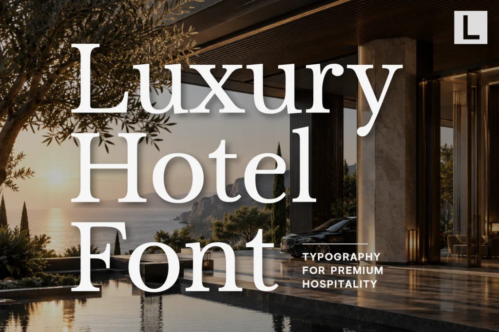
Luxury hotels compete on more than architecture, interiors, and service. Every visual detail contributes to the guest experience, including typography.
From hotel logos and signage to booking websites, menus, room materials, brochures, and social media, fonts help communicate the personality of a property before a guest ever walks through the door.
The right typeface can make a hotel feel elegant, sophisticated, contemporary, intimate, or exclusive. The wrong choice can make an otherwise premium identity feel generic or disconnected from the experience.
In this guide, we explore the best fonts for luxury hotel brands and how different typographic styles can be used to build a refined hospitality identity.
Why Typography Matters in Luxury Hotel Branding
A luxury hotel brand needs to communicate quality and confidence consistently across many touchpoints.
Typography plays an important role because it appears almost everywhere:
- Hotel logos and wordmarks
- Exterior and interior signage
- Booking websites
- Restaurant menus
- Room directories
- Business cards and stationery
- Brochures and promotional materials
- Social media graphics
- Guest welcome materials
- Event and wedding collateral
A carefully selected font creates visual consistency across these applications.
For luxury hospitality, typography should generally feel intentional rather than overly decorative. The goal is to create an atmosphere of exclusivity while remaining clear and functional.
What Makes a Font Suitable for a Luxury Hotel?
The best fonts for luxury hotel brands often share several characteristics.
Elegant Proportions
Fonts with balanced proportions and carefully designed letterforms can immediately create a more sophisticated impression.
High-contrast serifs, refined modern serifs, and elegant sans serifs are particularly effective for premium hospitality brands.
Strong Brand Personality
A luxury hotel should not necessarily look like every other luxury hotel.
A distinctive typeface can help establish a recognizable identity while still maintaining a premium appearance.
Excellent Readability
Luxury branding still needs to communicate information clearly.
Hotel names, room numbers, menus, navigation, and booking information should remain easy to read across different sizes and applications.
Versatility
A hotel identity may appear on a large entrance sign one moment and a small mobile screen the next.
A good typeface should therefore perform well across logos, headlines, body copy, signage, and digital applications.
1. Elegant Serif Fonts
Serif typefaces are among the most established choices for luxury hospitality branding.
Their refined details and traditional proportions can communicate heritage, sophistication, and timeless quality.
Elegant serif fonts work particularly well for:
- Hotel logos
- Resort identities
- Restaurant branding
- Editorial campaigns
- Printed guest materials
- Luxury wedding venues
For historic hotels or properties inspired by European architecture, a sophisticated serif can reinforce the sense of heritage and exclusivity.
2. Modern Serif Fonts
Modern serif fonts offer a more contemporary interpretation of luxury.
Compared with traditional serif designs, they can feel cleaner, sharper, and more fashion-oriented while maintaining the elegance associated with serif typography.
This makes modern serifs especially useful for boutique hotels, luxury resorts, and contemporary hospitality brands.
They can create an identity that feels premium without appearing overly traditional.
3. Minimalist Sans Serif Fonts
Luxury does not always need decorative typography.
A minimalist sans serif can create a sophisticated identity through simplicity.
Clean sans serif fonts are particularly effective for modern hotels that focus on architecture, minimal interiors, wellness, or contemporary experiences.
They can also provide excellent readability across digital booking platforms and hotel signage.
The key is choosing a sans serif with enough character to avoid looking generic.
4. Geometric Sans Serif Fonts
Geometric sans serif fonts are another strong choice for contemporary hospitality branding.
Their structured forms can create a feeling of precision, modernity, and confidence.
They work particularly well for:
- Urban luxury hotels
- Contemporary resorts
- Design hotels
- Architecture-focused properties
- Modern hospitality groups
Geometric sans serifs can also pair beautifully with elegant serif display fonts, creating contrast between classic luxury and contemporary simplicity.
5. High-Contrast Display Fonts
Some luxury hotels need stronger visual drama.
High-contrast display typefaces can create an editorial and sophisticated atmosphere, particularly when used for large headlines and campaigns.
These fonts can work especially well for luxury resorts, fashion-oriented hotels, boutique properties, and premium lifestyle destinations.
However, highly expressive display fonts should generally be used selectively. They are most effective as part of a larger typographic system rather than being used for every piece of information.
Best Lettertype Studio Fonts for Luxury Hotel Branding
For a premium hospitality identity, several fonts from Lettertype Studio can work particularly well.
Serelia
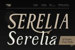
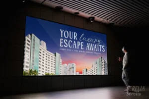
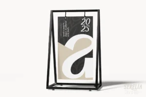
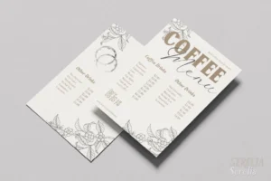
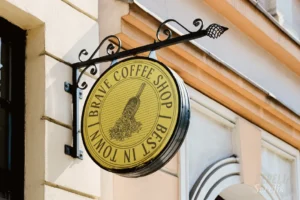
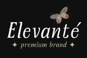

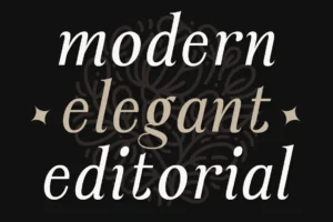
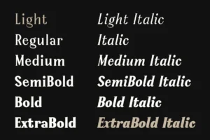
Serelia is a strong option for elegant hotel branding where the identity needs to feel refined and premium.
Its sophisticated character makes it suitable for hotel names, editorial headlines, invitations, and other luxury-oriented applications.
Montegar
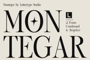
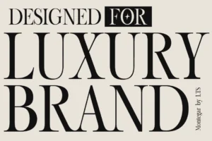
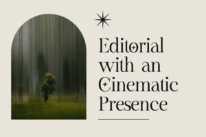
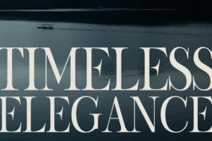
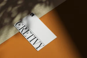
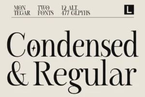
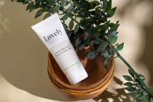
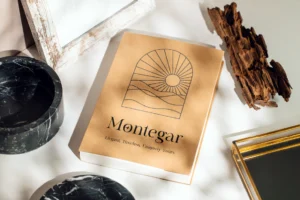

Montegar brings a more expressive premium character and can work well for boutique hotels, resorts, and hospitality brands that want a distinctive visual personality.
It can be especially effective in large display applications such as logos and campaign headlines.
Horiva Sans
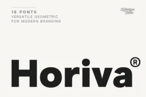

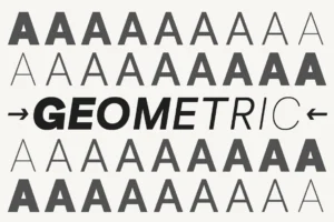
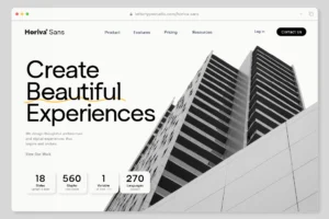


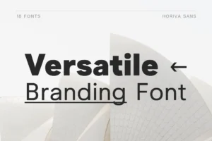

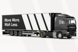
For hotels looking for a cleaner and more contemporary direction, Horiva Sans provides a modern sans serif approach.
It can work across hotel identities, signage, websites, and supporting brand communication.
Gravex Massive
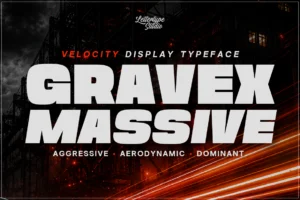
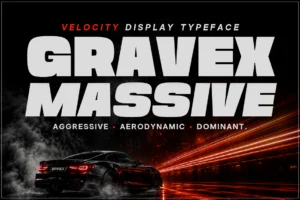






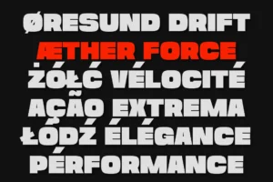
Gravex Massive is better suited to situations where the hotel brand needs a bold and highly visible typographic presence.
Its heavier display character can be useful for campaign graphics, promotional materials, and contemporary hospitality concepts.
Lenia Soft
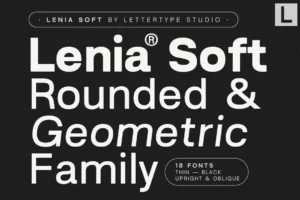
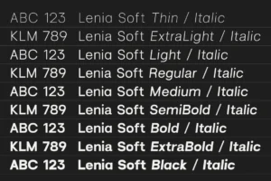
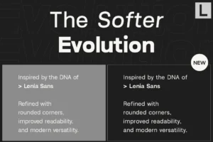
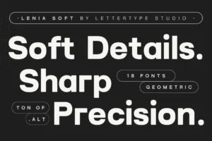
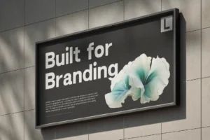

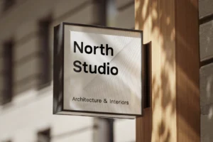
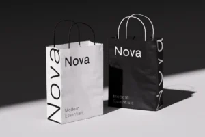
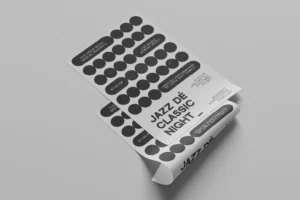
Lenia Soft offers a softer direction that can work particularly well for boutique hotels, lifestyle resorts, wellness properties, and hospitality brands that want a more approachable premium personality.
Serif and Sans Serif Pairings for Luxury Hotels
One of the most effective approaches to hotel typography is combining a distinctive display font with a clean supporting typeface.
For example, an elegant serif can be used for the hotel name and major headlines, while a minimalist sans serif handles navigation, descriptions, booking information, and smaller text.
This creates a clear hierarchy.
A typical system might look like:
Hotel Name
Elegant Serif
Section Headline
Elegant Serif
Body copy and navigation
Clean Sans Serif
This combination gives the brand both personality and usability.
For contemporary hotels, the relationship can also be reversed: a strong sans serif becomes the primary identity while a refined serif is introduced as an accent.
Typography for Hotel Logos and Wordmarks
The hotel logo is often the most important typographic element in the identity.
A good hotel wordmark should feel distinctive without becoming difficult to recognize.
Luxury hotel logos often benefit from:
- Carefully balanced letter spacing
- Elegant proportions
- Strong contrast
- Custom-looking letterforms
- Controlled use of decorative details
- Clear visual hierarchy
Typography should also reflect the hotel’s positioning.
A historic luxury hotel may benefit from a classic serif, while a new urban boutique property might be better represented by a modern sans serif or contemporary serif.
Typography for Hotel Websites
Hotel websites need to balance atmosphere with usability.
Large display typography can establish the mood of the property, particularly in hero sections and campaign pages. Supporting typography should then make practical information easy to navigate.
Important information such as:
- Room descriptions
- Amenities
- Rates
- Booking details
- Location information
- Restaurant menus
- Contact information
needs to remain highly readable.
A sophisticated display font combined with a clean sans serif is often an effective solution.
Typography for Hotel Signage
Signage is another important consideration.
Guests need to navigate a hotel easily, so typography cannot sacrifice readability for aesthetics.
Wayfinding signs, room numbers, elevators, restaurants, and facilities all require clear typography.
A premium hotel can still maintain an elegant visual identity while using a highly readable typeface for functional information.
The best result is often a combination of brand typography and functional typography rather than forcing one font to handle every application.
Typography for Hotel Menus and Printed Materials
Restaurant menus, spa brochures, welcome cards, and room directories provide opportunities to introduce more expressive typography.
Luxury serif fonts can create an editorial feel for restaurant menus, while minimalist sans serifs can make practical information feel clean and organized.
Printed materials are also an excellent place to experiment with typography hierarchy, spacing, and large display treatments without compromising usability.
How to Choose the Best Font for a Luxury Hotel Brand
Before selecting a typeface, consider the hotel’s personality.
Traditional Luxury
Choose refined serif typography with elegant proportions.
Best for heritage hotels, classic resorts, and properties with a strong sense of history.
Contemporary Luxury
Look for modern serifs or sophisticated sans serifs.
Best for modern architecture, premium city hotels, and contemporary resorts.
Boutique Luxury
Choose a typeface with stronger personality and distinctive details.
Best for independent hotels and lifestyle properties that need to stand apart.
Wellness and Resort Luxury
Softer serif or sans serif designs can create a calm and welcoming atmosphere.
Best for spa resorts, wellness retreats, and destination properties.
Bold Urban Luxury
Strong sans serifs and expressive display fonts can create a confident identity.
Best for design hotels and modern urban hospitality brands.
Final Thoughts
The best fonts for luxury hotel brands are not simply the most decorative or fashionable typefaces. They are fonts that communicate the hotel’s personality while remaining functional across every part of the guest experience.
Elegant serifs can communicate heritage and sophistication. Modern serifs can bring a contemporary sense of luxury. Sans serifs can create clean and confident identities, while expressive display fonts can give boutique properties a stronger personality.
For Lettertype Studio projects, fonts such as Serelia, Montegar, Horiva Sans, Gravex Massive, and Lenia Soft offer different directions for building premium hospitality identities.
The most important principle is consistency. When typography works together across the logo, website, signage, menus, and guest materials, it becomes part of the hotel’s overall experience—not just another visual element.
Featured Fonts from Lettertype Studio
- Serelia — Elegant and refined luxury serif
- Montegar — Expressive premium display style
- Horiva Sans — Clean contemporary sans serif
- Gravex Massive — Bold modern display typography
- Lenia Soft — Soft and approachable premium style