A logo doesn’t fail because it looks bad.
It fails because it doesn’t feel right.
And more often than not, that comes down to one decision:
the font.
In modern branding, sans serif fonts have become the go-to choice for logo design. But this isn’t just a trend—it’s a strategic decision used by brands that want to look clean, confident, and scalable.
So why do so many brands rely on sans-serif fonts for logos?
Why Sans Serif Fonts Work So Well for Logos
Sans-serif fonts offer something most brands need:
- Clarity at all sizes
- Strong visual presence
- Flexibility across media
From app icons to billboards, a well-designed sans-serif font maintains its integrity.
That’s why they dominate industries like:
- Tech
- Startups
- Corporate branding
- Digital products
The Advantage: Simplicity That Scales
A good logo needs to work everywhere.
Sans-serif fonts are:
- Easier to read at small sizes
- Cleaner on screens
- More adaptable in responsive design
This makes them ideal for modern branding systems that live across multiple platforms.
Best Sans Serif Fonts for Logo Design (2026 Picks)
Here are some of the best options if you want your logo to feel modern and premium.
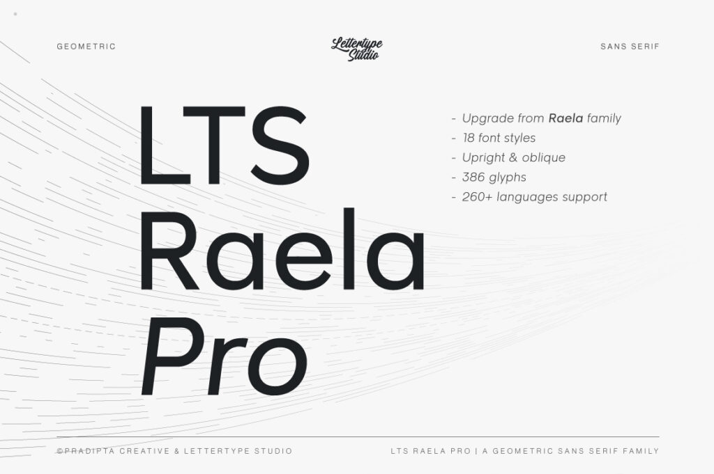
1. Raela Pro — Sharp and Professional
Raela Pro delivers a strong, structured look with clean geometry. Perfect for brands that want to feel precise, confident, and modern.
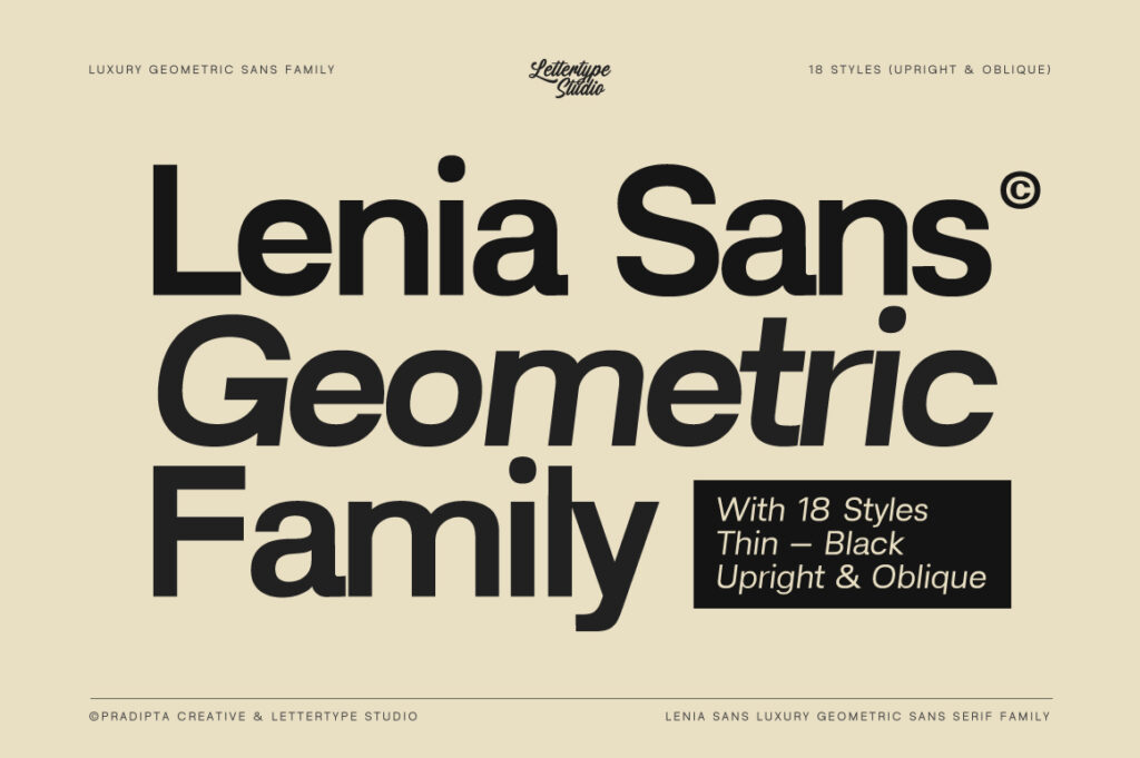
2. Lenia Sans — Minimal and Refined
Lenia Sans brings calm and balance into branding. Its subtle refinement makes it ideal for clean, minimalist logo systems.
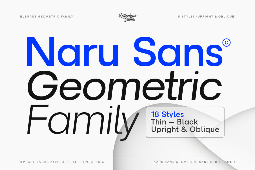
3. Naru Sans — Friendly but Controlled
Naru Sans offers a softer approach without losing structure. Great for brands that want to feel approachable yet professional.
4. The Pixel Editorial — Expressive Branding Edge
While not a pure sans serif system font, The Pixel Editorial works exceptionally well for logos that need personality and editorial flair.
5. Inter — Functional and Digital-Ready
Inter is widely used for digital interfaces. It’s highly readable and optimized for screens, though often lacks distinctive character for branding.
6. Helvetica Now — Neutral and Timeless
A classic choice. Helvetica remains one of the most widely used logo fonts due to its neutrality and clarity—but its popularity can reduce uniqueness.
7. Circular — Clean with Warmth
Circular blends geometric structure with subtle friendliness, making it suitable for modern lifestyles and tech brands.
When Sans Serif Might Not Be Enough
While sans serif dominates, it’s not always the perfect choice.
Some brands benefit from:
- Serif fonts for elegance
- Display fonts for uniqueness
For example, a luxury brand might gain more impact from a refined serif like Vescura, especially in high-end or editorial contexts.
How to Choose the Right Font for Your Logo
Before you decide, ask yourself:
- Do you want to feel modern or classic?
- Should your brand feel neutral or expressive?
- Will your logo be used more digitally or physically?
The answers will guide your choice.
Final Thought
A great logo isn’t about complexity—it’s about clarity and intention.
Sans-serif fonts continue to dominate because they offer both.
But the real advantage isn’t the category—it’s the execution.
Choose a font that aligns with your brand, and your logo will do the rest.