Minimalist Typography in Luxury Branding
Minimalist typography has become a defining element of luxury branding. Clean letterforms, generous spacing, and refined proportions communicate sophistication, exclusivity, and confidence without visual noise.
Luxury brands use minimalist typefaces to project clarity and premium positioning across logos, packaging, editorial layouts, and digital platforms. In typography, restraint often signals confidence and authority.
Why Minimalist Fonts Feel Premium
Minimalist fonts work exceptionally well in luxury contexts because they emphasize structure, balance, and subtle details rather than decorative features. Their simplicity allows brand systems to feel timeless, modern, and internationally relevant.
In high-end branding, typography must perform across multiple touchpoints—from print materials and packaging to websites and digital products—while maintaining a consistent premium tone.
Lettertype Studio Picks — Minimalist Fonts for Luxury Branding
Below are curated minimalist sans serif families from Lettertype Studio that align with luxury branding systems.
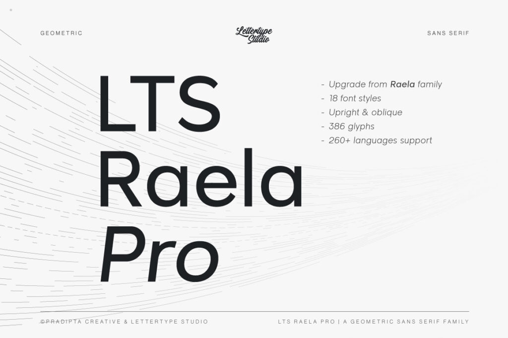
1. Raela Pro
Raela Pro offers a contemporary minimalist structure with refined proportions. It works well for luxury branding, editorial layouts, and premium corporate identities.
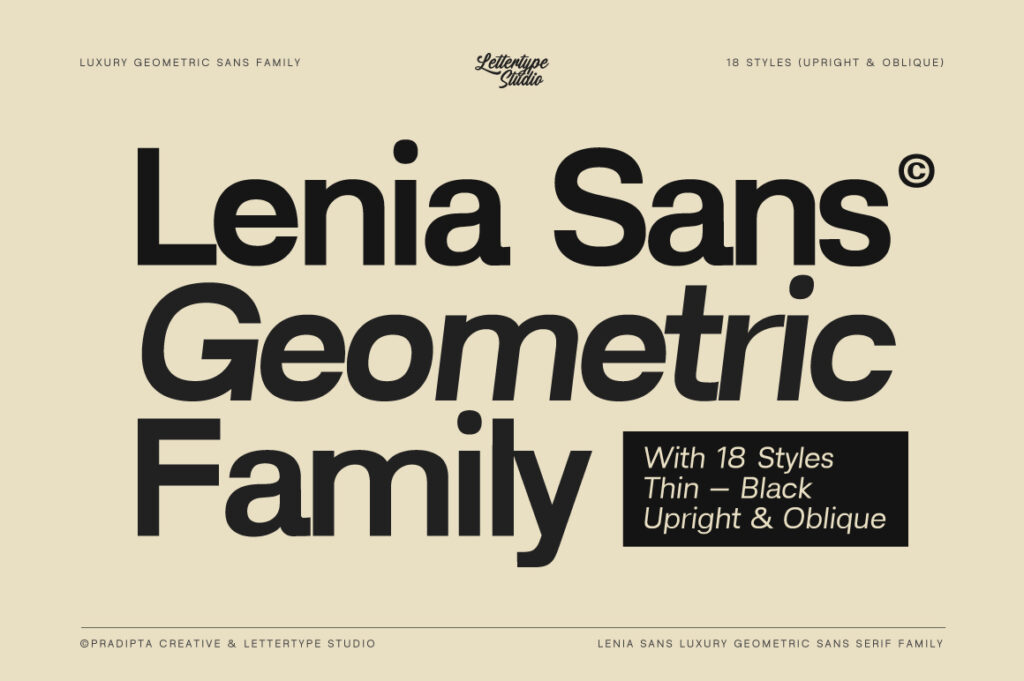
2. Lenia Sans
Lenia Sans is designed with a clean and modern aesthetic, ideal for minimalist brand systems, digital interfaces, and editorial design.
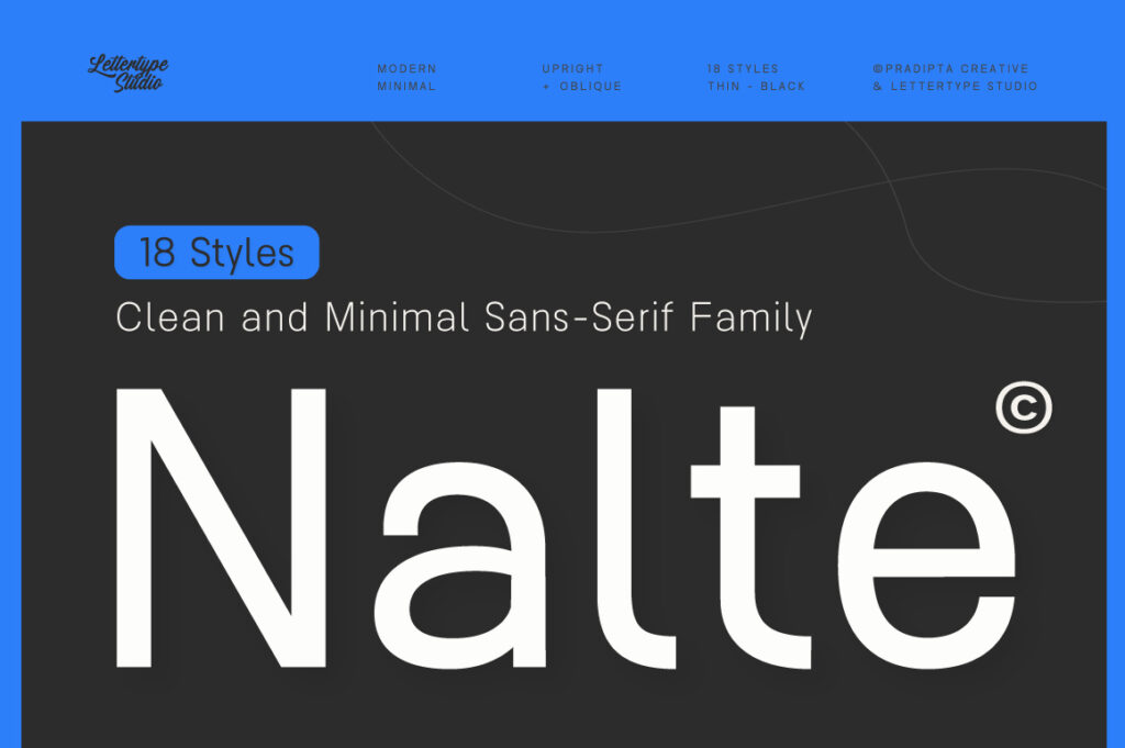
3. Nalte Sans
Nalte Sans provides a neutral minimalist tone with professional clarity, suitable for luxury corporate branding and sophisticated digital products.
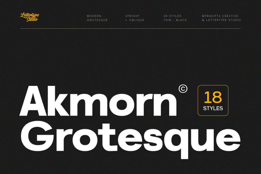
4. Akmorn Grotesque
Akmorn Grotesque combines minimalist structure with modern grotesque influences, making it a versatile choice for premium brand identities.
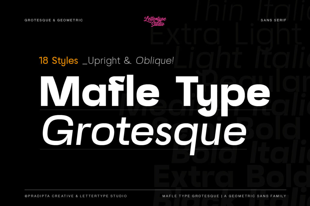
5. Mafle Type Grotesque
Mafle Type Grotesque is a contemporary minimalist family optimized for digital environments, ideal for luxury tech brands and SaaS products.
How to Choose a Minimalist Font for Luxury Brands
When selecting a minimalist typeface for luxury branding, consider these factors:
- Optical Refinement: Look for precise curves, balanced proportions, and clean terminals.
- Family Depth: Multiple weights and styles are essential for brand systems.
- Digital Performance: Fonts should render clearly on screens and across devices.
- Brand Personality: Minimalist does not mean generic—subtle details should align with brand identity.
Minimalist Typography in Modern Brand Systems
Minimalist fonts are widely used in logos, editorial design, packaging, websites, and UI systems. Their neutrality allows imagery and brand storytelling to take center stage, while typography provides a strong, quiet foundation.
For luxury brands, minimalist typography communicates confidence, quality, and timelessness—qualities that define premium visual identity systems.