


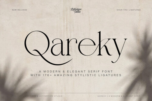
Description
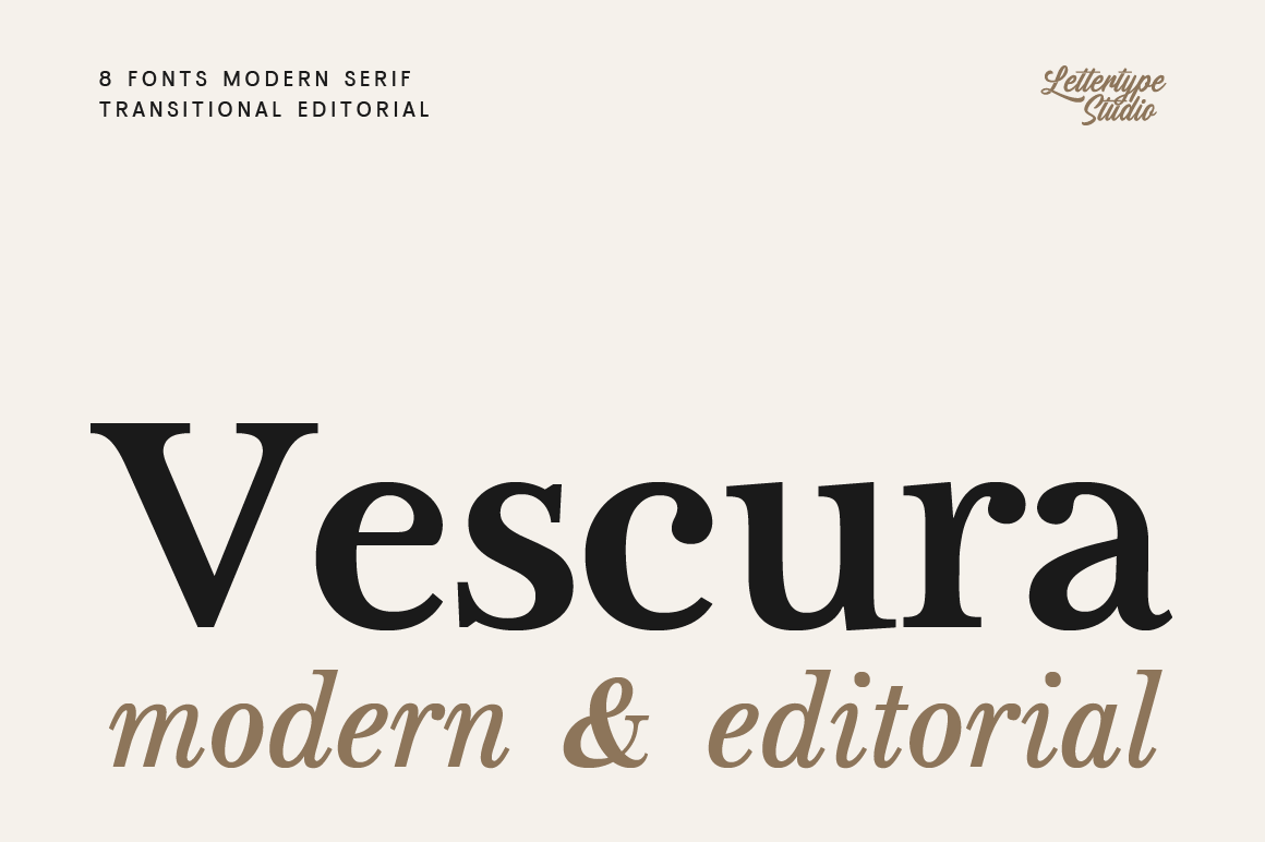
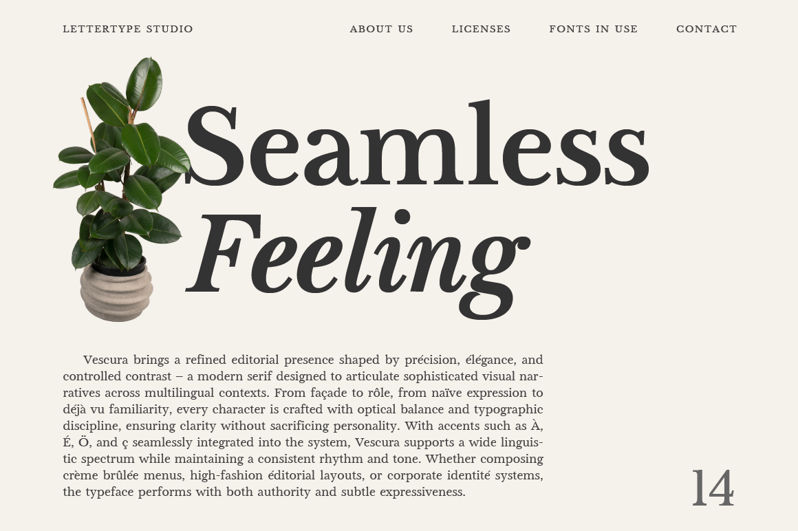
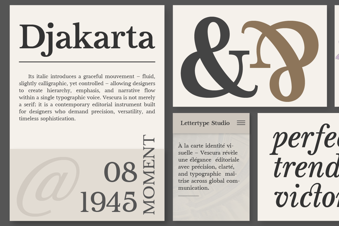
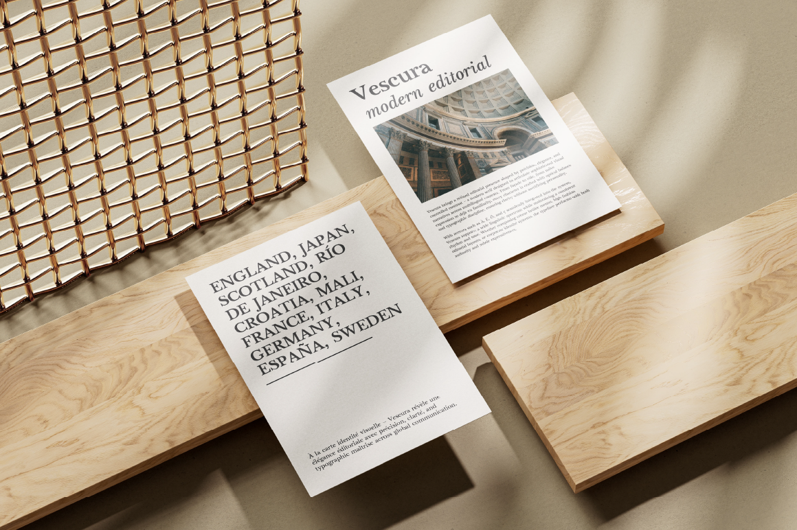
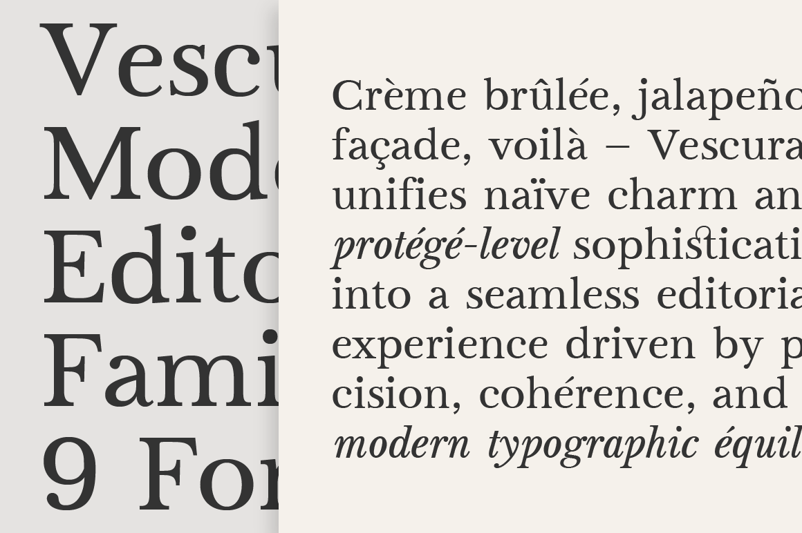
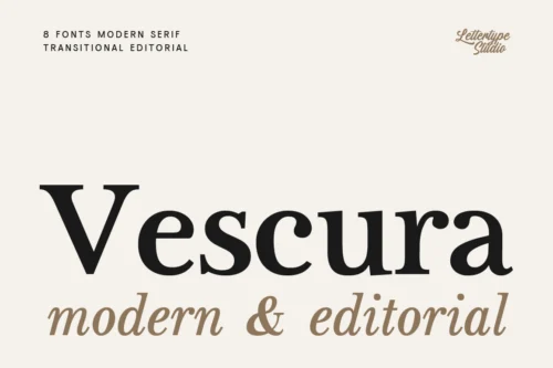
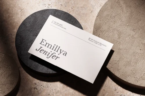
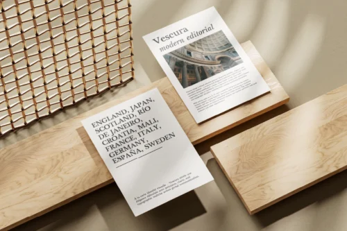
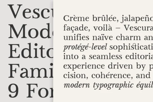
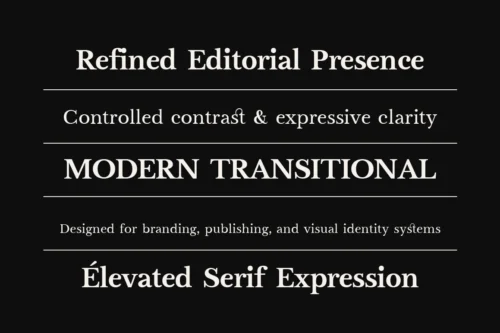
Vescura is built as a modern transitional serif system that balances clarity, structure, and editorial expression. At Lettertype Studio, this typeface is developed with a focus on controlled contrast and optical consistency, allowing it to perform reliably across different weights and styles without losing its refined character.
View the Vescura Specimen PDF to explore its full visual range — from refined headlines to clean paragraph text, crafted for modern design. – Download
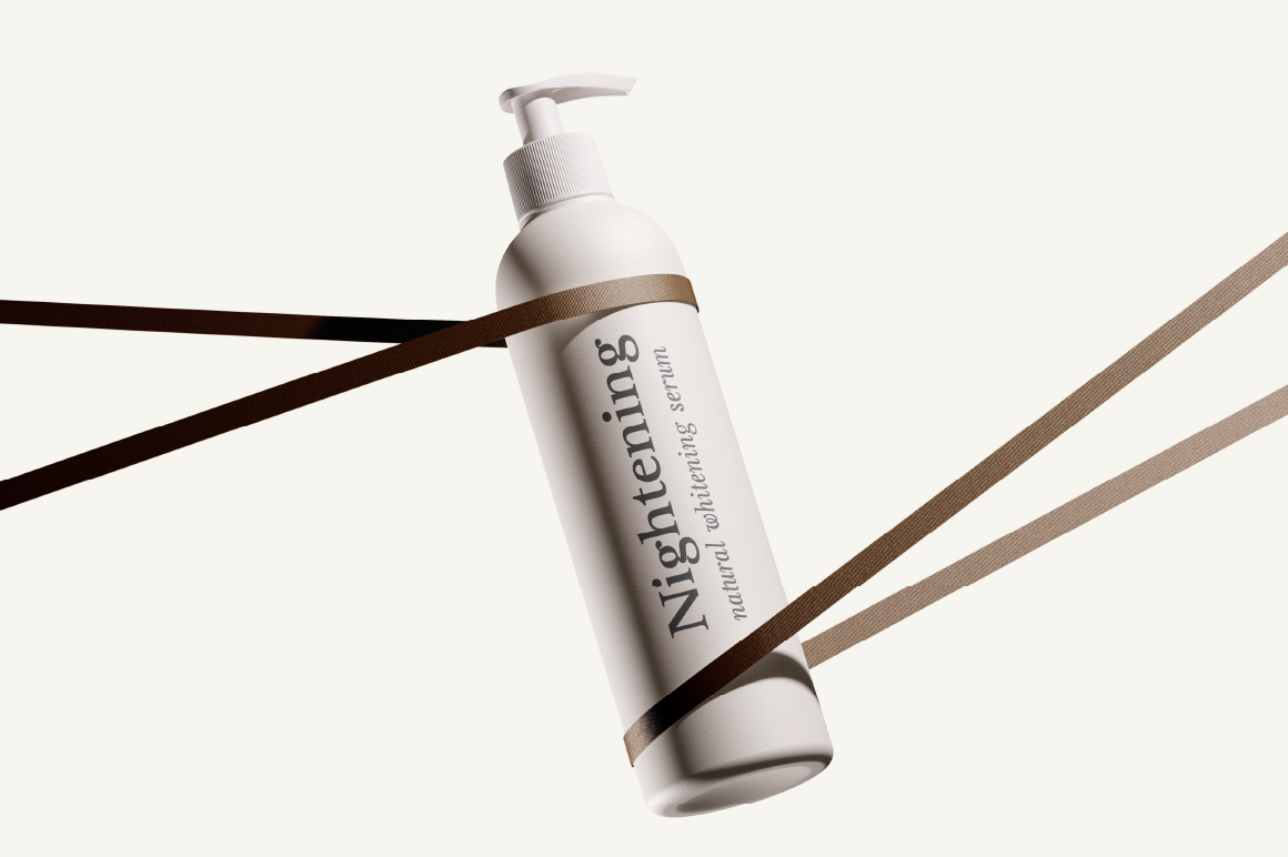
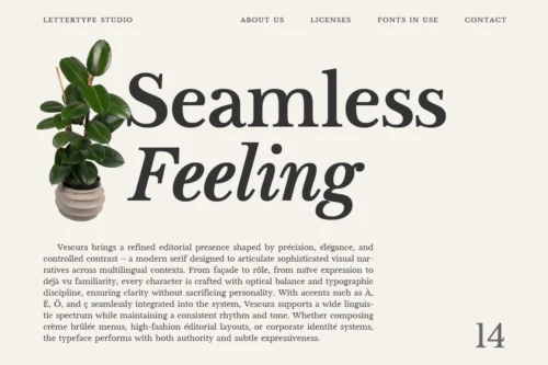
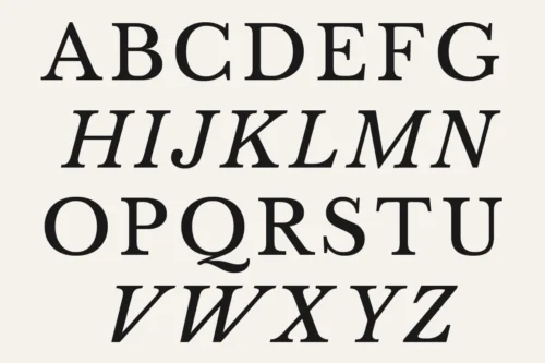
Unlike traditional reading serifs, Vescura introduces a slightly elevated x-height and a cleaner construction, making it more adaptable for contemporary branding and digital environments. Its structure remains disciplined, yet flexible enough to support both long-form content and expressive display usage.
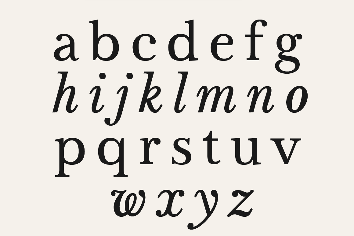
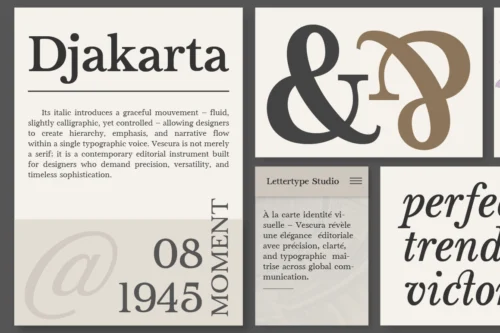
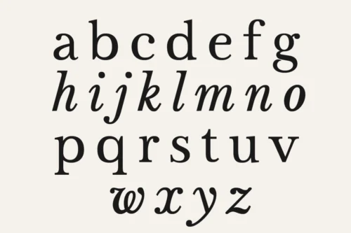
One of Vescura’s defining features is its italic style, which brings a subtle calligraphic influence and adds movement to the overall system. This combination of stability and expression positions Vescura as a versatile editorial serif for designers who require both functionality and personality.
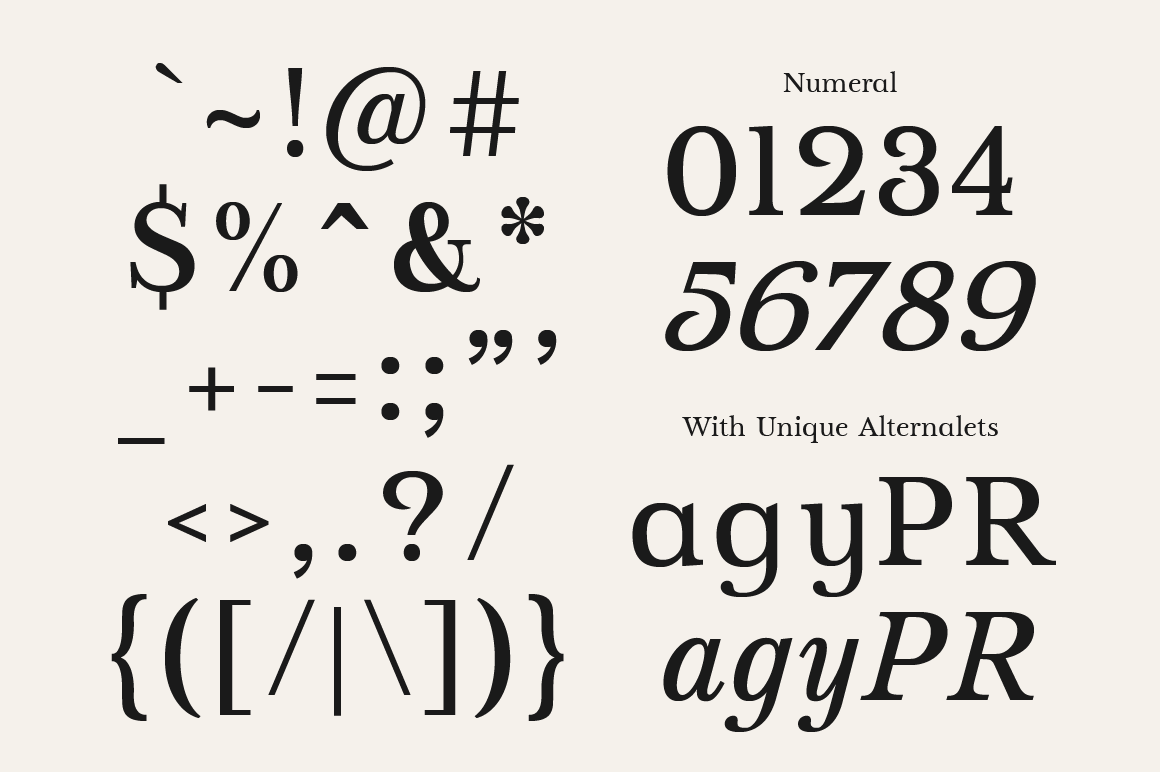
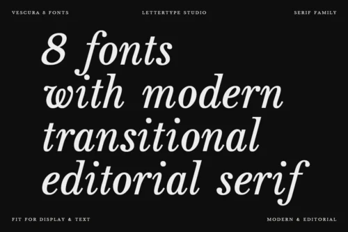
Vescura Features:
- 8 Styles
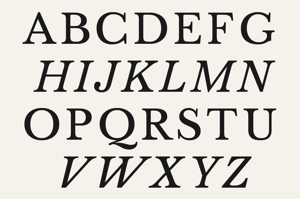
- Regular & True Italic
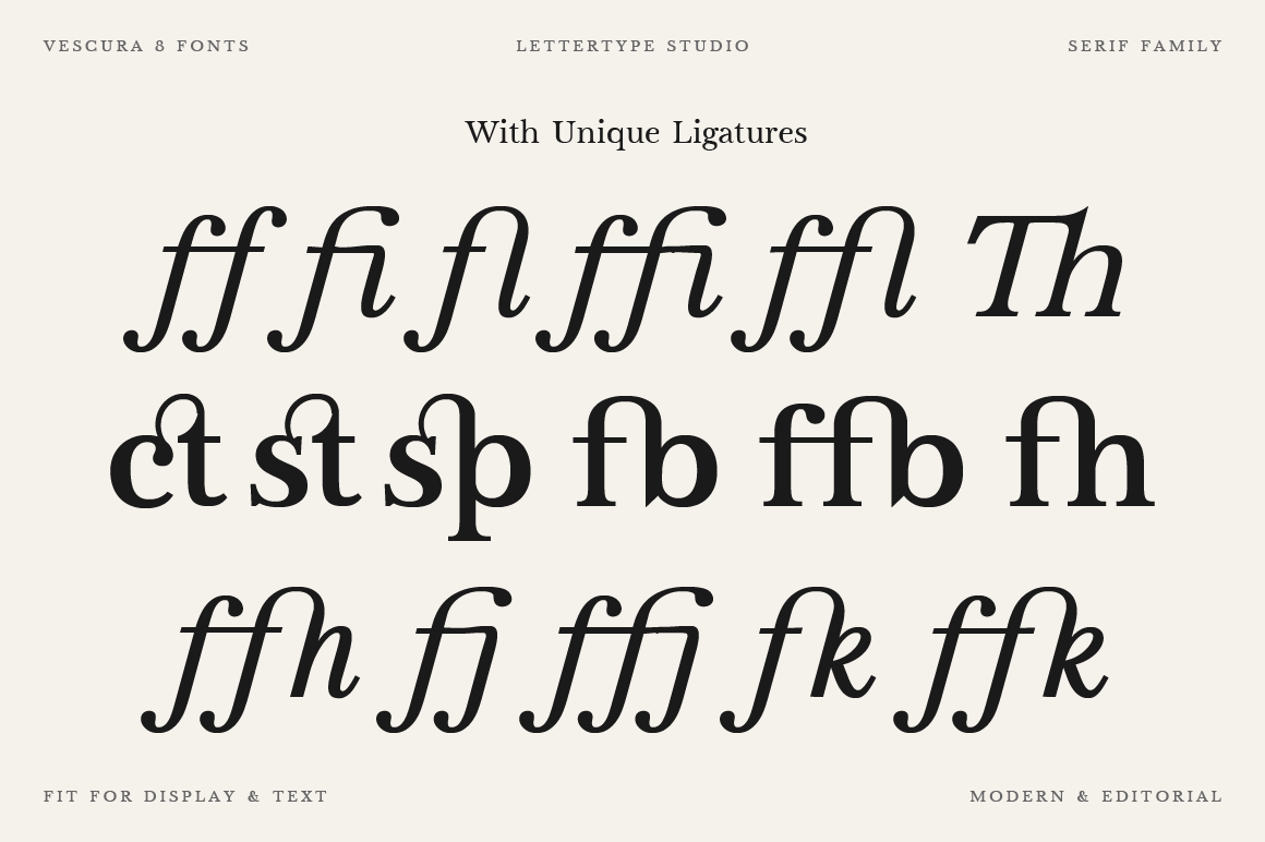
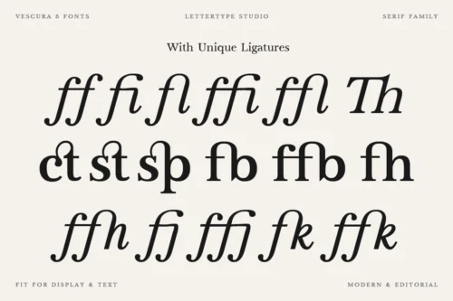
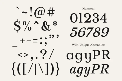
- 10 Alternates & 30 Unique Ligatures
- 490 Glyphs Total
- 260+ Languages Support
- TTF & WOFF Format
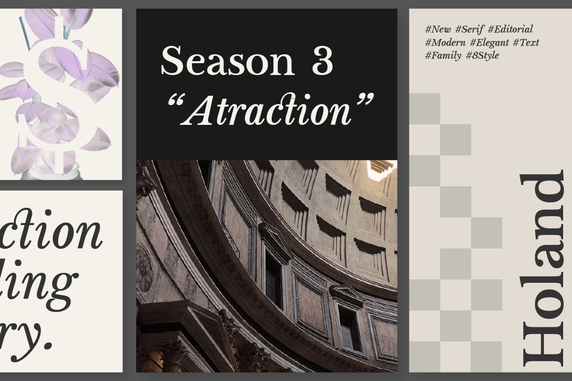
Perfect For:
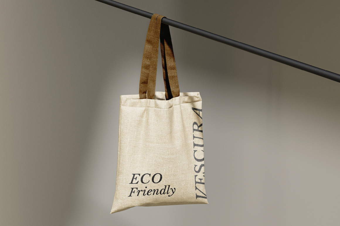
- Editorial & Magazine Design
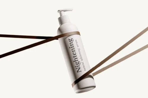
- Luxury Branding & Identity
- Fashion & Beauty Visuals
- Logo & High-End Packaging
- Creative Direction & Art Publishing
Diki Pradipta Tri Atmojo — Lettertype Studio.
Please email us at hello@lettertypestudio.com for a custom license or any other inquiries.
Reviews
There are no reviews yet.