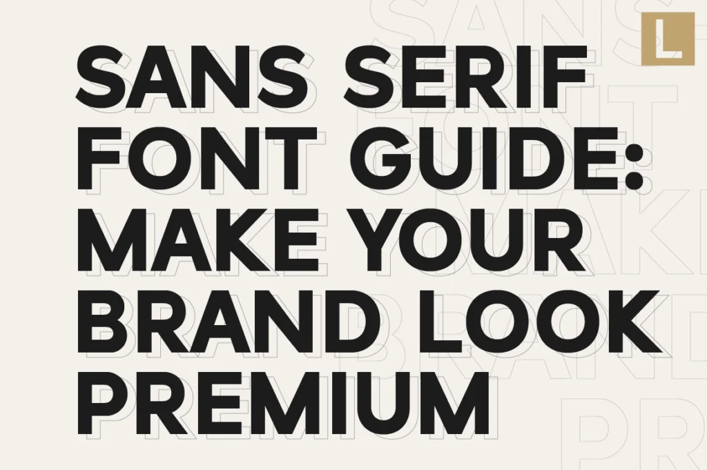
Most brands don’t fail because they lack ideas.
They fail because they look like everyone else.
And more often than not, the problem isn’t the logo, the color, or even the layout.
It’s the font.
Choosing the wrong sans serif font can instantly make your brand feel generic, forgettable, or worse—cheap. But the right one? It can elevate your entire identity without changing anything else.
Most Sans Serif Fonts Are “Clean”—But Not Premium
Here’s the mistake most people make:
They think “clean” equals “professional.”
In reality, clean is just the baseline. Thousands of sans-serif fonts are clean—but only a few feel premium.
The difference comes down to subtle details:
- Proportions that feel balanced, not mechanical
- Spacing that breathes, not cramped
- Shapes that feel intentional, not default
This is why many free or overused fonts fail to create a strong brand presence—they lack refinement.
The “Expensive Look” Comes From Control, Not Complexity
Premium brands don’t use complicated typography.
They use controlled simplicity.
A well-crafted sans-serif font creates:
- Calm visual rhythm
- Confident spacing
- Consistent character shapes
Fonts like Raela Pro, Lenia Sans, and Naru Sans are designed with this principle in mind—where every curve and spacing decision contributes to a cohesive brand feel.
This is what separates a designed typeface from a default font.
5 Things to Check Before You Choose a Sans Serif Font
If you want your brand to look high-end, don’t just pick what looks “nice.”
Use this quick filter:
1. Check the spacing (kerning & tracking)
If it feels too tight or inconsistent, your brand will feel cramped.
2. Look at the letter proportions
Are they balanced? Or do some characters feel off?
3. Test it in real scenarios
Logo, website header, Instagram post—not just a font preview.
4. Avoid overused fonts
If you’ve seen it everywhere, your brand won’t stand out.
5. Choose a font with a system
A good font works across weights, sizes, and contexts.
Why Generic Fonts Kill Brand Identity
Here’s the uncomfortable truth:
If your font looks like everyone else’s, your brand will be treated like everyone else.
Typography is one of the fastest ways people judge your brand—often subconsciously.
A generic sans-serif font signals:
- Low effort
- Lack of identity
- No clear positioning
While a refined typeface communicates:
- Confidence
- Clarity
- Intentional design
A Better Approach: Build Your Brand Around Typography
Instead of treating fonts as the last step, flip the process.
Start with typography.
Choose a sans-serif font that already reflects:
- Your tone (minimal, bold, elegant)
- Your market (tech, lifestyle, corporate)
- Your positioning (affordable vs premium)
From there, everything else—colors, layout, visuals—will follow more naturally.
Final Thought
You don’t need a complicated brand system to look premium.
You just need to stop using generic typography.
Because in modern branding, the smallest detail—like your font—often makes the biggest difference.