✦ Every Letter Speaks Emotion
Typography isn’t just design — it’s language without words. When you change a font’s weight or spacing, you’re shifting how a brand feels.
A bold, tight sans-serif radiates confidence and modern strength. A light, airy serif whispers elegance and trust. Even small tweaks in letter-spacing (tracking) can transform perception: wide spacing feels premium and calm, while compact text feels energetic and assertive.
That’s why leading brands invest in typographic tone — not just logo design. Because the same word can sound different depending on how it’s set.
✦ Weight Carries Meaning
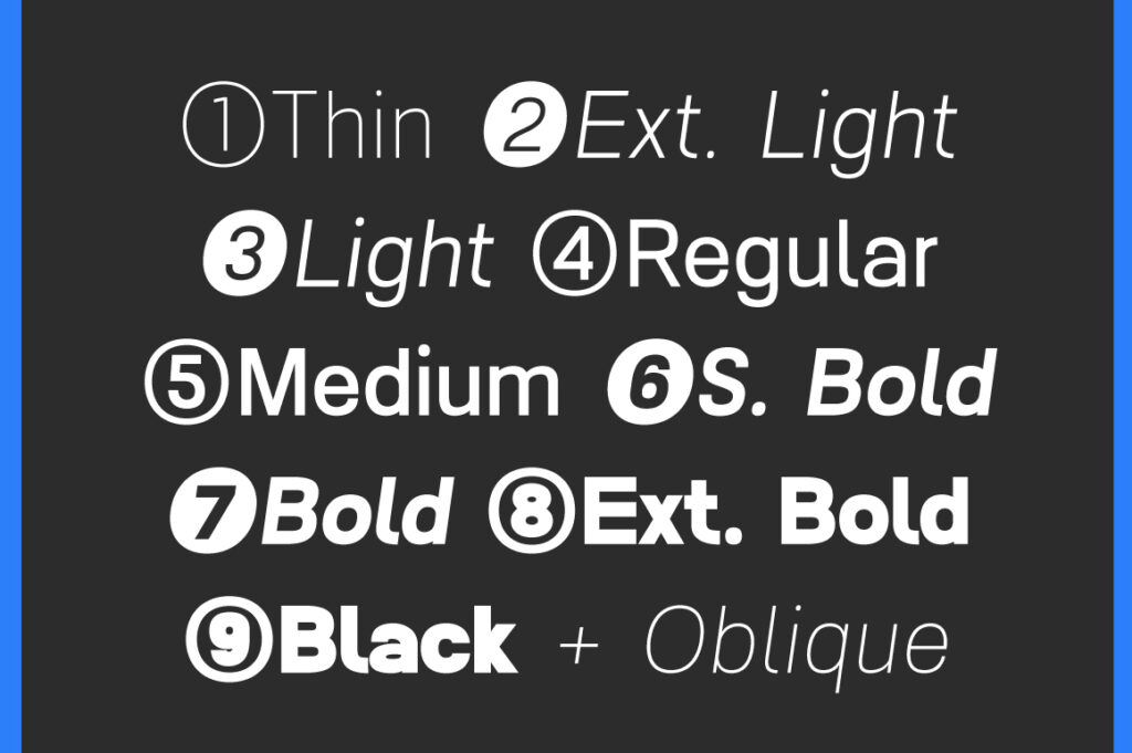
Font weight directly affects visual tone.
Thin / Light weights communicate sophistication, silence, and openness — perfect for beauty or luxury brands.
Regular / Medium conveys balance, clarity, and reliability — the universal choice for editorial and corporate design.
Bold / Black projects authority, excitement, and confidence — ideal for tech, sports, or fashion statements.
Take Gamola from LTS as an example: its bold upright structure expresses premium power, while its oblique variant adds a sense of speed and momentum — both crafted to match different brand attitudes.
✦ Spacing Defines Breathing Room
Letter-spacing and word-spacing give rhythm to words. Wide spacing feels elegant, reflective, and modern — think high-end skincare or minimalist tech. Tight spacing creates urgency and focus — perfect for startups and impact-driven campaigns.
Good designers don’t just pick fonts; they adjust spacing to match intent. The right amount of breathing room between letters can make a design feel calm, controlled, and intentional.
✦ The Perfect Balance
In the end, typography is a balance between visual harmony and brand personality. Font weight sets the tone; spacing gives it rhythm. Together, they tell a story before the audience reads a single word.
At Lettertype Studio, we design fonts with this sensitivity in mind — every weight, curve, and gap is intentional. Because great typography doesn’t just look right — it feels right.