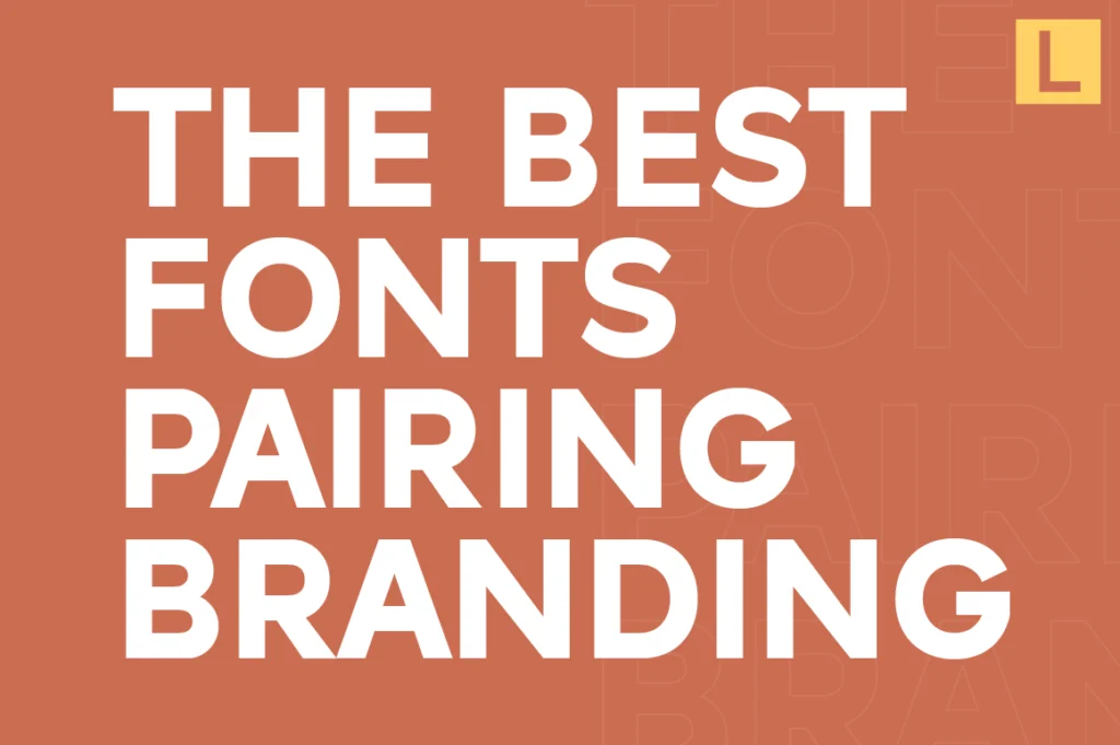
Choosing a great font is important—but combining fonts correctly is what truly elevates your branding.
Font pairing is where most designs either feel premium… or completely fall apart.
The good news? You don’t need dozens of fonts. You just need the right combination—and a clear system.
Why Font Pairing Matters in Branding
Your brand rarely uses just one font.
You need different styles for:
- Headlines
- Body text
- UI elements
- Marketing materials
Without proper pairing, your design can feel inconsistent or unprofessional.
Good font pairing creates:
- Visual hierarchy
- Better readability
- Strong brand identity
The Golden Rule: Keep It Simple
The biggest mistake beginners make is using too many fonts.
The ideal setup:
👉 2 fonts (sometimes 3 max)
- 1 primary font (for headlines)
- 1 secondary font (for body text)
That’s it.
More than that, and your design starts to lose focus.
3 Proven Font Pairing Strategies
1. Sans Serif + Sans Serif (Modern & Clean)
This is the most popular approach today.
Use:
- A bold, expressive sans for headlines
- A neutral sans for body text
Example:
Result:
👉 Clean, modern, highly scalable branding
2. Serif + Sans Serif (Classic Premium)
This creates contrast and elegance.
Use:
- Serif for headlines
- Sans-serif for body
Result:
👉 Editorial, luxury, high-end feel
3. Same Font Family (Safest Option)
Use one font with multiple weights.
Example:
- Lenia Sans Light → Regular → Bold
Result:
👉 Maximum consistency, minimal risk
What Makes a Font Pair Work
Strong pairings usually have:
1. Contrast
Different enough to create hierarchy
2. Harmony
Still feel like they belong together
3. Consistency
Work across all applications
If two fonts feel like they’re “fighting,” they’re not a good pair.
Common Font Pairing Mistakes
- Using too many fonts
- Pairing fonts with similar weights but different styles
- Ignoring readability
- Mixing decorative fonts with no structure
Keep it clean. Keep it intentional.
Best Font Pairing Ideas from Lettertype Studio
Here are some ready-to-use combinations:
- Raela Pro + Lenia Sans → modern & professional
- Alvara Sans + Naru Sans → corporate clean system
- Vynce Sans + Lenia Sans → contemporary branding
- Raela Pro (all weights) → minimalist system
These combinations are built for real branding—not just aesthetics.
Final Thoughts
Font pairing is not about creativity alone—it’s about control.
The best brands don’t use more fonts.
They use fonts more intentionally.
If you master pairing, you instantly level up your entire design system.