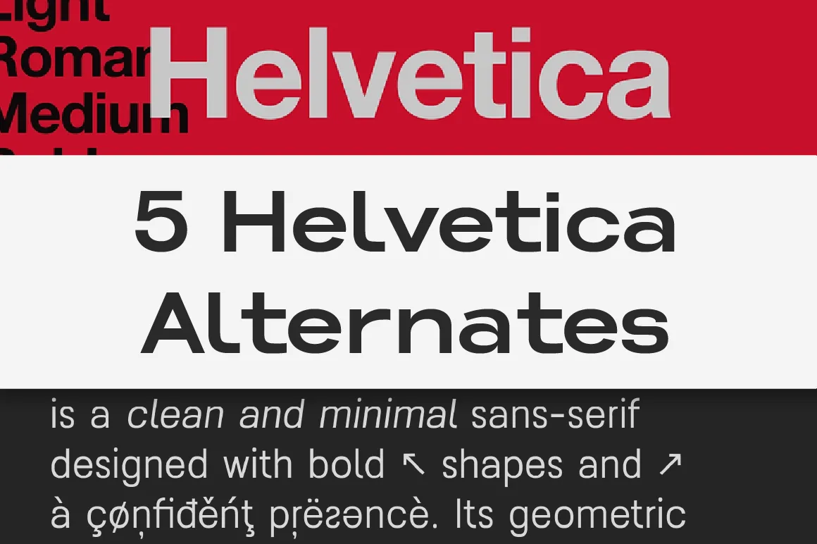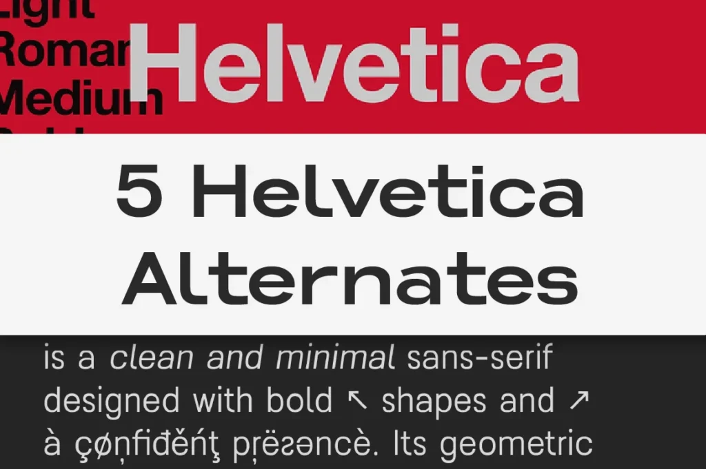
Helvetica remains one of the most recognizable typefaces ever created. Its clean neutrality, balanced proportions, and outstanding readability have made it a global standard for branding, signage, UI, and corporate communication. Designers rely on Helvetica because it communicates clearly without adding unnecessary personality — a perfect tool for universal, timeless design.
But as visual trends evolve, many creatives seek modern Helvetica alternatives that preserve its clarity while offering fresher aesthetics, improved functionality, or a more contemporary tone. Below are five Lettertype Studio fonts that deliver the same dependable neutrality while bringing modern refinement and versatility.
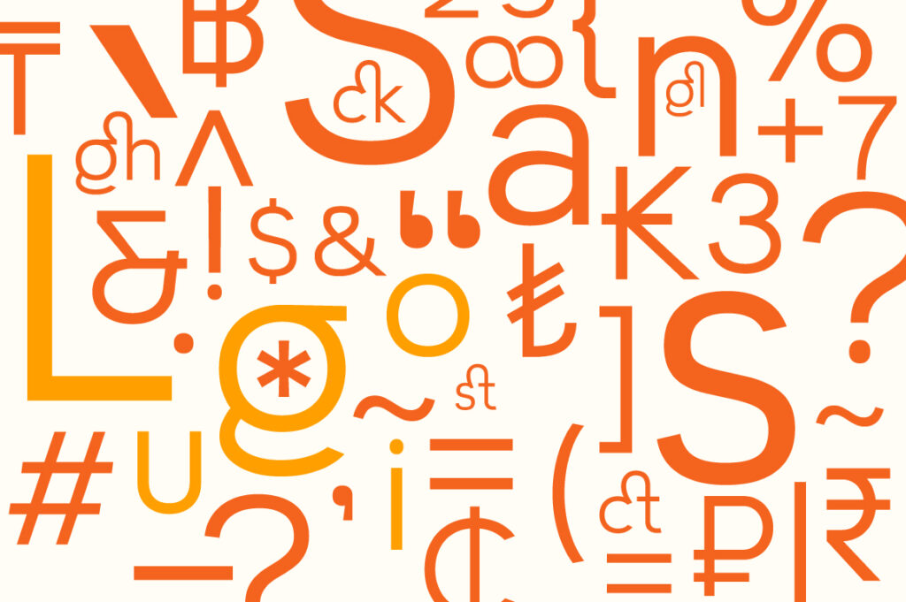
5 Lettertype Studio Fonts Similar to Helvetica
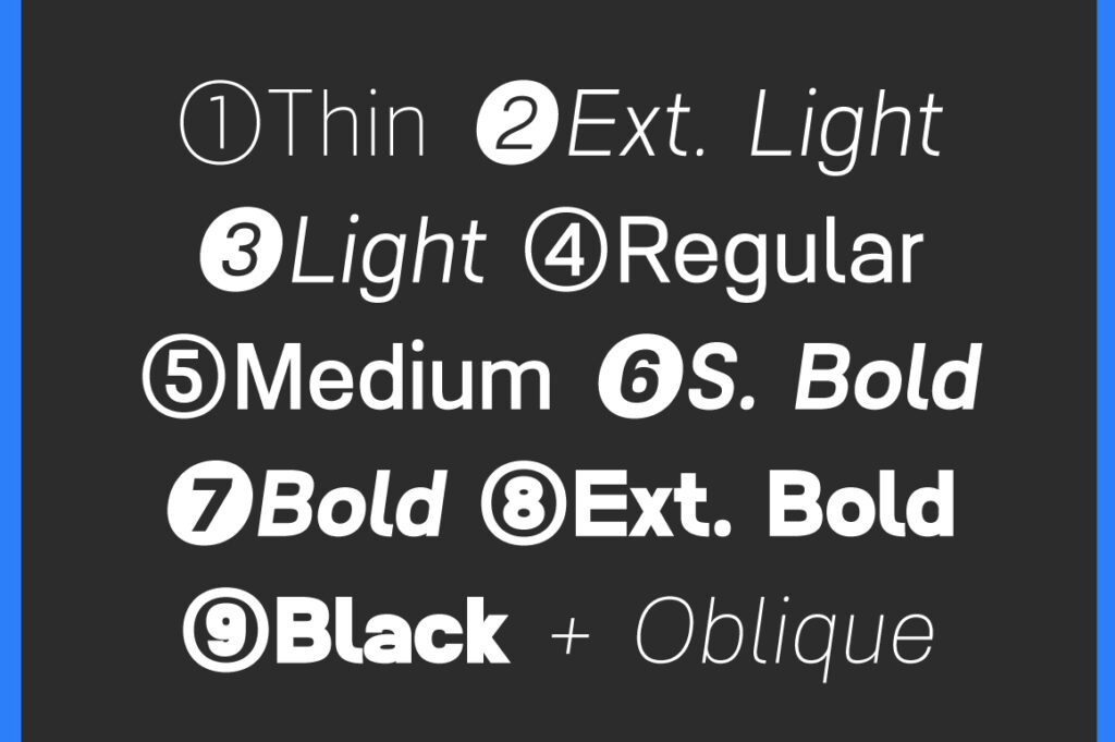
1. Raela Pro
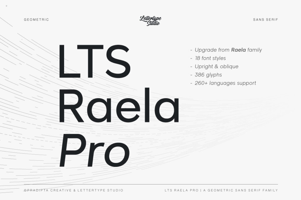
A clean, modern grotesk with balanced rhythm and excellent readability.
Why it’s a great Helvetica alternative:
Raela Pro maintains the neutral, versatile feel designers love while adding contemporary smoothness and improved spacing — ideal for corporate identity, editorial work, and digital interfaces.
Link: https://lettertypestudio.com/raela-pro
2. Nalte Sans
A refined sans-serif with clean forms and a strong geometric–grotesk balance.
Why it’s similar:
Nalte Sans brings a professional, neutral tone reminiscent of Helvetica but with updated proportions and a more modern silhouette, making it perfect for branding and UI systems.
Link: https://lettertypestudio.com/nalte-sans
3. Lenia Sans
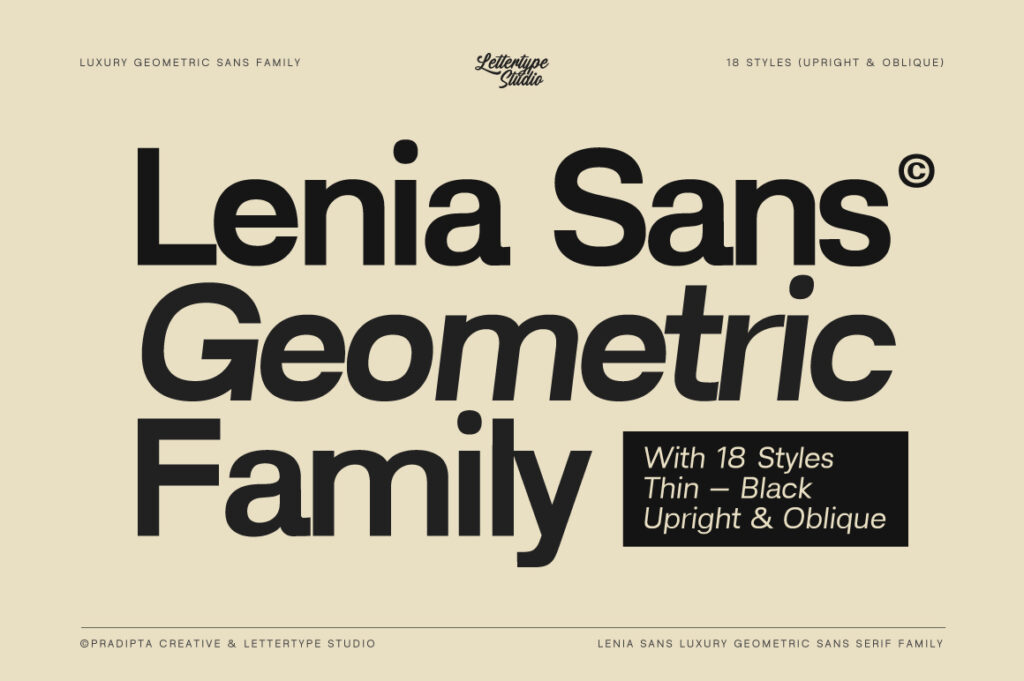
A premium geometric-grotesk hybrid built for elegant, modern branding.
Why it’s similar:
Lenia Sans offers the same clarity and usability as Helvetica while introducing refined geometric touches, creating a cleaner aesthetic for tech brands and minimalistic identity systems.
Link: https://lettertypestudio.com/lenia-sans
4. Reflow Sans
A functional grotesk with straightforward construction and excellent balance.
Why it’s similar:
Reflow Sans embodies the simplicity and utility of classic Swiss-style sans-serifs, making it a practical Helvetica alternative for signage, UI, and general-purpose design.
Link: https://lettertypestudio.com/reflow-sans
5. Lugio Sans
A minimalist sans-serif with a neutral voice and clean, efficient structure.
Why it’s similar:
Lugio Sans delivers the same “invisible typography” quality that made Helvetica iconic. It’s simple, modern, and highly adaptable for corporate design, apps, and editorial layouts.
Link: https://lettertypestudio.com/lugio-sans
Conclusion
Helvetica’s legacy is unmatched, but modern design calls for alternatives that provide fresh aesthetics while keeping its clarity and neutrality. These five Lettertype Studio fonts uphold the Swiss-style spirit of Helvetica while offering updated forms, improved readability, and distinctive character suited for today’s branding and digital environments.
If you’re seeking a modern twist on the world’s most famous sans-serif, these LTS choices are the perfect place to start.