In a world overflowing with visuals, brands fight for just a few seconds of attention. Colors, images, and layout all play important roles — but typography is often the quiet hero that determines how a brand feels, communicates, and connects emotionally.
A well-chosen font doesn’t just “look good.”
It expresses personality.
It builds trust.
It creates recognition.
And most importantly — it helps a brand stand out in a crowded marketplace.
Here’s the story of how typography shapes brand identity, along with three Lettertype Studio font families that demonstrate the power of choosing the right typeface.
The Story: When a Font Becomes a Brand Voice
Imagine two companies launching the same product at the same time — same features, same price, same target market.
Yet one feels modern, trustworthy, and premium.
The other feels generic.
What made the difference?
The font.
Typography sets the tone before the audience reads a single word. It influences how we perceive a brand:
A geometric sans can feel modern and efficient.
A serif can feel elegant, premium, or editorial.
A soft rounded font can feel friendly and approachable.
Brands stand out not just by what they say, but how they say it visually. And typography is the language behind that voice.
Below are three font families from Lettertype Studio that demonstrate how the right type choice can transform a brand’s presence.
3 LTS Font Families That Help Brands Stand Out
1. Naru Sans — For Modern, Confident, and Scalable Brands

Naru Sans represents clarity, structure, and modern professionalism — qualities that strong technology companies and digital-first brands rely on.
Why it makes brands stand out:
Its geometric precision feels trustworthy and well-engineered.
With 18 styles, it scales effortlessly across websites, apps, packaging, and corporate materials.
It projects a clean, contemporary voice that feels both reliable and trustworthy.
Brands that benefit: tech startups, SaaS companies, and corporate systems.
Link: https://lettertypestudio.com/naru-sans
2. Cirvia — For Premium, Elegant, and Story-Driven Brands
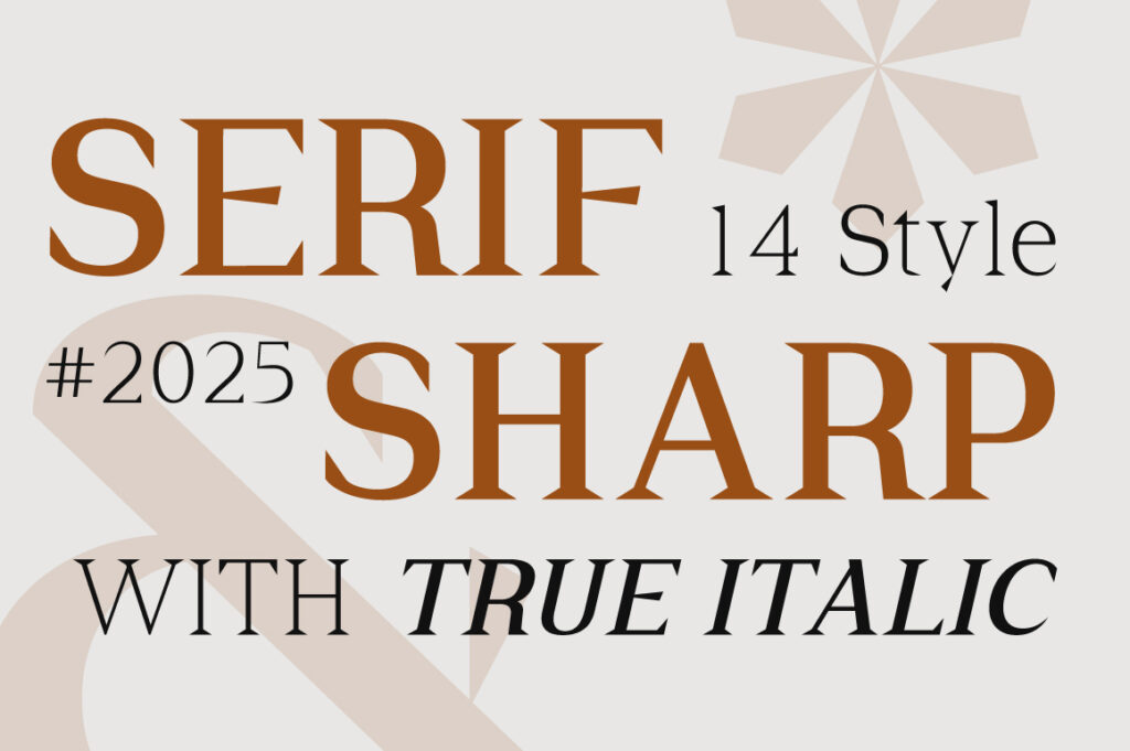

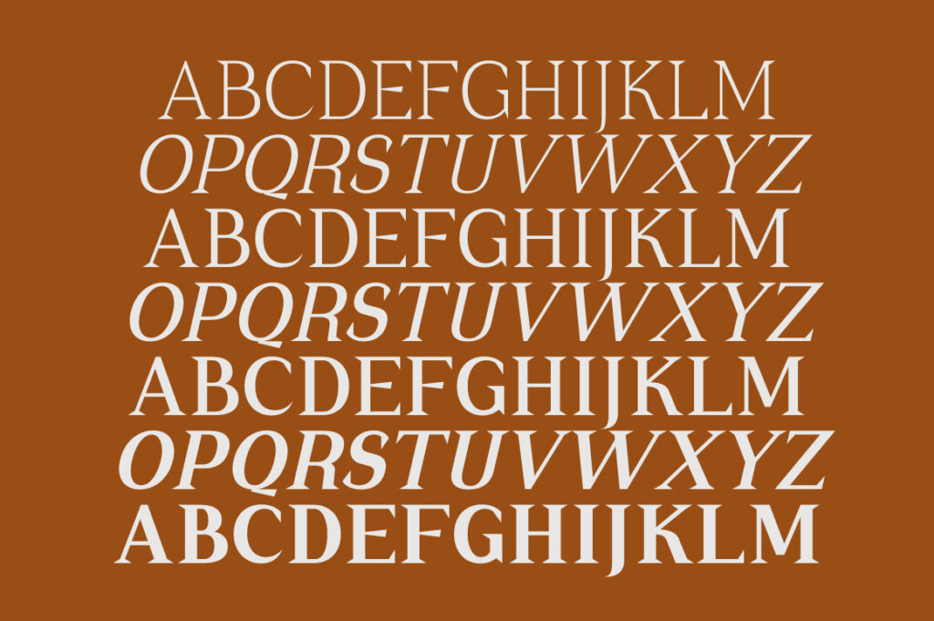
Cirvia shows how a serif font can instantly elevate a brand’s emotional tone. It brings sophistication, warmth, and a sense of crafted detail.
Why it makes brands stand out:
Its delicate contrast and refined curves create a premium visual identity.
Perfect for storytelling-focused brands that want to feel artistic, editorial, or luxurious.
It adds memorability — something many brands lack.
Brands that benefit: beauty, fashion, lifestyle, and editorial publications.
Link: https://lettertypestudio.com/cirvia
3. Somerun — For Friendly, Approachable, Human Brands
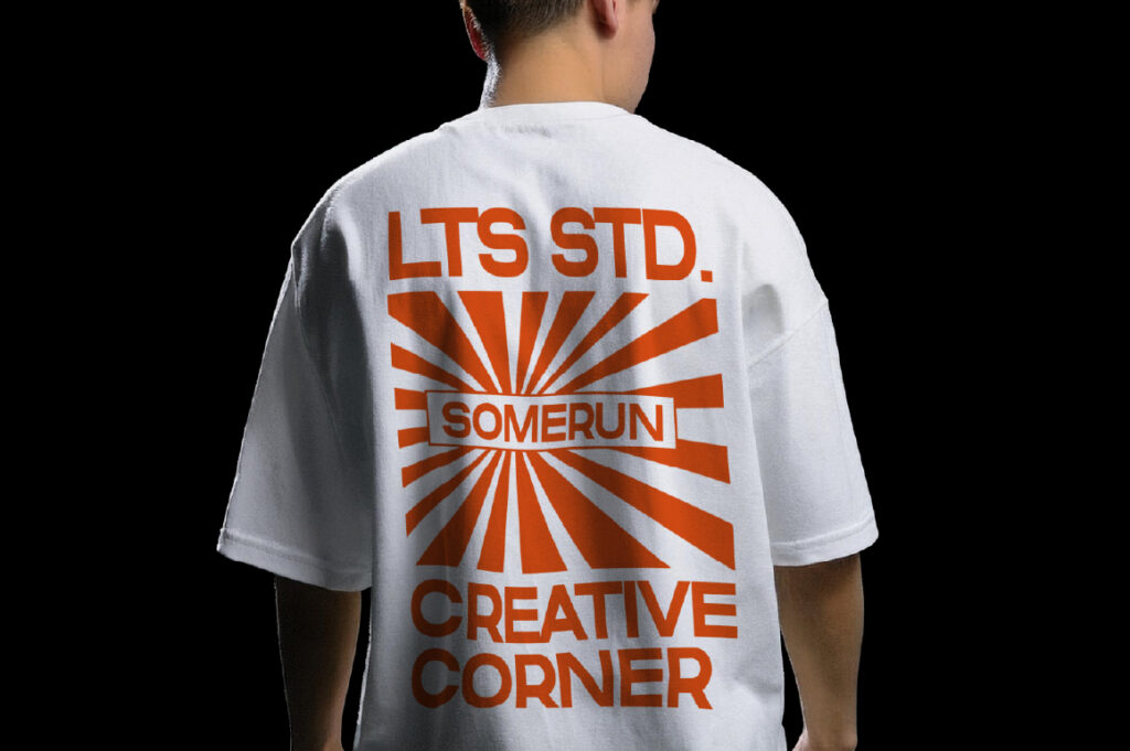
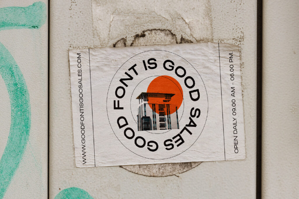
Somerun proves that simplicity can still be distinctive. Its smooth forms and balanced shapes create a warm, modern tone that resonates with audiences.
Why it makes brands stand out:
Its friendliness makes communication feel human and relatable.
Works beautifully across packaging, social media, and brand campaigns.
It offers design neutrality while still maintaining memorable character.
Brands that benefit: consumer goods, wellness brands, personal branding.
Link: https://lettertypestudio.com/somerun
Conclusion
A brand’s message can be powerful, but typography is what makes people feel it.
The right font:
✓ shapes personality
✓ builds trust
✓ supports storytelling
✓ differentiates a brand from competitors
✓ and ultimately, makes a brand unforgettable
Naru Sans, Cirvia, and Somerun each show how strong typographic choices elevate branding from ordinary to iconic. When a font is chosen intentionally, it becomes more than design — it becomes identity.