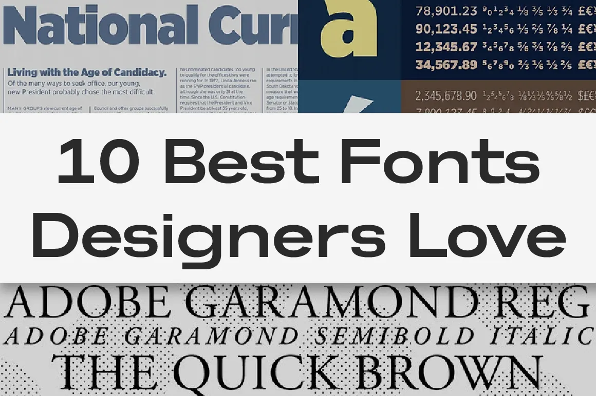
Typography is one of the most powerful tools in visual communication. Many designers rely on the same classic typefaces—Helvetica, Futura, Arial, Roboto, and others—because they’re familiar and versatile.
But if every designer uses the same fonts, creating a unique brand identity becomes much harder.
This guide covers:
The 10 most commonly used fonts in the design industry
Why relying only on popular system fonts limits your creative expression
20 modern alternatives from Lettertype Studio, complete with descriptions and direct links
10 Most Common Fonts Used by Graphic Designers
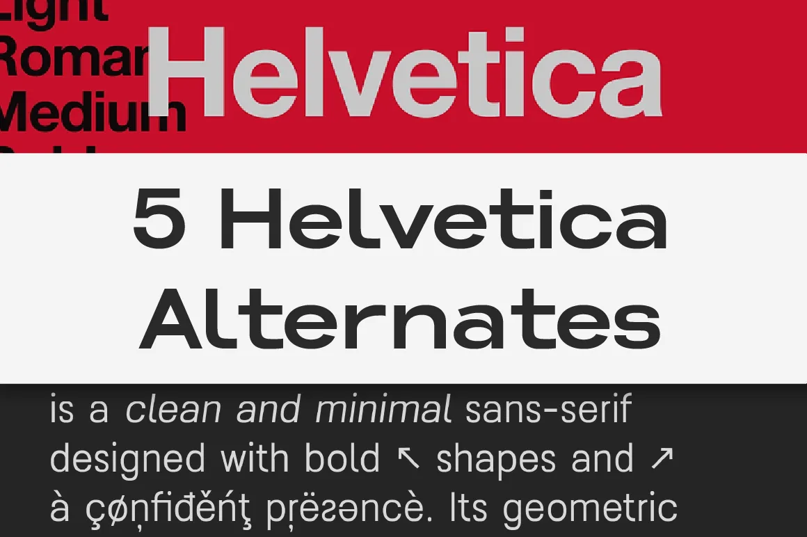
1. Helvetica
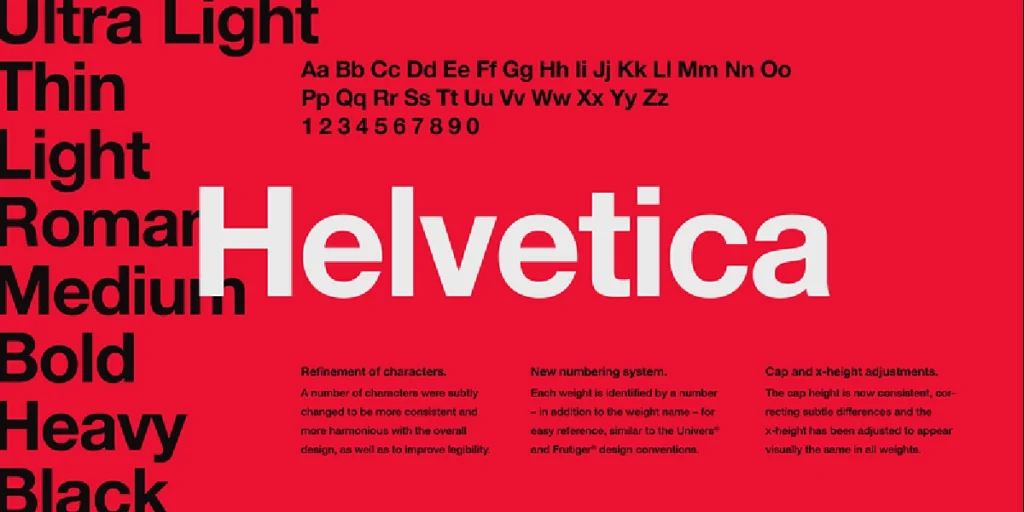
A neutral, versatile grotesk widely used in branding and editorial design.
Why it’s common: Timeless, readable, universally available.
2. Arial
A system default that mimics Helvetica’s neutrality but with simpler forms.
Why it’s common: Pre-installed everywhere.
3. Futura

A geometric classic known for sharp forms and modernist influence.
Why it’s common: Strong presence, highly recognizable.
4. Roboto
Designed for Android UI, featuring mechanical skeletons with friendly curves.
Why it’s common: Excellent screen performance.
5. Gotham
A clean, geometric sans with broad applications—from editorial pages to brand campaigns.
Why it’s common: Bold, modern, trustworthy feel.
6. Times New Roman
The traditional serif standard in print and office documents.
Why it’s common: Default for decades.
7. Proxima Nova
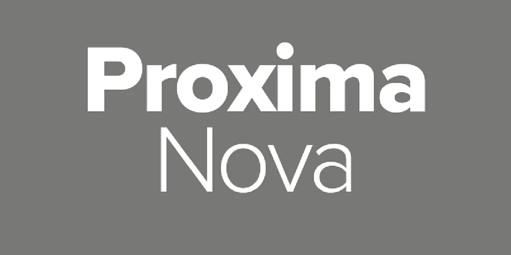
A balanced hybrid of geometric and humanist sans styles.
Why it’s common: Versatile across interface and branding work.
8. Montserrat

A Google Fonts favorite inspired by early 20th-century urban signage.
Why it’s common: Free, friendly, easy to pair.
9. Open Sans

Highly optimized for screen legibility.
Why it’s common: Clean, neutral, minimal quirks.
10. Bebas Neue
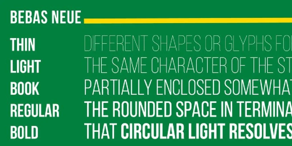
A bold, condensed display sans used for striking headlines.
Why it’s common: Strong impact with minimal styling.
20 Modern Alternatives from Lettertype Studio
These typefaces maintain the functional clarity designers expect, but with refined proportions, improved spacing, and stronger brand personality.
1. Lenia Sans
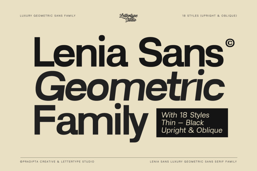
A clean modern sans serif with balanced geometry, perfect for branding, interfaces, and minimalist layouts.
🔗 https://lettertypestudio.com/lenia-sans
2. Lenia Mono
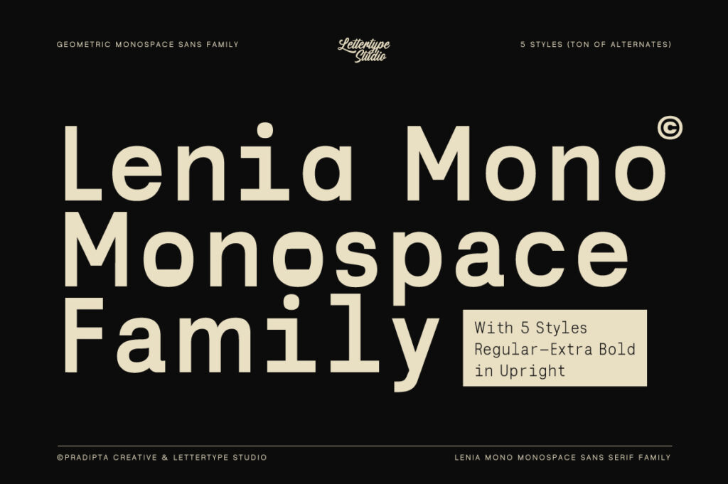
A monospaced companion to Lenia Sans with precise rhythm and tech-focused aesthetics for coding and digital branding.
🔗 https://lettertypestudio.com/lenia-mono
3. Naru Sans
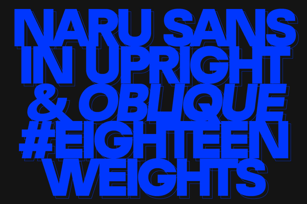
A versatile humanist sans with smooth curves and excellent readability for long-form text and product design.
🔗 https://lettertypestudio.com/naru-sans
4. Raela Grotesque (100% Free For Commercial Use)
A contemporary grotesk with refined proportions, ideal for editorial, modern branding, and website typography.
🔗 https://lettertypestudio.com/raela-grotesque
5. Raela Pro
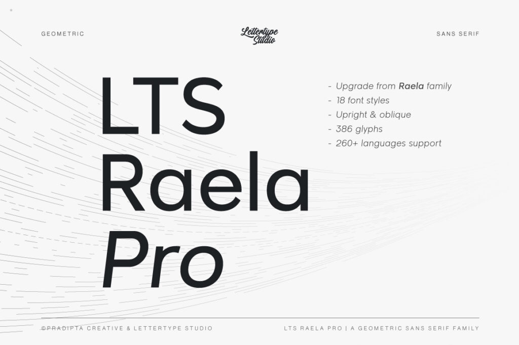
A professional-grade refinement of Raela with improved spacing and stylistic versatility across weights.
🔗 https://lettertypestudio.com/raela-pro
6. Prolinea
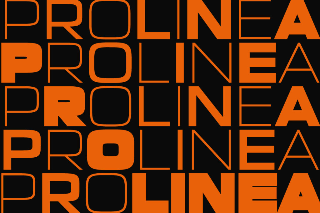
A geometric sans with sharp precision and clean modular construction, perfect for tech and corporate identities.
🔗 https://lettertypestudio.com/prolinea
7. Akmorn Grotesque
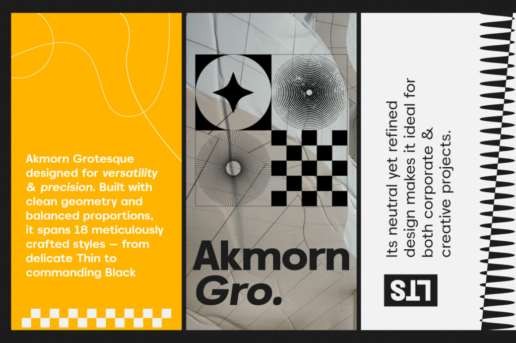
A strong grotesk with assertive forms and confident tone, great for branding and impactful headlines.
🔗 https://lettertypestudio.com/akmorn-grotesque
8. Kota Sans
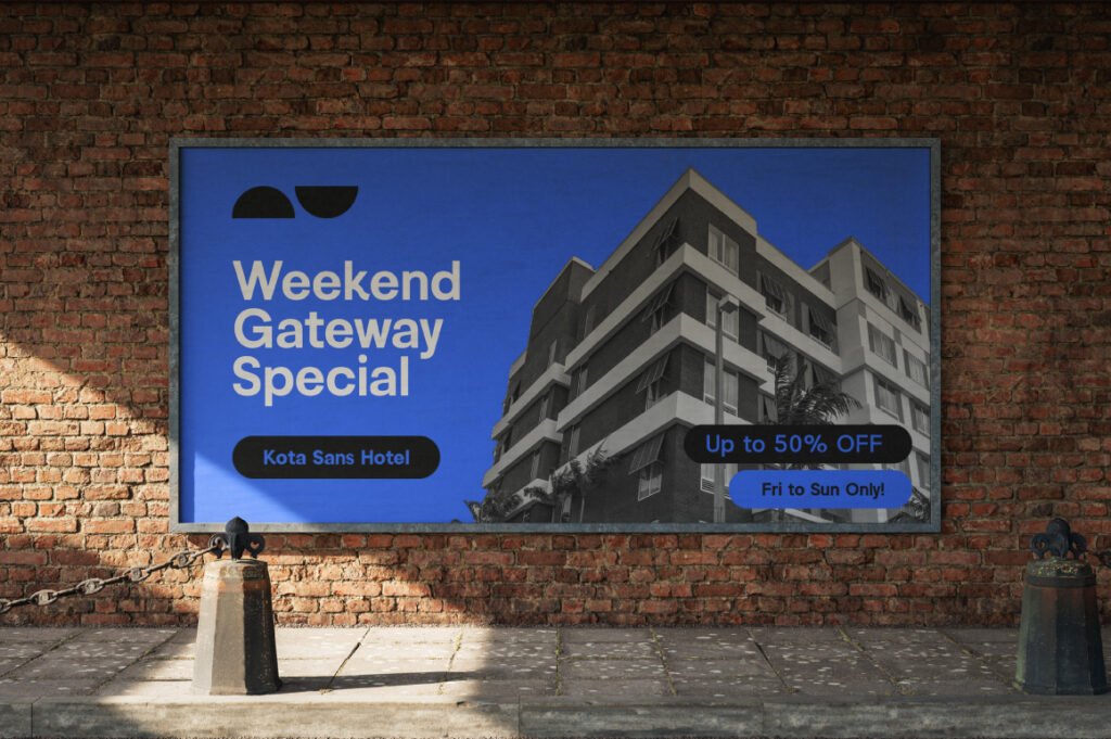
A functional sans serif with modern clarity and balanced text flow, made for digital interfaces and apps.
🔗 https://lettertypestudio.com/kota-sans
9. Vynce Sans

A clean sans serif with subtle humanist touches for warm branding and editorial layouts.
🔗 https://lettertypestudio.com/vynce-sans
10. Lugio Sans
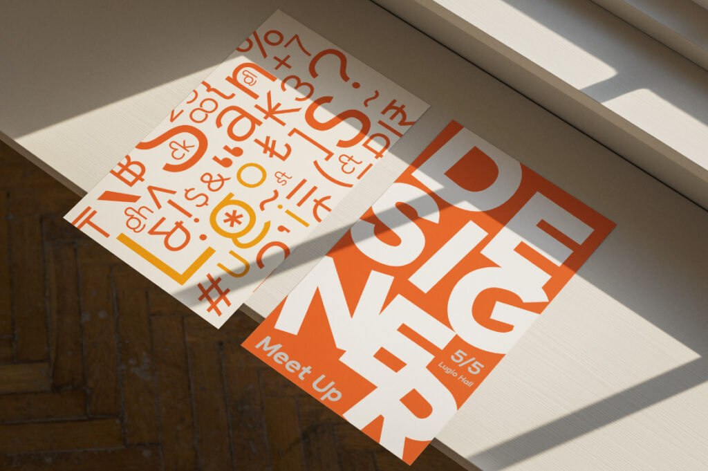
A sleek contemporary sans serif designed for expressive headlines and responsive digital typography.
🔗 https://lettertypestudio.com/lugio-sans
11. Cirvia
A soft geometric sans with elegant terminals for lifestyle, fashion, and feminine brand aesthetics.
🔗 https://lettertypestudio.com/cirvia
12. Alvara Sans
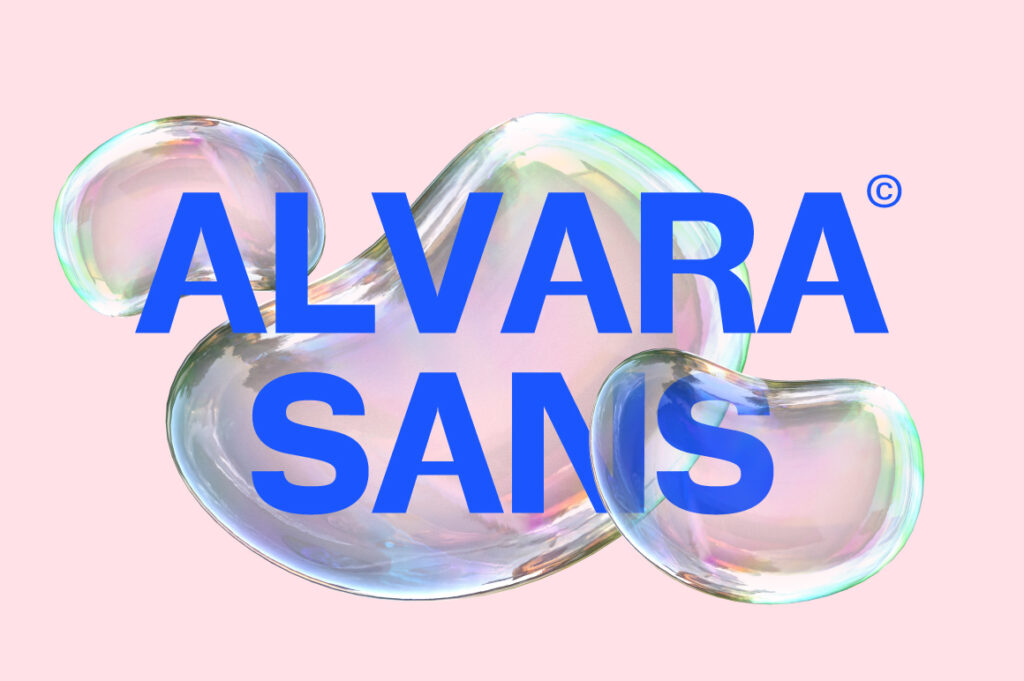
A refined editorial-style sans serif with smooth contrast for magazines, books, and brand systems.
🔗 https://lettertypestudio.com/alvara-sans
13. The Letter Editorial
A high-end editorial typeface with polished details, perfect for luxury brands and publications.
🔗 https://lettertypestudio.com/the-letter-editorial
14. Imperial Aureas
A premium serif with classic elegance and strong contrast for luxury branding and packaging.
🔗 https://lettertypestudio.com/imperial-aureas
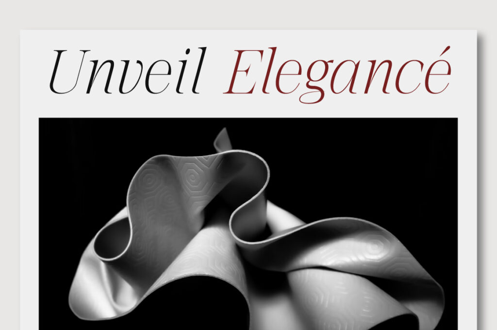
15. Serelia
![]()
A soft contemporary serif with romantic curves, ideal for beauty, lifestyle, and premium editorial design.
🔗 https://lettertypestudio.com/serelia
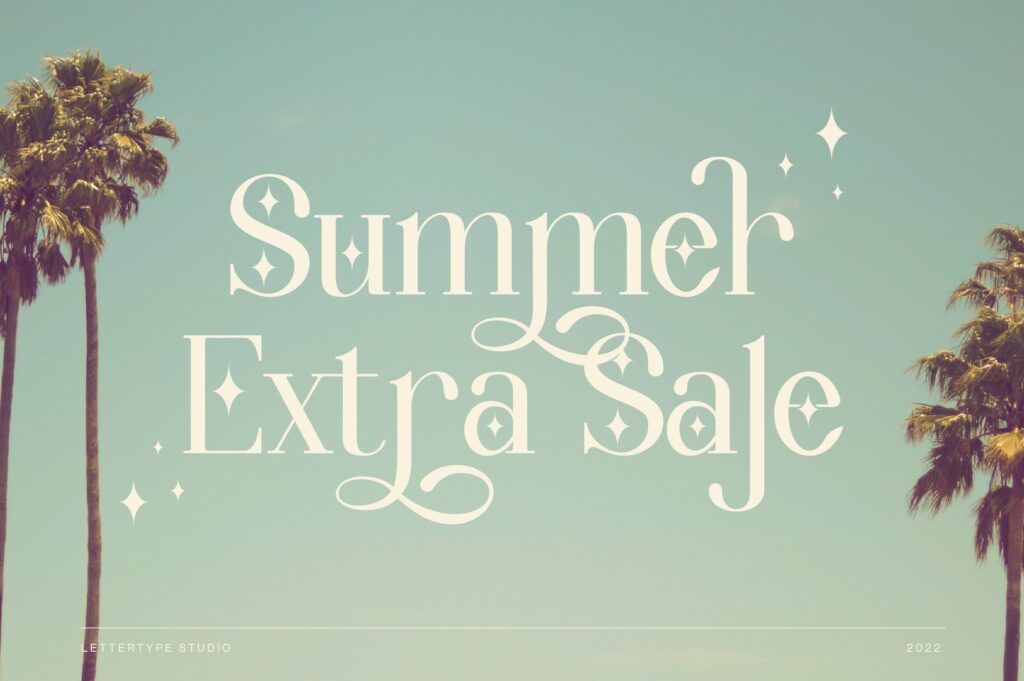
16. Mirevielle
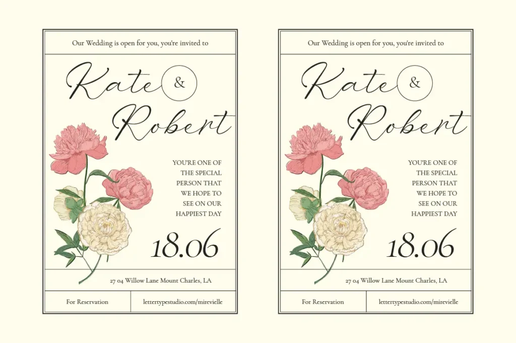
A stylish serif with refined curves and artistic details for expressive editorial layouts.
🔗 https://lettertypestudio.com/mirevielle
17. Sketsa Hand Drawn
A textured hand-drawn font that adds warmth and authenticity to creative layouts and packaging.
🔗 https://lettertypestudio.com/sketsa-handdrawn
18. Brownies Handdrawn
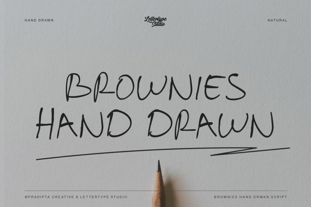
A friendly, playful hand-crafted font suited for kids branding, food packaging, and casual design.
🔗 https://lettertypestudio.com/brownies-handdrawn
19. Bold Marker
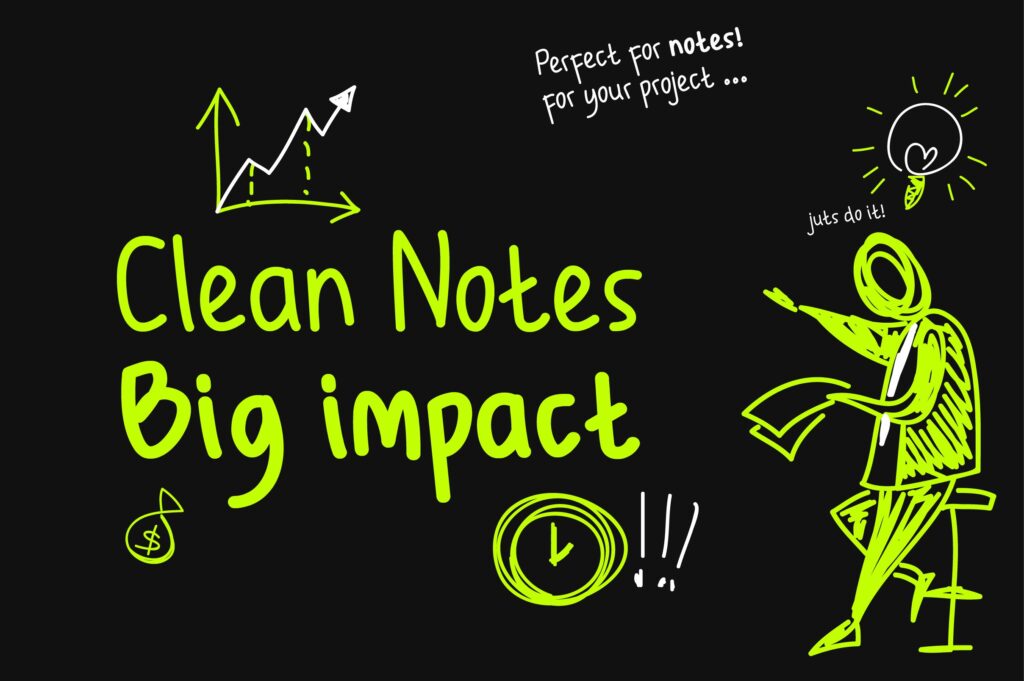
A thick expressive marker-style font for bold posters, campaigns, and modern visual statements.
🔗 https://lettertypestudio.com/bold-marker
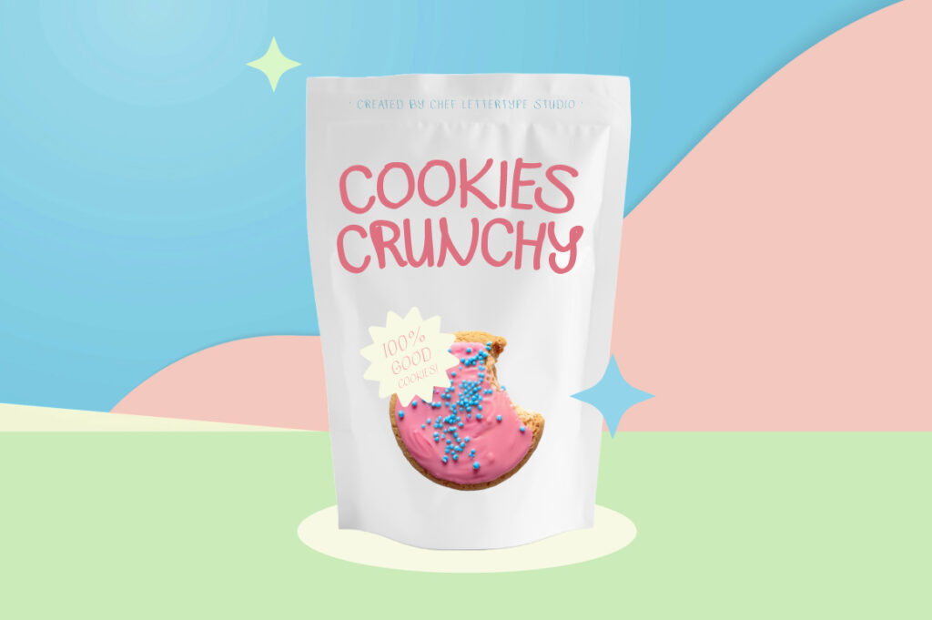
20. Wondernesia
A playful decorative font inspired by whimsical character shapes—great for logos and storytelling visuals.
🔗 https://lettertypestudio.com/wondernesia
Why You Shouldn’t Rely Only on Common Fonts
Using popular fonts is convenient—but it also makes your work blend in with everything else around it. When the same typefaces appear across countless brands, websites, and campaigns, it becomes harder for your design to stand out.
The downsides of overused fonts include:
Reduced ability to build a truly unique brand identity
Inflexibility for specific design narratives or moods
Limited feature sets (e.g., stylistic alternates, multilingual support, advanced punctuation)
A high chance that competitors use the exact same typeface
A curated or custom-selected typeface—like the ones offered by Lettertype Studio—instantly elevates the visual tone of your brand or project.
Lettertype Studio: Modern Alternatives for Every Design Need
Fonts from Lettertype Studio are crafted with:
Consistent and intentional glyph construction
Optical refinements for both display and text applications
Stylistic alternatives for flexible branding systems
Extended language support
Clean, controlled spacing and proportions
Whether you’re looking for a grotesk, geometric, serif, rounded, monoline, or display typeface, Lettertype Studio gives you stronger visual distinction while maintaining the usability designers expect from standard system fonts.
Final Thoughts
Using common fonts isn’t wrong—many of them became classics for good reasons. But if you want your work to truly stand out, your type choices must go beyond defaults.
Lettertype Studio provides contemporary, designer-focused fonts that preserve the clarity of well-known typefaces while giving your brand a more memorable and distinctive voice.